really cool game! I thought it was fairly simple to pick up, fun art style, and strategic. Very engaging!
flamewolf14
Creator of
Recent community posts
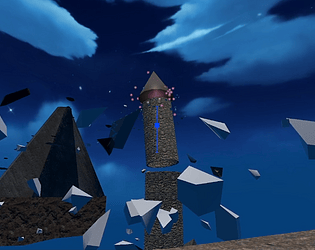
the effects were quite good for attacks. The art was pretty cool. I am just kinda confused. Maybe I didn't get the the part with enemies, but there were a lot of breakable objects. The attacks were hard to aim precisely on keyboard. There was platforming, but it didn't seem like a main focus. There was a pop like song at some point about romance? not sure if that was part of a story? there were 4 different characters with 4 different attacks, which seemed cool, but were hard to use, if they seemed to do anything(battle mage's melee didn't seem like i could hit anything before it hit me and it was stationary) It seemed almost like a grab bag of very different ideas sort of unrelated not like a specific vision. So the experience feel like it was lost in translation. oh also mouse lock in place would help, but that might be an intch.io thing. and other people already mentioned the camera.
over all it seems like the game you designed might have been really cool, but you guys might have fallen victim to scope creep, or just too large a scope from the start. I have been there plenty of times. Hope you work on the project more and it goes where you want.
The ideas was very interesting, and the getting waves to form was satisfying, but maybe I just am not a true gamer I was struggling with the little guy in the canoe. I had to reset because my tentacles got so long they would spaz around that is how after I restarted (they guy flew off the screen) my big tentacles hit the guy and his cursed canoe! but then the second level felt much easier, the third took a bit but felt doable.
I would make clock wise circles usually to the left of the target to make waves and just move in those circles and try and time them to make them bigger not sure if I was doing it wrong.
If you are using unity if you go to the canvas you can lock the ui to be anchored to a specific point
nifty Idea , I thought the water physics was interesting.
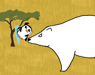
A zoology degree that is so cool! yeah I saw videos of them fighting like that and it seems so cartoonish I just had to have them in here. And there is plenty more for me to do, even just a win screen would be a good idea. I have to make a better enemy ai system which was a taunting task, but I am looking forward to improving the project
Thanks for the feedback! I did think some kind of little narrative at the start would have helped seeing as there wasn't even a picture or main menu to give a hint. I plan to update it before the end of the month and my second job will have a more conducive schedule for my workflow. (working 40 hrs 4 days a week then some weekends over the summer)
Having the buttons stand out more when you hover over them like a color inversion or animation of them getting bigger could help. Then when you go back to the good place sometimes I would be pointed up then pick a random boon egg, which I also didn't know what they did, which as long as that was a consious decision thats fine though indicating what they do to the players gives them choices to engage with the game. Also the grey eggs that shoot 2 blue fire balls horezontally the projectiles come out off center not sure if that was intended. I would also seem to get stuck on the fence around which didn't feel good as a player. I think having the ability to heal could be useful to help players be able to play more if they make a couple mistakes or get stuck on map geometry.
Over all I rather liked it
The art didn't turn me off the game I found it a bit indeering. The audio did its job wasn't anything magical or epic, but helped communicate the the player and establish a mood I appreciate it. I thought the tension between I want to pick up these eggs, but also avoid them to not get hit was interesting. The risk reward of seeing them "wind up" with the exlamation point and if I was quick enough I could get em before they shot but if my timing was off I was punished for poor timing or movement. The movement took some getting used to, but was quite interesting. I tend to play card games so not exactly my normal arena, and for games with movement I tend to play stuff like mordhau or csgo(though I haven't played the 2nd of the latter yet). I found myself when I died I wanted to play again because I thought I could do better, simple but effective. Oh also even though the act of dodging the attacks wasn't crazy difficult it was satisfying.
the ui art is great. the art on the cards im not a big fan of would recommend a boarder all the way around the card i personally think it looks more professional. it seemed like you just hit ur opponent in the face first not really a big incentive to trade if your a head in health. most of the cards are just scaled up vanillas which i get, its good place to start. having a blocking mechanic might be good. when you have your hand up on your turn you can't see how much health you have left. your turn ending after you hit face does make it so trading is a good option but if you open with too expensive cards and your opponent has many cards they can play you seem to get behind, maybe a mulligan system. also being able to play against other people would be cool but idk what ur goal with the project is that's what a random on the internet thinks. over all great job probably took a good amount of work
so I have had a bit of confusion at times telling the difference between gold and the energy so maybe making them more distinct. I also initially had trouble telling i had to add the coins to my bag because they sat next to the bag not under it like the other items, but once i moved some into the bag it obviously made sense they needed to be in the bag too but it took a bit. because in some games gold has its own spot so that is what i thought it was
Very fun game neat ideas im a bit iffy about how well balanced it is. Also some of the effects like poison its hard to know what they do when deciding which items to pick having an extra panel pop up next to them when you hover saying what the effect does would be nice. Lovely art style and a good time. well done :D
learned something about kwanzaa so thats cool had kid book vibes which is what you were going for very different from what i expect when i think of a game but interesting. some of the art didn't go super well together. I really respect what u said about buckling down and getting it done Great job :D
so when I played the mouse was still moving around normally which made it very hard to look around it took me reading the comments to figure out what to do cool art style fun music it slowing down immediately made me think something was wrong so thats good. the pickup mechanics felt a bit weird maybe it was just user error I would try to pick something up then also throw it. I noticed I mainly camped by the board and looked from across the room at people not that thats a bad thing just something I noticed cool stuff which I didn't have the mouse issues but i think I might have been the only one also some sound when you throw something or buy the thing. and the issue with the mouse i think happened when i clicked lmb before the I was close enough then got closer and clicked again but it like auto pick uped which is what threw me off
watching the live stream makes even more sense good point about the reward for doing something right makes a lot of sense I'm a little curious was there a reason u picked mine first was it just was in the middle or was the name interesting if there was no real reason its all good just curious if there is something I can capitalize on next time
gotta agree movement feels a bit jank and idk if some of it is ment to be intentional and a style choice also i fell out of the scene/world as I tried to do the jump over the wall next to the spike and chip gonna try again just gonna have to reset. art style is sweet but the level being individual objects makes it a bit awkward and sometimes you fall through them like i did to fall out of the world. cool music btw. the ability also being on a timer made it a bit of an issue to time because sometimes it wouldn't activate when I wanted it to. i might be unsure exactly when the extra jump hight is added very interesting concept quite unique as far as ik nice job :D
cool puzzle game it felt like the game took a while to ramp up it was around like 12 or so not necessarily a bad thing just a thing I noticed. I like the art, the little ball guys were cute. the story stuff with the text boxes were a bit confusing im guessing there was more in the secret levels which i like that thats cool. i just didnt figure out how to get to them. i also noticed that later in the levels you had some more tutorial/ simple levels and was initially thinking that was bad, but actually having variation in difficulty is good to not burn out the player so great job there. a little unfortunate that when you refresh or go back to the page you loose progress i know there is a way to keep that info through like player preferences(or something) but idk how to do that sorry. I also didn't get the random slow downs of time but im guessing that was the hidden narrative elements i didnt get too. Overall fantastic job :D
So my big issue is and this may sound weird but its too easy. the reason im saying that is a lot of the starter levels i could just walk around picking up paintings and the only fail stat was walking into a ! square unless i missed something. and the first time i lost was just to see if that is what would make me lose. after i realized that was it i played some more and ended up doing it again just to make sure i was right then i actually read the description and found out you had these sick awesome abilities, but for the most part you had every opportunity to just not walk into the ! squares. I even didn't initially know i could walk into the guards and swap with them. once i figured that out it really made me think dang this does seem maybe a little too easy/ i can even be caught in one then just walk out and even if im surrounded just use the ability. I was initially trying to pay attention to the numbers on stuff to know when it was going to switch but then i realized i dont have to worry about the numbers just the !s. idk this all might sound overly critical but that's what me slowly start haveing less fun because it felt like i didn't have to be that careful and it even got to the point where i game overed 2 times from just not paying attention. all that being said i played like 6 or so runs and might have spent 30 min on it. It started out really fun, but it lost something when i started to feel like so many moves were safe and i didnt have to pay that much attention. i really like the vibe and the concept and the abelites are super sick. i hope this long winded comment was helpful and didn't just sound mean cause i don't mean it that way. and honestly it kept my attention for the most time out of the games i played so far so major props there and even if i sound overly critical i think u still did a great job!
it honestly plays more like a puzzler platformer for me at least because you have to get the placement right for the stuff to get the dude. I think the game could really use a reset level button for when you realize your stuff didn't get him. and the timer makes, the kinda unforgiving platforming, and the limited stuff to put down doesn't really make it feel like a defense game which is what i thought it was going to be a reimaging of that said thats not a bad thing because that might not be what you were going for. it feels like im more raceing to answer a puzzle that is very rigid and hard to read. for example sometimes it seemed like the canon did 1 heart other it did 3/4ths. I really like the chill music and the art and sound effects are super adorable :D
i really like the tittle screen art cool style there the game play art is cool too just not as cool imo. the shoot mechanic was very rigid i imagine that was to make it more difficult to shoot things. and if you shot something there was a chance for the projectile to come back and kill you idk if that was intentional but it would either come back right at me or above where i would jump to avoid getting hit by the return shot but when i did dodge it that was cool. ima be honest i didnt read the words there were a lot and they were too fast. on the level where you go down the mountain it was tough to see where it was going that might have been intentional to make it more challengeing but not seeing an enemy then getting hit by them with now way to shoot it first doesn't feel great unless you were going for a more challenging dealio there in which case good job. also the last level where you would jump over the orange guys then land on another slime that hurt until i figured out you could get down to the ground sooner and you could even see the top of the people on the bottom of the screen i feel like that was a nice subtle hint. the background effect with the sky was a pretty jittery for me. Overall had fun nice sound effects and fun music


