Love this game! Got to x9 combo and then called it quits. Finally, a claw machine I'm good at! I'm curious, does the spawning of new items depend on items available and current required combo? I ask because at some point I needed to smash 3 apples, but only had one on screen and thought to myself "uh oh, I might be screwed now" but the game only ever spawned apples as long as I needed it, which was cool! Was this intentional or a happy coincidence?
jammydoodles
Creator of
Recent community posts
Man, I sucked at this game. I really wanted to explore it for the level design (the screenshots look so cool) but I rage quit after falling for the 10th time. If it's meant to be a sort of rage game like Getting Over It, then kudos! Otherwise I feel like the platforms could have been a little bit more forgiving at times (I can totally stand on a ledge with just my pinky toe, right? Right??) It's impressive how much set dressing you managed to get together in such a short amount of time and the idea is very cool.
I'll def be giving this one another try to see if I can get further :)
The results are multiplied, not added. You need to make sure that the tiles you place are adjacent and you place at least 1 citizen card (the ones with the gnome faces) as well as worker cards. If you’re missing citizens for example, then everything gets multiplied by zero citizens, resulting in zero score :) hope that helps!
Great game, love the art style especially! I really wanted to play it a bunch and see my farm expand but I got so unlucky with the RNG in that I rarely ever saw lumberyard and my farm would be overrun with pine immediately. I realize that the pine situation is a bug, but maybe a good temporary workaround is making sure lumberyard shows up in the first two shop rolls until it's fixed? I'm going to give it some more tries cause I really want to see everything it has to offer as the little I got to see - the gameplay loop, the little animations, sfx, etc - was really cool!
SO CUTE! I love the art direction on this - the domino tiles are so adorable, the UI works really well - it feels super polished. I wish there were some SFX when the points tally up, but otherwise it's awesome! We also made a settlement builder inspired by balatro (only with cards) so it was super cool to see how you approached it. Great entry, great job :)
I'm surprised this isn't getting more attention! Really cool to see a local multiplayer game. I love that there's a character selection in the beginning, the aesthetic works together really well, full sound effects, etc. And the inclusion of the scale elements is a great addition, doesn't feel forced.
I suppose maybe one thing I would improve is the movement felt a bit on the slow side (just a tiny bit) but I was also playing both sides so it could have just felt harder to maneuver anyway. Great job!
Interesting take on a memory game! The aesthetics and sound design are really good and the game itself is quick and simple to play :) I have a very bad memory so I only successfully memorized the first one (yeah...) so I can't give feedback on later levels cause I'm just very bad at these kind of games! (I played around 4, but having to use the "see the solution" always)
I didn't understand what the letters on the accuracy scoring were for - S, A, F, etc. It would have been cool maybe to see how many were wrong (1 room placement wrong, 2 wrong landmarks) and have a chance to retry, but get a much lower score for each new attempt.
All in all, great interpretation of the theming!
Nice card game! Took me a bit in the beginning to realize how it worked (yes I'm those people that skim through the tutorial confident they'll get it), I thought I was trying to accumulate smileys and would get confused when it would go down from 28 to 4, until I realized the happiness was per round! As someone else said here, it becomes tricky when you have more cards and you don't remember which ones you have already, being able to view all cards in deck would have been amazing, but it's a solid game as it is. Good job!
It's one of those games for me that start out difficult but then gets easier the more attempts you make! I agree with another person's idea on the start countdown at the beginning, or a tiny headstart (couple of seconds) before the water rises just to fiddle with the movement before it begins.
It's fun and satisfying to try to beat! Great job :)
I really like how you interpreted the limitation, the tiny pixel art is so cute! I think I would have enjoyed it more if the controls weren't mouse based as it felt really hard to navigate, which is such a shame because I really want to get further and see everything you created in the game! I wasn't always sure exactly what I was buying at the shop too.
I like the ambience, the cute chiptune sounds and the way the map isn't fully revealed :)
I like the tiny planet vibes and the overall concept! I wasn't sure what the end goal was, at some point I stopped moving and I didn't seem to be getting smaller or anything was happening? I get that a weekend isn't a lot of time to add more difficulty especially when you're doing it alone so good job getting what you already have here done :)
This is INCREDIBLE! The art style is so good, the cutscene in the beginning, the exposition of gameplay via the goddess, the sound effects, the movement of the boat, the little guy fixing his boat when you get hit!! 10/10 game, loved it. I really like how you kind of force the player to get as close as possible to the obstacles with the faith mechanic, so clever. Congrats!
I couldn't stop myself from becoming megaladon sized :( Haha I really tried, but the fish just swam straight into my mouth! I must be really bad at this could it felt like I couldn't avoid the clouds of clownfish around me. But aside from my skill issue, I really like the concept of the game and the message of trash effecting wildlife :)
Really fun! Towards the end I became so powerful I could sit still and just watch the fish get destroyed around me :) I like how at the end you get to spend your coins at the shop, such a neat addition! I had one giant shark appear which was cool, I expected there to be even more as it progressed but I seemed to just get the one! So that's my feedback, more giant sharks please! :D Great job on the game.
Thanks for this detailed insight, you hit the nail on the head. The third point has to do with the way I handled updating the sprite turns - basically the "physics object" you don't see rotates 360 degrees based on how long you hold down the inputs, and there are 16 sprites so every 22.5 degrees the sprite updates - which means that there is a 22.5 degree margin between what you think the angle is (due to the visuals) and what it might actually be. I tried fixing this by making the physics object snap to angles, but at least the way I tried it just ended up feeling bad to move around. So I'm not 100% sure how to fix this, but the first two points I can fiddle with already, so thanks I'll do that!
I clicked for the cover art alone, so cool! I love the art style and I think overall the game is simple but fun and easy enough to grasp. At first I thought (even though it states that the gun fires automatically) that I had to aim the gun with the mouse and thought that it was glitching out on me. It feels like it moves erratically because it aims at fish we don't see on the screen yet. Maybe if the camera was just a bit more zoomed out so we could see the incoming fish that would help?
I almost made it to 2 minutes but then I was surrounded by a bunch of giant fish (which was funny) but also felt like there was no way I could have avoided them being how slow I swim, again maybe if I could see them incoming a bit better I could have avoided them?
I love how you drew his little fit kicking under the water it's super cute :)
Thank you for playing my game! :)
Yeah I understand the controls thing - up/w is really "moving forward/accelerate" depending on the rotation of the boat, so if the boat is facing downwards, hitting w will move you forward in a down direction. Maybe I should have chosen a different key to be the accelerate (like spacebar or something) and that would have been more clear? Anyway thanks for the feedback!
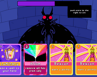
Haha will do! I have a version that is a bit more expanded and difficult I plan on uploading when the jam is over! I just wanted to make sure everyone could make it to the end :) The new version has more card types, higher score requirements and more varied enemies (some more aggressive than others) as well as 4 starting mana rather than 5 so that it's less possible to play all cards in a row :)
Hey! In the limitation description you say how the player follows the mouse, but at least for me that doesn't seem to be happening? My wizard kinda just stands in place and I can use the spells but that's it. What happens is I just cycle through the 4 possible spells and die haha. Is there a goal? Or is it just to see how long you can survive?
Also I noticed that there are volume settings but there's no sound happening for me either!
I think it would help to have a clear goal (reach the end of the level, defeat all the enemies, survive the night) and also perhaps some indication of the spell cooldowns, like a colour overlay on the icons that increases until it's full again, so we can time the usage better!
Good job getting the game done though! :)
Cute and simple! Some kind of visual cue that night is approaching would have been nice (maybe the sky going pink like a sunset vibe, and the timing between sunset and night could be random each time, so there's still the element of trying to push your luck) so it's less random luck and more based on fast reaction time? I love the pixel art :)

Hey! I can't play your game because the resolution seems bigger than my window! This is what it looks like for me, the Play and Quit buttons go off screen and I have to horizontally scroll to view it. Is it possible to edit this? (it might just be editing what sizing you put when creating the game page).
Cool and atmospheric! I speed ran through it cause I was scared of getting caught by the monster, so I didn't test to see if the notes acted as checkpoints or not? Also I thought the light would protect me from the monster but it got me several times whilst standing in a spotlight (not the flickering ones) is that supposed to happen? Maybe the lights just slow it down, not stop it completely? Your game did it's job of spooking me! I liked reading the lore through the notes as well :)
Thanks for your feedback! That was definitely something I wanted to do (I had planned for the enemy sprite to change progressively depending on the score) but I just didn't have enough time. And I'm honored you think it has potential! If I work on it more I'll add your idea of changing the backgrounds too :)


