Thank you for playing! :>
Jyunaut
Creator of
Recent community posts
Super cool game! I think this game captures the Castlevania style very well. The jump feels a little heavy but I'm not sure if that's intentional. I also lost a run because my game got stuck in a black screen after dying. Only the UI was showing and I could still enter the menu, but I couldn't see any of the game screen. My character was still moving and attacking as I can hear the dagger bounce off the walls. So maybe the black screen transition just wasn't able to disappear?
Other than that bug, I had a lot of fun!
I love the art style and use of limited colour palette. I think the jump doesn't have much use since you can't jump over the enemy, so instead you would have to switch to the melee. I think if you just focused on the melee drill mechanic, you could make a pretty cool game with just that and it would be pretty fun!
The art style is super cool and I really like the world you've built!
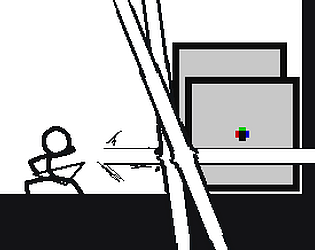
However, the gameplay itself is definitely lacking in comparison. I did not understand why I wasn't drilling the rock until I saw in your gifs that you were also moving the character in circles together with the handle to actually do any drilling. I also realized that you don't even need to spin your character and just spam opposite directions (eg. Left and Right) to speed run through the game. The game also lacks a lot of feedback for the player other than the slight screen shake from a successful drill and the heavy breathing on the player when they are low health. If you are not planning on providing any in-game tutorial for the player and want to make them discover the mechanics themselves, the controls should be intuitive enough for them to do so.
Other than the gameplay, I really enjoyed the world and atmosphere that you've built!
Pretty cool concept! The music slaps and I liked the animations.
It was really difficult to aim the cannon left and right because it's hard to tell the angle due to the perspective. Perhaps some sort of crosshair on what it's aiming at could help. The cannon only moving one direction was also tough because if you overshot the angle, you would have to spin all the way around again and hope you didn't overshoot it again.
Nice work!
This game has some pretty insane visuals! While you are using a premade asset pack, the way you used it is really well done. The gameplay is fun and simple enough once you get past the bit of reading at the beginning of the game.
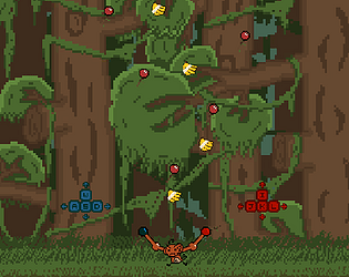
I felt that the bosses were a little too tanky and the fight seemed to drag on a little too long, especially if you decide to throw your seedlings instead of use them to ram into the boss. Throwing the seedlings would often spread them way too far out of the arena that it would eat up a large amount of time. As a result, I would rather risk taking damage and ram into the boss since the overall DPS feels far greater that way.
Really neat stuff!
Pretty cool game! I definitely got some Dead Space vibes with the sci-fi body horror style. The gameplay was pretty straightforward and simple to pick up and the boss attacks were well telegraphed so nothing really felt cheap. The small mobs were also pretty fun to steamroll through with an AOE spin build.
The game definitely felt like it was lacking in the juice, though! I would have liked to see more hit effects so that it feels like I'm doing damage to the enemy rather than the only feedback I get is watching the health bar go down. Regardless, I had fun with this one!
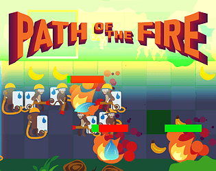
This was a really, really unique submission for a boss rush game. I don't think you see many tactics games in this sort of jam! I love the sprite-work and the concept as well. I see a lot of potential in this one but have a few issues with the controls and UI.
I felt that it was really tedious to press the arrow instead of the unit itself and I had to physically stop myself from clicking the unit each time I wanted to control them. I also think it would have been nice to somehow see the action timers on the units themselves instead of the corner of the screen. This just makes it easier to focus on the board. I also often found myself getting into situations where I would be busy chasing the boss with three units which was hard to manage at times. This is especially difficult when the boss would be running perpendicular to the direction of a unit, so I would have to spend a turn spinning the unit around (sometimes multiple units). I think the majority of my issues with this is due to the fact that this is a real-time tactics game, so board information should be as easy to gather as possible since the state of the game can change any second. So the more time I have to fiddle with the controls and UI, the less time I have to plan out my next move.
Or maybe I just suck hahaha. That's just my first impression and hopefully my feedback was helpful in any way!
I really liked your implementation of the spin theme! The gameplay is very clever and I really enjoyed how fair the boss attack patterns were! I felt that it was a little too easy to easy my own tail by accident when i'm trying to gather ammo, which made it hard to kill the boss. Other than that, nice work! It's a shame that there was only one boss, because I had fun with this one :>


