Didn't play and cannot rate, but the cat looks absolutely gorgeys, as well as the other art.
kaikkeus
Creator of
Recent community posts
Hell yeah! Awesome sounds. Good to control, and nice to see some physics in play. I wish I could jump even higher to hit even more from afar. Also perhaps some fun ending (edit: apparently I didn't finish the game). I'm gonna need more games like this. Making the physics joy even more awesome (still pixely, sure) would be nice, there's so much potential here. (For example a bit more points to interact, like making the embered thing having even hotter spots... anyway something where every action kind of escalates things more visibly.)
Kind of an overlooked genre. Good job. I think it's even nice how it's slightly hard to move it comfortably, and that you can drop too.
I'm not sure if the poster for the game is so fitting though, thematically yes, but it looks like soome stupid genAI thing (sorry if it's not, nice image in some ways sure), kind of signalling that the game itself could be anything (bad).
Cute game and funny style, overall very harmonious aesthetics. First, for some reason I wasn't able to do anything (fullscreen too), or at least seemingly. I clicked everything not knowing what would happen, and nothing happened (except sounds came). But eventually I understood what was happening. Not sure how to make more understandable in the beginning though, perhaps some more clear notifications of what just happened or should happen. Nice stressful yet cozy management click hell, since it's a bit hard to see what's happening at all times, but good thing it's still not too fast (although I guess it's ok if it gets faster).
Cute story, good fashion clothes when you see them at the end (but not so much before that). Maybe it's the hot summer but for me it was first too hard to remember what to pick, but I guess that's good, this is basically just a memory game anyway (the play mechanics are otherwise a bit too boring, and slowish pace), thus would be good for kids... then again since adults seem to have memory problems, maybe they should play these kind of games more.
Good mechanics, it's kind of easy to play yet simultaneously hard. Nice basic dark atmosphere. I don't really see this fits the theme or limitation of the game jam though. Otherwise, the game is perhaps too hard for me personally and I don't see a purpose, like why am I doing this? Maybe having some tasks in the game would help. I didn't play very long so maybe the game has something else in it too. Pretty much a ready game with the basic elements, and good intensive sounds too.
Well yeah not a game at least traditionally... although I wouldn't be that strict. Also I designed a nicer system for choosing specific parts more predictably, however it's the randomness that makes it exciting for me at least, there's a sense of almost scary ephemerality and sudden worlds. The "game" could still very well include other things too (such as story, money management and maybe gaming for money... or some interesting twists, although that wasn't quite possible for me in 3 hours), but they'd be kind of nonessential after all... they'd be other games. (At first I planned to make this something different, a weird game of failing yet simultaneously achieving something interesting - for example the shirt would always be too small or too big but it would become high fashion - but even then it would've been kind of avatar creation style.)
Cute style. I like it how it resembles card games; it's good to have the automation on top of it so that players don't need to count everything etc. Anyway, for me it's hard to keep attention. The notifications are somehow annoying, and while I get it, I would... just want to see things more in action. No it's quite abstract and you can barely see what even happened.
Did you already mention sucking? Yes, and it doesn't suck, it's fun when you get to suck space. Lovely puzzle kind of thing, and I like how the image is filtered. The moving objects and failing doesn't quite work like I'd expect, it's too hard. Otherwise good smooth movement and soothing music. Also, I kind of expected more fierce sucking.
Very cool looking realistic-but-not-quite background, nice simple idea (although it was first kind of unclear if this is all the gameplay has to offer). Nice to have simultaneous two-button mouse controls, although I'm not sure how much it helps with this. Again, physics gives the player nice tinkering feel.
I like the music and initial setting seems ok even though it's minimal. However I don't feel I get what I am supposed to do in the game. Perhaps it gets nicely complex or cozy, I don't know, and for that even simple menus like that could work ok. The game doesn't quite fit the screen, BTW. Additionally, it's not related to this game jam.
This is an old format but with a very nice cute addition of floating gems there too. Great quality too and good graphics (not the thimbnail image so much somehow). It's fun to play, I get slowly better at it... maybe. I will come here again after I've finished the game (and also to rate it, now I'm not yet included in the jam so I don't have an option to rate). Although it might be a bit hard to finish the game, that's taking away some of the enjoyment. But it's also refreshing to see "oh, I forgot to monitor my oxygen level" etc. (as if acknowledging my mistakes would be growth... maybe on some level but not necessarily avoiding the mistakes). BTW, first I tried to collect the bigger gems from the asteroids. Sure, the description says to look for the mining trucks. And it's nice to see the gem industry system in work in the game! It feels like all resources are rooted in something concrete.
This is definitely something I'd want to come back to and learn it a bit more. I don't totally like the system of moving, but it seems still that it's totally deterministic and fine (smooth physics), and it's just more about my learning curve and problem solving. So this is a good thing, I got some improvements already and found cool things... doesn't even need to be winning the game, just tinkering is fun. Although at least in the beginning and maybe otherwise it still might feel too hard. I like how the game is also so minimal otherwise, it means it's easier to come back and get improved. The worst thing here is maybe the thumbnail image of the game... although I couldn't make it better.
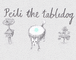
I still had problems with ordering things depthwise. Basic things but sometimes they are very gimmicky. I haven't seen the ball going through the dog though. I also considered shadow and might add it later anyway. It's just that a "light" might not make such shadow... but I guess it shouldn't matter. Reflections would do too. The top of the animal was actually supposed to be a mirror for the light to bounce from (as the character name "peili" stands in Finnish language), and I didn't have time to add the reflections.
First I thought the game felt just uninteresting, too slow, not very good looking (the space is still nice)... and sure, it's still too slow to start. But the new good lookin (!) enemies and challenge after that was enough, nice almost hypnotic evading. Also I just kept spacebar pressed so it was nicer to shoot (before that I didn't like the shooting... and still didn't but it's ok). I'm not a gamer at all but I'd still kind of wish for even more challenge, some more bullet hell feel. Or at least even more extra speed (this is the biggest con imo)... maybe it sped up but I didn't feel it was speedy. And while a space shooter isn't the most original idea, it's still fun and appreciable. It lagged a bit for me at few points though, but to me it still actively feels while playing that there's something technical behind it that's well done too.
Incredibly good drawings, and I absolutely love picking stuff as a hand, and it's awesome to see physics applied to 2D drawn art. The game idea is also good. Still, I didn't enjoy it as much as I would've liked, basically it's just an annoyance to use the mouse (for my physical hand feel itself, but also the game is oddly difficult too - of course that's reasonable though)... perhaps this is perfect for a tablet though! Also, first it's hard to know what you need to do (but I didn't land on the game from the game page so that's on me, I mean I had this in separate window and didn't check where it was launched from), good to have the video explaining it though, even though still I didn't even notice the bag (again, my fault). Very lovely little piece!
Refreshing to see such 3D things, nice amount of retro and modern, I really like the Doomy feel. Good horror atmosphere. First I can't really find out what I should do in the game. There was some bloody attack and I don't know what happened, but it would've been nice to have something like that again... but after that there was nothing. I like the idea of vague darkness and directions, but I think it might still be too hard mostly, if the monster is just super close to you suddenly. The game didn't lag for me (desktop Firefox), except the attack perhaps. Anyway, after a while I went back to the game and after all there was a new monster attacking and somehow I beat it (with absolutely no skill, I just clicked), and the found element was very nice. Still way too hard to navigate (plus movement doesn't feel so good but it's my bad). My screen is bad and I added lightness and it got better, but still kind of too hard to find back. And after filling one task, again there's nothing to do. I guess something will happen later and it's the gist of these kind of games (I don't know), but I'm just not sure if I should wait and roam around aimlessly or not.
Well I do like eating fish. But some effect would be needed for the eating event. Also some more fine graphics (but I can handle this mostly, and I love the light coming to the water), for example the comic style crunch when you get eaten isn't so nice... I mean it is all anyway kind of comic style and that's fine per se. Nice aquatic music. The game feels a bit slow, losing my interest. But a great fish eating game is something that's always welcome, and any variation.
The idea is very nice, it's something that simply has to exist and be developed fully. First I didn't get what to do, arrow keys didn't work (since you'd have to turn off the lights, and even then you can't move unless it's just one step), also I think my first level didn't include any plushies... so it's extra confusing. Also first rounds somehow I managed to put off the lights right away, so there was no memory helping except very short view. Also, you don't notice you got the plushies (even though there's a counter but first I didn't see that and it doesn't feel so good). But once I got it all, it's fine. Perhaps a bit too easy since you can stare them so long lights on, and you can just move haphazardly (but of course that's where the competitive timer would jump in and make the game awesome). BTW it would also be nice if you could get out of the level to try again (for example when I pressed space too soon). I get that it's incomplete. The art style is cute, although I'd personally want to see more details or just more exposure to cute things. Maybe something that makes it more emotional somehow.
Nice little puzzle, I like how old-school things get mixed with something that feels like physics, the environment feels precise enough yet still organic. Sometimes it's not clear how the light behaves here but it's ok. Good atmosphere. Lol the monster is like a robed executioner... and still cute. Have good times in the darkness!
This style is really good for me, grid games FTW, and lovely tiny visually. Gets a bit time getting used to the movement but it's ok. The enemies are a bit too hard sometimes; it's interesting that they aren't maybe totally predictable though. The light limitation is a good idea, even so that it's hard edged, giving it eventually kind of a unique dice-y RPG feel if you don't really know what's next to you but have to take risks. (First I thought the game would end there but it doesn't... well maybe effectively sure).
Oh, yeah I get that (and I also thought speed could also mean low speed when I was spitballing ideas). However I didn't notice how it would have an effect in this game. Felt hard to predict the result; I merely focused on staying away from the lights, so for example if there's two lights, I'd try to go what's exactly in the middle of them, since it would be the darkest spot. I guess I have to check out again how even slower speed or right amount of speed would affect it all. Maybe if it's too fast the balls don't quite follow the route so exactly?
The idea for the view is actually for a bigger game I'm planning... and I now realize it feels like giving out information and decreasing the chance of novelty of the planned bigger game... but whatever I guess. But basically the bigger game would be like this I guess. It took quite a time to come up and stick with the view, it's a form of cavalier projection (but I didn't find anything like this). It's 72x72px squares, rather steep 2:1 slope upwards depthwise, so 48px and 24px residuals to different directions. 72 is a great number since it can be divided by 8 and 9 (since I'm planning to have even smaller scale modularity). Also one pixel would actually represent one centimeter... so for example one basic block is the same height as a table, two thirds are the same height as a chair. Also obviously it wouldn't only be 72px, but maybe smaller or bigger in some cases (x times bigger assets - actually here it's 2*72px - and smaller when zoomed out, anyway using whole numbers for sizes are better when things are supposed to be tiling, although it still doesn't always work). I'm using CSS and they have to have image rendering set as pixelated or crisp-edges. Not quite sure what I'm going to do with many different kinds of image edges. My main reasoning for this kind of cavalier perspective was that I want the game to be arrow key controlled and easy (whereas isometric would be weird to control with up down right left), yet straight top-down looks a bit too odd and is hard to draw. Also, in this way you get relatively large bottom layer vertically too (compared to projections where the depth slope is not so steep). It IS supposed to be used as top-down AND platformer thing though. One problem is that I need to draw so much more, since I don't really want to use 3D models either. Especially if I extent these into 8 directions. But after all it still might be something that would be fun to work with, slowly adding material.
Awesome idea and smooth aesthetics (and cool segmented and other technical approach however it is done). Lol, first I though I was moving the healt bar, and the balls just seemed like some effects. I feel this is a bit more puzzle game, not so much about speed. It's kind of too easy to die in my opinion, it's hard to say what you are doing wrong. A faster paced more open world would be great for me at least.


