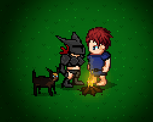
I created this roll thing for Permadeath mode for myself. When I die, I roll a new character.
However, if you want to "save" your roll, just take a screenshot, and actually I think there's a feature for that! Don't remember the hotkey now, could be Ctrl C. But take a screenshot with your Printscrn button and save the image on Paint or whatever!
LakeDead
Creator of
Recent community posts
The false theme naming throws off unnecessarily in the beginning. And only just now I saw a link under it now that you mentioned it.
Many people just quickly check the theme from the main page to get to brainstorming asap, and as the theme sounded so fancy and unknown, it's wikipedia time!
And sure okay maybe shouldn't always trust wikipedia either, but it's describing anything but your detailed rules.
So this was averagely designed, feels like, I'm sorry. I don't think I'm alone in this.
Ah, goshdarnit. I guess should come to see what people write in the community, before working on a game. Yea the theme is NOT Dunning-Kruger, great. Time to rethink my whole game, because it was about that.
Please, next time, don't just use fancy words you don't know the meaning of.
As the theme text, could just use something like "Protagonist is the smartest person, but they and everyone else believes the opposite."
I guess a real DK effect happened here. Host promised something and fell short in their competence. Followed theme to the letter!
Happy jamming!
No aggression here, but...
Excuse me? What on earth is a male game jam?
I've never seen a single one. Go ahead, just open up ANY game jam blindly, you'll see they won't disqualify you for being a female, girl, woman, a bear, your mom.
It's hardly understandable. There is no such thing as a male game jam. Now there's a woman game jam here and it's the only one that restricts gender.
However, it IS indeed a good thing that everyone can express their creativity through art and games, etc. without limitations of one's persona. The Game Design university I went to had 50% females 50% males so there was NO minority, it was perfectly balanced. And in the end it was mostly girls that graduated. So I guess it depends on the country. But here in northern part of Europe, women making games are not a minority.
You'll be happy to know your vision of the world is misinformed and things are actually better than you think. :)
By the way I do still support the idea of this "woman game jam" because it can help inspire those more shy ones and the ones that try to avoid any male contact for some personal preference reason.
Good luck and have fun jamming!! Love! <3
It's made in Game Maker and I'm just providing illusions that it's a C64 game. The loading screen is merely an animation to provide a more authentic ruse. :P I have made some games using BASIC language on C64 though, but I could not create this game with it. I don't do Assembly and with BASIC I can only create text-based adventures, which it is super good for.
Nice ideas. Many people in jams don't even listen to the sounds, but their own music that's playing in the background, especially if they are a streamer, so I don't take audio as very high priority and should be done last in any project, if there's even time to make sounds. I thought of some difficulty-increasing elements like puddles or obstacles you pull the cart through, but I was really on my last minutes before going to sleep and I just joined the jam at the very end when I could, so I just left it at where it was at that point.
Ah, never even heard of these options. Thanks! I will probably not be adding more assets on my account though, because this has been mainly my storage for game jam entries. Might make a separate account dedicated just for assets. :) Unless I figure out how to make a different section on this account for Assets so that they aren't amongst the games.
The star buff is a dice roll of luck sometimes. It takes a short time to activate too so if you just smash into an enemy as you pick the star up, you'll die. Also it ends abruptly which can happen mid-collision with the enemy I suppose.
Most level design was made during the final hours of the jam, so balancing wasn't possible. Last levels possibly were made in too high difficulty due to developer becoming better at their game at that point after testing it so many times.
Thanks for playing and for the feedback!
The star does make your character "flash" slightly for the duration, but if there was more time I'm sure we could've added some additional sparkles as an effect, and perhaps even change the appearance of the enemies (PacMan style) to notify the player something's up.
Thanks for playing and the kind words!
Thanks for the wonderful words!
Indeed, over the course of the jam I quit it twice even though I didn't even press the Join button until there was only 20 mins left to the deadline.
Perhaps the reason for me to only join jams on the last hour nowadays is part of the fear of failing in a depressing way, such as threatened to happen during this jam.
But I figured out my own method of getting back on track for a fresh try and fresh mind and dropping some personal requirements of quality and content to create anything.
Perhaps this will also boost my confidence and courage on future jams as well.
I spent way too much time on the graphics and audio, taking up most of the jam on those, and then I didn't have time or energy to implement the depth in the battle system that I had thought about initially. Though even with those ideas there wouldn't have been upgrades or builds to choose from, which is something that I've been thinking about implementing in later versions of the concept.
Btw the CRT / Scanline filter is literally just a dark line -sprite, drawn across the screen several times (tiled) and then you can from the ESC menu adjust its intensity (basically just changing the alpha of it by .1 ) so it's actually not a filter, just a sprite. :'D It just works!
Thank you for playing!
Now, you can interpret the victory screen as you want. Which one of the characters was actually rescued? Hehe. ;)
Yes, I put way too much time on the atmosphere and the immersion ( no pun ) of the experience, but unfortunately that is then seen in the lack of some depth ( not another pun xD ) on the game mechanics themselves. But for a Game Jam I think this is good. I have seen less progress on people who have spent 2 years on their projects, so I can only be happy with these results. I will ofcourse continue the concept's development and improve upon the battle system and its frequency first, before touching upon other aspects of the game.
Thank you for the kind words and for playing!
It's true that I initially had the idea that you will reach a certain location where you can dive literally downwards, but that would've overscoped the project for a jam, and should be reserved for an actual commercial game with months of development instead.
I'm glad that you enjoyed atleast the atmosphere of the game!
Thank you for playing!
Nice comments that warm my heart.
I didn't think at all that the color scheme would somehow be similar to something like Another World, since this is underwater and that wasn't, but cool that there's some kind of a distant relation to such a cult game that's showing up everywhere if you search for retro stuff.
Thank you for playing!
Speaking of sick, I had initial ideas for the combat to have more depth, but I lost 1 day to reinstalling Windows during the jam, and for the last 2 days of the jam I was feeling quite ill, so I didn't dare to include deeper features that could introduce new issues and bugs to the project. Already barely submitted in time with 6 minutes left on the deadline timer. :'D
I appreciate the wonderful comments and indeed; the atmosphere, visuals, audio are my favorite part too and agreed that the combat could've been a bit better and less repetitive. Still happy what I came up with in basically under or in a week.
There are plans to improve further upon this concept of a dungeon crawler. I will try to make the battlesystems better.
Thank you very much for playing! <3
Great atmosphere, very cool visuals and a take on the well-known concept of "Let's venture through the same corridor again and again" games. I have a personal issue with the design of the tasks though. I got told by other users that there's a puzzle in the game. The game never told me there's puzzles or much that I need to do absolutely anything, so the game's lacking in that sector. Confusing character selection, too much text on face. Cool slideshow tutorials, although also a lot of text at once, and then suddenly less text to tell the player there's puzzles? Otherwise awesome entry!
I'm glad you enjoyed the experience and I appreciate your kind words!
Indeed you called me out on it, I did place npcs to block the paths with some tasks related to interacting with the events spawning into the world. If there were no blockages like this, the game would've lasted only 2 minutes. Personally I play it through in 5 mins still, so it IS quite short indeed.
I spend a lot of time just listening to the chill exploration music though. It's almost like a cool screensaver with relaxing music. Accidentially made a nice music track that I keep humming to myself even when off the computer. Heh.
Thank you for playing! <3
Aah, another combat system inspired by Guild of Dungeoneering and that one Ludum Dare space game where you chose your moves beforehand too. But this is only a positive thing! I thought about making a similar system to my entry too but I didn't have time to implement and design it so here you are with more interesting combat and overall world than mine! :D Well done!


