Play game
Cosmic Delusion's itch.io pageResults
| Criteria | Rank | Score* | Raw Score |
| Theme - How well does it incorporate the theme? | #14 | 4.038 | 4.038 |
| Overall | #21 | 3.746 | 3.746 |
| Completeness - Is it an unfinished tech-demo, prototype or a complete game? | #25 | 3.962 | 3.962 |
| Audio - Does the game have nice sfx and music? | #37 | 3.654 | 3.654 |
| Graphics - Is the game aesthetically pleasing? | #57 | 3.808 | 3.808 |
| Gameplay - How fun is it to play? | #68 | 3.269 | 3.269 |
Ranked from 26 ratings. Score is adjusted from raw score by the median number of ratings per game in the jam.
Leave a comment
Log in with itch.io to leave a comment.


Comments
The music is really nice. Didn't get the color switching thing, needed more animation maybe. Got a bug near the end where 'good luck' stayed on screen then I engaged the boss and couldn't progress.
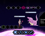
The combat is still confusing to me albeit I have read all the notes on the game page. It is a good concept, not gonna lie, but just needs more clarity.
The game feels polished. You can decide the outcome of each combat which I really like.
I managed to complete the game (+secret boss), but I only get grip on a combat mechanics pretty close to the end of the game. It was quite hard to calculate all the switching, pulling/pushing to kill your enemies and not getting hit at the same time. Mechanically combat is pretty cool, but it seems that some improvements in UX is needed for it to be easier to understand. Probably adding undo button will make it more accessible + maybe some kind of visualization will add to the accessibility.
I enjoyed delusional theme and how it all were weaved together in this story. Music was spot on in the 'real' world, for some reason it gave me Shin Megami Tensei 3 vibes.
Pretty cool, I managed to defeat the director, and the secret enemy. A few spots movement/collision felt weird - when I first teleported and saw the director I immediately took one step backwards, and, unfortunately, found myself way back in a previous area. Not sure if that was intentional, but it was a bit annoying ^_^.
I love the overall vibe and music. Combat took me a rather long time to really figure out, the first times it all flowed way too fast for me to figure out what was going on. I did not realize until much later, even after reading and rereading the description, that my attack, then move, then switch all happened before the enemy's attack (I originally thought I'd attack, they'd attack, then I'd move, then we'd switch, so I was quite confused occasionally when things didn't go as I'd expected). By the end though, I had it down, and managed to defeat the director without taking a single point of damage, which felt really satisfying =).
Nice touch having lots of portals between worlds. They imparted a feeling of progression, which I don't get with very large or endless single-floor levels.
Graphics look great! Movement was good. I especially liked the wall bump effect.
I would have liked a few audio cues for the combat, which I had some trouble deciphering.
Nice game!
Congratulations, i really liked it! Even though the combat system is quite confuse, it was really enjoyable to beat the game. Music and the dialogs from my bizarre co-workers are really good.
good interesting game nice setting good music and interesting battle system, it clicks later on but it would be better to have a short tutorial i think.
This was a good interesting game.
I'm not sure if I entirely understood the plot, but it was enjoyable and some dialogue were definitely funny. The combat system was confusing but it's fortunately balanced by forgiving each mistake with infinite healing and retries with full life.
The only problem I has was just the raycast which sometimes make us able to interact with objects through the walls which deceived me sometimes as It made me think of some secret area or something (and the game does have some like the sock enemy!)
A really nice game!
Ahah thanks for playing! Yeah, the interactable objects have no idea of their environment, I just check if the player is on an adjacent space. Will do better next time!
Well, I don't know if the way you made it allow it, but making the tiles registering the nearby walls might do the trick, so the objects could know if for example, the north wall is blocked but not the south one, etc.
This might even give you some opportunities of gameplay like one-sided walls which allows you to pass but don't come back, or something like this ^^
Also, I forgot to say I liked the way you made the player able to run fast and crash against walls when the forward input is kept pressed xD
Check out my live review at https://www.twitch.tv/scalphamission
That was fun! I love how the fantasy version of yourself is an anime girl. I then had a brief existential crisis the moment one of the NPCs said something about needing to have a meeting to 'touch base'
Aah, another combat system inspired by Guild of Dungeoneering and that one Ludum Dare space game where you chose your moves beforehand too. But this is only a positive thing! I thought about making a similar system to my entry too but I didn't have time to implement and design it so here you are with more interesting combat and overall world than mine! :D Well done!
Ahaha I never heard of those, I thought it was looking too much like Darkest Dungeon/Slay the Spire! I inspired myself from a boardgame called RoboRally where you program your moves in advance, but your opponents too and it messes your moves! So you watch how your perfect plan get screwed up. I couldn't do that on a solo game because it's unfair, so I had the idea how Slay the Spire always shows you moves in advance so it always feel like you're in control. I'll definitely check Guild of Dungeoneering!
Well in Guild of Dungeoneering you really just choose 1 action at a time, but the same action can have multiple effects. Also while it is a dungeon crawler kind of, it's not first person and you don't directly control your character at all. It's kind of exotic!
Combat took me a little bit of figuring out but had a nice amount of depth to it once I understood what was happening. If you decide to update the game after the jam I think it would be nice to have a bit more audio/visual feedback when attacking or being attacked by the enemy.
Really liked the music and art style as well as the way you worked in the theme with the corporate and fantasy worlds.
What an incredible entry!
Great controls, combat is not boring (though a tutorial could be nice). Dialog is not over bearing while still being interesting.
Great job!
The combat system is a little bit confusing at first, but it makes sense once you figure it out!
I confronted the Director and vanquished them.
This was fun and I concur with what've been said, the combat is not particularly varied but it's a fun combat system, navigation feel is good (although I'm always for the possibility to walk as fast as you want) and I enjoyed my travel through this delightful surreal world.
This was a good time! The battle system was a little bit confusing at first, but by the second or third battle I got all the details and enjoyed trying to think through all the details. I would've enjoyed a bit more variety in the moves and difficulty in the battles, but fitting all that content in for a jam is hard enough so I certainly don't hold it against the game!
I wasn't sure why the sword attack showed red instead of yellow; I assume that was a bug and it was mistagged as an enemy move?
Thansk, and for the sword attack yeah, it was exactly that
![]()
Modifying variable via the inspector is nice, but next time I will set everything via code so it will stop moving around >: I
Movement and FOV are nice, combat was a little confusing though. A control scheme switch was a little jarring
Wow what a nicely put together game. Lots of npc dialogue and things to interact with. The combat is something I've never seen before and at first I didn't understand a single thing but once I grasped the concept it worked well!
Graphics is nice with interesting creature sprites. Nice music too but after a while it would've been nice to be able to lower volume a bit.
Controls is for the most part fine but sometimes it doesn't respond quickly enough after a move. If you quickly want to turn after moving sometimes you need to wait a little bit extra before you can act.
It was a little bit strange that you can be position in the middle of a door when it closes :)
I like the theme interpretation. There were even layers to it :)
Thanks a lot! I didn't have time to implement an input buffer and it was annoying me a lot as well. I actually sped up the transition a lot so it was less noticeable. Something for my next game >: D
Really cool idea! I did not understand a thing about battle but it looks cool and i think that with proper slow tutorial it can be very interesting