Indie game storeFree gamesFun gamesHorror games
Game developmentAssetsComics
SalesBundles
Jobs
TagsGame Engines

mpaul0416

61
Posts
1
Topics
7
Followers
15
Following
A member registered Jun 16, 2018 · View creator page →

Creator of

Recent community posts

Hey! Been working through simulation and management games made in Godot and I came across this one. I really like the idea. You have kingdoms who are trying to survive and thrive while pitting themselves against each other.

I feel like this game needs more insight into the systems in order for it to pull off what it was trying to do. I saw that the jam them was "The game is a liar", but without any visibility into the systems, I couldn't tell if the advisor was being truthful or not. At that point, I just ignored what was said.

The feedback systems seem to be missing. One example would be that my food would be bad, but my people very happy. I would buy some food, and that would switch to good food but the people would be very angry. Another example would be the combat. I was never able to conquer another nation even though I sent a lot of troops. I didn't know if it was because I failed (or why) or if the game just didn't implement it.

I really liked the idea and wanted to see if there were any plans to keep working on it in the future. With some polish, playtesting, and balancing, I could see this being a lot of fun.

Also, not sure, but it looks like someone else re-uploaded your .exe to itch. It doesn't work, as you still need the .pck file, but I thought I'd let you know.

Really like the idea and the execution was great!

For the HTML5, I had a couple issues with the grappling hook detaching on mouse release. Lack of detach + the reel-in mechanic means I slam into whatever I'm hooked into.

I'm not sure, but I had several crashes pretty quickly. I was playing the Windows version.

Other than that, it looks pretty fun! The art style is good and I like the variety of the tasks. Speedrunning it would be nice with saving times so you could see how well you did.

Thank you for playing the game!

Thanks for playing my game!

I could see how that would cause problems. When I pick this game up again, I'll make sure to space the collectors so that starting a new week, they won't rebel until at least the third collects. 

Thanks for the play!

I know! I wasn't planning on joining this jam, but I saw the theme and couldn't resist. There have been some really fun games!

Thanks for playing my game!

Many thanks for the detailed response! My background is almost entirely programming, so the feedback on the art presentation is very welcome. I played around with theming for the Font, button, UI, etc. but didn't figure it out enough to really push the idea I had in my head. And the crosshair is my shame! I had it on my list to do a second pass on the visual style for that, but alas, time was not on my side.

I'll have to play around with the rendering tiny and then scaling up. I hadn't thought of that approach before. I know, for the roads, I had planned on tiling a texture across them, but I think there may be a bug in the Line2D with the vertices because it went all sorts of weird when I tried.

Sorry for the freeze! I didn't have time to stamp out the bugs on the HTML5 version, as I developed it testing on the Windows.

I agree with the lack of tactical gameplay. I had just planning the routes, but realized that the player would be super bored during the week, so I started adding abilities to give the player something to engage with. Do you have anything specific in mind in terms of adding tactical gameplay?

Thanks for the comment! I had planned on getting more levels, but ran out of time. It seems like the bugs come out of the woodwork in the last 3 hours :D

Thanks for the feedback! Which version did you play, the HTML5 or the windows version? I couldn't track down all the bugs for the HTML5 version, and I tested almost exclusively on Windows, so I'm pretty sure the crashes wouldn't happen in the Win version.

Haha yeah, that one was my favorite ability too! 

I hadn't had time to tweak spawning and road walking for the collector, because there were several edge cases where the collector would just get wrecked without the player being able to do anything about it.

Thanks for the feedback!

Thanks for the feedback! I didn't have time to really tune the player info, so it's good to point out increasing the visual difference. If I could change it, I would probably make the tax collectors a different color so you can parse them better while the scene gets busy.

Haha, my second game jam game had a procedural music generator and it ate up time like nothing else! I'm glad I did it, but think that I would need to build a system several times, or have one pre-built that I could use as a stepping stone.

Have some more time for thoughts.

I like the PS1 style graphics. They seem to be making a comeback as a good compromise between high fidelity of today and the pixel art that was the norm in the birth of gaming.

I thought the UI was a little hard to read, as I only saw it when I was moving from building to building. Because of that, I think it was hard to understand what was going on.

Excellent game! I  loved the atmosphere of the game. The story was a good one as well, had me hooked immediately.

Like others, I found the wall jump to be a little clunky. With some polish though, it could be an excellent stealth game.

I did find an issue where I died after getting the grappling hook and it took me back to the beginning, but didn't respawn the hook, or let me use it. I had to restart the game to get it back.

This game is really interesting! I like the idea, but it was pretty hard for my brain to map the notes to the keyboard. I if this would work better with a gamepad or some other dedicated device.

I love any kind of procedurally generated media, so this is really cool to see.

I really liked this game! I can see a solid concept with plenty of room to grow. You could either turn this into a puzzle game by making the levels not random, or push it to more of a sim game by keeping it random and adding more systems to interact.

I wasn't sure how the hero was going to react, so some indication of what he's thinking would be nice. Maybe he has moods that means he's looking for certain things. A mood emote could pop up that basically says "Hey, I wanna kill a monster" or "I'm hurt, looking for health!"

Thanks for the feedback! Was there anything specific about the mob management that you think could have been improved?

Thanks for the feedback! I was definitely practicing with my UX on this one, so I'm happy that you called it out.

I had a tutorial planned, but the deadline snuck up on me. If I come back to this game, making one as the entry levels is definitely on my list!

When I made the game, I targeted mobile platforms, so it's good that you thought that it would be better on their. I planned on adding buttons on the keyboard for the abilities, but ran out of time.

Sorry for the crash! I don't know what happened, as I had programmed it to deselect a settlement if you clicked on it when it was already settled. Honestly, I didn't realize that I had to submit either an HTML5 or all 3 platforms, so that threw me. I had only tested on windows. I know HTML5 deploy better than linux or mac, so I went with that one, which had some of its own problems.

Thanks so much for the feedback!

Thanks for the comment! I bit off more than I could chew, but wrapped it up decently enough. Amazing how fast time goes by

This one probably needs an epilepsy warning for the title card. Anything rapidly changing like that can cause issues.

Love the atmosphere and the sound work.

I feel like the creatures don't give enough time to react, given the slower speeds of the characters.

Something else that I've not been able to see is if you can complete the game without a survivor. With the number of doors I've run into, I don't know if it's possible. Maybe make sure that the game can be completed with no doors (the doors make it easier, but not necessary) or fail the game when even one of the survivors dies.

I'm not sure if there is/was plans for something for the weapons, but right now they are misleading in the game as they seem to do nothing. Maybe you could replace them with abilities specific to the survivor?

I liked the art style of the game. I thought it worked really well for the gameplay. 

For gameplay, I felt like there was a story, but it didn't mesh well with the gameplay of eating the fish and avoiding the jellyfish. Maybe if you tied it in somehow, like make the player find so many fish before being rewarded with the next dialog or letter.

The story is an interesting subversion of the usual my parent's not my parent. I thought the reveal twisted it pretty dark, though, and the ending didn't leave enough breathing room for the player to process. This is probably because it's a jam game, but if the story were to be stretched out longer, the player would definitely need some time to anticipate, process, and decide whether they agree with the actions of Jo and the reaction of Tip.

My favorite part of the game would have to be jumping up out of the water. For some reason, I did that for quite a bit of time. Maybe you can "follow the fun" there and expand on that mechanic if you were to take it further.

Overall, I love to see a story-based game in a game jam! Most of the time you see a pretty standard prototype, light on art and story, focusing only on the core element. This game, however, has more story than most. That was pretty neat!

As soon as I saw this game, I knew it would be a contender! It has a simple yet challenging game loop, art that serves the game well, and a fantasy that's amazing! Great job!

If I were to add to this

I struggle to find things to add to this game. If I were to expand it, I would probably add conversations that you could listen to. I might also inject a substory, kind of like how Papers, Please tells a story without ever coming out and saying anything.

Game Design

I'm going to be using Jonas Tyroller's framework for fun for these reviews, so you can watch his video for more context around it. My day job is looking for ways to improve things, so just because I offer a lot of opinions on that, don't think that I didn't like the game. :D

Impact

There's a lot of good impact in this game. The small sound of plugging in the cables, the ring, and people talking all give weight to what you are doing. When a call completes, the bell is a pleasing sound that rewards the player. The post-game screen helps the player to decompress and examine how well they did.

Challenge

I thought the challenge curve was especially good in this one. The first two shifts are pretty easy going, but by the time you get to five or six, it's a frantic race to get them connected. I like how the names persist across the shifts, so that time spent memorizing the places in the earlier shifts pays off later.

Fantasy

I am jealous of the fantasy this game is able to conjure. From the game card on the itch.io page, I can see what the game is going to be. The title screen throws me into the era. The music is exactly what I would expect to listen to while I am waiting for callers. Everything in the game adds to the fantasy, and I think that even with the other strong points, this is the reason this game is so great!

This is a great concept that can easily play into the idea that different perspectives bring valuable info to the table. The puzzles in the game highlight different things to solve, which can be expanded upon in a larger game. Good job!

If I were to add to this

In the jumping portion, the black edges against the black area beneath made it hard for me to gauge when to jump. I would provide a little more contrast there. I would also be careful with making the puzzles based solely on color, as it can shut out people with forms of colorblindness.

Game Design

I'm going to be using Jonas Tyroller's framework for fun for these reviews, so you can watch his video for more context around it. My day job is looking for ways to improve things, so just because I offer a lot of opinions on that, don't think that I didn't like the game. :D

Impact

The actions in the game seemed to carry weight. I felt like the buttons were being pressed with the right amount of "thunk".

Challenge

This was a good mix between memory and hand/eye coordination. I was definitely satisfied when I was able to complete a puzzle, so good job there.

For the jumping puzzle, I wasn't quite sure the trigger that would cause the safe color to change. Maybe animating or drawing attention to the fact that it's changing would help explain that puzzle a little more.

Fantasy

I think there was a good basis for the fantasy of the game, but it could have been explored a little more. Maybe giving some testing flavor ala Portal would help with the fantasy.

Yeah, I think cameras are one of those things that are easy to have a basic implementation, but really hard to do very well. Thanks for the feedback!

I thought this puzzle game was well thought out and a really good idea for a game jam game. With some additional interactions, I think you could make a fun and engaging puzzle game. Great work!

If I were to add to this

I think some variation in the color around the key elements would be nice. I'd also add some items around the levels that would animate (think lights, elevators, fans, etc.) to give some impact on hooking things up would kick this up a notch.

Game Design

I'm going to be using Jonas Tyroller's framework for fun for these reviews, so you can watch his video for more context around it. My day job is looking for ways to improve things, so just because I offer a lot of opinions on that, don't think that I didn't like the game. :D

Impact

I think the connections really need more impact, as the player is working toward hooking these up. Some sounds, lights, and other things coming to life would really add to the impact the player feels when hooking these up.

Challenge

The challenge in this lies in planning ahead. I think that if you can do that, this game is not very challenging, while if you can't, it could become frustrating. I think that some variety in the challenge would be good.

You played with some moving elements with the crushers, which was pretty nice. I think some other interactions that involved that kind of timing or reaction would be even better.

Fantasy

Beyond robots hooking wires up, I wasn't sure what the fantasy was for this one. My brain was struggling to come up with a story that it was satisfied with.

Even though I had a vague idea of where it was going, the idea was fun and I felt pretty good getting the hunter to light up at the end. I loved the in-game nod to the unfinished boss content. This game felt like a good prototype that with polish could be really fun. Good job!

If I were to add to this

I would tighten up the controls around jumping, as it felt floaty. There were a couple of times that I couldn't see a door directly above the characters, which I think could be fixed by a little lead of the camera.

The level was pretty dark as well. Maybe cutting the back off of the level and doing silhouettes would help the player pick his way through the maze better.

Game Design

I'm going to be using Jonas Tyroller's framework for fun for these reviews, so you can watch his video for more context around it. My day job is looking for ways to improve things, so just because I offer a lot of opinions on that, don't think that I didn't like the game. :D

Impact

For impact, I felt like the individual stars could give more reward to the player, such as a pleasing sound. You have a sense of progression, with lighting the stars up. Maybe highlight that by animating the collecting of the stars. Another one that might increase the impact would be to animate the doors opening. There was a vertical door that opens up after a certain star, that I had no clue until I stumbled upon it. Some stars flying over and opening the door might have been nice.

Challenge

I think the game could be made more challenging by making the jumping more impactful. One thing I noticed is that there is no damage invulnerability timer, which would allow the player to experiment more without fearing death due to being stuck in a spinny red blade.

I'd love to see what you had in mind for the boss!

Fantasy

I think the framework of a good fantasy is here. Maybe make some more nods to it in some of the design, either the level, or a slight story around why I'm running around. With some reason to be doing this, the actions can have more impact as well.

This game was a sleeper that I was really impressed with. I was initially put off on trying it because there was nothing on the itch page. That initial presentation is so important to get people curious about the game. I'm glad I downloaded it anyway! Great job on the game!

I actually liked the voice transmissions and how they were both in-universe and provided instruction. I also liked the giant cube buildings. The verticality reminded me of the pretty typical cyberpunk city, which was great.

If I were to add to this

Add to the itch page, for sure. I also think some more cues about when you are wall-running or climbing vs just jumping next to the area would be nice feedback to have. I might tweak the gravity curve for the jump, as it feels a bit floaty currently.

Game Design

I'm going to be using Jonas Tyroller's framework for fun for these reviews, so you can watch his video for more context around it. My day job is looking for ways to improve things, so just because I offer a lot of opinions on that, don't think that I didn't like the game. :D

Impact

The impact that was in the game was pretty great. I loved the change that the pylons made, with the changing colors and pleasing connection sound. Some more impact could be some other lights and things that animate or light up as they pylons get connected. That would increase the impact and add to the fantasy.

Challenge

There was only one section that I died on due to me missing the pad. I felt like the level was a great tutorial level and I would be happy playing even harder ones. For similar games, I think Windlands would be good to look at, or Mirror's Edge.

Fantasy

The fantasy in this one was really nice. Being a robot connecting pylons felt natural to me, especially because the voiceover was in-universe. The UI further led me to step into the fantasy of the game. Honestly, I think this is the strongest aspect of the game. I wanted to keep playing, even if the wall-running or climbing felt weird at times. Great job!

I wasn't sure what I was getting myself into when I started this game. I was pleasantly surprised to find that it was a 3D puzzler that relied on the different perspectives to solve. In the example levels given, there was only a couple instances where I felt I needed to switch the different perspectives, but I imagine with more levels to explore the mechanic, it would become increasingly important. Good job!

If I were to add to this

I think some animation for the plug would feel better rather than teleporting to the next location. More levels are always nice. Take a look at some of fez's level design for inspiration on the puzzles.

Another thing, related to the impact, would be some sort of win screen for the level. You could combine this with a reward in the form of something reacting to you plugging it in. Maybe a lamp or fan in the background turns on?

The lighting makes this game look less polished than it would otherwise. I'm not sure, but maybe increase some global illumination and dial back the point light would soften the specular highlights. I'm not familiar with Unreal enough to diagnose that further.

Game Design

I'm going to be using Jonas Tyroller's framework for fun for these reviews, so you can watch his video for more context around it. My day job is looking for ways to improve things, so just because I offer a lot of opinions on that, don't think that I didn't like the game. :D

Impact

For this game, I feel like the player doesn't get a lot of payoff for solving the puzzle. The start to the next level is a little jarring and doesn't provide the player some time to rest before the next one. There is also little change to the environment, which again leads to little impact felt by the player.

Challenge

I think the challenge would be presented with additional levels that explored different perspective, so there's not much there I have to add. Maybe some puzzles involving timing from the different angles would work well.

Some other metric that would tell the player how well they are doing would be nice to direct the challenge. Want people to go fast? Put a timer. Want people to think through the puzzle? Make it better to take less steps. You could add replayability by having a reward for each style of solution.

Fantasy

I think that a good fantasy would help take this game from prototype to quirky game. Even if the story is in the background, having that framework would help the player focus on the best parts. Maybe you are a ghost plugging it in and you can only see through the cameras they have set up. Or a hacker. Something to allow my mind to pin a story to it.

Yeah, vertical movement is definitely something I would tweak going forward. 

Thanks so much for the feedback in our swap! It helped bring the chaos down and really allowed the game to shine.

I'm glad that you commented on music and art. I was struggling to write composition for this, so instead I made procedural music. It was definitely a stretch for me, but I think it paid off. I wasn't able to do all the things around art and sound I wanted to, but it's room for improvement if I go back later.

Yes! I realized that as I was doing final checks to make sure the downloads worked well. I kept struggling going up, while going down was a breeze. If I were to fix that, I think I'd have the camera moved to the thought bubble rather than the person would work. I think I would also lead the camera toward the target person.

Thanks for the feedback!

I really like this game. It seems like management games tend to be avoided for game jams, due to the difficulty in balance. It was nice to see you tackle the genre in a game jam! The art style was very cool as well.

There was a part of the tutorial where it says the icons are above, I wasn't sure if you meant above the tutorial panel or above the part panel.

If I were to add to this

Tweaking the challenge would be good, although that's really hard to do. Unifying the UI would also help guide the player. For example, blood cells on the heart look like cells, but when applied to injuries, it has a different UI. This change can lead to confusion.

Game Design

I'm going to be using Jonas Tyroller's framework for fun for these reviews, so you can watch his video for more context around it.

Impact

For impact, I think some response in the world for fixing an injury would be nice. Something like a bandage that appears for a small time after fixing an injury would help reward the player for mastering the game loop. Another one would be having the human react in some way. That would both reward the player and help sell the fantasy.

Challenge

This game definitely upped the challenge! It would take some practice to be able to last in this game for some time.

I  feel like some more tweaking to lower the skill floor would help ease the player into the game a little better. There are also things that make this more difficult, like not automatically returning the blood cells when you finish healing a part. 

I think this is an excellent entry in the management game jam game, and with tweaking could become even more compelling.

Fantasy

For Fantasy, I think that you have the beginning of a great one, but it will need expanding some more in order to draw the player in. The folders feel more like computer folders, I think more closely matching something doctor's orders would help sell the fantasy.

Another thing that might be fun is to see what the injury was and what caused it. Was it a car crash that injured my leg and foot?

The art style is great. I can tell you really like the art! The game was short and sweet, which considering you pivoted in the last 2 days was a good idea. I found that the voiceovers when picking the objects to be a great way to add audio feedback for the player. Good job!

If I were to add to this

I would add the visual feedback I mentioned down below. Hopping penguins, particle effects, animations would add to the reward the player feels for feeding the penguins. I would see if I could increase the skill curve and add a couple more levels.

Game Design

I'm going to be using Jonas Tyroller's framework for fun for these reviews, so you can watch his video for more context around it.

Impact

I think the idea of building a bridge to allow penguins to cross is a great idea. Building the bridge provides progression and allows the player to impact the game. 

One thing this game could be improved by is visual feedback for picking items, placing planks, and feeding penguins. Something like penguin reactions to being fed batteries, some particle effects on the bridge being built, or some animation on clicking the items up top would help with that.

Challenge

Challenge is one of those things that's different for every person, so it's pretty hard to get right. I think you did a good job with the starting challenge. It took me losing once or twice before I realized everything I had to do. A tutorial would help with that. Unfortunately, the skill ceiling wasn't much higher than the floor and once mastered, I didn't have an issue getting through the levels.

In terms of fairness, I think the game didn't have any sucker-punches that I wasn't expecting. That's always important that the player doesn't feel cheated.

Fantasy

I think fantasy is one of the most important aspects of a game. A great fantasy can hide a crap game, while a great game with no fantasy has a much harder time standing out.

For yours, I feel the fantasy is great! I love the idea of helping cute penguins trying to cross the water. The art style was consistent with the fantasy and the music and audio helped it come together as a light-hearted game.

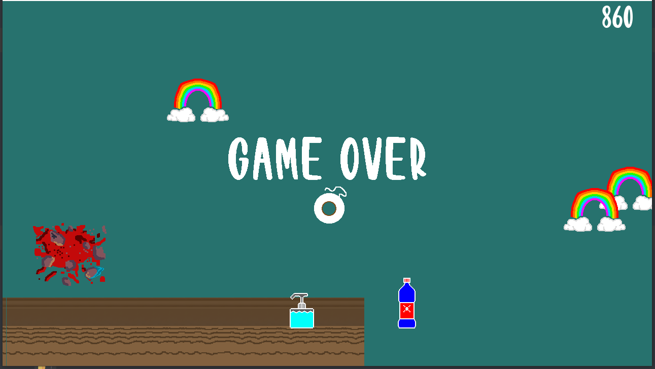
Good job fixing the end scroll! I think there are two bugs where, after you finish a level, you can't hit play again. The second is that the clouds and rainbows show up on top of the louse. It is a little disconcerting to see something in the background cover up the character.

Thanks for the feedback!

I really like the art of the louse. I felt the tones were really good. It took me a bit, but I laughed when I saw the mask on him. Good job!

I think one thing that could make this game even better would be some kind of reward for the player when you hit a milestone - maybe every 2000 or so. It could be a change in the background or the objects you are dodging, or a message and a pleasing sound effect.

I did find one bug (haha). After I had gone for a little I died. I stopped, but the screen kept inching forward. It wouldn't have been a problem except the tiling of the game didn't continue, so it started scrolling off of the end. I attached a screenshot of it.


All in all, a good jam game. Great job!

I liked the narrative around the game a lot. I thought that it did a good job showing that a good narrative can pull together elements that normally wouldn't go together (spiders building robots).

I felt the player was a little too slow. When I think of spiders, skittery comes to mind.

Two things that I think would take this game to the next level would be some kind of progression/powerup system (different weapons, armor, something like that) or some variation in the enemies. Maybe have some that can shoot back, or that jump, or run sideways for a bit.

Great job!