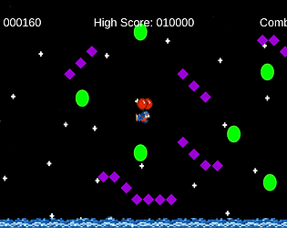
I did some further testing with some of my friends and it seems that players don't feel like they hit a star whenever they are staying still and the star moves into them. It just feels off when the star moves into you rather than the player moving into the star.
Patrick Merklee
Creator of
Recent community posts
Garrett, I really enjoyed your game! It was the perfect kind of rage game. The bounciness gave the game just the right amount of challenge. It took a bit, but once you get the hang of the controls it's fairly straight forward to make it to the top. The trampoline platforms were fun and I really liked the character design! I just wish there were more levels or the building was higher with checkpoints. I also really liked the surprise at the top! Overall, really fun experience!
Thanks! I didn't think about making the colliders smaller, but that's a great idea! I made the colliers larger for the collectables in my last, so I'm not sure why this didn't cross my mind for this one. The colliders right now are pretty exact for the player, diamonds, and balloons. That's a great idea and I'll definitely fix that
Jack, I absolutely loved this! Your hand-drawn art style is beautiful and I love your cast of characters! It's very impressive that you were able to animate all of the characters as well. The movement is very unique! I like how you can only jump while stationary so you have to use the slippery momentum for your jumps. It really makes you feel like you're skiing. I also really like how you respawn the character when the player falls off the screen. It's very clean and gets the player right back into the action. The funny signs and dialog throughout really added to the experience as well. And I really loved the little party area at the end! The music goes along perfectly and just makes this a very fun experience! I had a smile on my face the whole way through.
Gio, your game is beautiful visually! Your layered background and art style makes your project stand out! I love how the camera pans across the whole scene at the start of the game. I agree with what you said in the description. My main problem was that there were too many blind jumps because of how the camera works. I don't think making it stationary would help much. Maybe make it so if you press down the camera will pan in that direction? And checkpoints definitely would have been helpful. I found it interesting that your trampoline platforms make you jump higher and higher the longer you stand on them. I had a lot of fun just bouncing! I was only able to find 3 orbs in my play through (including the one at the beginning) I made it to the end and backtracked but I could not find those last 2 orbs for the life of me. I searched in places that seemed promising but most branching paths just lead to the same place without any rewards either way. I think maybe a minimap or any indication on where to find missing orbs would be helpful. I went across the whole map 3 times with no luck. i also think your game would benefit highly from sound! Just some things to think about. I really enjoyed what you have so far!
Hey Ana! I love the concept for your game and the playable character is very cute! However, the screen size on the WebGL is way too zoomed in and makes the game very difficult to play. Once I got to level 3, the player started halfway off the screen so it made it impossible to progress any further. I only really did the small taps close to the character in fear of it going off screen (I had to refresh the page a few times because of this). Other than the screen size, this is a very fun game! The movement is fun to do and I like the risk vs reward aspect. Should I click close to the character for more control but go slower, or click further away and speed run the level? I would honestly love to try and speed run this! As for your questions, I don't think it's too difficult at all! And I don't think the mechanics are annoying either. The game is pretty easy if you stay close to your character, but overall a fun concept!
Edit: Just played again after you fixed the window size. Made it all the way to the end! Very fun game and nice level design! I still think speed running this game would be a lot of fun! One last bit of feedback is that there should be boundaries to reset the player if they go off screen. Overall, your game was a lot of fun!
Edit 2: Now that I know your game has a reset button, I have no complaints! Very well done
Jack, your game left me speechless. I can tell you put a lot of yourself into this game. It's truly incredible how much symbolism you were able to fit into this maze. I feel the map is very well designed and guides the player into the themed rooms you want them to explore. Each room is unique and leaves the player wondering what the true meaning of it all is. The atmosphere you were able to create fits perfectly with your prompt and I am very impressed with what you were able to accomplish here.
Gio, I really enjoyed playing through your project! I thought it was very remarkable how you were able to get the movies to play on multiple screens. I also really love the layout for your theater! The snack stand and ticket counter were really neat and I like how the tickets spawned depending on what movie you chose. I think it would've been really cool if you had doors blocking the entrance to each theater that would open up depending which ticket you gave to the ticket collector. I also think it would have helped the immersion if you had a few people walking around the theater and sitting in some of the seats instead of it being completely empty, Unless that's what you were going for since that's how theaters look like now, which in that case it works very well! I thought the atmosphere was very successful and being able to pick up the tickets and snacks was also very cool! I liked how you gave the player options as to which movie they went to. I also really loved your title screen and pause menu, since that's something not many people have been able to implement so far. There really isn't anything that I disliked about your project. Overall, great job! I think you fit the prompt perfectly.
Tom, you absolutely nailed the aesthetic of your game! It truly is remarkable how creepy you were able to make the atmosphere of your game. When I first started playing I felt like I was playing an actual indie horror game. The sound and level design are superb. However, the gameplay I feel is quite lacking. Your main mechanic just does not work. I understood the clues that I needed to pick up the cake and cross as keys but the game just would not let me no matter how much I tried. I had to look into your scripts because you didn't tell the player the controls in game, so I know that I am supposed to be able to pick these things up but it just doesn't work. This quickly became frustrating and makes the game impossible to beat. It truly is unfortunate because I can tell you put a lot of time into this project, but a little extra time spent on the gameplay could have improved the overall experience drastically. Like I said, the atmosphere is a huge success! I love all of the particle effects and assets you did to flesh out the level. I also like the teleporting between rooms instead of just making it all into one building. It really gave the game an other-worldly and creepy vibe. Truly expert level design. Something I didn't really like though was the flashlight, It felt really funky and just wouldn't work when you got close to objects. Overall, I really enjoyed exploring this creepy world you were able to create, but I wish I was able to actually complete the puzzle part of your game.
Georgia, I really enjoyed playing your game! It was a nice short and sweet experience. The most remarkable thing about your game was the level design. I liked how all the shelves were stocked and that there were signs about telling the customers to wear a mask. That really helped immerse me into this frightening shopping experience. I also really liked the health bar you incorporated and the fact that it went down so quickly when touching other people really made me want to keep my distance. This element could also be improved though because the game doesn't actually end when you lose all of your health and you can still continue afterwards and get the win message, so that kind of defeats the purpose of having the health bar in the first place. Also, I think it might have been neat instead of collecting coins you had a shopping list that you had to go around the store and search for. An indication of how many items we needed to collect would have been helpful as well, because I actually didn't realize I won at first because the game just kept going. Moving on, I thought your movement was very successful and fun. The speed felt perfect for the frantic feeling most people get going to the supermarket theses days. Finally, I really liked how you had the other shoppers moving around and they were placed in great positions where you had to maneuver around them to get the items you wanted. One last thing that I didn't really enjoy was how you start the game facing the wall. I was a bit confused at first and didn't realize the game had started. Overall, I really enjoyed playing your project and I thought it was a really good prototype!
Thanks for the feedback! I love the idea for the unlimited timer with bronze, silver, and gold rankings. I feel that would definitely work better than the timer I have now. I made the timer so high because I wanted all players to have a chance to win even if it took them long, but looking back if that's what I wanted then there was no need for the timer to begin with. Having the rankings would add more replay-ability and allow players to decide whether they want to go fast or not. I made the course pretty easy to complete on purpose because I wanted to really show off the proof of concept rather than actually making a challenging experience. I could definitely move obstacles around and speed them up if I wanted to provide more challenge for the players. As for your question, I believe the camera moves so fast while stationary because I tied the camera movement with the ball's velocity. That is also why I believe you are unable to move the ball before rotating the camera left or right. The velocity of the ball dictates how fast the camera moves to keep up with it, so since the velocity is 0 at the start I think the camera has no constraints to how fast it can move at the start. I think I could definitely improve on this movement using what we've learned since this project.
I played your game a few times and I enjoyed what I played. I found it remarkable that you were able to fit so many balls into the small condensed space. I can tell that you wanted to make the space chaotic as your title fittingly states and I believe you certainly achieved that. However, I noticed that after just a couple minutes most of the balls bounce completely out of the arena. It may have been useful to add a ceiling to contain everything and keep the mayhem going! Also, I noticed that every time one of the purple balls made contact with the goal post an error would occur so that's something to look in to. I thought the timer was a very good idea so players could see how fast they can get through the chaos. I think it would have been a nice touch if the timer and bouncing balls reset with the player when they reached the goal so the player could immediately go for another go to try and beat their best time. Also, I realized that the controls were programmed for a camera at a 45 degree angle but your game's camera is not rotated so the controls don't really send the player where they would expect to go. I'm not sure if this was intentional or not to add to the mayhem, but it was something worth noting. Overall, I enjoyed playing through your prototype!
Immediately after starting your game I thought it was very remarkable that you were able to program an AI opponent this early on in the course! That's very impressive and definitely made your game stand out. It was also really cool that you were able to play that goal animation whenever someone scored a goal. Something that I think could have been improved though was that sometimes the player or AI movement would suddenly get a huge boost. For example, there were a couple times where I would jump on top of the AI and I got shot upwards insanely fast. Granted, this was really hilarious when it happened but it's still something to think about. Also, I think a 2 player mode would be a really great option to have! Something I found that was successful about the game was your timer for game length. I think you found the perfect amount of time for the game to last because it didn't drag on and it didn't feel like it was too short. Finally, I liked that you used new assets for the game that we haven't seen before. I also just really enjoyed how it felt to hit the ball because it felt very responsive to my inputs. Something that I didn't like was how the player and and AI were not on equal footing. The player character looked like they were slightly inside of the ground and were lower than the AI. This made it so the AI could jump higher than the player character, which seemed unfair at times. Overall, I found your game very impressive and I'm excited to see what you do for the next project!
For starters, I found it very remarkable how much effort you put into the look and atmosphere of the game. From the second I started up your project it was clear that you went above and beyond what we've learned to make your game look unique. I loved all the texture work, the fact that you added in music, and the animation for the coins. I played through all of your levels and through playing I did find something that I think could be improved upon. When I got to the third level, I noticed that you can climb walls by mashing the jump button. I was able to hang on to a wall after falling off, and I was even able to skip the entire level by mashing against the first wall because I assume every jump adds to your current velocity so it added up. However, even though I made it to the end of the level in this way, it didn't let me move onto the next stage. I'm not sure if this is because I didn't collect the coins in the stage or if it was for another reason because it wasn't clear from the start screen whether collecting the coins was required to progress or not. Moving on, something successful about the game was definitely the level design. The third level in particular stands out because I really enjoyed how it's a more condensed space and you're climbing up a mountain. I also loved that you made the ball glow in this particular level so it could still be seen behind the moving obstacles. I also enjoyed that you added a double jump so players could attempt to fix their jumps if they were a little off target. Finally, I really liked that you added multiple levels to your game. It made it feel more complete and I was actually surprised when I moved onto a new level after beating the first one. I also really liked how your UI faded in and out on its own at the start of a level. I also enjoyed that your game was pretty difficult, but I did not like having to restart at the beginning of the level when I died. Your levels were decently long, so a checkpoint or 2 in each would have helped out a ton. There were a few times where I just wanted to stop playing because I fell off at the end of the level and I didn't want to have to go through the entire thing again. The perspective of the camera also sometimes made it difficult to tell where I was in the 3D space and I would end up not landing on a platform that I thought I was going to land on. Overall though, I really enjoyed playing through your first project and I'm excited to see what you do for the next one!


