Indie game storeFree gamesFun gamesHorror games
Game developmentAssetsComics
SalesBundles
Jobs
TagsGame Engines

ReadyGo

48
Posts
3
Followers
A member registered Apr 30, 2020 · View creator page →

Creator of

Recent community posts

(1 edit)

So impressive guys well done, probably the best game jam game I've played to date, including tomatomare - the big winner from the last GJL :P

Some random criticisms and thought:

The camera gets a bit too close sometimes, making it hard to enjoy/see combat.

The big hammer dude is so much fun when you're trying to kill him with a sword and dodge his attacks, but tough cuz the sword does so little, you've setup this dude so perfectly for a melee/dodge combat - but then you've made melee so tough and given infinite(essentially) resource to your ice which takes him down from a distance without challenge and no need to worry about his attack at all. This makes me a bit sad!

Would've loved a bit more oomph in the ice and fire spells.

Think that collectible mana for ice + fire would suit the game a lot better than recharging the alternate selected - this is just too easy. And if I don't have any ice mana then maybe I'm forced to do some badass sword melee dodging on the hammer guys ;)

Loved the voice acting in-game - created a great mood

loved the music

loved the 2d/3d mix, though I think the 3d spacing (away+toward camera) should've been less.

Loved the balance between combat, exploration and 'parkouring'

Eventually got stuck/lost and gave up without finishing, but enjoyed my experience a lot regardless

I never found a need to use defend

The dodge/dash feels great and works great!

Enemys in general are not threatening enough, although the impact of taking enemy hits is great!

Thanks for the experience :]

Very cool puzzle mechanic... What could be quite interesting is if you respawned where your head /bones land... because if you run forward and die you launch your bones forward with that velocity... would be an interesting way of propelling you through things you would otherwise be unable to traverse... cool idea well implemented!

Thanks a lot Spike, I might just do that... there's a few creative problems I'll need to figure out though but could be fun :]

I was excited when the music picked up pace but disappointment that the games speed didn't seem to change to accompany it...

Sometimes it also feels like your fate is out of your control at times because there's a forced delay before you're allowed to jump again.

Lots of fun though thanks guys!

Very cool, I just wish I got to use the dash mechanic more, it seemed unnecessary, or maybe I just didn't get far enough. I found it crazy difficult! The jump/double jump felt very unpredictable which makes things hard, but cool idea!

Cool 3d models! I like the take on the limitation but it was quite difficult to get used to, well done none the less!

Couldn't get this to full screen for some reason, only stayed a very small box on screen :( Quite difficult but I like what you did with the limitation, nice work!

Couldn't get this to full screen for some reason, only stayed a very small box on screen :( Quite difficult but I like what you did with the limitation, nice work!

Thanks for the feedback! Sorry you didn't quite understanding everything, this seems to be quite a common complaint on this project. Not too sure how I could've made things much clearer though short of a tutorial which was way out of scope in a 3 day jam. Oh well, maybe some better in-game hints next time!

Hahah exactly, that about sums it up xD thanks for the feedback!

(1 edit)

Great intro, accidentally skipped through it not knowing there even was an intro and went back after seeing the comments. Totally worth it, that voice actor is mega legit@!@

I was sad that just as I was getting real pro with the mechanic it ended. I wanted to see some boss 32 combo guy come at me xD

Really fun great work team!

Those soda cans just don't get me far enough away from that attack-on-titan mouth@!@ Haha jk but that is intense.

226 points so I'm kinda the best. Great fun!

Those soda cans just don't get me far enough away from that attack-on-titan mouth@!@ Haha jk but that is intense.

226 points so I'm kinda the best. Great fun!

(1 edit)

I finished with 20 strikes, so I must be the best xD

Great fun and so many levels for a weekend jam game of 1 guy!@! Madness well done!

Haha awesome, so glad you enjoyed it! xD

Haha damn sorry, I should definitely put a timer to trigger that pause button. Thanks a lot for the feedback!

(2 edits)

Heya, no scroll wheel is needed. I think the instructions to start are misleading you. When it says "scroll right to play" it just means move the mouse to the right side of the screen. It means scrolling as in RTS-style scrolling, not mouse wheel scrolling. Sorry for the confusion!

Although I imagine because of the need to use both left and right click, a trackpad could make things a bit tricky...

Appreciate the feedback, thanks a lot!

Cool concept! Very difficult though. I also liked the menus in spite of it breaking the button rules, good job!

Love the artwork!

Was a bit confused about what to do until I won. Not sure why I was controlling 2 different objects... to add to the challenge I suppose?

Movement felt great! Never found the need to use the scary ghost mode and bells didn't seem to alert enemies about me which I assume was the reason for the bells right?

Great entry though well done!

Thanks for your feedback!

I'm sorry it was a bit confusing, the premise is pretty simple - keep your orc minions alive at the theme park to enjoy their candy treats.  It may be more challenging than it seems :]

So cool that you made an RTS game. I am super keen to try my hand at an RTS next. I found it a bit confusing though. I think it would feel a lot cleaner if the workers maintained their tasks. Then you could destroy the resource nodes quickly and this would create the need for the mining facilities to be built more and more as your workers have to travel further and further out.

Also found the building placement system a little confusing because I wasn't aware that I was in "building placement mode" at times and wondered why I couldn't select anything.

But really cool, good job!

(3 edits)

Thanks for giving my game a try, really appreciate your feedback!

Absolutely bit off a little more than I could chew. I think I could do this again in half the time though having learnt what I learnt, and then I'd have plenty time for polish and bug fixing. So I probably won't drop my scope in the next week-long project, so let's see how that turns out xD

I think my biggest take-away from this project was that I need to allocate more time for bug fixing and play-throughs. It's my least favourite part of a project but certainly very important! I think I gave myself about 20 minutes for that, haha, silly, maybe 5 hours next time xD

Really sad I didn't get those retry + skip intro buttons working properly, sorry :'(

That city is all credit to Synty studios' city asset pack but I agree it looks pretty sweet!

The spacebar thing - what I found in testing was that putting jump on down-press made it feel too much like a toy, I just found myself bouncing everywhere, so it felt like I wasn't working with something heavy like a mech, but something bouncy like a mario man. I then added a jump-charge so that you could hold it down for up to a second or two, the longer the hold the bigger the jump. This felt too unresponsive and delayed though and made things even harder, so I didn't like that. The jump on release was a compromise between the 2 states. Would be curious to hear if a lot of people felt as you do though.

Glad you you liked it thanks so much for the feedback! 

Really cool, you did a lot with a little here, and the sound effects were awesome!

I think it would've been a little more satisfying if you put something in there that deterred the player from spamming everything, maybe slow the clocks down but force doing actions in sequences? That would be real interesting!

No worries, no offense taken!

I would argue that there is enough free assets out there to showcase your skills just as well as there are paid assets. Paid assets generally come in better looking but if people are being honest about what they pulled in and what they made themselves, then the judges have all the info they need to judge accordingly, so you shouldn't feel worried about "losing" based on this. Further to this point though, jams aren't really about winning or losing are they? It's more about practicing your craft, getting feedback and building your portfolio, they're all about your own progression, so you really shouldn't be concerned about what others are paying for or not.

I have a few years experience as a hobbyist, most of it was focused toward a small mobile game I shelved shortly after launching, but that project gave me a strong base of knowledge to work from. By trade I am a developer, not a game developer sadly but coding is one of my stronger points so I can crank stuff out pretty quick usually :)

Sorry I really wish I spent a few more minutes on that secret 'skip' button you mentioned, I don't think I ever remembered to wire that button up, my apologies :'(

(4 edits)

Hi Nazandr, thanks for your feedback!

Happy to hear you enjoyed the feel of the shooting, this was something I was particularly proud about because it was the first time I had written firing like this and I loved how well it worked(I am always going to push myself to do new things in jams). It uses a combination of raycasting, illusionary particle effects and object pooling for those particles to get the fire rate up high and the fps stable(The particles you see travelling to target are a total of 5 objects being recycled). I could've pushed the fire rate to the moon with this but the problem was the sound, I would've needed to do the sound effects for the shots in a different way because it becomes too much for the ears. I was happy with how it came together though, maybe I'll do a youtube tutorial for this kind of firing system some time! It was still missing screen shake, muzzle flash and mech barrel animations though but there were more worrying things to address.

So let me dive into the beef of your comment - what did I do.

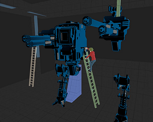
The assault mech (protagonist). The model and walking animation I took from the store, however none of it is linked to behaviour, the code you get with it is written for the purposes of the demo scene that shows it off. This model was actually not so great to work with because the rotations do not align correctly with Unity's coordinate system. So when I used Quaternion.lookrotation and slerping to rotate to the aim target, it was all wonky. This is where I learnt that you can "Add" quaternions together by multiplying them together, but it is not commutative, so the order matters, that was an annoying little lesson! So I was able to offset the spastic model direction and that got it right.

The model textures were also quite realistic, really nice for a high quality project but out of place in the low poly world I was putting together. I created a new material from the flat cell kit shader to "cartoonify" it up. 

It also didn't come as pieces. So in order to create the intro scene where Dom is working on it all broken up, I had to get it into blender, but it was some kind of "ASCII" FBX file, so I had to use an autodesk converter to do so. Even then it shows up in blender as one piece, no hierarchy. So I had to tear it up into the pieces I wanted and then patch it up and reimport it.

The walking animations for the model while great, did not come with any kind of logic I could borrow from. So I created an animator, took the animations I wanted (just walk+run+run_jump) and plugged it into my control system. The animations weren't blending together well at all though, this is where I had to learn what a blend tree was, very cool! They were also read-only so I had to learn how to get around that as well. 

Before I even went to this mech I spent a lot of time in Blender making and animating my own mech, and it was about there but the animations were really difficult to get right and I am still brand new to rigging and animating in blender, at some point in the process I decided to drop it and go with a store bought model, purely to be able to get walk animations.

Next the jumping/jetpack - the trickiest thing to get right was the jetpack power, to have it strong enough to accelerate the player up when already falling to the ground, but not so strong that the player could jump, immediately use the jets and fly to the moon. I ended up using a raycast to the ground to help mitigate both sides of the equation but ultimately I don't like where it ended up. I think I would program the behaviour differently if I had to do it again.

The biggest "steal" from the assets I used was the map itself. I spent about 3 hours writing a random map generator using the synty city buildings as prefabs and while it worked pretty well to place buildings of the same size, it was really difficult to get it right with buildings of all various sizes, while still looking aesthetically pleasing. So I decided to drop the custom map generation and instead cut a corner piece out of the synty city demo scene, patched it up a bit and then wrote+applied the necessary destructible scripts and layering to the map objects.

In terms of modelling - the only thing I did myself was the rocket car. This was modelled from scratch in blender. I also animated the tires for driving but never had the time to actually implement movement on enemies.

It took me 4 days to get the player controller/mech playing and feeling right with flying/jumping/shooting/slamming. A day and a half to do the intro and learn timeline. The last day and a half to sort out the map/enemy logic/enemy spawning(incl. that flying drop-in aircraft logic - I enjoyed that a lot)/boss logic/death+victory cinematics/game state+scene management/bug fixing/balancing.

Anyway, I hope you can see that although I did borrow a lot from store assets, I did a lot more than just "glue stuff together".  Thanks so much for your feedback and I hope this gives you and others with the same concerns a better understanding of the work done.

Loved the writing, it had me grinning for a good couple of minutes. Only realized at the end that you can click on the persons profile to get clues though, damn! Not a whole lot in the "gameplay" space  but a fun experience for sure and beautiful artwork that skeleton is amazing@!@

My favourite entry so far, well done team!

A few bugs here and there but nothing totally game breaking. Performance issues detracted from the experience quite a bit though. Seemed to get progressively worse at nights.

Would love to see what this is like with a lower time to kill on both zombies and player and amp that night time blood pumping music up!

(1 edit)

Heya OhmZ, thanks so much for the feedback!

Your criticism is right on point, I over extended myself a bit and couldn't get it nearly as solid or as bug free as I wanted.  Unfortunately my HDD crashed the very next day after submission so there will not be opportunity for me to polish this up as I would've liked :'( In fact I would've liked to do a lot more than just a bit of polish, damn!

Regarding the ammo problem you had - yes there is no ammo on the level, ammo is regained by jumping/flying above enemies and then holding shift to slam down onto them - when you kill an enemy in this manner you regain ammo. Not sure if you were aware of this already or if you struggled regardless of understanding this mechanic. Just in case . There is red warning text above your ammo counter that explains this when your ammo runs out. Playing the game a bit myself though, I realize the difficulty and lack of space for the player to breathe makes it very difficult to read a bit of text in the corner of the screen. Even in spite of knowing this though I do agree there is not enough ammo, especially with how hard it is to shoot down the damn glowing balls...

When I play tested, it was entirely through the editor game window. In the game window you can see your mouse cursor, in the game itself you cannot. This makes a massive difference to the difficulty level, because shooting the red missiles down with a mouse cursor is quite easy, doing so without it is damn hard.

Lots of lessons learnt this jam, but thanks I really appreciate your feedback!

Heya, sorry I didn't realize .rars would cause problems  but I appreciate you making the effort to work around it! Unfortunately I can't fix it until rating period is over..

I do understand there are a couple of bugs related to scene changes... I definitely could've used an extra day for bug crushing... In fact there is a much more severe bug which spawns the boss outside the play area and unless you really try to find him out in the back from a high building - it is not possible to win, which I'm so bummed about because there's a victory cinematic I was hoping some people would see as well :'(

Anyway thanks, I really appreciate your feedback!

Thanks Dave. I agree with you on the repair dynamic, I can definitely see it's design is not so intuitive to building repair. Sometimes it's easy to let technical decisions take precedence over good design decisions, especially with the time pressure of a jam, and I think this instance is definitely such a case! I'll spend a little more time on this game in the future and this will be one of the things i'll change.

Thanks for the feedback! You're right, the difficulty was too high. Something I've learnt since doing this jam is that your own skills as the developer increase quickly through repeated playtesting, so I set it to a level that challenged me but I was playing like an e-sports pro so that was a good lesson for me. Appreciate your confirmations and thanks for the kind words! :)

Well, I think the dragging part of it is important actually, I just didn't enjoy the finickiness of trying to click the small hands, if I could just drag from the body with mouse1 for left arm and mouse2 for right, I feel it would be a little more satisfying... also that could mean its possible to accidentally detach yourself too which would be a laugh and a challenge. Not sure if it would be better but might be worth testing :]

(1 edit)

Oh damn, think I'll try it again then! I got to the 1 where I met my crush - this is the ending that was much alike the story I mentioned :]

2 selects your repair weapon. 1 selects your attack weapon. Left mouse fires your selected weapon. I wanted to include some UI to make this clearer but alas - time!

I think with a 2 weapon system, R mouse button would make more sense though.  Thanks for the feedback Dave!

Loved the sounds, super well written. Ending reminded me a bit of the space jump short story from love,death and robots, thanks for the entertainment!!

Would've enjoyed alternative endings and a restart button :]

Really cool stuff! I finished it after 2 tries. Really good maps, made only walking and only running both impossible, you had to figure out when to walk and when to run, nice!

Didn't enjoy that my life timer got reset between levels, would've enjoyed it more with a persistent clock. Made my super-awsm map finishes feel nullified.

Tutorial was really impressive but perhaps a little unnecesary, why not build the tutorial into the first few levels and then just teach the player by default as they get started with the game :]

Overall awsm stuff, sad that I didn't get to see the human form nicely at the end though!

Really cool aesthetic, chilled music vibes, nice!

Too buggy for me to play through though. Spacebar only makes me jump sometimes, maybe 1 out of every 4-5 times I press it. Did you perhaps put the jump logic in a FixedUpdate loop instead of Update? Then I got stuck in a roof near the 2nd door :'(