Indie game storeFree gamesFun gamesHorror games
Game developmentAssetsComics
SalesBundles
Jobs
TagsGame Engines

ScrapMetal03

42
Posts
2
Followers
15
Following
A member registered Oct 10, 2016 · View creator page →

Creator of

Recent community posts

The palette, look and feel of the animations on this are so great. Love the vibe.

If I could play with a controller I think I would've enjoyed this better. I almost quit on that first infuriating double platform jump required right at the start. That was so tricky to pull off... that sort of jump backward but don't hit your head, then land back on the upper platform. (With the current controls, it made it nearly impossible). Maybe the movement speed was too slow to pull that kind of stuff off easily? I'm not sure, but besides the control frustrations... the rest of this was so good!

This has such a cool feel. I'd give it 6/5 stars for GB soul if I could. The music/sfx and art are so good and feel so nostalgic. :D The look of the levels and everything is just incredible work.

The controls were a bit tricky for me. I don't mind a little deceleration, but the movement not stopping when I wanted to made the smaller platforms more difficult to jump than they should have been. The attack range was also tricky (which made combat less fun). And the jump/fall felt really good when the camera wasn't following. But when the camera was panning with... the fall gave this jitteriness that sort of bugged my eyes.

Overall, this was a super cool entry!!

Oooooh.... I was trying to burn them with the light. :P Oops.

Loved the vibe!! Had a very mysterious and spooky feel... made it fun to explore and progress through the house. I didn't make it very far though as I couldn't figure out how to get past the first plant enemy. I just kept dying, and starting completely over.

Wow that was hard!! Really cool stuff though!

The art is just spectacular!! Everything reads so clearly. I am blown away by the backgrounds and level art. It is so polished in that amount of time. Just incredible stuff.

The gameplay is super fun!! I got hooked right away. But gets hard super quick. :O 

Ha! No worries at all! I didn't test with keyboard on mine.. which is my bad. lol

This comment is 10/10.  I lol'd

HOLY CRAP. The atmosphere and vibe are phenomenal!! I love the look and feel of this so much. So many nice details to pull you into the world.

I was a little lost on the main objective or what I was supposed to be doing, but honestly, I liked the sort of mystery and discovery of it. The entire tone of the story/setting is so cool.

Only note I have is with the attack... I wish it was on press, not on 'button up'. It makes it feel very laggy. (Also feels like the first frame or so of the attack is the idle as well? So makes it feel more delayed), but other than that... in terms of feel, to me this is one of my top! 

Hmmm... interesting... I think with what both you and I andjela99 are saying, I should try reversing it. I think I initially tried it this way to keep more things on screen. And to contrast the firing toward the enemy, vs the plant doing it. I do need to telegraph a lot more damage vs non-damage. I'll try switching directions on the main plant and see how that feels. (I was also feeling like maybe it needed a radius, like it doesn't go off until the enemy is close etc).

Thanks for the great feedback!

Yeah... and I think you definitely want some beats in there to help with pacing and timing... but maybe keep it up and have a "...." between those lines? Eh. idk. All I know is when the box hides completely, I still had my cursor there and thought I could move, so it just became trying to move it constantly to see if I had control back. :P

Also... no worries at all! I'm impressed by how much is here! I'll have to go in and try the other entries now :D 

The art is great!!! And you have a title screen AND loading screen?? What the crap. :P 

I was slightly disappointed when I could use controller for part of it, (starting the game and jumping), but attack wasn't mapped. So I got confused at first. Easy to get past, but I wasn't super clear on what I was doing exactly or what collecting the diff plants did? Are they points? Maybe if each one gave you a diff ability as you went along it could be kind of a fun loop? Like a boost or an extra hit or something?

Really nice work!!

Wow. Looking at the screenshots now... apparently there was a lot I missed. :O Maybe I got the short ending?? That was super cute and very very sad.  :( I did really like the charming characters and exploring the house. Gave me me some "Gone Home' type vibes, but for GB, which I really liked!

I don't mind dialogue, but I think what would have helped me was knowing better when I was in 'dialogue' mode and 'interact' mode. I think because of the way the dialogue box hid away off screen between each main dialogue beat, I kept thinking I was in control again, and would start trying to move the cursor, but then I couldn't, and  another dialogue line would appear. This started to lead to a feeling of frustration and annoyance with the text, rather than fully enjoy the conversation. Maybe if it indicated which character was talking without hiding the dialogue box until the player had control again, I think that would have felt a lot better.

Love the colors and overall vibe!!

The animation on the main character is incredible. I also loved the setting. It was a little hard to parse some elements, or separate the main character from the background at times... but this had a neat feel.

The main thumbnail animation for the game is so awesome!! I guess because of that I was expecting something a little different. Maybe I didn't make it far enough to see how the two tied together.

I did get a little lost at parts... not really sure what to do. I just ran around clicking the J key hoping it would do something. I was also hoping to use controller as it would've added to the feel. But overall, great entry!

(1 edit)

WOW!! Holy crap this is amazing. The palette, the art, music, sfx, animations and feel....so so good!! Feels so great on controller too. I think with just a couple tweaks, you have a very shippable game on your hands. Which is pretty remarkable for a jam. If you could map to mobile controls somehow, I'd even play something like this on ios. I'm so blown away by how polished everything feels.

Here are couple notes that I think would fix a couple issues I had:

  • For some reason the start screen doesn't work with controller. So you have to switch from controller in hand to hit the spacebar everytime. (And you have to do this every time you die currently).
  • Every time you die, you watch the entire intro again. Yikes. This was the biggest one that brought the game down for me. It's such a fun fast paced scroller, that I want to just restart quickly when I die. This is a small tweak, but would make it feel that much better. (I would play it a lot longer too).
  • I would up the damage on the spray can a lot. It feels so neat to spray, but the amount of damage it does is SO low. Right now it felt like 5-6 hits. I would make that 1-2 max. Especially when you are forced to move up so quickly, you don't have time to spray enemies. It would make it feel like a nice little move if it almost insta-killed.

I think with those couple tweaks, this would easily be 5 stars for me on all categories. Really incredible work!

Oh.. and that title screen... wow. Looks so good.

Holy sh** this is hard! LOL. But at the same time super fun and addicting!! It sets the expectation very early on this is going to be punishing and difficult. But in a challenging way... not in a cheap, you fell to your death because of jank collision and now you have to restart the entire level way. I didn't rage quit this, or even want to... I wanted to keep trying because I 'believed' I could get better. :P LOL. (And... you restart so quickly, so it doesn't feel as annoying).

Honestly, this has so much appeal and charm. It's super simple, and the recall mechanic with the sword is fantastic. I want to just keep trying.

I love the chunky look of it too, and the way you used the palette. 

I only had two (minor) notes:

1) It took me a sec to realize when I pressed 'c' it actually dropped the sword the first couple times. I thought he was just playing an anim I didn't understand (because I didn't move, and they stacked). I think if you just offset the sword a slight bit when it planted, it would read a little clearer. (Or offset the player?). 

Basically, here is the current pose:

Maybe something more like?:

So you can see he clearly planted and separated from his sword. (the sound effects are perfect though :P). So I think with the two combined, it would be clear right from the start.

2) My other one... and this is just personal taste. The chunky art is so satisfying and appealing, I wish it all stayed chunky. :P Like, even the sword planting, I wish it was drawn that way (vs rotations). Or even when it rotates through the air, be a distinct rotate anim etc. Same with the affects that scale up. Staying in that pixel scale. But..... then that wouldn't be sort of your distinct style... so... idk. lol. I just think overall, it'd feel more polished imo.

But damn... this is long because I loved the game so much. It's crazy addicting, has a simple hook, and is a TON of fun. The feel of it when the music kicks up and everything.... it's just awesome.

The art, sound and writing are phenomenal!! The characters are so great... and I felt very immersed in this world. I'm blown away by how many characters you were able to create in that time. And I lol'd so many times at the dialogue. The overall tone of the game is perfect... and hilarious.

The art and animations are incredible and it felt like playing an authentic GB game. Like one that came out back then, but somehow you never played, but now you discover it in the used section at a Gamestop.

OMG. So dang cute!! The level of polish on everything is so good. The art and animations are top notch!! I also really love that palette. This game just oozes charm and personality.

I love that it had a health bar. The balance was better than most other platformers I felt. I was compelled to actually complete it. (Even when I died a few times). It felt more forgiving in that way, which I really liked.

My main gripe was no controller support. :( I had such issues with the controls on keyboard. Like I was playing backward or something. My brain just had a hard time switching everything over. So many times I would jump when I meant to shoot, or shoot when I meant to jump. If it had controller support, it would absolutely be the top imo.

I also had trouble pulling plants at first, (until I realized you had to press 'up' first, then X, I tried doing them at the same time and it rarely worked). But the mechanic of killing an enemy to then get a dropped plant that was more powerful was great. I also loved the surprise of pulling up plants, not knowing what you might see. That part alone was really cool.

The amount of completeness for a jam, and a level of finish and detail on everything  was insane.

And that end boss..... WOW. The design and animations were hilarious. lol. It made it worth getting to the end. Really great stuff!

Super cool! The vibe is really amazing!! Love the music and art.

Admittedly, I got super lost over time, but it was definitely fun exploring and fighting various creatures. Maybe more landmarks (or map like others suggested) would help? I had a few times the forest seemed to superimpose over itself. So I looked like I was moving, but I wasn't?

The level of detail on the art is amazing. Palette worked great with the style too!

This was actually one of the first I played, but meant to leave a comment. (It was the night of submissions so I was wiped :P).

Came back to play again... and dang, I love it even more the second time!

Your use of the colors... to add depth and for everything to read clearly is remarkable. That is a lot of info, and it all reads so well. I think this one had some of the best use of the 4-color palette in the jam. The art, animation, sound and music are just fantastic!! I'm blown away by how much you were able to pack into a jam game. It's a bit mind-boggling. And all so polished. (I love the music on the second stage too).

When I first played, it took me a sec to realize I needed a second 'press' to activate the choice. So for a bit, i just sat there waiting for the game.. then realized I needed to press it again. But once I got past that, the pacing felt a lot better :D  I loved the strategy behind it. And the constant upgrades and variety to keep things interesting and constantly progressing. (Again, I don't know how you pulled it off) :P.

Also... the fact I could play it all seamlessly on controller really added to the GB feel and made it so enjoyable. So good!!

Incredible job!! This is one I'll keep coming back to play just for fun.

Thanks man!! (also... I know! it hurt to bail on those. ;( But decided I would upload anyway just to show what I did for the jam). I didn't even know about the jam until Weds, then decided to go for it anyway :P Maybe I'll update and add a post-jam build later.

Also, thanks for the tip on the Pixel Perfect Cam! I actually was using that but realized I didn't have the correct settings for export. I was also having issues with my webgl build, so just added that. (With proper res now :) Which should work better! Thanks for checking it out.

Thanks! Yeah... I essentially started the jam over the last weekend. So wasn't enough time to accomplish what I wanted to. But I think with better feedback and tuning, could be fun. I still love the fast and rapid iteration on these jams though. I learned a lot. (I think on my next version, I wouldn't have enemies coming from both sides). And having more stuff you can place for longer periods of time. Thanks again for playing!

Wow.  Just wow. The feel of this is fantastic! Also... worked amazingly with a controller. So extra stars just for that. :P

I really loved the directional attack thing... taking advantage of using a dpad. Super cool. The attack required such precision...so it created an interesting choice and made it feel diff than standard side-scrollers.

I really wanted to use the downward slash more as that one felt great, but it was so hard to pull off without also losing a heart. I wish that during that attack, if you got a successful hit, it made you invulnerable for that moment. So it would encourage using it and pulling it off. Whereas now even when I get a successful hit, I'm still punished. So I just stopped using it.

I loved that I felt like I was playing an actual GB though. And the palette choice of BW with the accent green worked so well!! Awesome stuff.

Wow. So much polish. So solid all the way through. Love your sprites and the way you use that palette. Everything reads so nicely. :D

The controls felt really good, which made failed jumps less aggravating. (even tho I didn't make it the end, because I can only handle so many falls to death :P).

I also liked the slight spin on traditional platformers, needing to shoot the carrots at the enemy before jumping on them... but I wish there was more like that... to differentiate it from standard platformer stuff. But wow... so much polish for a jam game. And it's a complete package. Like you have an entire solid game from start to finish. The little intros and all that! Holy crap. Loved it.

Really nice work!

Super charming!! I love the vibe and feel of this overall. Exploring the house is a lot of fun!!

I liked the squid game nod... but that's where I got hung up. :P I think for me, I was in fun adventure type mode... exploring and finding stuff, and trying to figure out what to do with things. (more thinking/puzzle mindset)... then the game kept requiring me to do these crazy hard dexterity type challenges. :O Which sort of broke me out of it. I think for the red light/green light challenge, the controls and collision were too unforgiving to make it fun. If I goofed and got caught because I didn't hide at the right time, I would accept that. (Especially if the controls were snappy). But most of the time I failed because I got hung up on collision and then got spotted. So I sort of rage quit at that point. Which honestly bummed me out, because I really wanted to see where it was going! (The fire ants had the same issue for me). It was such a hard fail, it made it less fun, but at least that was more forgiving.

Well, that's my long winded feedback... :P But only because I really really loved the vibe of this!! It's super cute and I loved the humorous tone. It's so great. Sort of this mix of charming and... dark? lol.

Really nice job!! Also... the GB tone is spot on. 

Love this!! The impacts are incredible!!! I think I do agree with Retrobeat about the rotations... I know it's a stylistic choice, but for me, it brought down the appeal a little bit... as you lose some of the cool looking art in doing that, but the way you handled the colors and the overall feel and explosions is so awesome.

This looks and sounds fantastic!!! Right from the start the palette you chose is appealing af. Looks so good. I love that I can play with a controller and it feels so authentic. The look and feel is spot on for GB. Nice work.

Bopping the seed ball around to kill enemies was great. That part felt new and interesting. At one point, the seed one sprouted and I got stuck in a wall and couldn't get out. :P And I got a little frustrated at some of the jumps that were tricky (especially over those dang spiky bombs. (I died many many times to those. lol).

But this game had so much polish and I had a lot of fun playing. Hit me right in the nostalgia too. Really awesome stuff! :D

(1 edit)

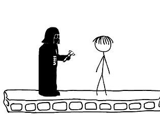
Very cool! I was not expecting this to be full 3D assets! The thumbnail definitely matches the comic exactly... but you could've shown off your great 3D art! Would've made it really stand out.

I loved the art and music, had a very nice vibe. I wanted to explore first thing.

I didn't love the controls tbh. I think it would've benefited from more traditional first-person controls, with mouse looking around, and WASD for movement. (Since you had to click stuff with the mouse anyway). And maybe a faster walk speed? That was the main thing that prevented me from finishing completely as the horizontal movement started to bug my eyes. It also felt like the camera in the hallway was very low to the ground.

I also would've liked to click the bottle and cork out of order. Sometimes I would find the number 2 bottle, but then have to go back to the cork, then go back again.

But overall, great work!

I had issues with the download links. I ended up finding the in-browser version and played that. I tried my best to be patient and make it to the end. I couldn't. :P I was liking the vibe but that was too painfully slow.

Great vid!!! 😄

I wanted to like this one as I'm a huge fan of guitar hero and rock band games. It's crazy impressive that you were able to make this in a weekend.

Does it work with a 360 controller? I wanted to try it with a controller but don't have my rockband stuff hooked up to my pc. It would probably be way better with a guitar controller.

The keyboard controls were somewhat difficult. But I think the biggest thing was needing some kind of feedback when you did well or messed up. There were a few sounds for playing wrong notes, but overall, seemed to play the same thing no matter what I did. So I never knew if I was doing good or not. (Until I failed :P). There was also no visual cue for hitting notes correctly. Just that lack of feedback made it very frustrating, even though I loved the concept.

Overall, still crazy impressive.

That was old skool kind of difficulty. Dang. Once I could make it past a few enemies, I'd smash into a wall. Differentiating the inside of the red building with a different color so it's clear where there is collision might help. Visuals were great though! And some nice enemy variety!

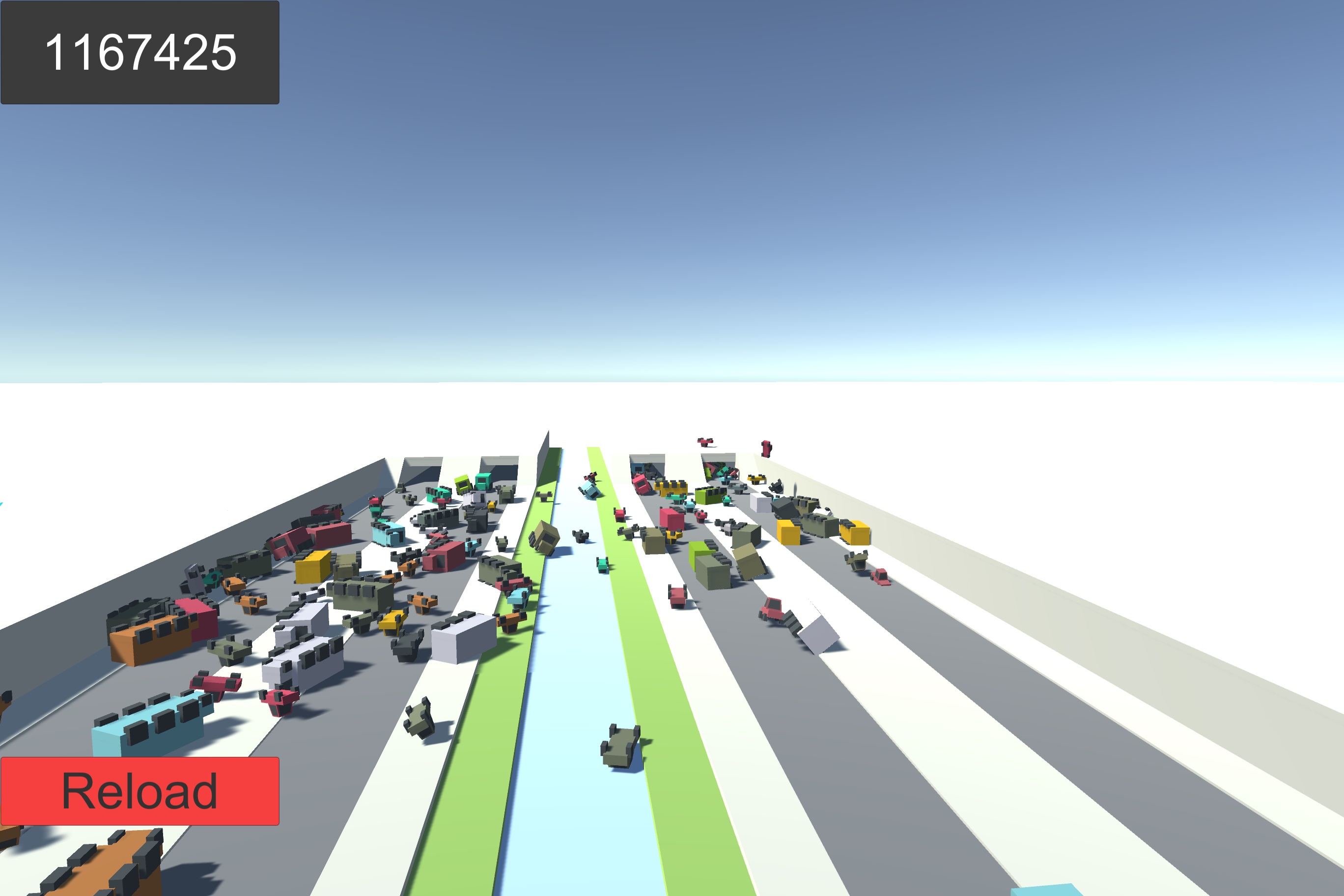
Had a blast with this one! :D I let out a giggle the moment the first cars crashed. The tuning on the car physics and the sounds are hilarious. So great.

I also liked the mechanic of launching the frog, there were times you got a great pileup and other times you would just miss completely. ( Would be nice if the arrow didn't embed in the ground though).

My biggest critique (and would be an easy change) is to not make the end HUD an opaque grey image.  I always went from laughing to being bummed the moment that screen showed up, just because there was no way to see all the destruction I caused. Feels like having a lot of fun and then someone comes up and covers your eyes. The game is already great fun, but if you just got rid of that gray background, and let the text overlay the traffic (while it continued to crash), would be 1000x more fun! :)

I had one round where it went on long enough the end screen didn't show up for a while.... it was so great! :D :D (I attached the screenshot)

The vibe of this game is fantastic! I love the simplistic but consistent look of the visuals... the mood and atmosphere overall is so great!! :D 

The flying of the bird looks amazing! My fav is the landing. The way it auto-targets branches, and flaps as it hovers to a land. All feels so great. It was fun to just fly around and explore.

One tweak might be following the bird's 'root' position while on the ground, (instead of body joint). To eliminate some of the camera up/down when moving on the ground. Flying didn't bug me though. The flight anim looks so great... makes me wish he had a little more animation while bouncing around on the ground. (Even if super simple, legs hopping, slight tail/wing motion, etc). But honestly, didn't bring the experience down, just would've made it that much better. Really cool stuff. :) Loved it.

(1 edit)

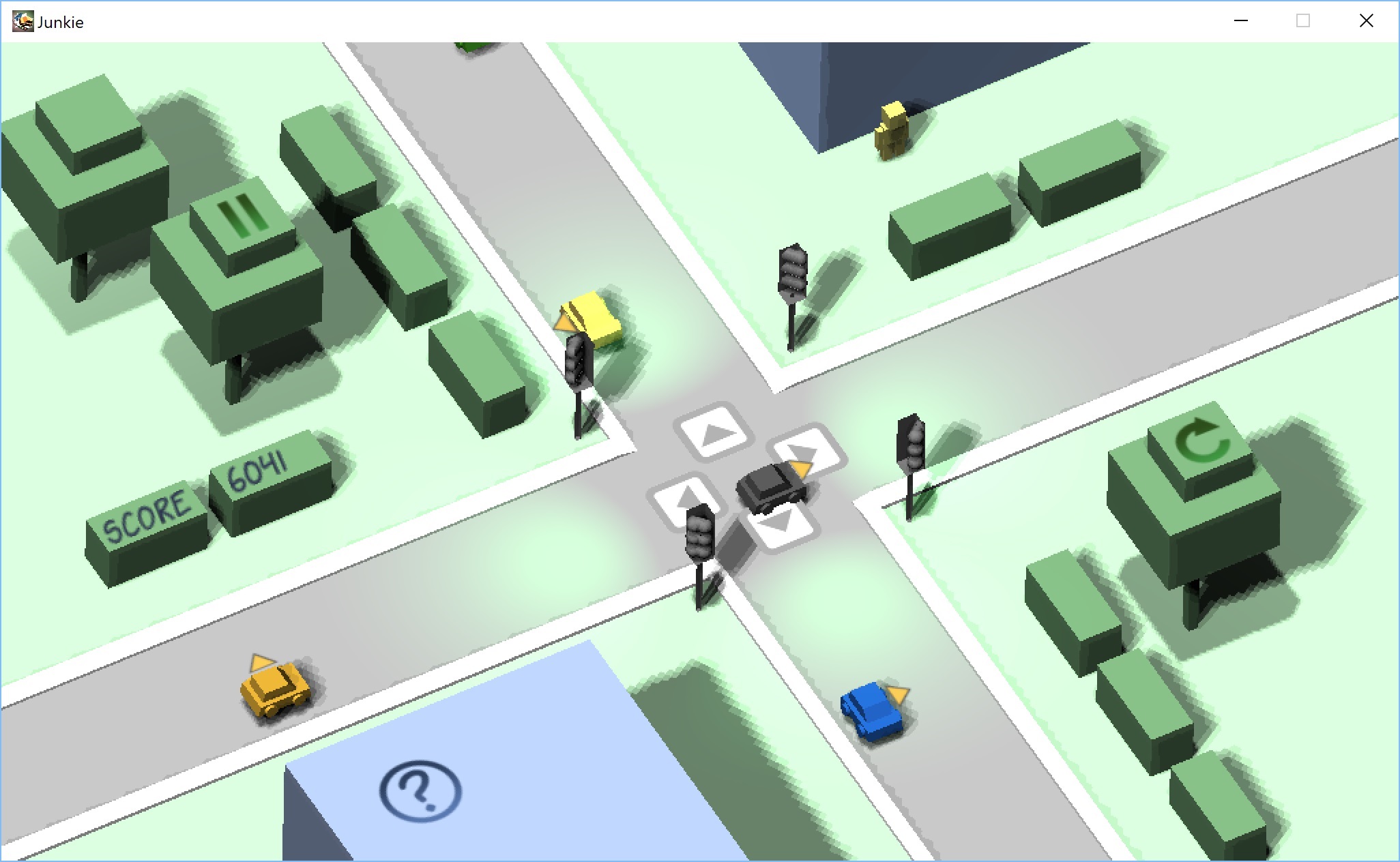
Overall, I really liked this. A fun take on the comic idea.. and trying to control traffic was really neat. I even tried just letting one lane go, but you lose if there is a pile up! :D So great! I also loved all the different pop-ups when you got a crash. So funny. :)

A couple things that could make it better:

- Sometimes pedestrians would get hit, but had never showed up. The art never showed at all. Which felt cheap.

- I could get a MUCH higher score by doing nothing. (I got over 6000 points by just letting all traffic lanes flow). I feel like the randomness on each lane should get a crash almost immediately if you don't stop traffic at all.

Overall, super cool concept! Nice job.

I loved the crafting for different outcomes!... I wanted to experiment with different combos more, but got too frustrated when I failed, and the game started over completely. If it just reset me to where I was before, that would've made it much more forgiving and fun. I liked the idea though! Very cute.

I wished the buns moved or got scared if you got too close or moved too quickly. Would've been a nice challenge and gave a reason for running vs crouching etc. Or trying to get that 'close-up shot'. But overall, great experience and very challenging!

Super cute game!! Love the music and overall tone. I like how it feels like a lot of players are with you. (Are those actual human players or ai? Impressive either way). Very cool concept.

My only issue with it is you tend to do better at the game by doing nothing. It became a goal to see if we could hide from buns long enough to become sad. :P It was quite difficult. lol. My wife got 125 happiness just by staying in a bush. The buns do need to show up in case you are unhappy, but I feel as your happiness gets higher, they should become harder to spot or something?

This is fantastic! I love each time you play the keys are different too. :D The subtle parallaxing on each panel adds so much! The motion and controls on the drone are really great.