I left my daily grind to get on this daily grind.
Solo Incrementing
Creator of
Recent community posts
:D
Fun polished game really set the atmosphere well, and nice sound effects
:(
I thought the card art actually was associated with the card values but it seems it's irrelevant, I think it would be good if it were consistent, perhaps all the shadow versions of the card have the same art design and when they flip it shows the real art and values.
Pretty cool you made all this with just web technologies, you have my respect. I like the dark atmosphere and the sound effects are pretty nice.
Issues/Bugs:
- The movement feels pretty bad, perhaps it's the lack of a background to give you a reference frame. A bug I encountered is that when you get the movement speed upgrade, the extra movement speed only applies in the direction you're moving, I don't know whether this is intended or a bug but it feels pretty annoying.
- The difficulty ramps up really quickly, It went from barely spawning anything to spawning like 5 different enemies really quickly in just a minute.
- Carrying on from previous point, the game balance is pretty bad, I don't feel like im getting enough money from enemies but maybe that's just me.
Lovely aesthetic to this game, I like the art and music, it makes me feel very comfy.
Sadly couldn't make it through day 5 :(
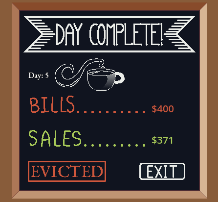
However I have quite a few issues that once solved would make this game so much more enjoyable:
- Please make the screen resizable/scalable. Having to play on such a tiny screen sucked a lot of enjoyment out of the game for me.
- The controls are not intuitive and hard to learn. This game would do very well having mouse only controls with clicking and dragging etc but if you do allow keyboard at least have keyboard input to go left and right, havint to click the left and right buttons to switch to the correct station with my mouse, but then use keyboard for the actual brewing for me personally was not intuitive for this kind of game.
- The difficulty ramped up pretty quickly having to learn up to 2 new process each day with the customer timer being very tight as well.
A simple mechanic but very well executed, I had a lot of fun playing this but sadly my APM is too trash to beat level 11.
Issues/Suggestions:
- The sound and especially the sounds effects are really loud it would be nice to have settings to control the volume and not just mute because I do want to have music and sfx while I play just not as loud.
- Customisable controls would be nice too, I would have preferred shooting with mouse instead of using the keyboard.
I had quite a lot of fun playing this game, I love the music and art! And no bugs to report!
A few suggestions for improvement:
- I think the shop page's "current brew" panel could be improved to show the DoT multiplier for specific monsters as well as the money gain from them. At the moment I have to hover over the ingredient to look at the effect and do all the math in my head for the effects on each monster.
- Perhaps this was intentional design to make the levels more difficult but the waiting monsters don't immediately go to a seat that opens up. There were times where I had a few seats open up but the monster simply decided not to go sit for a few seconds and got angry instead :(
Overall very solid fun game!
Charming 2048 inspired game with very nice visuals, calming music and popping sound effects!
The issues I have with this game are clarity, slow responsiveness/optimisation and the theme of shadow not being apparent:
- There's not significant differentiation between the tiles. The color difference between the types of potions is good, but within the same potion type, the shape is the only differentiator and that's not easy to see at once glance
- The game is running at 30 FPS. Perhaps it's the browser version makes it impossible to do so but it would be nice if the game could run at 60 FPS because this kind of game heavily relies on the feel you have seeing sliding tiles, and if the sliding looks choppy, it just takes away from the experience.
- Carrying from previous point, I am getting the following error trying to run the exe so I can't test the fps in that version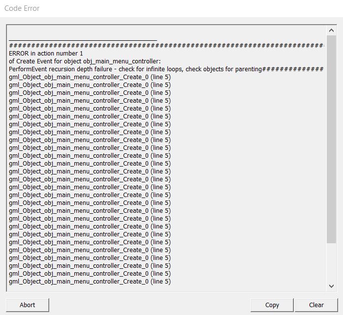
- The theme of shadow is not apparent in the game at all and seems to just be tacked on to the story
Funny and pretty well made! I like the music, art and especially the voice over.
My critique would be that it's actually hard to see if your mouse is over the poo would be nice to have an outline show up when the mouse is hovered over it.
Overall very good game played it a bunch of times, sadly my APM is very trash for this kind of game but that's a skill issue on my part :)
Thank you for the review!
I've been thinking about where to take this game visually so thanks for the pointers!
I will need to explore my options with enemies and see if it fits the game. I didn't think of adding moving hazards so thanks for the suggestion :)
My initial idea for this jam was actually about mixing colors where touching the altars is actually what adds to your color and you're trying to achieve white by mixing your starting color in a specific order, but as I play tested it, it felt really confusing to me and honestly a chore to remember what mixes to make what, color mixing would make the puzzles more interesting but having simple core mechanics is important to keep a puzzle game fun and more about learning than a really convoluted special system that only some people would even understand at first. This is why I had to pivot halfway across the jam and ran out of time to add sounds.
Ya I got it mixed up with the delay in the switching. I think the switching delay just increases friction for the player and it's not obvious in the game that the delay is there on purpose. I've been thinking and I think the reason why I as the player don't get that feeling of "will I have the opportunity to react to something in time" is because I see projectiles, and only projectiles that I know can hurt me. Perhaps there needs to be an indicator like a cooldown timer on the turrets alongside a cooldown timer on the player for their element switching with the same design, so I can make the connection that the timing has to be done carefully for specific turrets. I for one didn't really differentiate the "slow attacking turrets you can walk through" from the "fast attack turrets that are effectively lasers", perhaps they should have a completely different design. In Portal, there's those emitters that shot balls which are slow and you know you can dodge them, and lasers which block a line of path which you obviously don't want to attempt to dodge.
Anyways Im just throwing ideas at this point, I just sensed that lack of clarity as I played more.
I forgot to mention, why is the switching between elements so slow? I found it pretty frustrating having to take so long to cycle between the elements. Another thing I noticed a lot is you can't switch element and move simultaneously, this might be intended and part of the test for the puzzle but it was frustrating most of the time.
Thank you for the review!
I didn't have time to add the polish and music because I wanted to prioritise good puzzles. I've definitely been thinking about how to introduce the emotions and make them visually and audibly unique.
I designed the levels to make the player believe you have to bump into the altars initially, the ability to activate them by sliding past is actually a bug turned feature I introduce intentionally with one of the levels and it's one of the key "tricks" to solving a few levels. Now that you mention it, I will look into visually and audibly differentiating between bumping into activation and sliding past activation.
My take on alchemy was pretty abstract, seeing it as transition from one state to another, that's one of the core mechanics in this game, changing from one color (emotion) to another. The shadow thing is part of the story/setting which I didn't have time to create cut scenes for. One again, my take is pretty abstract, shadows are the absence of light, but I take it to be an absence of *something*, with a certain darkness to it, so evil spirits (which I represent by being a black color) are souls with an absence of emotion, hence they are able to go into voids which would otherwise kill you.
This is an interesting proof of concept, resource management for collectables to utilise special abilities is an interesting mechanic that I would love to see developed further. The music was nice and calm and the character design is pretty cool.
A few points for improvement:
- The character controller feels rather floaty at the moment, upping the gravity and jump strength would be a good idea here to make that jump curve thinner.
- Carrying on from my previous point, the character having such a high jump results in poor level design, the walls are gigantic compared to the size of the character, and not only that, this introduces a lot of "whitespace" in the background with a huge proportion of the screen just being background which looks bad.
- There's a tiny little collider bug in the beginning where the one of the floor tiles stops you from going left unless you jump
- This is from personal experience, although the character design looks great, the pixel resolution for the character is pretty high compared to the pixel resolution of the tileset for the level. This discrepancy makes the character look out of place. Another reason this is a bad idea (from personal experience) is that the character will take way too long to animate, and harder to animate well. This is particularly a problem in this case because you have two version of the character, each with their own animations, so you're probably quadrupling the amount of time it takes to develop.
In summary, I like the core concept and would like to see it expanded upon in a lengthier demo!
I do want a deep emotional story to the game but I didn't have time to flesh out something during this jam. I do want to include it in another iteration with cut scenes and the like.
The sound obviously I did not get time to complete due to poor time management which I'll get better at over time. I'll be adding music and sfx to the next iteration of the game to keep a look out for that :)
The kanji/chinese characters represent the 5 emotions happiness, sadness, fear, disgust and fear. I was going to introduce them slowly one at a time for more emotional effect but I did not have time to make more than 8 levels as I wanted to focus on quality of levels rather than quantity for this jam.
You make a good point about the lack of visual clarity on the character, there's a reason I make the void spit out particles when you're inside it. I didn't want an outline on my character because it would take away from my theming of souls completely filled with emotions, that's why I'm exploring these other means such as particle effects to expose your position instead, as well as a very noticeable idle animation.
If you start as a specific color and move towards a gate of that color, even if you change color midway, you'll go through the gate. This is bug I noticed during development but I did not have time to fix because it's pretty complicated, instead I intentionally designed the last level in that way so the bug adds to the complexity of the level. I will fix this bug in the next iteration though.
This other bug is when you unlock all the altars and die, the exit remains open (although not visually). This is a bug I was alerted to after submission deadline and have already fixed locally, it will be published in the next iteration of the game after the judging is completed.
Thank you very much for your lengthy review, I appreciate it :)
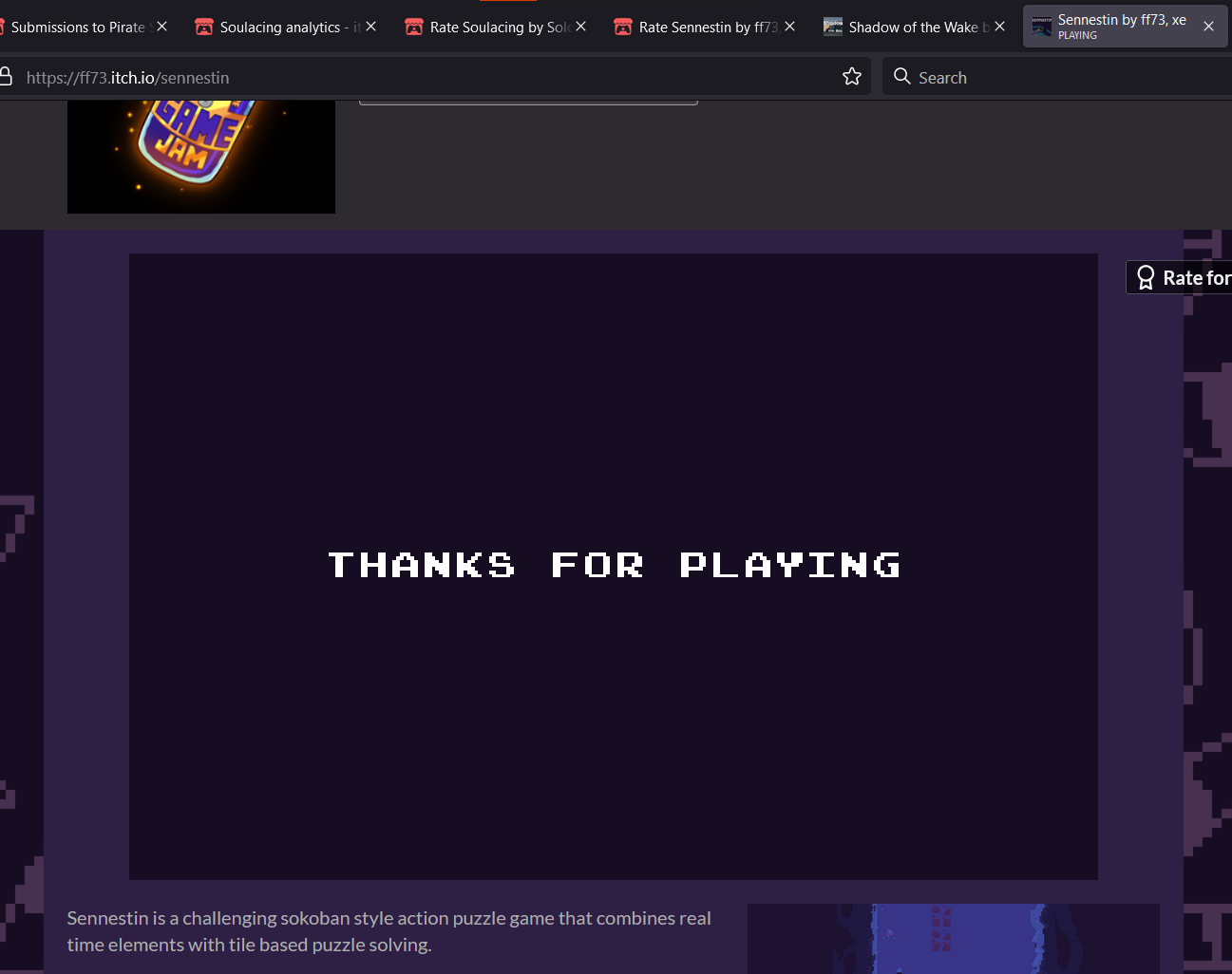
Spent the last day completing the entire game without using the guide (apart from one specific level where I needed a hint because the level design was poor imo), which took a few hours to complete as some levels were pretty difficult. Proof of completion:
Starting things off, overall a really well designed puzzle game with very interesting mechanics, good consistent art style, and music that allows you to think and I did not notice any bugs in my play-through. I like that the puzzles were actually intertwined into the story as if I was actually adventuring around this world, instead of just going from a level to another level with no real connection. The levels also had a duality to them, being able to be solved backwards which I really liked.
However, there were minor quality of life issues and some discrepancies in the game and level design which can make the game feel more frustrating.
Issues:
- I know the real time action is a major part of this game, but it does not mesh well for a "push the box" kind of game. The reason I feel this way is because pushing a box forces the character into a standstill even just for a moment. This can make you die to those emitters that an enforcing the opposite, that is quick movement. This is just a fundamental clash between two core mechanics in the game that have made puzzles feel frustrating. A puzzle game should feel frustrating but the player should feel it was because they made a mistake. Even though it is clearly the player's mistake for pushing a box infront of an emitter, it feels like the game is being unfair to you by forcing you to stay still for that fraction of a second while you're pushing something.
- The level design is good overall, but the progression in difficulty and introduction of new mechanics could be much better. I remember one of the levels suddenly introduced a bunch of emitters and I was rather overwhelmed at first. This can be easily solved by having levels which focus specifically on one mechanic. I always compare to Portal 2 because that game has amazing puzzle design. In Portal 2, each chapter introduces a new mechanic at the start usually but the first level in each chapter does not utilise the main mechanics of the previous chapters but focuses purely on the new one, aside from the very last chapters, of course the core mechanic of portals is always there. Similarly, your core mechanic is pushing boxes yes, but there were side mechanics which were not properly introduced. For example, just on the second level, you introduced the button to unlock the door and hieroglyphics which have *TWO* effects (walking over them activates them, and activated ones kill you) all at once! You should make the assumption the player knows literally nothing about your game (which they don't) and introduce things one at a time and slowly so they can master that mechanic because moving onto difficult levels.
- QoL - When you restart or die there's a screen wipe effect, which although looks nice, increases friction for the player. Every time I die or restart I have to wait just that much longer instead of just immediately being able to retry the level. Over time this can get really frustrating especially on those levels where the shadow is following you and you accidentally go backwards and die.
- QoL - This is very personal for me but after reading a note for the first time, the second time there should be a little reminder/warning message asking "Do you want to read this letter again?". There have been times where I accidentally click the interact button twice at the end of a note and it starts the entire dialogue again, I try to skip it quickly and the same thing happens again >:(
In summary, very good fun game with nice polish, just needs some work on game and level design and quality of life features.
I got an undo request from another review as well but I don't think it fits my game, my puzzles lure you into soft locks that you have to restart out of, having an undo just mitigates that effect. The idea is to make the player realise their mistake, and give them a fresh start so they can apply their new learning properly.
Thank you for the kind words! What do you mean by input my next move directly? Do you mean an input buffer like in Celeste where you can press jump right before you hit the ground and it will still jump? If so, I planned on adding that into the game as an extra QoL feature but I didn't have time to add it, I'll add it in the next iteration of the game for sure. Do you think it should stack so you can pre-move multiple moves?!
Thank you for the review! I interpret shadows and void to be similar if not the same, my lore is that souls either have resolved emotions (go directly to afterlife), unresolved emotions (the ones you are mainly helping in the puzzles), or they are emotionless (essentially evil spirits who thrive in the void and need much greater intervention like in the final level to get to the afterlife). As for alchemy, I interpreted it as changing from one state to another. One of the core mechanics in this game are the emotion flames which change your emotion (color) to that flame's emotion.
Since I made all my main mechanics and did all my level design in the last 2 days, I was not able to add the shadow entrance area as I had planned for the story which sets the setting for the game. I had also planned to introduce each altar (and emotion) one level at a time but I wanted to focus on the quality of the puzzles rather than quantity of puzzles for this demo with the limited time I had :)
I will be sure to add lore into the next version of the game!
Nice little platformer with a straightforward mechanic! I like the monotone visuals which make the light effects really pop.
My critique would be that the movement felt a little too fast for me, and the jump also felt a bit floaty. There was potential to introduce a few more mechanics and flesh out the game but I suppose your intention was just a nice simple short story and game.
A nice addition would be ability to restart with a key press (like enter on pause screen) because I had to go to my mouse to click the restart button.
Probably a bug: If you die in the first room (where you become the shadow), you have to start over again from the first dialogue and turn yourself into shadow again.
Overall pretty cool game, fits the theme and but I wouldn't say it stood out as something out of the ordinary (in my opinion)
Satisfying game that scrubs that roguelike itch. Good music, good visuals, good sfx, the perfect blend of juice.
My criticism is that having one kind of enemy that scales in health doesn't really give you that feeling of being strong. I always say you're only as strong as the enemies you go against. When there are enemies that actually do interesting things and can kill you not just because they have a lot of damage or health, it feels even better to get strong and beat em up.
Overall nice classic juicy game!
Interesting game mechanic. I enjoyed the novelty of it, the art is nice and simple to get the point across and of course there is some juicy sound effects for that dopamine.
However there is clunk in the controls and overall gameplay feel was not there. For example, the bounce strength from the ball being high, the slow heavy movement with short jump of the player, the lack of fine control over your character to position yourself correctly, all introduced a lot of friction to me as a player.
Also, the levels are simple enough to complete with just the ball and triangles alone, I don't really see the point in being able to combine any of these.
Also there's a bug where if you touch the wall you get stuck :(


