Play game
Umblight's itch.io pageResults
| Criteria | Rank | Score* | Raw Score |
| Playability | #1 | 5.000 | 5.000 |
| Cleverness | #1 | 5.000 | 5.000 |
| Theme | #1 | 5.000 | 5.000 |
| Artistic Style | #1 | 5.000 | 5.000 |
Ranked from 2 ratings. Score is adjusted from raw score by the median number of ratings per game in the jam.
Judge feedback
Judge feedback is anonymous.
- Fantastic aesthetics. Love all the attention to detail, even down to the animated Godot intro and changing cursor based on the action. Animations, sound effects, it's all good. The game feels very polished and complete.
Did you include your Game Design Document as a Google Drive link?
Yes
Seriously... did you include your Game Design Document?
Yes
Is your game set to Public so we can see it?
Yes
Tell us about your game!
This is an RPG rogue-like card game where the player can combine their cards and must manage resources to deal more damage to their opponent, while exploring 3 unique areas.
The game is quite long, so I'd appreciate if you would play through all of it before giving feedback.
GDD link:
https://drive.google.com/file/d/1my1OAbhSyYoXz69_WAx3gNQ51LRVyxJD/view?usp=sharing
Controls: mouse only, you can use the scrollwheel in battles to look up or down.
Extra Notes
Game puts the save file to user:// which I have no clue where that is on browser, but hopefully it shouldn't cause any issues.
Leave a comment
Log in with itch.io to leave a comment.



Comments
:D
Fun polished game really set the atmosphere well, and nice sound effects
:(
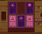
I thought the card art actually was associated with the card values but it seems it's irrelevant, I think it would be good if it were consistent, perhaps all the shadow versions of the card have the same art design and when they flip it shows the real art and values.
Basically all spritework is getting remade for the final release, with normal maps and a different version for shadow cards and light cards.
The shapes are indeed irrelevant, I just had to think of something generic for those cards, so I chose simple shapes.
Thanks for playing!
I enjoyed everything about this game, the art, the sound, the mechanics and theme interpretation, my honest feedback is: You guys rock, great game 12 out of 10. Well done.
"You guys" I'm a solo dev xD.
Thanks for playing!
whaaaaaaaaaaaaaaaaaaaaaaaaaaaaaaaaaaaaaaaaaaaaaaaaaaaaaaaaaaaaaaaaaaaaaaaaaaaaaaaaaaaaaaaaaaaaaaaaaaaaa amazing !!!!!!!!!!!
I've enjoyed the art design of the game.
Noticed the cards' main art does not take much play into gameplay itself. If it were an important aspect, I'd want to see entire enemy card, after the camera pans down during my turn. Tooltip on the Skills in your deck could feel more intuitive to appear automatically on hover and change cursor to suggest toggling it.
Would love to see what's yet to come for this project if it's going to receive updates.
You can scroll to look up and down.
I didn't want to make the skill descriptions appear every time you hover over them because they got distracting while I tried that out, so I made it appear on right click (cursor changes to a mouse showing right click as well). Most people learn what the skill does quickly anyway, so showing it constantly wouldn't make sense.
I'm planning on releasing this on steam this year. The jam version will get some improvements and bugfixes but that's all. If you want to get notified if stuff happens, then I have a discord invite link to a server on the game page.
Thanks for playing!
Brilliant game.
After some time playing I collected some things that I'd like to share:
1. It is a bit hard to tell what is currently selected.
2. I like to run through the game sometimes if it allows to do so but there are some things that slow me down like text on chests as I already know what I need to do or battles that introduce enemy that I saw before. It is nice to be introduced to Mr Cube once again, haven't seen him since previous room. (Not that I hate it, just a bit repetitive)
3. After fighting with 'Missing file', I think, I got to the next room with card totem and could not combine cards but could advance further and interact with things. During next fight I couldn't move cards. It happened in a blue area.
4. Would be nice to change volume during the game. :)
Overall game is fun if you enjoy this type of game. For me it is a bit like 'Slay the spire' and 'Gwent'. Tbh those are the games I played so far. :P
1. I will be adding outlines as a hover over effect for the 3D section.
2. This is already fixed in a newer version.
3. This is also fixed, but that was the softlock I warned people about on the game page. It likely happened because you tried grabbing a card during a scene transition.
4. Will do.
Thanks for playing!
Finally was able to play this, and it's so polished now :D
Thanks for taking into account my currency balancing ideas, the game feels so much better now.
You really cooked with this one man. Surely you'll get a top rating ;)
If you don't we riotThanks for playing!
The idea of dungeon crawling with cards and card duelists along the way is interesting.
Expanding your deck with a "gift card room" is nice and mixing it so you can have new, and more powerful cards is awesome. I did understand the use of coins to play but never used coins in the outside combat stance, as I thought it was better to keep them.
The general art style of 2d pixels in 3d is style super awesome, and I would like to see the card a little more "artistic" Idk if you understand what I'm trying to say... for now they are nice but too simple compared to their surroundings.
Anyway, I really like the atmosphere and general look of it, GG!
I'm planning on making the cards look nicer in the full release.
Thanks for playing!
Ok, this is the first time I'm playing this genre and this was so cool, your game was so polished I can't believe you made it in two weeks, goddammit!
you implemented the theme of the jam very well.
the art style was so unique and the eerie atmosphere matched it perfectly, some things that bothered me(some of them subjective so they might not be relevant):
1. the "conversation" audio was really cool the first few times I heard it, but then it really got on my nerves since it more or less the same sound all the time, so some variance to that would be awesome
2. I really don't like reading a lot of text or waiting for animations to finish, some like it, but I really tried sometimes to spam the mouse to just make it finish faster(especially when I get the options in the chests)
3. I felt the gameplay was a bit repetitive and i got like 5 special cards after only 2 battles and I didn't even need to use them to win
overall this is the type of game that makes me feel bad about mine, and I think this has a lot of potential and a very good chance to win this!
Thanks for playing!
Nicely done! I am usually not a big fan of deck-building games in general, but I am still enjoying yours regardless. I also loved the graphic, tone and especially the colour palette, seems very fitting! Sadly I encountered the soft lock you mentioned and it was just disappointing, given that the run is going strong. But oh well, I was warned not to do, so that's one on me.
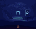
As for small nitpicks, I would say the doorways are quite blend-in into the background, such that at first I just don't know what to click. It surely would be much better if the interactable elements stand out a bit more.
Other than that, good job! Really enjoyed it!
Yep, I'm planning on giving a bright outline to interactable objects when you hover over them.
I'm sorry for the bug, but I hope you had fun regardless!
omg that's like INSANE quality. The art style is amazing, love the limited color palette and the pixel-art-kinda shading, really gives off some eerie, mystical vibes. The gameplay is great too, very addictive, played it for a while actually (trying to beat suzanne xD). Though sometimes the DM gets hit with DeMentia and explains same stuff over again lol. But overall, feels like an actual polished game, great job!!
I already made the DM repeat stuff less in a new version, but I can't update the game here yet.
Glad you had fun playing!
Such a fun way to combine your cards to get special ones, and sometimes just destroy your previous card haha. There is an insanely amount of meat to the game, as you can keep replaying it and have different difficulty levels A bit more music would help with the vibe as it often was pretty quiet. Nice one!
I kept the ambience in the 3D sections very minimal, because I think it shouldn't compete for attention in that section and it's more fitting.
Thanks for playing!
Okay I will leave my more detailed feedback here:
This is a good game, very polished. The tutorials are kinda eh and there are lots of bugs with them. It also takes a lot of inspo (i’d say maybe a bit too much) from Inscryption, but it’s a jam game so I dont expect it to be the most original. The actual gameplay itself is a bit boring at the start, but once you get into it it gets fun again. Also, I would like to be able to skip thru the narrator’s speech faster (please, like make it an option or something) so if he’s just yapping I can skip through.
The game doesn’t have enough variety in its gameplay at the start either, as the mechanics lead to the same strategies being used over and over (drawing normal cards, if they cost 0 merge them, if they cost 1 use a light coin and see how much power they have). This changes a bit with the introduction of skills, but this only occurs in the 3rd area and I feel like this couldve been introduced a bit earlier, maybe. It’s also not quite obvious what each skill does, it took me a while to figure out that i could right click on the skills and it will give me a description of it, so maybe pop up the description of a skill as soon as it appears in a fight (the first boss?)
Alright thats it, fun game, looking forward to the steam release!
Yeah hopefully most of these will be fixed with a new tutorial and a bit of progression change.
Thanks for playing!
I'm honestly kinda speechless with this one. The production value is through the roof...
Firstly the graphics and style of the game are amazing. The fau-pixel filter on the 3D is perfect and the limited colour pallete throughout the world and the card scenes are great and really set a fantastic eerie tone.
The narrator/DM who serves as both tutorial and guide is really well done and the pacing of the tutorial gradually explaining features as you unlock them is honestly perfect.
I really don't have anything to criticise about this, I suppose the only thing would be that I wish the card art was a bit more interesting but honestly it doesn't really take away from the world or the gameplay at all.
It feels very inspired by inscryption and shotgun roulette with the sorta gritty / distorted world and "voice" of the narrator while still being it's own creation.
Simply an extremely well polished and brilliant game.
The card game gets a lot more interesting (imo) at the later areas, where there are a lot of skills and your deck is full of great cards.
Thanks for playing, I really appreciate it!
The Art style is great, the gameplay loop is pretty solid, the only real issue I have unless being told how to use the cards slows the gameplay down a bit if its possible to do a visual version of explaining the mechanics I think it will make that bit more digestible for people who do not like sitting down reading through all the text just to know it works but other then that this is a pretty fun card game! I can't wait to see where this goes after this!
I tried making the tutorial mostly interactive, but it's getting remade for the full release anyway. Thanks for the feedback!
Super sick artstyle! Took a while to understand but got hang of things eventually. Kinda tough and a lot of dialogue that I had to slow down to read but otherwise incredible job. Keep it up!
I want to like this game, I really do, but a lot of small issues just kinda drain the fun out of it.
Presentation: The world looks interesting with this filter, but interactable objects should be highlighted. It’s very common for doors to be partly covered by shadow and not visible. As for cards, I’d like more differentiation, like some text or more interesting sprites. I know that the idea is that they are covered in shadow or something until you play them, but right now it feels like all cards are the same card with randomly changing stats.
Gameplay: It’s annoying that the dialog forces you to pause. You should either let the player do the thing, or somehow indicate when the player can and can’t interact with stuff. It’s especially egregious when you get the same 3 items from chest, but game has to pause and announce every one. Also, don’t just hide attack value on cards, replace it with “?” or something. When tutorial talks about cards having 2 values, you don’t actually see it, so I assumed that the coin sprite on the right is the second value, and always 0 for some reason. It’s also quite underwhelming to get a bunch of “special” cards, only for them to be a 1/0 crap. Like, why would I ever spend 2 coins on them?
Overall, I think it is a testament to game’s polish that I judge it not through the lens of a game jam, but as an actual game that I would play in my free time.
- If the cursor is a regular pointer, you cannot interact with anything. I could hide the mouse during dialogue, but that felt weird when playtesting.
- I'll make the treasure only announce new items you haven't seen before. It seems to be easy enough to understand what they are, so that should be better.
- I like the idea for putting a ? for the power. I'll add that for the next update. Before I changed the enemy AI, the enemy always played a light card on the first turn, which made this confusing.
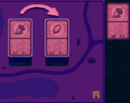
- For the special cards, you can use those 1/0 cards to combine with other special cards using the card combiner that you can sometimes find in pathways. They are useless by themselves, but really nice after combining with other cards. This is how the deck building works in this game, and I have a feeling you hadn't played the game enough, because in later areas (and after the first boss) you can get special cards with skills.
Thanks for the feedback!
1: I’m talking more about how in tutorial you can’t move cards or do anything else until dialogue is over. It’s fine in itself, but you should somehow signal that tutorial dialogue is over and you can now do the thing. Like show outline on cards or something. Or better yet, let the player move/combine/etc cards and skip the tutorial dialog if the player didn’t wait for it.
4: Yes, I hadn’t played the game enough. That’s kinda my point - if I consistently get rewards that are useless until I encounter some other room in a randomly generated dungeon, it stops being fun.
I see, thanks for clarifying!
Wow, great presentation!
i love the environment so much that i wanted to freely explore it. great aesthetics and very cool mechanics on the card game. congrats
Thank you!
This is great! I don't know if that is supposed to be a joke since are sometimes crossroads lead to chests and such, but I think the narrator saying there are empty pathways in both sides is funny.
The rooms with the health totems or card fusion totems are both referred to as "pathways". This is why the narrator keeps saying "something may happen here in the future" when you enter an empty hallway. Thanks for playing!
Love love love the artwork/overall vibe of the game! Super clever idea, too.
I really enjoyed playing that!
❤️