Indie game storeFree gamesFun gamesHorror games
Game developmentAssetsComics
SalesBundles
Jobs
TagsGame Engines

squintik

61
Posts
A member registered Jul 06, 2020 · View creator page →

Creator of

Recent community posts

Quite frantic in the last levels, it's pretty hard not to destroy too many civilian ships (I didn't notice the acceptable failure quota UI actually, but didn't fail anyway).

It's fun to try to anticipate the other missiles / ships trajectory, although it changes a bit too frequently to feel smart in my opinion.

Not sure if it would be too harsh or not, but maybe having a missile reach the end of the screen should have a malus too ? Currently, it kind of encourages to have 2 missiles on the edge, not risking to damage the civilian ships, and focus on the 3rd one.

Very different from other games from the jam, interesting. I quickly got into the mood of exploiting the system as much as possible (there were some clear exploits to use from day 1, making it possible to max out several ressources).
Perhaps allow this kind of thing only in the very first days, like the villagers understand their mistake after you exploited it, and then you have to be smarter and need to exchanges several resources in order to do the same ?

Probably asking too much for a game made in 48h, but after a few days (I stopped at day 8), it felt too repetitive to me. I think I would need a small narrative on top of this (like someone in your family will need quite a lot of meds at day X or else it won't go well ...). Just some kind of longer term objectives, rather than numbers slowly going up.

But for a 48h dev, it's already quite impressive how it feels solid, sets a mood pretty well, and hooked me into your game. Well done !

The controls work really well (although I struggled with my azerty keyboard). I also love the anticipation built for what's next, with the nice mood, messages, etc...

The feedback for the temperature could be better (and more funny probably), but the art, although quite simple, works quite well.

Good job :)

Funny game, I loved the sky background quickly going to stars, super exaggerated :)
It looks like the game encourages the player to slow down regularly, as you quick lose all your speed if you don't press anything. I think it would work better if the motorbike would always accelerate by default, but goes crazy with the random burst you have.

Also, I was expecting it to have the front wheel go up when it goes crazy, instead of the opposite which doesn't seem very natural (I always wanted to do back flips for some reason).

But I had fun, so good job :)

I like the initial idea, and the title screen made me curious to test it, but I didn't really feel like I was moving the world in the game. It felt more like a weird mouse control for the vehicle.

The boats and sometimes trees moving with the camera (a little bit) tried to give this feeling I guess, but it's not very consistent, and there are a lot of elements that don't really react to the world rotating. Not sure what could sell the idea better, not an easy thing to do !

Also, I had bugs where the environment was suddenly changing, and the road just disappears and make me lose.

The idea could work, but I feel like the possibilities offered don't feel very cool and unique, but are feel a bit too cheap/artificial (moving projectile, creating a barrier). I would have expected things like choosing 2 areas to transfer projectiles entering 1 area to the other, or things like this.

It's also too bad there's no mechanic to deal with enemy ships. I tried moving their projectiles behind them or things like that, or using the gravity well to attract the ships, but nothing worked.

The gravity well and barrier can work well together (cool to start to have some sort of combo thing), as you can attract and kill lots of bullets with this. Moving projectiles one by one is quite painful from my experience, so I didn't do it a lot, and it seems to go a little bit against your game (hellbullet ! tons of bullets ! precisely moving 1 bullet at a time ?).

Simple but fun idea. The level design is very good, making the game quite challenging, having to time the movement properly. It was quite hard but I finished it :)

I'm not entirely sure, but I was thinking perhaps the last beep could be different to warn about the jump. I had to look at the meters a little bit too much for my taste, but it should be as intuitive as possible in my opinion. As you change the timing quite often, and in some cases it has quite a lot of beeps, it made me rely a bit too much on UI.
The art is quite nice too (I like the FX, like the feathers for the death).

Well done !

Nice game with some a lovely presentation. The game part would be easy to cheat with a simple print screen, but it would ruin the fun, so I went through the dialogs trying not to forget the weather forecast. (there's 1 day where I messed up ...) It would be a little bit more difficult, but I would be curious to try without the sum up of the forecast after the character dialog.

The art is pretty cute. Perhaps some icons are not super clear sometimes (like the disaster ones for the last day, there are 1 or 2 which I wasn't sure what it was)

Anyway, good job, pretty polished for a 48h game :)

(1 edit)

The idea takes some time/levels to really pay off, but it's interesting and offers a lot of possibilities. Nice surprises level after level (oh cool I can actually play after dying ! oh I can move the whole geometry instead of me ! etc...).

The art works well with the game, audio is pretty basic but does the job I guess.

It took a little bit of time (impressed by the time you had to do all these levels on top of the core of the game), but I completed all the levels in the end. Good job !

Same, I was expecting the loss of controls to be stronger. And I think it would have been worth it to spend a little bit more time on the level design. You can easily slowly progress without ever being in danger, as enemies only attack you when you get close to them. Same for 2nd map, you can simply shoot the objective from your spawn point.

Quite frantic which can be fun, but I think it was too regular, too much the same experience the whole time, and lacking a bit of variety.
It could have been interesting for example to have some enemies slower but with more health (so that you have to focus on them for some time).
I quickly stopped thinking and just spammed the space bar moving up and down, not really caring about the bombing as I was avoi dthe top part, and not caring what enemy was coming from.

Congrats on making everything (art, audio) during the short time frame !

The base is pretty simple, but it manages to offer some fun parts.
I liked the ice cube death :)
There are a lot of levels, but some are not particularly special, so perhaps you should have reduced the number to make the remaining ones more special. I was hoping for some jumps to do and having to land and slide quickly on the opposite direction when landing for example. I was happy to see the jump, but it was too much trial and error.

I also think it's too bad nothing pushed me to go fast (to encourage stupid mistakes), but instead let me do it slowly and precisely if I wanted. Some more craziness would have make this better in my opinion. Either just a timer, or ice breaking if you stay too much at the same location for example, or some wind gusts.

Original idea, which stays quite simple at its core, but offers some interesting enough gameplay. I would be curious to see how far you could get with this (a NPC stealing my control cube and going away with it ?). The art is also nice by the way.
The level design is quite limited and short, but you managed to prove the concept quite well !
When I'm holding a cube into the world (drag&drop but without releasing the mouse click), I would expect the camera to stay centered on the cube I think, so that it's easier to prepare the cube, jump, drop it, without the cube being moved at the same time of the camera.

I didn't know about QWERTZ oO I guess I'll need to prepare a Unreal template with a menu to remap keys, so that it's not a problem in the future. (as a french guy, I'm used to messing with Windows language input preferences to switch to QWERTY, but it's not ideal).
And you're right for the violent start, perhaps without a tutorial level, it could have been a slower start with just 1 controllable agent, and then you free more and it becomes crazy ... but yeah didn't have the time to properly think and implement smart things during the jam (1st one for me, so I'm not used to this)
Thanks for the feedback !

Not so sure to understand how this works. Whatever I try, I can never reach most white spheres, so I lose control anyway, and the emergency flaps don't really give me control anyway (can just avoid a crash from time to time). It sounds like it could be fun, but I guess you should let more control on the player so that it's clear when you lose it. Also, it wasn't clear that the green gauge was doing this until I read the game page.

Very cute visuals, and it plays smoothly. I had no idea what did the colored gems (?) when cutting grass, as it looked like the only goal was to kill the monsters before they reached the roses. It looked like the character was attacking on the wrong side at 3rd level, so I couldn't make it further.
Anyway, good job having something so nice in a short amount of time !

Super good job with the bacon movement ! Funny to move around, and the character look very nice with its simplicity. I couldn't do much else than turning off the alarm, and I had the feeling the hands movement was purely cosmetic and I never had to use it (at least when I tried, it still didn't allow me to open the door when bell rang, or do anything particular.
Stupid and fun anyway, well done :)

Cool and funny idea :)
Very good presentation too, the environment and the characters are looking nice and polished.
The design was a bit too limited for me. Stealing an object was not particularly challenging, and the idea with using the sneeze to break things (at the risk of a louder sneeze) is cool, but I couldn't steal the object afterward (just a bug I assume), and it's quite easy to escape the guard anyway, so it still lack something to have an interesting experience in my opinion. It was very pleasant to play anyway, so good job !

Good job, the narrative and visuals work well. The controls are not so common I guess, with the camera rotation, while the game look very 2D in style. The mix works well anyway.
The puzzles were a bit too basic in my opinion (I solved it without really thinking about it), but I guess it's just an excuse to have the player do something and come back for some dialogs.
Small detail for the visuals, but the stone ground inside the temple look a bit noisy with the camera angle you have when entering it. Perhaps slightly bigger size for the pavement would work better ?
Anyway, well polished for a 48h game, congratulations !

I have some ideas to integrate this in a bigger game, but still not sure I'll have the time and motivation to do it :)
Thanks for playing, and for the feedback !

(1 edit)

Simple but fun concept. I like the panic to quickly move my hand over the right keys (good idea to always keep the classic WASD alignment to keep this more immediate). I would have like a quick feedback just before it was going to switch, in order to anticipate the change (would still need to react quickly and reach the right keys after).
Not sure having the physic be different for slopes was worth it (you kind of lose control a little bit when reaching the top of the slope, and enemies go too fast when going down a slope in my opinion).
Good job anyway :)

Well done ! It was fun seeing everything moving on constantly, with the conveyor belt and chaos regularly going on. I love the art you made for the characters, environment and the effects, everything moves nicely. The audio works quite well too. I was not sure what was the objective (it was going on forever and the progress bar with the bomb at the top didn't change anymore after a while), and I didn't understand if it was problematic to have bad objects reach the end of the line (it was cool being able to throw them to the trashbin, but I didn't see any consequence not doing it).
Anyway, I enjoyed testing this, so good job !

Good idea, it's pretty cool to both push the character, protect him while also protecting ourself. The mix of all this makes it interesting, and the presentation (visuals and audio) are matching well with the game. The progression works well, but it becomes quite hard for me when there are spikes and bats everywhere. Good job doing this in 2 days !

2 things that were not clear at first :
- I could kill the bugs by jumping on top of them (classic, but I didn't think about it). Having the bugs do some sort of plunging attack and stick in the ground for a second or 2 could encourage player to jump on them for example.
- the clouds have an outline giving information about their effect (rain or lightning). Perhaps changing the visual of the whole cloud itself would help ? or just a tutorial text to explain.
- I needed to push my ship from "outside" the ship. It would be better if the robot could just grab it even if we're on top of the ship in my opinion.

I like having to be both careful for the robot, and taking some risks to push the ship under the clouds. Once I understood everything, it's fun and I could complete the game (well, have the giant ship arrive, but I couldn't find anything to do with it).
The visuals work pretty well, too. Good job :)

The idea of unlocking things progressively to get back control over the robot (movement, shooting, aiming, etc...) can be fun, but it seems impossible to complete the 3rd level (dying nearly instantly, whatever I unlock).

Not sure to understand. It looks like when I click on a colored cube to make it go away, it fills a gauge ... but not sure what use it has ?
In the end, it felt like I just had to click quickly on any colored cube, but no matter what I did, it went crazy quite quickly and I could not do anything about it.

I had a good laugh when discovering the  humans and what happened to my "character" :) It reminds me about the crazy ending of Inside, but in a more goofy way, and super hard to control ! Probably too hard to play at the moment, as I struggled to climb the first wall, only to die in spikes after. The camera is quite painful too, but good job on this crazy game.

Pretty funny to struggle and fall again in the same canyon at the bottom :) The level design is not very forgiving, but that's part of what you wanted I guess :) The physic is pretty good for the vehicles, doing some kind of random stuff when going too quickly, strafing and doing 180 turns with the mouse, but that's part of the fun. But I have to admit I didn't finish it, and didn't have the motivation to climb up the same part of the race every time I messed up.

(1 edit)

Cool, thanks for playing, I'm glad you enjoyed it :)
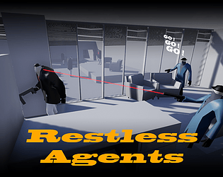
I still have to play Frozen Synapse, and was more inspired by games like Shadow Tactics / Commandos. Try these in case you like the genre (but they're not turn based, so it plays differently)

As a simple prototype, it would need some tweaking so that the agents go a little bit less crazy, and/or tweak level design so that the 1st half is easier.
For a bigger game, it could be something progressive (like the agents start more calm, and get more and more in a frenzy the more the kill hostiles.
Thanks for playing :)

I went a little bit too far with the agents hyperactivity indeed :) (at least when discovering the game for the 1st time)
Sorry for that, and thanks for playing !

Thanks :) (joli boulot sur Sgnittes Club !)

Thanks for playing :)

Raaaah, I forgot to had the W so that WASD works too (but the A works ...). Sorry for that ... I guess that's my secret revenge for struggling to play most prototypes with my french keyboard :p
Thanks for playing !

For a small prototype like this, I prefer to have the 3 agents go crazy in order to better show the idea of the nearly impossible to control agents.
I should have increased the time before they move, and put back the feedback on each agent to see their restless gauge (the information is on their portrait UI, but it's a lot easier to miss). I was afraid of having this mechanic not present enough, and not enough time to think about this and show good feedback, so I guess it's fun only when you master the game enough, but too hard for trying it quickly. Lesson for next time :)
Thanks for playing, and for your feedback !

Yeah, the art is super super basic, not enough time for me to do this on top of making the design work. I guess I'll have to use existing art next time, or go for a more simple idea.
Thanks for your feedback.

Very cute, and the behavior and animations of the cat and the physic objets are very well done.
I'm surprised there's no sound on the cat itself (apart from the jump swoosh), and the cat sometimes can go through the cardboard, but other than that, it works fine.
Good job :)

Pretty simple game, but well executed. The changing mechanics set a nice pacing to the game, and the art is pretty cute.
Perhaps lack a feedback to tell when the character will change emotion, perhaps on the emotion FX itself (like the flame getting less strong when approaching the change for example.
Also, the rainbow mode is cool to go crazy, but intuitively I didn't think about rushing into the books while in this mode, perhaps just because the visual for this emotion doesn't look very "aggressive".

Nice idea with getting crazy and losing control of what you're doing (without losing any game control  for a change !).

I stopped before binding too many keys and getting crazy, but nice touch with the game. I wish some information about problems had a visual feedback (like hurt people in red when needind a medic, so that it's not purely focused on the text and enjoy a little bit more looking at the colony grow, but I guess it's a choice :)
Original game with its  own style, good job.