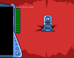
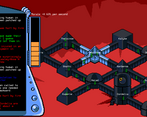
I got really far in this game but eventually it became really stressful and hard to keep track of. Some indicators like for fires would be nice, like you did with hurt people. It also became pretty difficult to remember where the sectors were (which I suppose was the point) but maybe some color coding would be good. Honestly I thought marty's jokes were irritating because they cluttered up the feed. This review sounds really negative but I honestly really enjoyed it. Great game!
Play game
A Bind on Titan's itch.io pageResults
| Criteria | Rank | Score* | Raw Score |
| Originality | #372 | 3.900 | 3.900 |
| Overall | #373 | 3.733 | 3.733 |
| Fun | #625 | 3.467 | 3.467 |
| Presentation | #685 | 3.767 | 3.767 |
Ranked from 30 ratings. Score is adjusted from raw score by the median number of ratings per game in the jam.
How does your game fit the theme?
You assign multiple keys, but the game never reminds you of the controls.
Did your team create the art for this game during the 48 hour time slot?
We created all art during the game jam
Did your team create the audio for this game during the 48 hour time slot?
We created all audio during the game jam
Comments
I played for quite a while, but I never had enough people to build another sector after placing the first one. Marty's jokes are funny, but there is just nothing else happening. I also figured out you can move between buildings with the arrow keys and press space, but I'm not sure what it does.
Sadly the game doesnt scale to a 4k resolution properly and only 1/4th of the screen is visible, and as there is no windowed mode I cant play it :( Hope to see a post-jam release ! :)
- antti @ juicy.games
Cool game! Nice aestetic. Fun to map your own controls. Would be nice with more feedback on the events, like when pilgrims arrived and people became sick but more! When stuff is broken and on fire. I felt that as long as you could keep everything under control it was quite easy but as soon as you started to lose control it snowballed, but that works well with this kind of "arcadey" game. Good job!
To be honest I wish the chaos ramped up faster. It's too manageable early on and it takes so long to get to a new keybind being added that the game gets boring. Overall, really fun concept. I love when 15 things go wrong at once and you are panicking to keep everyone from dying by sending firefighters to one place, guards and technicians to another place, and medics everywhere.
I stopped before binding too many keys and getting crazy, but nice touch with the game. I wish some information about problems had a visual feedback (like hurt people in red when needind a medic, so that it's not purely focused on the text and enjoy a little bit more looking at the colony grow, but I guess it's a choice :)
Original game with its own style, good job.
Secret for ya. Pressing space bar will give you an icon conveying the issue in each sector. We were going to include them normally, but then I think the terminal would have been useless. Perhaps we should have had some kind of scanner that tells you the specific problem, but works on a cooldown so you can't spam it.
The only problem I had with it is that the names of the different sectors aren't on the sectors, they're offset quite a bit, so It's difficult to tell which is which. This may be intentional, but it doesn't seem that way.
Really neat concept, letting the player choose their own keybindings while constantly adding new buttons to press! The presentation was quite nice, but quite frequently I got a pop up - new pilgrims, for instance, I pressed the guard button and I got told there was nothing the guard was for. This also happened a couple times with leaky pipes, which was quite frustrating!
Still, excellent concept and a well done implementation! The only thing I dislike was the intro screen - it was too overwhelming with info all at once.


Leave a comment
Log in with itch.io to leave a comment.