Indie game storeFree gamesFun gamesHorror games
Game developmentAssetsComics
SalesBundles
Jobs
TagsGame Engines

tducasse

259
Posts
16
Followers
1
Following
A member registered Dec 30, 2020 · View creator page →

Creator of

Recent community posts

Thanks, that’s exactly the goal. I wanted to use this game jam as sort of a way to develop the core systems and see how everything goes. Everything has been written in JSON for example, the layout of the map, the different levels, the rewards, the cards, the monsters, etc. So everything is in a sort of database that I can edit in any way I want, and it generates the entities on the fly.

Thanks for the kind words!

The Pc version didn’t work for me either :(

Fun take on street fighter! I would have liked a few sounds though, just add a little bit of feedback :)

Super fun twist on a deckbuilder. I think I got three of the same cards (a 2), and it didn’t count as such, because I got a high card instead. But otherwise fun!

You should check our deckbuilding game too :)

Really liked the ambience in the cutscenes

A bit challenging because day time is short, but all in all a fun game!

Definitely feeling the wario ware vibes :)

Great animations!

Thank you for the kind words!

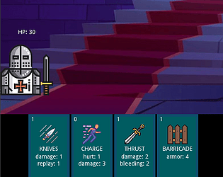
“Replay X” means “play this card X times”. So basically it applies the effects of the card X times.

Thanks!

This is awesome! Nice take one of my favourite games :)

I took this as an opportunity to learn a new framework (love2d), build my own LDtk parsing library, and work outside the “main” path…. I was more interested in the technical learnings than the game design for this jam 🙂

Thanks for playing!

mmmm I was thinking I would probably try to work on something a bit longer for the metroidvania, given it’s a whole month! But right now I’m playing with a few different frameworks, tinkering with the idea of building my own layer above a framework, etc :)

Nope, sorry, no controller support!

I’ve seen this other project, it’s just the same name, not related to this project 🙂

thanks a lot! I think I understand what my mistake was. On a high dpi screen, the library I use for resizing the screen was making pixels bleed for some reason, and I moved to not using their default canvas instead. Now looking at what they’ve done in this Love lowrez template, I get it now!

Thanks for taking the time!

(1 edit)

mmm I’m sorry I don’t really get what you mean! maybe something is wrong with the way I do it?

Two things I do:

  • my drawing canvas’ width and height are 64px
  • the window’s width and height are both 640px

So effectively, I scale everthing up by 10.

The counterpart of this, and something I realised after the submission deadline, is that my camera is not aligned with the pixels, which means that while the size of the screen looks like 64x64, there are subpixels at the edges of the camera, like here:

Is that what you’re talking about?

Another issue is the fact that I’ve not aligned the movement to the grid either, effectively creating subpixels there as well, like here:

Sorry for over explaining, it’s my first time participating in the low rez jam, so I just want to make sure I understand for next time 🙂

(1 edit)

“chill beats to shoot metroids to” 🤣

thanks for playing!

are you talking about the fact that while the canvas is 64x64, the movement is smoothed so it accidentally involves subpixels?

great music and sound effects. I also really liked the trail effect, it actually gives a good feeling of speed, and it makes me want to press the buttons even faster.

Really good job 😀

I love a good rhythm game! I only wish it was longer, I was waiting to see the difficulty pick up!

Great job overall 😃

(1 edit)

this is so hard I feel stupid haha! Reminds me of these overcooked/cooking mama games, where the timer keeps going down in a very stressful way.

Good job, and congrats on your first game!

I ended up just mashing the buttons randomly after some time, and I actually did better than when I was thinking about what I was doing 😂

Maybe you could add a cooldown between the balls/attacks so that people don’t just press keys really fast!

(1 edit)

Having to remember the layout was a good idea, I totally missed it at first and I understood while moving to the second level :)

I 100% agreed when I started play testing, which is why I put a grid tile under every skree, so that you can avoid them whenever you see one!

but yeah, I didn’t have enough time to make other people play it and watch where things were too hard/easy.

cool thanks, it sounds promising 👌

Thanks for playing and thanks for letting me know about the crash, I’ll definitely have a look once the jam is over 😀

yeah I’m at this point where I feel like I’ll never be happy with a framework unless I make it myself, but that’s a very deep rabbit hole 😬

Fantastic work on the pixel art here, very well done!

omg I died so many times…

Good job!

completely absurd, I love it!

The first ship made me panic a little bit, I must admit! Nice game, and I totally agree with you, restrictions actually help, especially with the art when you’re not super good!

Well done, congrats on your first game jam!

that was great! I spent a lot of time on my first try just killing every zombie I could see, and then I was like “wait, where do I find the ammo again?” and I died haha. Went much further on my second try… Good job, it was a super fun game, you totally captured the fact that zombies are stupid and slow!

TDD in game programming, are you crazy hahaha

This is very impressive, given the time constraints! I’ve ready your devlog, and as a fellow Love2d first timer as well, I totally agree with your feeling: it absolutely gets out of the way, allowing you to build whatever you want on top of it.

Is this game open source anywhere? I’d love to see how you managed to handle your animations, especially the “trail” on the last boss’ moves, it was very very well done!

Also, great job on the screen shake and the little details like the red squares moving inside the HP bar.

Definitely one of the best games I’ve tried in this jam!

Pretty challenging game, with a nice progression, adding a new thing every level.

Side note: I found wall jumping a bit weird at first, because you have to go towards the wall, which means that you can’t do the typical mario like wall jump, where you jump between two walls by angling away from the wall.

I found it really hard to understand how the controls worked at first, but I got the hang of it after a few tries - but that’s probably just me. Other than that, I like the fact that you used this “field of view” circle, that’s a very good way to justfify why it’s only 64*64.

Well done!

Good job downscaling Kenney’s assets, they look great. What’s your experience with Pixelbox like? I’ve done a very basic proof of concept with it, and I don’t know how it scales on a bigger project 😀

I’m glad I got a new mouse 3 days ago, I put it to good use here 😂

This was a very interesting experience. I especially like the minimalism with which you drew everything, even in the little details like the birds flying away.

Great job 😀

yeah the web version is really buggy at times… Sorry about that! The windows export works way better!