Play game
Hidden Temple's itch.io pageResults
| Criteria | Rank | Score* | Raw Score |
| Visuals | #172 | 3.303 | 3.303 |
| Audio | #177 | 2.879 | 2.879 |
| Gameplay | #191 | 2.788 | 2.788 |
| Overall | #220 | 2.909 | 2.909 |
| Authenticity (use of resolution restriction) | #300 | 2.667 | 2.667 |
Ranked from 33 ratings. Score is adjusted from raw score by the median number of ratings per game in the jam.
Leave a comment
Log in with itch.io to leave a comment.


Comments
What an interesting game! I included it in my LowRezJam compilation video series, if you’d like to take a look. :)
I applaud you for making a platformer that controls crisply with precision. You also gave me a chance to get used to the controls before giving me something too challenging.
I assume you're aware that the guy needs a climbing animation when going up ladders, more of a detail really.
I noticed that right after my guy died from hitting a trap I would respawn in the same area but with the trap used up. I could keep on going as if nothing had happened. That defeats the purpose of the trap.
I also noticed that I wasn't able to tell if a switch was going to be beneficial or if it would be a trap. I just started assuming most were traps since traps kill you instantly.
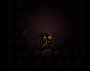
I love the idea, the art and the lighting in this one! 2 things though, was there no sound? It didn't seem to be working for me. Also, the jumping was a bit strange/jarring as the camera moves along with the main character. Nice work!
I love the idea, the art and the lighting in this one! 2 things though, was there no sound? It didn't seem to be working for me. Also, the jumping was a bit strange/jarring as the camera moves along with the main character. Nice work!
Not a bad game but... it has both assets that don't fit in the 64x64 as well as sub-pixel movement, if you had made it with the limitations it could have been a great submission :/ Apart from that the game is awesome!
not exactly 64x64 but a decent little game none the less. I think some variation in traps instead of button/death every time would really improve the experience. other than that i think the art was nice and the atmosphere was very fitting. great job!
Simple but elegant art assets--good use of the restrictions. I like how the lit area stops you from seeing pitfalls. I died so many times. Good job! Like someone else said below, you should have to restart or start at a checkpoint when you die to make it even harder!
thank you so much!
Good use of the resolution in the game and it was fun avoiding the traps (or trigger them and see how they killed you 😅)
Thank you so much glad you enjoyed it :D
omg I died so many times…
Good job!
Thank you so much :D
Good visuals, awesome character sprite. I think that when you die on a trap, it would be better to reload it instead of just let you pass through.
TY!
Fun little game. And perfect length for a jam in my opinion. I was able to finish it in under 10 minutes and am ready to move on to the next one. The art assets went together nicely. I also liked the very generous use of checkpoints. I feel like in a gamejam you don't wanna be replaying a lot of the same content. Obviously the UI broke the rules of the jam and I feel like getting the UI and text readable was a big part of the fun and the challenge of the jam and seeing everybody's unique workarounds has been really neat, but I will say your main gameplay does appear to follow the restrictions perfectly and looks pretty good at that.
ty so much!
I died so many times hahaha. would have been fun to have maybe a death counter at the end telling the person how many times they die trying to find all the treasure. then you could replay and try to avoid the traps better for a higher score. Overall pretty fun little explorer game!
thats a great idea ty!
Loved the lighting in this! Pretty sure every single trap got me though hahaha
Nice game!
I haven't seen so many construct games, so good for this.
I like the atmosphere, music and art.
As others said the instructions interface don't follow the rules, but the game overall does so i think it can be fixed later on.
Wish you luck on this entry!
I really liked the use of lightning!
When I first saw your utilization of lightning in the menu, I thought the game would have the same mechanic as well, pointing the mouse in order to see things I mean... The music and sound effects are also effective, they resemble the adventure.
The playable part of the game fits the use of resolution restriction I think, so not being perfect in the menu in that case is not too bad!
Great work!
Thank you so much! Originally I wanted to use the lighting mechanic but it felt weird with the resolution restriction so I scraped it and used it on the menu
Your UI elements don't conform to the 64x64 pixel rule, but there's still time to fix it! Your character animation is great, by the way, and I love the use of lighting.
Which part isnt 64x64? The resoultion is 64x64 resolution and i thought that was the only rule?
Your UI, the text and text/outlines on your buttons.
The outside border and the rest of the game as far as I saw are 64x64, but your UI is much higher.
Thank you! Sadly I just have no time. Hopefully its alright though since the game is following the rules <3