Indie game storeFree gamesFun gamesHorror games
Game developmentAssetsComics
SalesBundles
Jobs
TagsGame Engines

TJ-Works

36
Posts
1
Followers
1
Following
A member registered Nov 13, 2020

Creator of

Recent community posts

Thank you for your honesty! I understand if you feel this. Some of our teammates were pressed for time, so we only had so much time to balance everything we could to a playable state in time for the deadline. Some things could've been rectified. We also had other features we wanted to incorporate, including a How to Play page, but had to be scrapped.

Thanks for playing! :)

(1 edit)

This was a charming, light-hearted game. Can't help fall in love with a game about dogs.

I respect the focus on fun with the dialogue and content, emphasising the charm of a good boy.  Although it's readable at a large resolution, it can be a little hard to focus with the dog blending into the background since it's all black and white. I would increase the width of its white outline to make it stand out more. The use of background assets is a little chaotic too with inorganic placement and lack of consistency in pixel-line widths.

Good job though for a solo dev!

This was a fun and challenging game! I love the moody atmosphere in the swamp backgrounds, rolling fog and accompanying soundtrack. It all melds together for a chill experience.

The atmosphere compliments the difficult challenge too. Perhaps a little too challenging in some levels though. The first levels were a little tricky to start off from. I also think there should've been more thought into the flow of introducing mechanics and the difficulty curve. For instance, after introducing the portal mechanic, the next level doesn't use it? Strange time to introduce it.

However, the core gameplay is fun and addictive, and the controls are tight and response. Like other commenters have said though, increasing the range of tongue could help reduce the frustration. Good job to the dev team!

Wow, for a 1 week 3D game demo, this looks great! The steampunk artstyle looks nice and consistent in both the environment and robot characters. I appreciate the careful attention to the level lighting with the tone variety and placement so it's not too dark.

The puzzles were simple but easy to grasp, and help link to the theme where every robot is important. However, I need to mention I experienced a glitch where my robot clipped through the floor and was stuck in an endless void. I had to restart from the beginning.

Despite that one glitch, it's a very-well made demo. Congrats to the dev team!

Thank you! Good to hear what you liked. The difficulty was, err, difficult, for our programmers to balance, but at least doesn't seem to be too hard.

I'm surprised more people having tried/rated this game. This feels like one of the more complete packages in this game jam, and all from a solo dev no less! Very impressive.

The voxel art style is neat and consistent, harmonised by a moody, sepia colour theme that gives me fantasy RPG vibes. I like the added detail of your character aging or changing appearance when it wins a round. The UI design is simple but efficient and matches the overall theme. The rock/paper/scissors gameplay was easy to grasp, though relying on random guesses to win doesn't feel as satisfying. But I did keep playing to see how much the character would change each round. Sound is good.

Great work!

I was curious what the 11-person team would come up with, and it's a pretty good entry! A tower-defense game themed around antibody soldiers fighting off a disease. Fits the theme well. It looks like you had a lot on your plate. Everything functioned properly. The gameplay loop was a little repetitive with setting turrets up, fight germs, freezing, gain more turrets, repeat, but it was still a bit of challenge running from germs while trying to find a place to set up turrets.

The art direction is sound, and I appreciate the consistent use of theming. I think it could've benefitted with a more consistent art style, namely with the character designs as there's a big disparity between the 2D and 3D designs. I liked the funny dialogue exhchange at the beginning, and the UI design is strong! 

Nice work.

This was a disorienting experience. I can see they went for the narrative approach; from what I gathered, it seemed to focus on a lower-class person trying to climb the societal ladder (by literally climbing) while completing good deeds for others to progress, only to be met with harsh reality at the end. It was a little hard to focus because of the janky camera, clipping models and swaying movement making me nauseous. It could've done with a proper ending to cap off the narrative, and maybe soft music and sound effects sparingly to add to the ambience. Kudos to the game dev for completing their entry in their own vision.

Thanks! First time hearing our art being called groovy, haha.

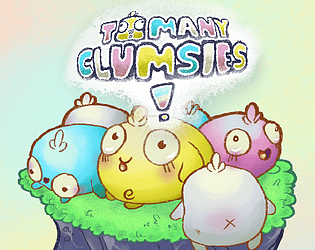
Thanks for sharing your opinion! As for losing being inevitable, this game was designed to be a mix between a survival game and a pet-breeding sim; the idea being keeping your Clumsies to survive for as many generations (or rounds) as possible. We did have other ideas to add gameplay variety (including island variety as you mentioned!) but due to limited time, we could had to cut back alot of ideas to get our game to a playable state. We're glad you still liked it. :)

I'll have a look at your game when I can.

Another solo dev entry! I respect one-man teams tackling a game jam on their own.

I appreciate the type of experience you attempted with playing the role of a psychologist as you try to ethically diagnose patients. However, the majority of my playthrough resorted to guessing. Unless I'm missing something, there isn't enough information to correctly diagnose the answer for each patient. I think more time could've been spent on the dialogue so there's more information for the player to parse. The whacky alien characters were interesting!

From the look of things, it looks like the developers wanted to create a WarioWare-style game. It certainly plays like one!

With only a minute number of minigames though, it doesn't leave much of an impression. I couldn't figure out the objective for Wall-Flower, either. The rest were easy to grasp though in a short time. And I'll give credit for the game being in a functional state. I just wish there were more quirky minigames and tighter presentation to make the full experience more fulfilling.

From what I played, I feel this was on the onset of being a fun experience with a goofy concept. Unfortunately, it doesn't hit the mark. Knowing the developers were unable to address major bugs with their games, it's a shame this demo didn't turn out the way they wanted it too.

I will comment on other features. Although the art direction is simple, the flat-tone low-poly aesthetic works for the game jam and the type of game this is meant to be. The warm colour scheme is soothing and easy on the eyes, and the daycare layout is organised and spaced out evenly. The title screen is great too!

Despite the faults, I can see what the developers wanted to make and where the care was given in its presentation. I wish them luck on their next game jam and hope things run smoother!

I wasn't expecting to play a game with a mature theme and story. Although I don't normally play games such as this one, I respect the creators for wanting to focus on a mature experience supported by its story and ambience. The pixel art is strong, and I like the added visual effects such as the pixel light sources and the shadow effects when passing through corridors. Passing by corpses of your previous attempts were disturbing (in an effective way) that adds to the atmosphere. I can't say the level design and gameplay match in quality; its mainly a walking corridor simulator. While being wary of your step counter has narrative effect, it ends up leading to trial and error as you figure out which way your supposed to go. But as I said, the narrative, art direction and ambience help make up for it.

(On a minor note, I experienced a bug where I walked through a solid wall, but wasn't game-breaking.)

Props to the developers for tackling a mature theme!

Good to hear so much praise for our art direction! Our creature designer/animator, Kevin, did a fantastic job nailing the cutesy, bouncy liveliness of our Clumsie creatures. We understand the gameplay information can be hard to grasp at first; we did our best trying to balance the difficulty and information conveyance with the limited amount of time we had. We'll think about this more in future projects!

Awesome to hear your opinion! We did plan to make a How to Play page, but with us running out of time, we had to improvise. Our programmers/designers thought having a brief tutorial at the beginning of the game was the most efficient way to explain, but we understand that it could be improved. Thanks!

"Achievement Unlocked: You have pet the Clumsie."

Good to hear you had fun with the creatures! Our aim was to create a pet-breeding simulator with a survival twist, so we're glad to hear we nailed the pet-breeding part. Our composer is pretty young so I'm sure it'd be great for them to hear praise for their audio work!

Thanks! Good to know.

Thanks for your opinion! We had more ideas that had to be cut. There's only so much you can do within a week, haha.

It's great to hear how much everybody loves the cute factor of our game, haha. We had a tricky balancing act figuring out how to convey stat information and how much it would influence the gameplay. A lot of ideas had to be stripped back to get our game to a playable, understandable state. Thanks for your kind words!

Thank you! We had a lot of fun establishing the art style and designing/illustrating every element. 

Glad you enjoyed the game! We did originally plan to create a How to Play page, but we were running out of time, so our programmers/designers thought the most practical way would be to have a brief tutorial at the beginning of a session. A lot of things had to be stripped back for us to complete our demo to our satisfaction. Thank for the feedback!

It's okay if it's not your type of game. Trying the game out and leaving feedback is all we can ask for, so thank you!

This was a surreal experience. It reminded me alot of Katamari Damacy but from a 2D perspective,  and was a quirky fun time. The physics could be frustrating, but I think that was the intention and I was just bad at manipulating it to my whim. The flat vector aesthetic was cutesy and helped add to the Katamari sensation. Some minor things could be improved in the presentation, such as replacing the pixelated UI with higher-resolution versions, but altogether a solid entry that matches the theme superbly!

The presentation was neat and complimented the cute scenario of a tiny grapple robot. I struggled to grasp the mechanics though. I understand you have to sacrifice your robot to create platforms, but reaching the higher platforms was a different story. The grapple mechanic didn't feel very intuitive, so I had to do a lot of trial and error with jumping to maneuver through the level, which i don't think was the creator's intent.

I think if the platforming mechanics were refined further, I would've enjoyed this more. I understand being a solo dev in game jams is difficult however, so I respect the dedication to making a complete demo!

I can see the Dark Souls inspiration. A tight little action romp focused on top-down 2D boss fights.  I was enjoying it up until the Spear Saint boss fight, as I couldn't figure out how to beat them with the current gameplay mechanics in hand. It felt like the combination of his spear range vs. your sword range and inability to attack during health-loss cooldown made it impossible, and the dodge roll mechanic did not help me.

I fail to see the connection to the game jam theme as well. Despite this, I could see the creator's love for action-RPGs, and it was neat execution for a solo dev. 

What a cute and unique interpretation of the theme! A precision platformer where every jump you make costs a heart. The level and mechanic design compliments this concept to great execution, and I had fun playing to the last level. My only gripe is jumping against a wall slows the cat's jump, and took me a frustrating minute til I realised what was happening. I don't know if was an oversight or intentional, but I didn't think it was necessary.

I enjoyed this demo, well done!

Oh dang, this team went all out with the art direction! The scratchy linework and watercolour style reminds me of book illustrations, and they follow that through into its clean presentation and UI design. Very nice.

It took me a couple tries to understand the card-focused gameplay, as the boatload of tutorial information was alot more than I was expecting for a 1 week demo. But once it clicked, I was invested! I ended up using all my cards before the last two clients and somehow still won though. I think linking the context of the murder weapon cards to the clients made the answers obvious. Maybe if the clients were less stereotypical, it would be harder to guess? 

This was impressive for a 1 week demo. Well done!

This is a goofy premise at face value, shooting babies to parents from the confines of your baby-shooting transport vehicle. I feel like the execution was a bit restraint; I was expecting to be able to drive and shoot babies like crazy, but the vehicle maneuverability felt sluggish to turn/travel and baby-shooting was not as exciting as I wanted it to be. (Don't take this out of context.)

It was a decent attempt altogether! The art style and level layout is simple but effective. I think a premise like this would be more fun if they turned it into an absurd but dynamic experience.

A solid attempt for a solo dev entry; you must maneuver a kitten across precarious pipes to make it the fish at the end of each level. The challenge is carefully moving and snaking across the pipes while maintaining you balance, otherwise you fall and must restart from the checkpoint. Easy to grasp.

It could use some QoL features such as a retry button and visible checkpoint markers to make the experience smoother.  As for the gameplay, it can be a little repetitive and shallow, but as this was created by one person, I understand it can be difficult to achieve in short time. Good work!

This is a fun interpreation of the game jam theme, transforming it into a  metaphorical experience. I'm not sure what the connection was with the rhythm-mechanic segment, but otherwise, a short but sweet experience.

Hello, I'm trying to play your demo from the download zip, but it doesn't appear to work on my end? It doesn't appear to load properly. I'm using the Windows version.

This is a very sleek-looking mobile game with an interesting twist on the RPG-battle formula and neat interpretation of the jam theme. Everything looks polished from the flat, rounded UI design to the cute assets such as the RPG weapons and wanted posters. The gameplay has potential to improves its depth and complexity, as I managed to beat each opponent with a spammable tactic, but for a one-week demo build, this is impressive! Good work.

This is an interesting twist on the Snake formula, though in my mind, the snake would probably want to eat the chicken instead of protecting it?

I like the polygonal art style for the creatures and levels assets. I think more work could be spent on adding to the gameplay formula, as it feels a little barebones and uneventful. It's a fun idea though.

A friendly plant simulation game, focused on a more relaxing and meditative experience. Everything is well-presented and organic, from the simplified UI system to the harmonious, vibrant plantlife. The animal interactions are a little odd, as they seem to move in a fixed pose and don't move very much. It could use some QoL improvements; for example, clicking on the seeds doesn't do anything sometimes, or automatically closing the inventory when choosing a seed. Another solid entry!

This was a pleasant little game. The art direction was simple but effective and consistent; the choice of of orange and yellow with dark purples for contrast makes for a soothing colour palette complimenting its simple story. It's a little on the short, easy side, but it has potential to be expanded into a fuller experience should the creator take it further beyond this demo. Solid entry!