Indie game storeFree gamesFun gamesHorror games
Game developmentAssetsComics
SalesBundles
Jobs
TagsGame Engines

VexedParchment

19
Posts
2
Followers
A member registered Mar 14, 2020 · View creator page →

Creator of

Recent community posts

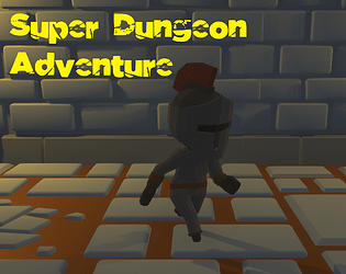
As this was my first attempt to make an actual game I definitely learned a lot from doing this - while my game is very different from what I pictured at the start of the jam, I'm still really pleased with it!  My game was made in Unity, and while I'd followed a few tutorials before, this was the first time I was having to piece things together myself.

My main takeaways were:

  • Learning the basics of importing models and animations.  I spent a good few hours just figuring out how to get the rigging/avatar importing properly, to say nothing of how to trigger the animations on cue!  I also really want to learn the basics of making my own sprites/models, but that's a whole other rabbit hole to go down...
  • Getting to know the different types of colliders and physics systems.  I managed to make a really impressive special effect where the walls and features of my level broke apart and drifted off into the abyss, which would have been great if only I had meant to!
  • Focus on making the bare minimum of a game that can be played from beginning to end - it was so easy to get distracted by trying to add a particular feature or keep on tuning it!  In the end, I'm really glad I scaled things back to tick off the core gameplay ideas as otherwise I would have run out of time with only a half finished game.  It's much easier to add content/features into a functional game than it is to try to make a game out of a collection of features, especially with that deadline looming!

All in all, I had a great time!  I'm also really impressed by the submissions of the other entrants - I've seen some amazing games this week, and I'm already looking forward to my next gamejam!

The presentation on this game is fantastic, and I was really impressed with the intro & ending cutscenes! 

I would say that the ship could do with having its base movement speed increased slightly, as at first I thought I needed to hold down the left mouse button to move.  However, it did help to sell the feeling of the ship being a large capital ship rather than a fighter, so I can see why you went with it - I think maybe it just needed more of a visual indication of movement, such as more of a thruster effect from the engines.

The combat was well done, I liked the more hands-off approach of the guns auto-firing - great job!

I liked the maze layout and enemy placement, they made it tricky to get through but there was just enough room to get around.

I did have an issue with the red enemies - it looked like they were suddenly shooting in from other rooms in the maze the moment they came on screen, but it was still possible to keep ahead of them.

The powerups/abilities were well implemented, and I liked the music too :)

I enjoyed playing this, the control system worked really well (I used the point & thrust scheme) and it had the feel of some old-school space shooters.  The visual style and music worked very well together, and I liked the way pickups would orbit you once or twice before being vacuumed up.

My only problem was that I wasn't able to finish, I was in the last (I think) stage with everything upgraded to level 4, but when I got killed I respawned in a small gap in the walls so I wasn't able to move.

This is a great looking game, the lighting and effects really helped to give it a very polished feel.  I also liked how the puzzles were very clear in what you needed to do without needing excessive explanation.

I liked the feel of the game, and having procedurally generated maps helps to keep it fresh.

I think that it could have done with a little more signposting of roughly where the next soul is, but it came together well as an exploration FPS

This is a really fun game - it had a great feel to it, as you always felt like you were just on the edge of being "fast enough" to get through!  I also liked how the powerups and map design meant that you could take shortcuts and get more of the gems.

This was a great idea, an interesting mix of genres - I enjoyed playing it!  Linking the jumping and shooting together gave it a rhythm-game like feel and helps it to stand out.

I didn't spot anything that indicated whether taking a hit would end the game or give you a buff (but that could just be me not noticing it), but other than that I felt it played really well.  

This was a fun game - I like how the ghosts are used as currency for upgrades :)

(1 edit)

The graphics and atmosphere were amazing, if a little dark!  I loved the physics of the ghost, with the billowing cloth and the slight head-turns as you were looking around.  The changing of the colour/temperature of the light as it faded away was a really nice touch too.

My only critism would be that I wasn't sure if I'd reached the end of the area or just couldn't see the way through (after the long stairs up and the two jail cells).  I'd love to play more of this :)

Thanks, I do have ideas on improving and expanding on the game so once I've got my Unity skills up I might well revisit it!

The game was really nicely put together and looks like it could be a lot of fun for a local co-op session - I gave it a quick try solo and I can see how the switch between racing for the power up and then avoiding the ghost would work really well!  The music was also a great fit and really helps to add to the atmosphere :)

Thanks for the comment - I hadn't picked up on the difference between the vertical and horizontal speeds, but I do agree that the hitboxes & collision detection is a bit janky :)

I really liked this, and well done for producing all the assets yourself!  

The two mechanics worked together really well, and the way each level expanded on the basics to produce more challenging puzzles was really nicely put together.  I did feel like level 6 was a bit unforgiving with the collision detection, as hitting the side of a downward facing spike could kill you.  Still, I persevered and got to the end :)

Thanks - I did originally intend for the two halves of the game to be more closely linked but I didn't have enough time to get that in place. Still, there's always opportunity for a sequel!  

Thanks for the comments and for flagging up that bug, I'll see what I can do to get it fixed

I really liked it - you made a really good cohesive theme with the graphics & sound, it comes across as very polished!

The graphics are beautiful, and I really liked the overall design! The changing of the music and atmospherics between the different areas was really nice and it helped to show the journey of the character.

The only technical issue I could see was that after opening the door to the house in the first area, the subtitles on a couple of lines were overflowing outside of the backing image, making them a bit hard to read.

Thanks, I'm really glad you liked it!