Thanks so much! Appreciate the feedback!
yestermonth
Creator of
Recent community posts
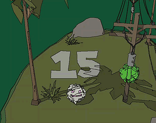
Thanks! Yea - the intent was that you would basically AIM before MOVING. So pick a good angle at start of game and then find angles while character is moving (either to target or along power line etc.) A few days isn't enough time to really get the game feel perfect but I'm still overall pretty happy with the results given the time constraints. Thanks again!
I really liked the art style here! The music never played for me - not sure if there was any or not, there was a checkbox for it though :) and other Unity games played music fine in WebGL so not sure what was up there.
The platforming was a little bit difficult - it had that floaty feel you get with the default Unity rigidbodies which makes it difficult to precisely control things. Nevertheless, I do enjoy these two character puzzle games that we're seeing in this jam so well done!
I really liked the general concept here but unfortunately it feels like you need to open up a constellation reference in order to play this correctly. In general, it isn't fair to ask your players to consult outside material in order to complete your game. I think at a design level, it can be OK to require community knowledge for more esoteric aspects of a game - for example in dark souls there are a bunch of hidden mechanics that aren't ever explained - but the main mechanic of the game shouldn't require a second monitor.
That having been said - I really liked the idea here with connecting colors together and the rulesets for how the colors connect. Also the sound design was really nice.
Nice job!
So yea, the art style on this is great. Really nice. Unfortunately, the controls are difficult to come to grips with. I thought my build must be bugged or something because I was having to hold down for so long to get the character to jump high enough. Additionally left/right jumping is very difficult to get accurately. I think a few small tweaks and you could really improve this in the future!
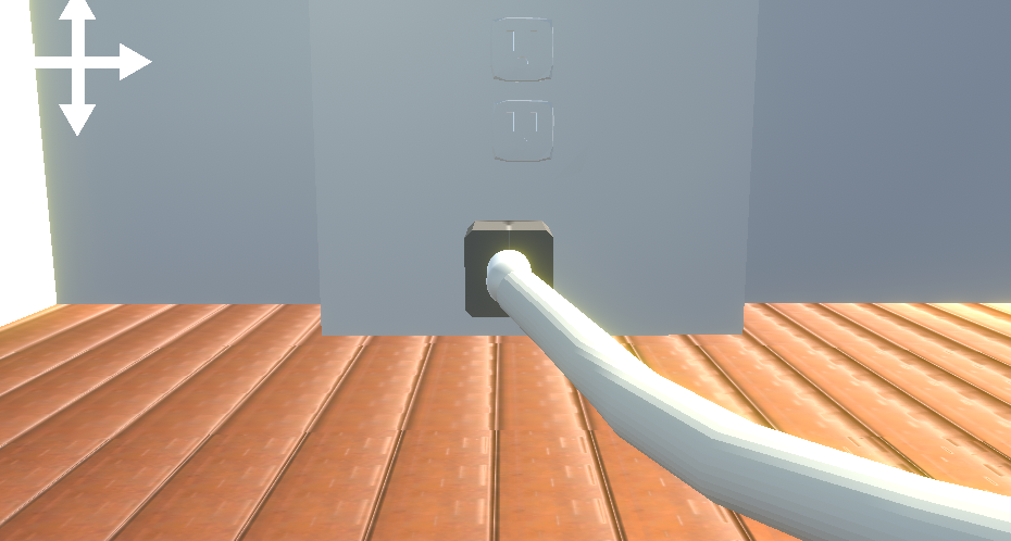
So I've seen a couple of these tehtered games in this jam so far - but this is the first 3D one I've seen. I'm going to give you the same feedback I've left on the other ones - I think it would be a lot easier if the controls were screen relative instead of character relative. It seems to me that having WASD control whichever character is on the left and arrows do the right character would work out better. I could be wrong, but 2d or 3d it's hard to keep track of which character is controlled by which side.
You at least do have the UI that shows up above their heads but you start to tune out stuff like that and then have to keep referring back to it when you go to move someone.
Nice art work by the way.
I had a hard time getting started - the buttons didn't work in the WebGL build but it seems like you didn't need them because you could just press ESC to hide the menu. The mouse sensitivity was super high in the WebGL build so an option to control that would be nice. Love the art style / sound design - really creates the vibe you were going for.
Oh. My. God. This was AWESOME. I bust out laughing when the guy says "WHY ME" haha. The art style reminds me of darkest dungeon for some reason. Actually I get a lot of darkest dungeon vibes from it - probably due to the unavoidable deaths. Really great job on this.
Edit: one suggestion, I would have preferred to have the option to use the left/right arrows to change the direction.
I love the art style on this! The music/sound seemed very low.
My biggest complaint is that the robot isn't really "responsive" enough to have such tight levels - especially at only level 3 it was quite difficult not hitting spikes. The double jump mechanic had a very big impulse after doing it which resulted in feeling like you can't really control the robot.
AGAIN - LOVE THE ART!
Great art style very dark and gritty. Reminds me of mobile puzzle game the room in that regard.
The ambient lighting definitely needs to be increased, it can be quite difficult to tell if gears are lined up or not. The other thing too that I struggled with is that nothing seems to spin until you get the exact right combination which made trial and error almost impossible.
Overall nice submission - there isn't anything quite like this in all the games I've played so far.
This is *really* good.
The pixel art work is amazing and this literally feels like I could have been playing an NES game. Very polished with a nice progression in difficulty.
I have one minor gripe: when the sunflower gets to the top of the screen, it becomes difficult to get it watered without hitting your head / losing track of your character. It just feels a little bit cramped. Otherwise perfect!
I was able to complete this and here are my thoughts
* Thank you for giving very generous checkpoints - that was great!
* Music / sound either wasn't included or just didnt' work for me but it would have been nice to have some sound.
* I leveraged the AI companion having better jump than me to save myself multiple times - I think this is a *feature* but wasn't sure, for example, I would be falling towards spikes while she was making it over succesfully so I just Q'd to her :)
overall nice job getting it submitted!
Really nice work for your first game jam. Obviously sound/music would have been nice, but you did really well with the theme. One recommendation I would have is control-wise, I *think* it might have been easier to have WASD control the left player / arrows control the right player (regardless of which color is on left/right). What happens is that you forget which player is which and you're constantly using the wrong keys. The visual on the screen isnt' matching the keyboard layout once they flip around and it gets confusing. Having WASD always control whichever character is on left and vice versa would have been a lot easier.
Nice job!


