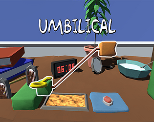
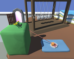
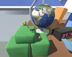
My daughter loved this, we spent quite some time playing it and yelling at one another to "move over a bit". Really well done. Premium art direction.
From time to time we got stick on the walls a bit. but likely an easy post-jam fix. Well done!
Play game
Umbilical's itch.io pageResults
| Criteria | Rank | Score* | Raw Score |
| Theme | #125 | 3.571 | 3.571 |
| Innovation | #217 | 2.952 | 2.952 |
| Overall | #244 | 2.967 | 2.967 |
| Art Direction | #270 | 2.905 | 2.905 |
| Game Design | #276 | 2.810 | 2.810 |
| Fun | #315 | 2.595 | 2.595 |
Ranked from 42 ratings. Score is adjusted from raw score by the median number of ratings per game in the jam.
Comments
Love your interpretation of the theme! The game reminds me of unravel on the switch. The mechanics work well and your game is oodles of fun!
Nice game. I like the mechanic. I think jump is too floaty, and perhaps play a bit more on elasticity. I like the 2.5D point of view, and camera was well managed. That's a good work.
A fun and quirky entry in to the jam. I definitely think it would be better play with another person but it is still enjoyable on your own. Wasn't expecting such somber music going in but surprisingly it fits quite well with the game. Well done!
I played the windows build and the controls were pretty difficult to grasp, I got stuck at level three cause I couldn't get enough height to get both the blocks over the third blue rectangle, and you couldn't jump off of the smaller blue rectangles either which would have made the platforming easier. I also wasn't sure what the function of the umbilical cord since it doesn't restrict how far apart the blocks can be and pulling didn't really help with anything either. Is there maybe some physics trick I'm missing? I feel like allowing the player to jump off of the blue rectangles would have solved a lot of the issues I was having. I also feel like increasing the amount of vertical distance a block can move after being pulled by the umbilical cord would have been better for the game. I gotta say though, having the clock show my time was pretty neat and the art was nice to look at. The idea itself is really good and just needs the physics polish so blocks move in a more definitive way, good work!
cool concept and great take on the connected theme! nice submission
The controls were a little bit tricky to handle but it's a cute little puzzle game that fits the theme well =)
Nice graphics and music, good approach to the theme. I love the idea that the game can be played by one or two people. Unfortunatelly wacky controls kills the experience, it's so easy to fall out of the game map.
I'm really impressed with the mechanics and physics of the game however I did find it to be quite fragile. With more time I imagine you could tighten the controls and dial in the physics more and it would be a really solid experience. The objects feel quite light and having no weight or presence in the world.
Having said that the idea and overall implementation is really good and I think it has so much potential if you were to keep working on it. Congrats!
Really interesting game, I've seen quite a few tethered games of this nature but none multiplayer, none 3d, and absolutely none with such a rubber band tether like this one lol!
I have to say while it is a cool game, in practice it just feels like you're constantly fighting with the weird rubber band tether and trying desperately to not fly off the map. I'm not quite sure what could be done to fix this but it's worth looking into.
All in all though a really cool concept and I'd love to see what you do with it in the future!
Great job friend :D
So I've seen a couple of these tehtered games in this jam so far - but this is the first 3D one I've seen. I'm going to give you the same feedback I've left on the other ones - I think it would be a lot easier if the controls were screen relative instead of character relative. It seems to me that having WASD control whichever character is on the left and arrows do the right character would work out better. I could be wrong, but 2d or 3d it's hard to keep track of which character is controlled by which side.
You at least do have the UI that shows up above their heads but you start to tune out stuff like that and then have to keep referring back to it when you go to move someone.
Nice art work by the way.
Love the art style and animation on the menu. It reminded me of old school 3d animation graphics from the 90s. The music was cool too. The concept was unique. Loved that there were separate controls for each part, which could be a fun co-op dynamic, but also made for a challenging single player experience.
A few bugs I ran into:
- Sometimes the left cube wouldn’t jump when I was on top of something, which made the platforming a bit difficult at times.
- The inertia of objects in motion felt a tad strong, though it was pretty fun to yeet across the screen from using the pull mechanic.
- I also got stuck on level 3. That final jump to get onto the big box was a bit steep and proved kind of challenging.
Really cool mechanics overall though! With some polish I think this could be top notch for sure!
The way the theme is incorporated is very creative, I really like the backgrounds i think they look amazing. personally for me the audio needs setting or the theme music needs turning down slightly. a couple other bits of constructive feedback. I think the levels aren't designed particularly well especially the second one with the button as it feels like your not meant to be that far apart and is very difficult to do and sometimes would result in the physics just breaking and sending me flying. I think the mass of the objects needed turning up slightly as they moved to quick and would just fly of the table, even the camera cant keep up and just resulted in me seeing nothing every now and again. One last thing I thought could of been better is the main characters, as they seem to just be colourless cubes? it doesn't seem to fit the aesthetic especially as most of your background assets look amazing. Lastly I thought the theme was incorporated really well and was clear to understand. overall i think the game has a lot of potential and I cant wait to see it developed.
Very creative take on the theme!
I played alone, so I probably missed on part of the fun.
Music overwhelms the other sounds and there's no way to mute it or change the volume.
As others wrote, physics is a bit strange, I also noticed that you can jump on the walls on the first level but can't jump again from there.


Leave a comment
Log in with itch.io to leave a comment.