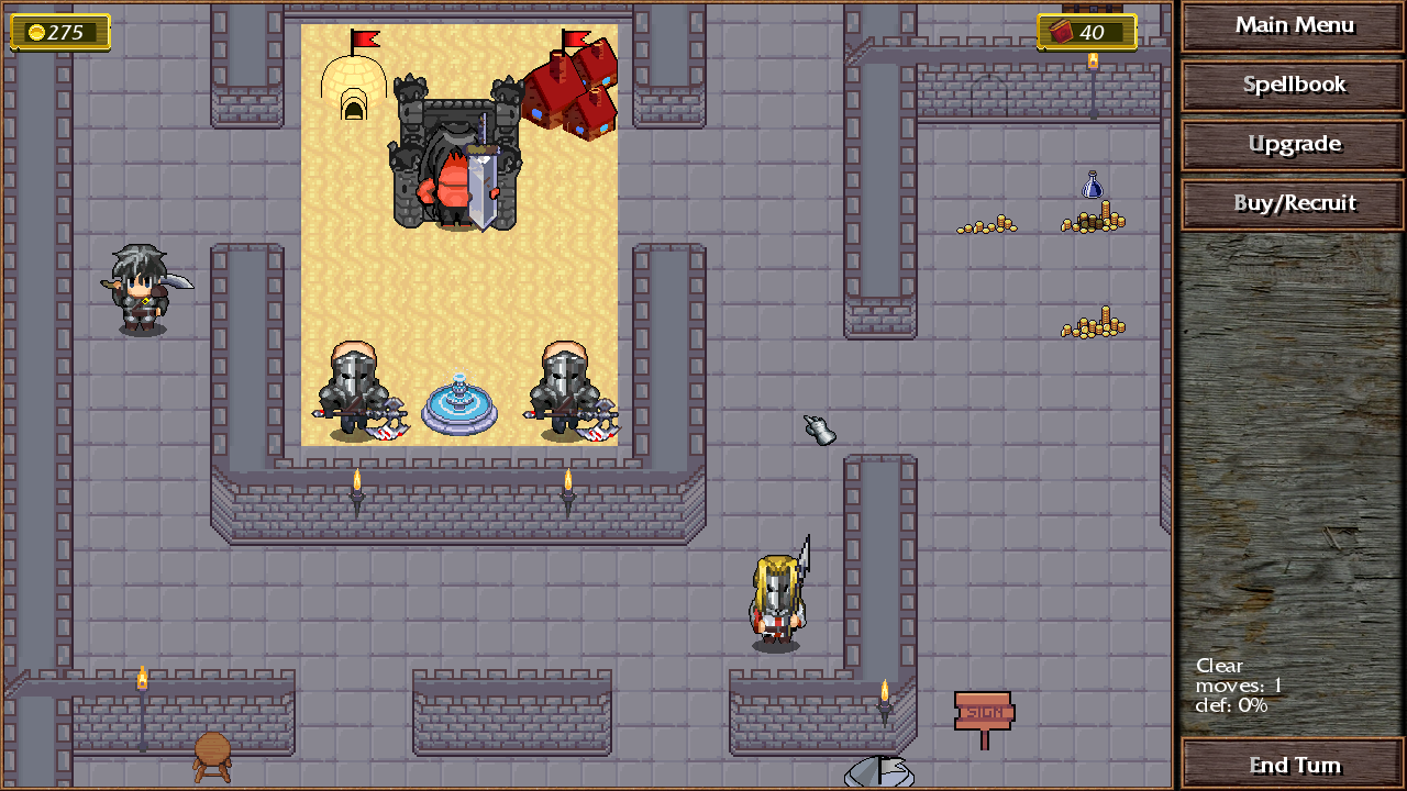
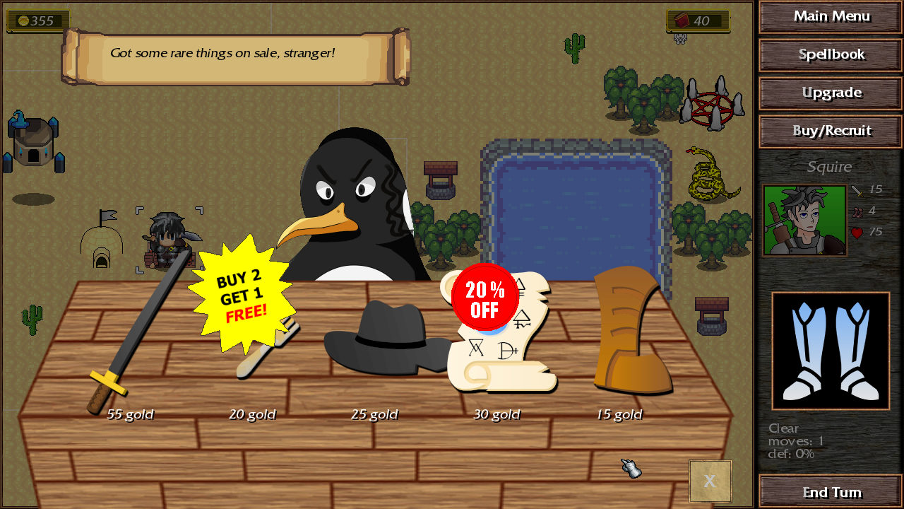
An interesting twist on a strategy RPG. I actually quite enjoyed the humor, though it's EXTREMELY subjective - you'd either love it or hate it. The shopkeeper at the starting map increased the price for the potion after I bought the boots - dunno if that is intentional or not.
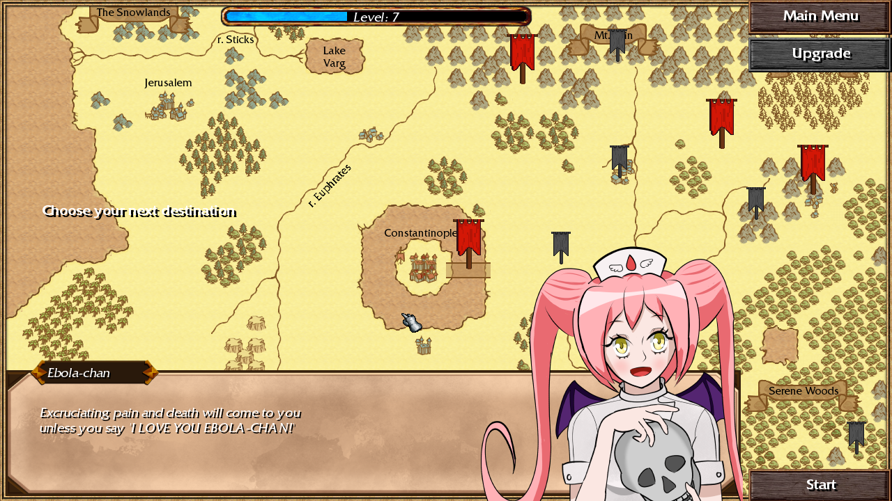
My only complaint would be - it doesn't really feel like you're progressing. The campaign maps are fairly short, but the buffs/items don't carry over to the next map, which is a bit underwhelming. I didn't actually find out what the "Level" bar on the main map does when it fills up, so maybe I missed that.
A cute little game. Very lighthearted, with well paced maps.
The shopkeeper tries to scam you on the first level and keeps increasing the price of the potion so that you can't afford it for a few turns. Maybe the first map is not the best place for a gimmick like that but I'm not sure where else to put it.
The level bar unlocks upgrades but that's not super relevant in the demo, you only get one towards the end. That's the only thing that you really keep between maps, my goal is to focus more on the strategy aspect rather than the rpg part. I'll consider either having other rewards for finishing levels or giving players more units earlier on to make it feel more like a strategy game.
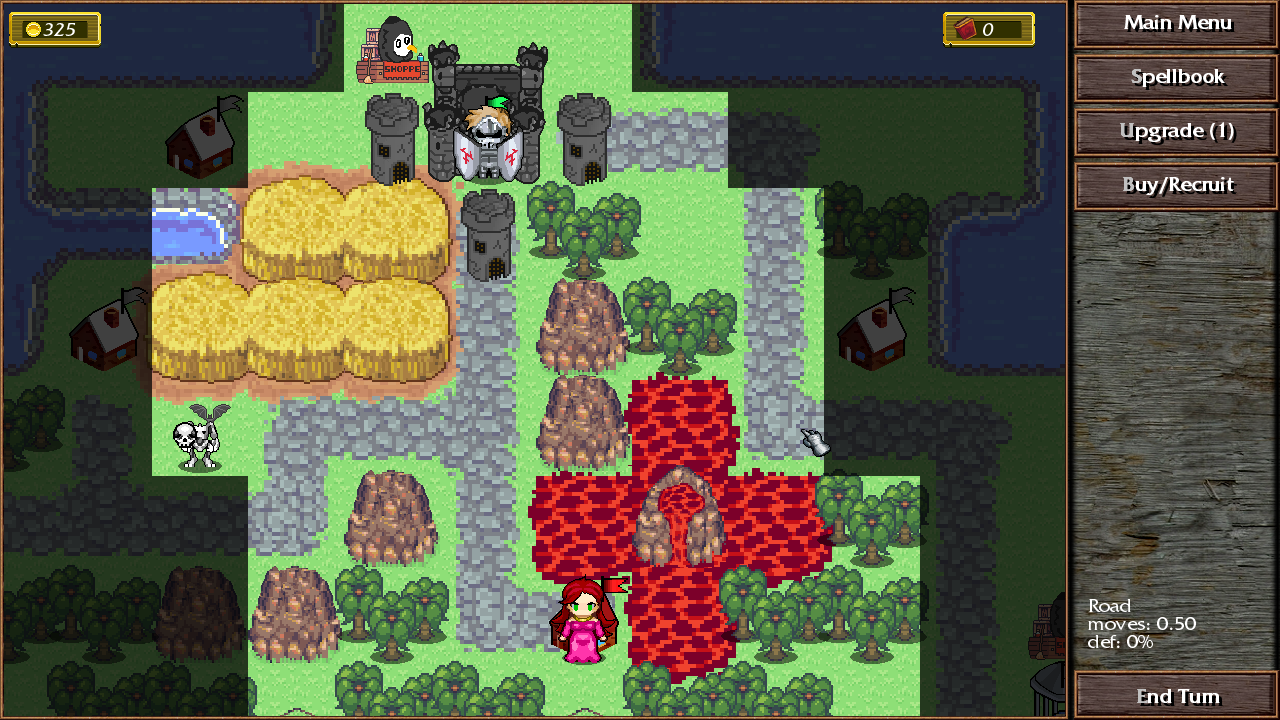
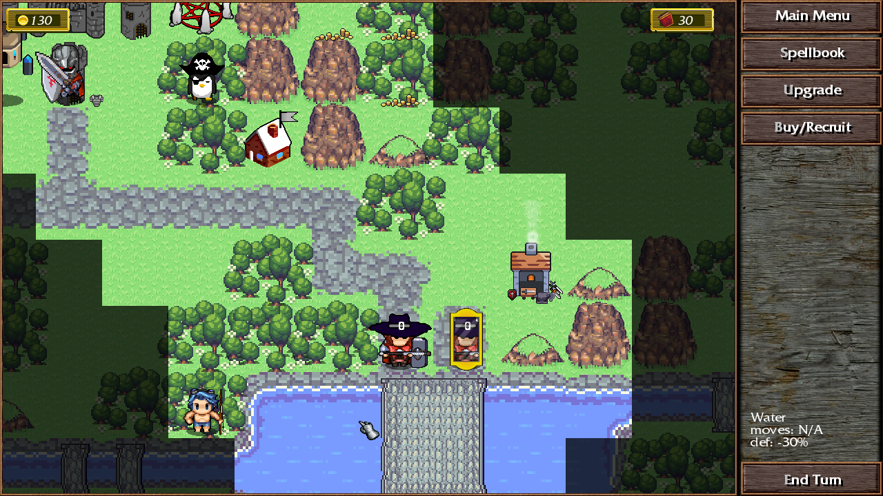
The wood mechanics and the lumberjack's interaction with that is interesting. I like all the unique little gimmick uses of srpg mechanics actually.
The end turn animation takes too long. A lot of stage mechanics require you to end turns a lot and it's not pretty.
Panning the map is not intuitive. The overlay that indicates your movement range is often not particularly noticeable against the background color. Pathfinding is aggressive enough to force you to take damage through flames, but not enough that I can move to an enemy tile to go there and attack with a single command?
Thanks for playing! I will try to shorten the end turn animation a bit.
To me panning the screen seems pretty intuitive but I have played a lot of rts games so maybe its because of that. There were some people that didn't figure it out at first but usually they got used to it over time. You can also move it with the arrow keys but I don't think a lot of people tried that. It did seem like a big issue for you though, there is a lot to explore to the right on the last stage where you died. Do you have any ideas on how it could be made more clear that there's more to the map and that the player should be moving the screen around more?
I think what makes the panning particularly worse is the fact that you're typically panning to the right, where you need to overshoot the fairly thick UI for any movement to happen. The cursor isn't even trapped in the game window either.
My muscle memory from all sorts of software is to hold the middle or right mouse buttons.
I very much enjoyed it, completed the whole demo. A lot of good stuff, I felt that the difficulty curve was good, and it felt satisfying to put it together in the final battle. A couple of things to think about:
The most glaring thing has to be the mixels. It just looks so distracting. You could maybe get away with the characters being a different pxiel size if you must, but having the roads and buildings being different from the grass and rocks is a step too far. You could just scale up/down assets sizes and it would be a big improvement, even without any cleanup.
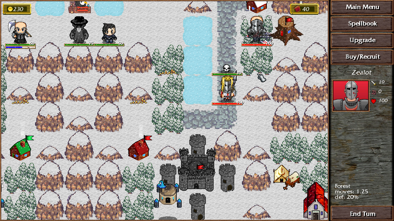
The white objective text blends in to the snow white backgrounds, maybe put a border around it.
The buying units menu was a bit unintuitive, I think there should probably be arrows to slide through the units, rather than having to click on the portraits of the left or rightmost unit to scroll through them. The 'buy' button probably shouldn't have grey text either, it makes it look like tis greyed out.
The amount of gold I got far outpaced the amount I needed, unless I missed some way to restock the shops, or increase my unit cap from 3.
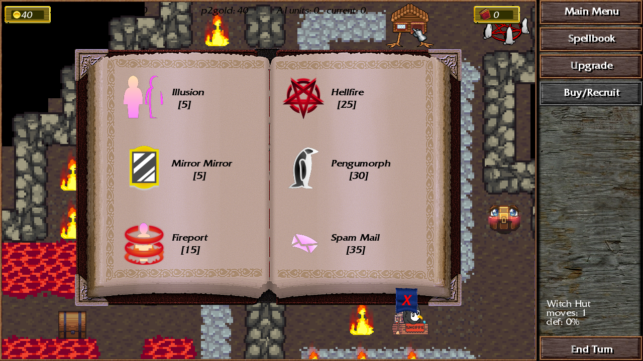
The level where you have to learn the spells was a bit boring, maybe you could come up with another way to teach each one in a specific situation, rather than just casting them, then waiting a turn each time.
A few times the text didn't load. Once when talking to the loli when we were being chased, then when the evil hooded figure showed up at the end and the elven archer started talking.
As a final thing, I wonder if anything could be done to speed up the turns, such as allowing us to move multiple units at once, or shortening the time in between turns. i know a lot of the time things like this can hard to change, but I think it would go a long way to make it more snappy.
I hope I don't sound too critical, this is the only demo I've played for a significant amount of time this dd, so you must've done something right to keep my attention. Good gameplay loop!
Thanks for playing! I'm glad you enjoyed it. It's not too critical, it's very useful feedback actually.
I will work on the mixel problem, I heard some other people complain about that too.
Some of the menus are a bit clunky still, the grayed out letter was supposed to hint at the hotkey for the menu but it's not very intuitive.
The text issue you are describing is a bit concerning, it sounds like an old bug where you could skip over the text if you press buttons too fast and go to the next dialogue but I thought I fixed it and I have not been able to recreate it recently. It would be helpful if you can describe how you did it exactly.
I will try to speed up turns, I don't think I can pull off multiple units moving at once but maybe I can shorten the time in between turns a bit. Thanks for the feedback again!
Ah I see, I think its actually not the issue I'm describing. There's a forced end turn in those two instances, not a bug. Maybe it's confusing if you are going through the dialogue quickly. Thanks for clarifying
1. There doesn't seem to be a way to save during a campaign. My last game crashed while trying to tab out so trying to save regularly for the second attempt but I don't see a way to do so.
2. Is there a downside to chopping down all the forest tiles in the first mission? It takes a lot of turns and is kind of a pain to do but it's free resources and I'm not seeing any immediate downsides.
3. I like the extensive enemy summaries with all the fluffy details.
4. I see. Gold gets reset between Campaigns? Did I miss the hint for that? But them again you still gain a lot of exp for chopping I guess? Chopping woods is really not enjoyable. Wait level also resets?
5. The sign in the winter area just makes a sound but doesn't show anything.
Thanks for the feedback! There is no way to save ingame, unfortunately, its just in-between missions and specific checkpoints. It is a little concerning that it crashed, I've never had that happen and I alt tab out of the game regularly. Can you tell me what OS you are using and how the crash happened exactly?
The levels are meant to be more like a strategy game where its balanced around the units you start with so carrying resources/units over would break the balance. It's mostly the introductory stages where you only have one or a few units but I think that gives people the wrong expectations. I will think of a way to explain that better.
i feel like you should flesh out the main skeleton of the game a bit more before adding more content
like, even the text boxes, it feels kind of awkward to pick the next one when you have a selection. the options should be bigger, and maybe buttons rather than simple lines of text.
Thanks for playing! Can you give me some specific examples on what felt awkward to use? And are you talking about the selection for multiple dialogue options?
Played until the "loli character" joined the team, sorry this story is too retarded for me to push through, I can't stand the humor. Clearly a lot of work has been put into this and there are very likely people who will find this funny, sorry, just not for me.
Improvements could be: original music, more cohesive art assets, quicker enemy turns. Good luck with your game!
Yes, the character art and the map art seem a bit at odds with each other, mainly for the environmental stuff. Could perhaps go with a more cartoony artstyle to fit the characters.
Is this made in gamemaker or something? The asset files really need to be a subfolder:
I tried it out with proton and it seemed to work okay until I moved the dude onto the first sign which caused it to crash from freeing an invalid pointer. I don’t know if it was too early for it to kick in but I also didn’t hear any of the music.
Didn’t play enough to really comment, looks like it’s funny.
Yes, It's an older version of gamemaker too so I kinda doubt that it would work on anything but windows, sorry. I think I had someone test it on linux with wine and it didn't seem to crash but there was also no sound there.
I will organize the files better in the future, I know its a bit of a mess now

Comments
An interesting twist on a strategy RPG. I actually quite enjoyed the humor, though it's EXTREMELY subjective - you'd either love it or hate it. The shopkeeper at the starting map increased the price for the potion after I bought the boots - dunno if that is intentional or not.
My only complaint would be - it doesn't really feel like you're progressing. The campaign maps are fairly short, but the buffs/items don't carry over to the next map, which is a bit underwhelming. I didn't actually find out what the "Level" bar on the main map does when it fills up, so maybe I missed that.
A cute little game. Very lighthearted, with well paced maps.
Thanks for playing, I'm glad you liked it.
The shopkeeper tries to scam you on the first level and keeps increasing the price of the potion so that you can't afford it for a few turns. Maybe the first map is not the best place for a gimmick like that but I'm not sure where else to put it.
The level bar unlocks upgrades but that's not super relevant in the demo, you only get one towards the end. That's the only thing that you really keep between maps, my goal is to focus more on the strategy aspect rather than the rpg part. I'll consider either having other rewards for finishing levels or giving players more units earlier on to make it feel more like a strategy game.
The wood mechanics and the lumberjack's interaction with that is interesting. I like all the unique little gimmick uses of srpg mechanics actually.
The end turn animation takes too long. A lot of stage mechanics require you to end turns a lot and it's not pretty.
Panning the map is not intuitive. The overlay that indicates your movement range is often not particularly noticeable against the background color. Pathfinding is aggressive enough to force you to take damage through flames, but not enough that I can move to an enemy tile to go there and attack with a single command?
Thanks for playing! I will try to shorten the end turn animation a bit.
To me panning the screen seems pretty intuitive but I have played a lot of rts games so maybe its because of that. There were some people that didn't figure it out at first but usually they got used to it over time. You can also move it with the arrow keys but I don't think a lot of people tried that. It did seem like a big issue for you though, there is a lot to explore to the right on the last stage where you died. Do you have any ideas on how it could be made more clear that there's more to the map and that the player should be moving the screen around more?
I think what makes the panning particularly worse is the fact that you're typically panning to the right, where you need to overshoot the fairly thick UI for any movement to happen. The cursor isn't even trapped in the game window either.
My muscle memory from all sorts of software is to hold the middle or right mouse buttons.
I very much enjoyed it, completed the whole demo. A lot of good stuff, I felt that the difficulty curve was good, and it felt satisfying to put it together in the final battle. A couple of things to think about:
The most glaring thing has to be the mixels. It just looks so distracting. You could maybe get away with the characters being a different pxiel size if you must, but having the roads and buildings being different from the grass and rocks is a step too far. You could just scale up/down assets sizes and it would be a big improvement, even without any cleanup.
The white objective text blends in to the snow white backgrounds, maybe put a border around it.
The buying units menu was a bit unintuitive, I think there should probably be arrows to slide through the units, rather than having to click on the portraits of the left or rightmost unit to scroll through them. The 'buy' button probably shouldn't have grey text either, it makes it look like tis greyed out.
The amount of gold I got far outpaced the amount I needed, unless I missed some way to restock the shops, or increase my unit cap from 3.
The level where you have to learn the spells was a bit boring, maybe you could come up with another way to teach each one in a specific situation, rather than just casting them, then waiting a turn each time.
A few times the text didn't load. Once when talking to the loli when we were being chased, then when the evil hooded figure showed up at the end and the elven archer started talking.
As a final thing, I wonder if anything could be done to speed up the turns, such as allowing us to move multiple units at once, or shortening the time in between turns. i know a lot of the time things like this can hard to change, but I think it would go a long way to make it more snappy.
I hope I don't sound too critical, this is the only demo I've played for a significant amount of time this dd, so you must've done something right to keep my attention. Good gameplay loop!
Thanks for playing! I'm glad you enjoyed it. It's not too critical, it's very useful feedback actually.
I will work on the mixel problem, I heard some other people complain about that too.
Some of the menus are a bit clunky still, the grayed out letter was supposed to hint at the hotkey for the menu but it's not very intuitive.
The text issue you are describing is a bit concerning, it sounds like an old bug where you could skip over the text if you press buttons too fast and go to the next dialogue but I thought I fixed it and I have not been able to recreate it recently. It would be helpful if you can describe how you did it exactly.
I will try to speed up turns, I don't think I can pull off multiple units moving at once but maybe I can shorten the time in between turns a bit. Thanks for the feedback again!
The text issue probably was from me clicking or skpping too fast. The text box dissapeared and there was a black bar along the bottom of the screen.
Ah I see, I think its actually not the issue I'm describing. There's a forced end turn in those two instances, not a bug. Maybe it's confusing if you are going through the dialogue quickly. Thanks for clarifying
1. There doesn't seem to be a way to save during a campaign. My last game crashed while trying to tab out so trying to save regularly for the second attempt but I don't see a way to do so.
2. Is there a downside to chopping down all the forest tiles in the first mission? It takes a lot of turns and is kind of a pain to do but it's free resources and I'm not seeing any immediate downsides.
3. I like the extensive enemy summaries with all the fluffy details.
4. I see. Gold gets reset between Campaigns? Did I miss the hint for that? But them again you still gain a lot of exp for chopping I guess? Chopping woods is really not enjoyable. Wait level also resets?
5. The sign in the winter area just makes a sound but doesn't show anything.
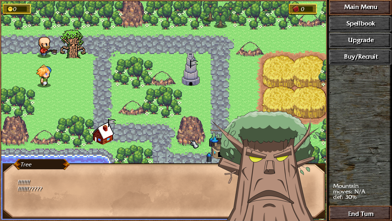
6. It's cool that you can chop signs.
Thanks for the feedback! There is no way to save ingame, unfortunately, its just in-between missions and specific checkpoints. It is a little concerning that it crashed, I've never had that happen and I alt tab out of the game regularly. Can you tell me what OS you are using and how the crash happened exactly?
The levels are meant to be more like a strategy game where its balanced around the units you start with so carrying resources/units over would break the balance. It's mostly the introductory stages where you only have one or a few units but I think that gives people the wrong expectations. I will think of a way to explain that better.
Windows 11. But I am playing on a Laptop with relatively little RAM so I would guess that could somehow be related.
i feel like you should flesh out the main skeleton of the game a bit more before adding more content
like, even the text boxes, it feels kind of awkward to pick the next one when you have a selection. the options should be bigger, and maybe buttons rather than simple lines of text.
Thanks for playing! Can you give me some specific examples on what felt awkward to use? And are you talking about the selection for multiple dialogue options?
yes the dialogue options are pretty small and at first i didn't register them as "buttons"
Played until the "loli character" joined the team, sorry this story is too retarded for me to push through, I can't stand the humor. Clearly a lot of work has been put into this and there are very likely people who will find this funny, sorry, just not for me.
Improvements could be: original music, more cohesive art assets, quicker enemy turns. Good luck with your game!
Thanks! Can you elaborate on your issues with the art?
Yes, the character art and the map art seem a bit at odds with each other, mainly for the environmental stuff. Could perhaps go with a more cartoony artstyle to fit the characters.
Is this made in gamemaker or something? The asset files really need to be a subfolder: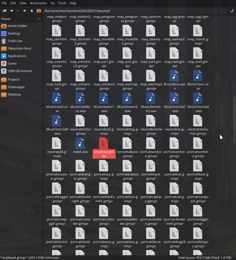
I tried it out with proton and it seemed to work okay until I moved the dude onto the first sign which caused it to crash from freeing an invalid pointer. I don’t know if it was too early for it to kick in but I also didn’t hear any of the music.
Didn’t play enough to really comment, looks like it’s funny.
Yes, It's an older version of gamemaker too so I kinda doubt that it would work on anything but windows, sorry. I think I had someone test it on linux with wine and it didn't seem to crash but there was also no sound there.
I will organize the files better in the future, I know its a bit of a mess now