Indie game storeFree gamesFun gamesHorror games
Game developmentAssetsComics
SalesBundles
Jobs
TagsGame Engines

Penguin Garden

30
Posts
3
Followers
A member registered Jun 15, 2020 · View creator page →

Creator of

Recent community posts

Thanks for playing, glad you liked it! 

The druid has an upgrade that turns him into a tree if he stays in place for a turn. It makes him a lot stronger but it can be punishing if you do it accidentally so there is a way to revert it if you use his secondary skill. 

I did recently release the game on steam so I'm not sure if I'll be posting any more demos here. Ideally I'd want to show off my new project next time. The last demo in DD 57 was focused on the campaign and I think there are some VODs there if you want to take a look. 

Where is the nuke? I couldn't find it. It's really easy to get out of bounds in the randomly generated level and the brick house obliterated my framerate when I shot it lol. I do like the new defense level but it would be nicer if the artillery actually shot at the enemies and helped you a bit

I love card games, I will give it another try but so far I only had time for 1 run so I'll give me first impressions.

It feels a lot like a mix between Magic the Gathering and Hearthstone which is fine but I did find most of the card effects to not be all that exciting. Maybe its just because its your starting deck. There was a card that gives stats to another card when it enters the board but it could also target itself which felt weird to me but maybe I'm just used to it being different in other games. I'm not sure how much you want to focus on the AI but there was an instance when the AI could prevent losing but didn't. I had 5 damage and he was at 4 hp and he blocked the creature that dealt 1 damage because it was a good trade for him (if he had the life to survive). Overall pretty interesting idea but I'd love to see a lot more flashy effects and rewards for this kind of game

Thanks for the feedback! The end turn thing does make sense.

What was the character that changed appearance? The treehugger does say that it can't attack if you check his skills but I understand that there are a Lot of skills to read and people probably won't see all of them.

Also where is the new awoken demo, I wanna play it

I hate it, it makes me feel like a boomer. JK, I always sucked at platformers.
I got filtered at level 11. It is pretty fun and looks nice, I like that its very fast. It feels like the spikes could have slightly smaller hitboxes maybe, sometimes I died when I barely touched the edge. Pressing down and jump on keyboard didn't feel super natural and I had no clue about the wall jump until I accidentally discovered it. No idea if it was explained somewhere. I also hated the slippery platforms but maybe that's the idea. I don't really play these types of punishing platformers though so I can't add much else

Thanks for playing! I will check out the vod later.

Healing effects are not as accessible because I was a bit scared of players keeping all of their units alive and snowballing really fast. Having more units is very strong here because it lets you get all the resources on the map.

If you play on higher difficulties the computer gets more mana so he does tend to spam the most expensive spells often which could be annoying.

The game is edgy, true, I'm not sure if I'm going to change that direction in the future since the whole point of going indie is that you can do whatever you want but I guess it could be written a bit more professionally. You are right about the visuals, this is definitely something I'm going to put a lot more time into for my future projects

This is a totally different demo from the last one as it features some of the skirmish maps instead of the campaign.
No tutorial this time sorry

Thanks for playing, I'm glad you liked it. 

The shopkeeper tries to scam you on the first level and keeps increasing the price of the potion so that you can't afford it for a few turns. Maybe the first map is not the best place for a gimmick like that but I'm not sure where else to put it.

The level bar unlocks upgrades but that's not super relevant in the demo, you only get one towards the end. That's the only thing that you really keep between maps, my goal is to focus more on the strategy aspect rather than the rpg part. I'll consider either having other rewards for finishing levels or giving players more units earlier on to make it feel more like a strategy game.

Cool game, reminds me of the good old RPGmaker horror games. I'm not sure when I'll have time to finish it so I'll write something now (currently in the second part)

Why does the rake insta-kill you? It's not a big deal, sure, but it feels kind of annoying to make the player reload. I've played RPGmaker games with tons of insta-kills (Misao) but in that game it was established pretty early on that everything is dangerous and that you should be careful. Here, this is the only thing that kills you (as far as I can tell) and it doesn't even look that dangerous. You might condition the players to avoid everything that looks suspicious after that. Or you can go the other way and make everything kill you. I saw some beartraps that only did a little damage when you stepped on them.

Sometimes I selected a dialogue option by accident and I wasn't even skipping the text. It's usually not a big deal but it seems like your choices actually matter here and it would be bad if it changed how the game progresses without the player knowing what he picked. I think there was an option in RPGmaker to not select any dialogue options by default and you have to move 1 down to pick the first one. Might be worth considering for this game.

The soundtrack is really good.

Not much I can say about the gameplay, typical RPGmaker stuff. I do like that there is actual combat and not just story.

That's odd... I'm pretty sure I tried shift + right click and it didn't work but now I tried it again and it did. I wonder if I messed up something or if it was a bug.

I assumed there is no rally because all the other commands are on the menu but that one wasn't. I guess it just replaces the move command atm. Would also be nice to see your current rally point.

I'm sure you will, keep it up

The UI seemed pretty intuitive. The only thing I didn't figure out at first was that I didn't see the empty slots showing how many perks you can have but I don't think that was an issue. I am used to playing RTS games though so clicking on the towers seems natural to me, maybe not so much for other players. The other thing that took me some time to figure out was that I need to stand next to the towers to restock them. I wasn't sure at first if that showed their hp or what.

I think I played on normal with the timeslowing character and got around wave 23, I was still doing okay but I didn't have more time to play. It seemed pretty easy at first but the difficulty did ramp up towards the end and I actually had to pay more attention. I was mostly just using the submachine gun and I only tried the other weapons on the turrets, I picked 1 of each just to see what they do. I haven't played enough to be able to say much about the balance of the weapons and upgrades. My first impression is that spending most of my money on my main character is better than spending it on the turrets and I only spent money on them when it was way cheaper than the alternatives. The fences didn't seem very strong but I only started using them late so it could be because of that. I didn't notice any enemies that felt overpowered. The homing missile guys seemed annoying at first but I don't think they actually hit me. The other projectile enemies weren't too hard to dodge either. I think my biggest worry was to not get surrounded by melee enemies.

Hey, it's nice to see an RTS for once (and one that isn't just trying to copy sc2) I'll be a bit more critical because I'm more invested in this genre:

The engine is solid, the only issues I had were that units feel like they slide (they don't start moving to where you tell them to instantly which is fine but they do turn instantly which is weird) and sometimes the way that fog of war gets revealed seemed off. Would also be nice to be able to queue unit commands.

The idea of capturing bases that autoproduce units is fine but I didn't like the execution. First of all all the units seem very random and have nothing to do with each other so its difficult to get invested in the different "factions". I don't get how the buildings work, they don't have any tooltips and as far as I could tell they don't cost any resources? Can you just spam buildings forever? After I built them I figured out that they buff your units or something but it's not very clear, and it would be nice to know that before you build them. Personally, I would prefer if there were less different factions but they were more fleshed out with more buildings and unit options.

Units die way too fast so you cant micro them very much. I just waited until I got a bunch of units and sent them all to kill everything. That's kind of boring imo, you want the player to go out on the map early and engage in smaller fights. It also makes unit abilities not very important since a lot of the units are just cannon fodder. Control groups worked fine but they could maybe show the number you assigned them to so you know you made a control group with them. There were no rally points as far as I could tell? I liked that the map expanded and new enemies appeared but without being able to rally units it gets kind of tedious on larger maps.

Some skills like that of the skeleton are way too important and others aren't. If players don't click on enemy units and read them it could be a problem. I only realized what the skeleton did once I trained some myself so they kept respawning in my base and I had to set up towers there. Also the AI doesn't seem to know how to counter the skeleton either.

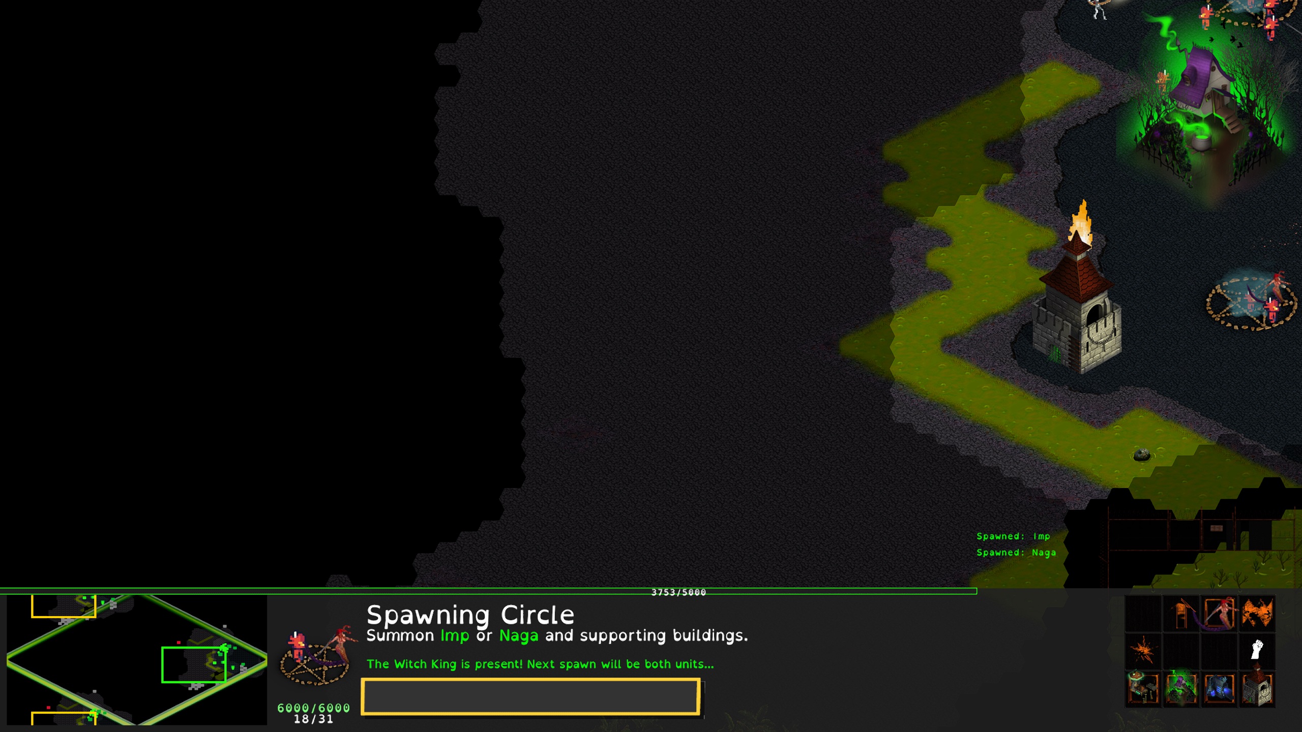
There was something wrong with my minimap, not sure why. It split into three:


I don't want to come off as too negative, I think you have a solid base for a game but I would like to see some tweaks in the gameplay.

Cool game, I like the different ways to spend your money and the combat feels good. It ran smoothly for me, even on browser. My only issue is that it feels a little samey after a while, could maybe need a change of scenery: like new areas of the map opening up or moving to a new location every X waves. There's already a way to move your buildings around anyway but I didn't feel the need to use it when I'm staying at the same place.

Horseshoe tank? Yeah right, that's gotta be a panzer 4, you can't fool me! I was going to complain that I can't play as them but you actually can unlock all the tanks so that's pretty cool. Customizing your loadout is also a fun feature. Is there a way to aim vertically with the 90mm? I did manage to beat the stage without doing so but it feels pretty weird. Level 2 had some slight performance issues. The repair sequence should probably have a timer? Now you can just take your time and it doesn't seem very difficult. 

I'm not sure what to say about the controls, the tanks are quick and responsive but I'm not sure if they should be. Depends on whether you value realism or more fun arcady gameplay more. I did actually prefer the third person view because in first person the camera is locked to the turret which moves slowly so its a bit more difficult to maneuver imo (probably easier to aim thought?) It wasn't very obvious when I'm about to die, especially when I was using the "horseshoe". Overall, it was pretty fun to play.

Thanks for playing! I will try to shorten the end turn animation a bit.

To me panning the screen seems pretty intuitive but I have played a lot of rts games so maybe its because of that. There were some people that didn't figure it out at first but usually they got used to it over time. You can also move it with the arrow keys but I don't think a lot of people tried that. It did seem like a big issue for you though, there is a lot to explore to the right on the last stage where you died. Do you have any ideas on how it could be made more clear that there's more to the map and that the player should be moving the screen around more?

I did check out the telescope but I wasn't really sure what it was showing me. I think the cube I couldn't figure out was the one that had 3 swirly things and one of them wasn't surrounded by solid tiles. Idk how to explain it lol. It was around the area where the camera follows you.

I tried all the characters and they seemed pretty different in power level. With the first one I blitzed trough everything and I don't think I even got hit once. She leveled up super fast and became overpowered very quickly. The bomb girl and the healer had interesting attacks but they were also a lot more difficult to use and get kills with consistently. There's also a bug where you attack when you pick a level up and that doesn't matter for most of them but its pretty annoying for the last character because it switches between heal and damage. Oh and occasionally I would start the game without a character, not sure what caused that. 

The core gameplay is fun and I like that there are hordes of enemies but the progression was a little weird, at some point in the midgame there weren't a whole lot of them on the screen but then before the boss spawned there were suddenly dozens of them everywhere. The level also gets a little empty after you destroy the barrels, I would like to see some different terrain features or obstacles. Oh yeah and it took me some time to actually find the boss, I know he spawns in the middle but its hard to tell where you are exactly.

I didn't look at the masteries very much, they seemed a little buggy. I couldn't exit the menu once and had to reset.

Other than that, it's pretty fun to play, good work

Everything looks really nice, I like the UI and the characters. My brain is too small for this game though, I think the best I got was around level 15. Are there plans to add more mechanics? The main gameplay loop is nice but I feel like there could be more to do, especially since is has a lot of characters, it would be cool if they were different from each other gameplay wise.

I played for a bit. I will say, I am really bad at puzzle games though. The only thing I really figured out was how to solve most of the cubes. No clue about the door or wand. I'm not sure how I feel about the camera, it took me some time to figure out I can move. There was one area where the camera was following you and it felt better. But if you want to keep the old school static camera for puzzle games it might be a good idea to experiment with a different way to move around - like point and click or something. The visuals for the environment were interesting. The font was a little hard to read. Would also like to see more feedback when you are going in the right way, I wasn't really sure what my goal was. Even if the puzzles are going to be really difficult and cryptic it would be nice to know what you're supposed to solve next.

I can't add much else, as I said, my experience with puzzle games is very limited.

Ah I see, I think its actually not the issue I'm describing. There's a forced end turn in those two instances, not a bug. Maybe it's confusing if you are going through the dialogue quickly. Thanks for clarifying 

Thanks for playing! I'm glad you enjoyed it. It's not too critical, it's very useful feedback actually.

I will work on the mixel problem, I heard some other people complain about that too.

Some of the menus are a bit clunky still, the grayed out letter was supposed to hint at the hotkey for the menu but it's not very intuitive.

The text issue you are describing is a bit concerning, it sounds like an old bug where you could skip over the text if you press buttons too fast and go to the next dialogue but I thought I fixed it and I have not been able to recreate it recently. It would be helpful if you can describe how you did it exactly.

I will try to speed up turns, I don't think I can pull off multiple units moving at once but maybe I can shorten the time in between turns a bit. Thanks for the feedback again!

Hey, interesting idea for a game. I think for this type of resource collection game you need the actual task of chopping wood to be Really fun. Right now it's a little clunky and it doesn't feel like the axe has much weight to it. It would be nice if it had a really big hitbox if you charge it all the way and it shakes up the tree. Right now it felt like the fastest way to chop was just spam clicking and ignoring the green bar. Would also be nice if your axe looked different when you upgrade it. Also, I was able to repeatedly buy upgrades, are they cumulative does it just use the most recent one?

Very fun game, probably the most enjoyable demo I tried so far. It plays like a finished game, I only have some minor issues. 

The weapon recharge bar feels kind of in your face, looked a little ugly to me. Can't it be the same way as the rock recharge? Or maybe if that's not enough it could have a visual or an audio cue. The menus work well but are a little tedious to go through, especially when I had a lot of items. I think it may be because its very small. I didn't check for any UI scaling options but the default felt tiny at least.

The weapons feel nice to use, I like the rocks especially because of headshots and bouncing. The spells are also very fun to use. Only the RMB attack felt a little underwhelming, its too similar to the LMB but very slow.

Overall, great job. Its a very solid base, just needs some more content.

Thanks for the feedback! There is no way to save ingame, unfortunately, its just in-between missions and specific checkpoints. It is a little concerning that it crashed, I've never had that happen and I alt tab out of the game regularly. Can you tell me what OS you are using and how the crash happened exactly? 

The levels are meant to be more like a strategy game where its balanced around the units you start with so carrying resources/units over would break the balance. It's mostly the introductory stages where you only have one or a few units but I think that gives people the wrong expectations. I will think of a way to explain that better.

Thanks for playing! Can you give me some specific examples on what felt awkward to use? And are you talking about the selection for multiple dialogue options?

I like the concept and the aesthetic of the game. I would suggest just straight up copying a lot of the controls from total war, no one is going to complain about that. Things like rotating the camera with q/e, unit control groups and unit control cards. 

Would be nice to gradually introduce new unit types, you have a bit too much to manage at first here. I'll talk about more general stuff though: Collision seems like an issue. Units bunch up together a lot. I had 4 tank destroyers that I ordered to attack 1 enemy tank destroyer, they all stacked together, got hit first and they all got stunned and soloed by the 1 enemy tank destroyer and that felt really awkward. They also went up really close, it's kind of difficult to tell how far units can fire, it would be nice to have some sort of range indicator or some indicator that they don't have line of sight on the target. I also had no idea that the green units are allies at first, it makes sense once you see enemy units but if you haven't seen any yet its kind of confusing.

I know good unit collision is a difficult issue to handle in 3d strategy games but I think it really improves the feel a lot so it's something I would focus on. It's more obvious for melee combat where you want to take up space and block others from getting there but it's still relevant for ranged combat because it's a natural way to prevent bigger armies from steamrolling everything by making it more difficult to have them all in a position to fire.

Wasn't a huge fan of the story levels but blasting things in the arcade was fun. 

Feels like you can't die if you know what you're doing though

I don't know how much I should nitpick since I don't know how much you plan to change but here are some random thoughts: 

Repair + railgun seems very strong, you can heal while reloading shots. It is fun to do but it made me not use the other weapons. The homing missile was also fun to use, I love the lock-on sound. Sometimes it blows up in your face when you fire it close to wall and its hard to tell what happened and where the missile is getting fired from. The other weapons seemed underwhelming compared to those two so I did not use them much.

The game was stuttering when I first started it. Eventually it ran fine but it was annoying at first. I couldn't check the controls when I'm in a game, it only shows the movement controls.

The enemies seem much more dangerous from up close, they drain your health very fast when they are next to you but aren't as dangerous from range. I'm not a huge expert on mecha games but imo it should be the other way around with strong enemies with powerful ranged attacks (that you can dodge hopefully) and small enemies with weak melee attacks that are annoying or maybe disable parts of your mech. Also I'm pretty sure some of the enemy projectiles disappeared while they were travelling. And even if they didn't they were far too slow to hit you.

I didn't really get what the items did. I assume one of them is a shield, no clue about the other two. It's probably explained somewhere but I feel like you should be able to figure it out yourself. Maybe there could be a voiceline or text message when you use one of them saying what exactly you are activating.

I like that there is an energy bar, having more things to manage is fun. I think it should also be drained by the sprint though and that way you can maybe make the sprint even faster? More mobility options is generally more fun

The movement and guns feel really smooth, I feel like that's the most important part for a boomer shooter so that's good. The only issue with movement I spotted was that I couldn't jump while I was next to something (it happened with one of the tables for sure). 

Some minor complaints: the jump sound gets annoying if you spam it, I need to have some feedback when I whack the walls with a melee weapon and more projectile enemies please. Would also prefer if the walker had a more interesting attack pattern, it just keeps shooting at you forever, even behind cover sometimes.

Thanks! Can you elaborate on your issues with the art? 

Yes, It's an older version of gamemaker too so I kinda doubt that it would work on anything but windows, sorry. I think I had someone test it on linux with wine and it didn't seem to crash but there was also no sound there. 

I will organize the files better in the future, I know its a bit of a mess now