Play smoke
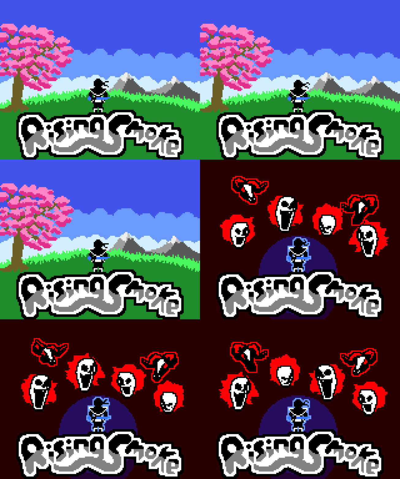
Rising Smoke's itch.io pageResults
| Criteria | Rank | Score* | Raw Score |
| INNOVATION | #42 | 3.971 | 3.971 |
| OVERALL | #45 | 4.065 | 4.065 |
| DESIGN | #49 | 3.978 | 3.978 |
| SOUNDS | #51 | 3.754 | 3.754 |
| VISUALS | #58 | 4.275 | 4.275 |
| MUSIC | #150 | 3.522 | 3.522 |
| THEME | #179 | 3.551 | 3.551 |
Ranked from 138 ratings. Score is adjusted from raw score by the median number of ratings per game in the jam.
Leave a comment
Log in with itch.io to leave a comment.



Comments
Wow. A crazy game is just what you were looking for. I loved your game, it's an excellent idea. I think you can get out of the JAM and turn the game into something much bigger.
Please rate mine !!
Sure, I’ll check it out after I’m done making dinner :D
Absolutely loved this game! bouncing from enemy to enemy was very satisfying. At times it did feel a bit difficult to judge exactly where to aim to hit someone and I had a few moments where it felt like I flew past someone I should have hit, but I think that's more of an issue with my judgement than actually the game itself. Still, a bit of player bias never hurts, so consider making the hitboxes a little bigger?
Either way this is really really fun and I'd love to see it turned into a bigger game.
oh... that game over screen... *chefs kiss*
I'll put 10 stars in innovation if it wasn't 5 max! (because both of the gameplay and your art style)
Also, good interpretation of the theme.
However I had some trouble to understand why I sometime can kill ennemies and sometimes not. That made the game way to difficult for me.
The cursor will change and turn red when you're close enough to dash into an enemy, but I think I've had a few times where I should've hit and I didn't. I'll look into it.
I know about the cursor, what I dont understant is why it dont turn red while I'm aiming at a monster. I thought it was because the monster was to far away but sometime it does that with monsters at close range too.
Oh, the whole thing about the game is your dash goes less distance the more you dash, then resets when you dash into a monster. So if you have dashed a bunch of times you have to be right next to the enemy for the cursor to go red.
The cursor is based off the range of the distance of your current dash
I love the 3D mix with pixel art - not a common path to take. Graphics and transitions are awesome. The game is abit hard and I wish I stayed alive for longer to enjoy slashing those angry skeletons. I am rating this one :) Well done. Check mine if you feel like and give me an honest opinion :)
Way ahead of you. I already played it XD I thought it was great but would be better as a phone game
cheers bro! Yes Totally agree with you. It's crying to be a mobile game.
I love the pixel art and the music!! The animations are really good too. I found it a little hard but overall it's really good!
Holy moly! You made this in a week?!? A concept I don't think I've ever seen before, jam or not, with fantastic sprite artwork and animations, super smooth gameplay and awesome satisfying kills? Damn son, very well done!!!
This game is just amazing! I literally couldn't stop playing. Everything is great, the graphics, the controls and gameplay. Good job!
THIS GAME IS SOO GOOD. It is really satisfying getting tons of kills in a row, and I love highscore chasing. Really well polished and addictive, no negatives from me!
A very good game! It's very well polished, the colors look good, the music not so much but the gameplay makes up for it. And if you added more levels and maybe a boss battle it might be an excellent full release game!
Yeah music's always been my weak point ngl. Thanks for the feedback!
Really nice work! I'm not good at this kind of game, but I'm a sucker for the pixellated art style. Very complete experience, with an options menu, nice game-over screen with animation etc. Well put together and there seems nothing really to add/remove :)
Great stuff!
I really liked the hands animation. I'm curious, is that a 3d model, that you treat with a custom shader, or an actual pixel animation?
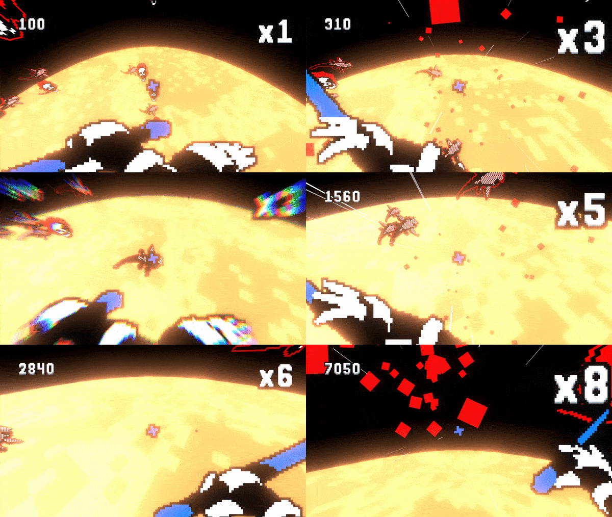
Some of the animations are hand animated (the ones that look worse). But the hands are 3D models yeah, I used a toon shader and lowered the resolution and anti-aliasing to make it into pixel art, then rendered them into 2D images and edited it in aseprite. Here's a pic of the model if you're interested:
I see you were using Blender for the animation. Thx for clarifying your workflow :) Super interesting!
This was actually incredible. I found myself replaying for quite some time! Sound is great, animations are great and the game play is addicting. For a 1 week game this is as good as it gets!! I'm saving this one to my collection!
Awesome art stile and love the combosystem!
Thanks! I honestly was thinking about basing the whole game around the combo system, it's probably my favourite bit of the game
This is one of the best games i played during this jam and i loved everything about it i really dont have any negative feedback and you should be proud of yourself, everything from the visuals to sound was super fun
Super fun game and it seems like you learned some stuff along the way which is the main point of these jams.
My only feedback would be enabling the adjustment of look sensitivity and add another layer of complexity for the player movement.
One of the games I actually enjoyed in the jam.
I don't like anonymous votes, so here is my rating.
Keep up the good work!
Thanks! If you go into the options menu, you can change the look sensitivity
Really good game! The gameplay is really engaging, and the combo system is very juicy! I also think that it fits the jam's theme very well.
I had fun while playing it even if I really suck at it ahaha you could add a gameplay video to show what it looks like when played by a pro
I actually have a video I want to add to the page, but I can't figure out how :,(
Ok, I think I've figured out how to add a gif, but it's not gonna be very lon
Try to load it on youtube and then embed the video in the game's page
Ok done, thanks a bunch. The videos just a regular run that I did, nothing all that special ngl
nice game Was very very fun!Well deserved 5 star..
Thanks a lot!
This was actually really dope! The mechanic is very hard at the beginning but once you pick it up it's very rewarding. Loved the art style as well. Nothing to add really, just that this concept could really be worked out further :)
Thanks a lot. I might try and do more with the concept at some point, I mean I really enjoyed making this game
I'm impressed! This mechanic is so satisfying, I could see a lot of people playing and replaying this for a long time, especially if you add an online scoreboard. Really cool game, congratulations!
This is my best score for now :)
Thank you! Here's my highscore in the current version if anyone wants to try and beat it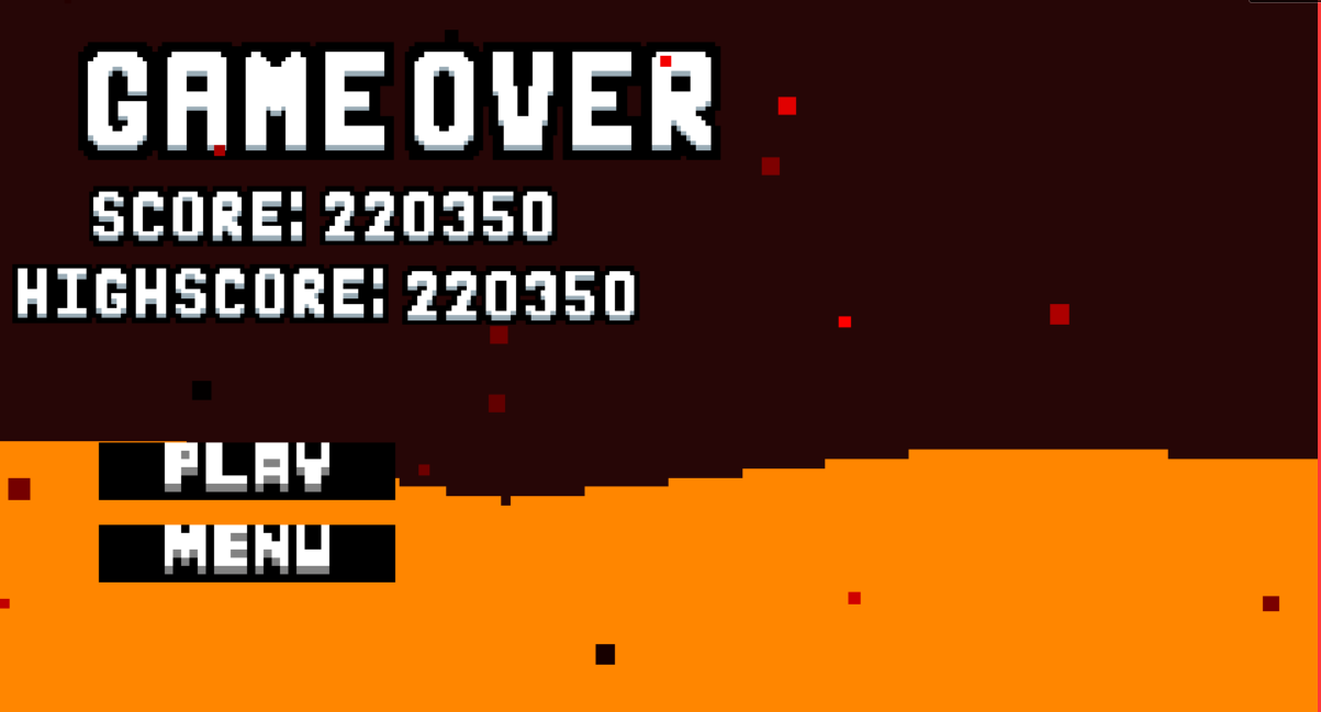
Extremly cool concept and very difficult. Not sure if this is intentional but the sprites look like they scale differently on the side of the screen vs when you look directly at them. Pretty trippy effect
Thanks a lot! That's because I upped the FOV a little bit, made it easier to see your surroundings