Play game
To The Core's itch.io pageResults
| Criteria | Rank | Score* | Raw Score |
| USE OF THEME | #2 | 4.429 | 4.429 |
| CONTROLS | #5 | 3.643 | 3.643 |
| Overall | #7 | 3.810 | 3.810 |
| SOUND/MUSIC | #12 | 3.714 | 3.714 |
| ART/VISUALS | #13 | 4.286 | 4.286 |
| BOSS DESIGN | #19 | 3.500 | 3.500 |
| FUN | #21 | 3.286 | 3.286 |
Ranked from 14 ratings. Score is adjusted from raw score by the median number of ratings per game in the jam.
Game's take on the theme
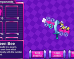
Our game is inspired by hollow knight but encourages the player to build their weapon out of scraps, resulting in a very makeshift (and very large) weapon.
Does your game utilize the PlusMusic plugin?
No
Did you use any third-party plugins other than PlusMusic?
Cinemachine
Leave a comment
Log in with itch.io to leave a comment.


Comments
Beautiful and colorful game! I love what you dids with the theme! Freat work! Just the dialogue are a bit slow :D
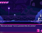
Somewhat grindy, even with a fully öpaded swod I didn't get past the intro boss, but that might be due to my ineptitude.
I did manage, however, to make a config where the fight bugs out. He gives is talk and then the game stops.
Save Loadout didn't seem to work properly as well, loading gave me an empty config.
For the main game-play my controller worked fine (although attack was a different button than the shop-keeper told me), but unfortunately not everything can be done with it...
Despite some shortcomings this one looks super polished, great graphics and sound.
The shopkeepr and dummy could use some movements, though.
I am truly impressed by the use of the theme, very good idea and implementation indeed, which directly translates to the good gameplay, pair this with the excellent art and visuals, I believe this game deserves to be the winner.
the visuals are really nice the graphic touch is original, big gg
I love the art and animations on this entry, (Especially the doggo), the theme was used very well but I do agree with some other comments on the fact that it takes a little too long before you can start the actual boss fights, Overall an amazing entry tho, good job!
I love the idea behind this game, the art is amazing and I love the dialogue. I would love to see some damage feedbacks from the enemies and the player.
The art is quite impressive, and there's a lot of love put into the story and characters. I do feel like it takes a little too long to get into interesting gameplay. The weapon builder is neat, good job on that! Unfortunately, a combination of contact damage from the boss and no invincibility frames when you take damage was a deadly one, so the fun started to fade after 3 deaths that felt a bit unfair. Consider adding some balancing, and you'll no doubt have longer playtime from more players!
I love the idea of this
you make this game is so good !! I like how you put your idea to this game !! Great game !
Good use of the theme! One of the most "makeshifty" games here!
Fun take on the makeshift! Not a fan of the music choice compared to the world that was built. I couldn't defeat the boss as every time I got close I took damage unless I was just on the edge of range.
Super fun game! I enjoyed the concept a lot and had fun mixing and matching the pieces on my sword. My only real critique is that it takes a while to beat anything, the boss health could be brought down a bit
Yeah, getting the boss health balanced with the component system was a bit tricky and I'm not sure we got it quite right. I'm so glad you had fun though and I appreciate the feedback!
Great makeshift concept. Great art for both the characters and the environments. Combat feels challenging but smooth. I spent more time fighting the first boss than I have on many entire games combined in this game jam. It was that fun. Every time I went in I felt rewarded, and I also felt like my skill was improving to an extent that actually made a difference.
Honestly, this game is good enough that it deserves a more detailed critique than just "oh I liked this and that." A pain point during combat was that taking damage didn't provide enough feedback. The sound for this is very quiet, and less VFX play on taking damage than when dealing damage. I even think a healthbar animation of some kind would make it more obvious that you took damage or healed (from the Tooth). On the flipside, dealing damage feels great with the subtle screen shake and such. On the topic of makeshift weapons, I wonder if there's some way you could make the swing FX reflect the size of your sword. It could also be fun to introduce some element of weight or balance to the sword (e.g. the longer you make it, the further it'll hit but the slower it'll swing). But that stuff is difficult and wishful thinking haha. Lastly, pls let us proceed without hurting the poor dummy :(
My biggest disappointment in this game: I want more bosses! I would love to keep playing this game so hopefully you continue developing it :)
Thank you so much for your review, and I'm so glad you liked it! The damage has been a recurring theme in our reviews and something we're gonna fix going forward. We're also hoping to get the weapon swings to better reflect the components tacked on for a future build, because we do have plans to continue with development! Maybe the dummy can get his revenge later on...
Thank you again for playing !
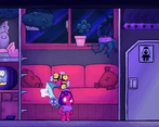
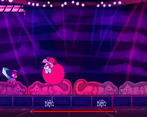
Wow, this was amazing! I had lots of fun playing it, the bosses were interesting (the kangaroo is very cute) and the experience is pretty nice overall, I did encounter some weird bugs and the controls weren't the best, but apart from that it was very fun.
Good luck! - Snow from LTP