Play game
The Battle of Carmic's itch.io pageResults
| Criteria | Rank | Score* | Raw Score |
| BOSS DESIGN | #149 | 2.870 | 2.870 |
| ART / VISUALS | #166 | 3.130 | 3.130 |
| Overall | #200 | 2.601 | 2.601 |
| FUN | #213 | 2.435 | 2.435 |
| SOUNDS / MUSIC | #221 | 2.435 | 2.435 |
| USE OF THEME | #222 | 2.261 | 2.261 |
| CONTROLS | #222 | 2.478 | 2.478 |
Ranked from 23 ratings. Score is adjusted from raw score by the median number of ratings per game in the jam.
Game's take on the theme
There is a regular exchange of coins with the angel for healing.
Did your team create the vast majority of art and music during the game jam?
Yes
Did your game use PlusMusic?
No
Did your game use Playroom?
No
Did your game use generative AI art?
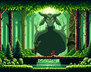
Yes, the title screen was generated with AI. Then modified to fit our game.
Leave a comment
Log in with itch.io to leave a comment.


Comments
Fun game! I really liked the art design, and the sound is good too. Really nicely done!
I enjoyed this cool visuals and growing flowers and animations and such. Great aesthetic! 3.75/5
Nice game! Visual style is amazing!
Overall a 3/5 game in my opinion. I only gave 4 stars to the art bcs the pixel art of the game is really good. Congrats on the art team for that. Love the title screen especially. AI or not it looks cool. Overall atmosphere and art style gave me Miyazaki vibes, especially Princess Mononoke
Controls need some work. Attack animation triggers a few miliseconds delayed after you press left click. Some times you need to press a few times for the character to turn left or right and charged attack is glicthed, it doesn't work.
Boss desing is artistically good but combat is pretty straightforward. First and third bosses have 2nd phases, but the attack patterns are too simple. I think this is the hardest part to pull of for designing a boss fight. 2nd boss is just running left and right.
I think there's a good foundation for a good video game here with some polish and magic touches here and there. Good job for the team and good luck !
The pixel-art is soooooo cool and well doone! Good job :D
The forest vibe is pretty nice, but the player animations feel stiff, and the currency didn't really have much use since the player heals after dying anyway. The raccoon was hilarious though lol
The game was pretty cool I liked the different abilities you get when you defeat a boss, I would love for you guys to include a menu for the abilities to see whenever they're available as both of them have a cooldown.
The art is amazing. The menu design especially. The game is fun and the boss patterns are easy to pick up. The last boss gave me a tough time though.
Great art, the music is too loud needs some balancing and the sfx need some variety.
The graphics are pretty.
Fun little game (:
Some advice: Your game looks pretty, but when working with pixels try not rescaling them. Keep the pixel size constant and your game will look majestic.
Nice work! The shop was very creative, gotta love that guy.
Like with others, loved the raccoon shop haha! The game needs a bit of work it's not the most fluid in combat (In the deer fight you can just stand in the far right and it cant hit you for example). But it's really pretty and would like to see what's next from you :)
The strongest point of your game is clearly the art and visuals! I liked the mechanics, the bosses and the main idea. But needs a lot of improvement, mainly in the level design. However its pretty solid submission for a mounth! Congrats!
Holy moley the art is so beautiful. The flying raccoon is amazing. This game def has potential but just needs more polishing.
The game looked pretty, and the boss sprites, especially the last boss, were pretty cool, but I think the game could use a layer of polish, such as cooldown indicators for some of the skills, and smoother animations.
The racoon-shop was funny!
But you need to improve on polishing the game! The quick attach should start right away, the animation before is too long and makes the game feel unresponsive, we should have a way to tell when the shield is recharged, background pixels being bigger than the characters' pixels is a bit weird.
The boss designs are simple but okay, they are a bit repetitive, bosses could benefit from having one more move each maybe? Like the deer jumping sometimes so it avoids your shield, things like that.