Play game game :)
All Wound Up's itch.io pageResults
| Criteria | Rank | Score* | Raw Score |
| Audio | #760 | 2.781 | 2.781 |
| Graphics | #828 | 2.938 | 2.938 |
| Innovation | #969 | 2.563 | 2.563 |
| Theme | #989 | 2.688 | 2.688 |
| Overall | #992 | 2.625 | 2.625 |
| Fun | #1086 | 2.375 | 2.375 |
| Game Design | #1112 | 2.406 | 2.406 |
Ranked from 32 ratings. Score is adjusted from raw score by the median number of ratings per game in the jam.
In what way does your game fit the theme?
It is about helping a windup toy: Bob. Hes rewinding and going back in time to look for his lost windup keys and trying not to get all wound up.
Did you write most of the code yourself and made all the assets from scratch?
Yeap i sure did. :)
Leave a comment
Log in with itch.io to leave a comment.


Comments
nice game although i encountered some issues
1) on some tutorial levels the text is covered by the rewind bar on top of the player which makes it abit hard to read
2) controling the player by running away from the mouse felt abit weird and hard to play with
but other than this a great and solid game well done
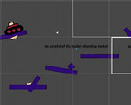
Thanks for the feedback! Actually the cursor has a collider which you can use to push the player, i was trying out a somewhat new? game mechanic. But ye thanks for playing!
Loved the unique art. The music was great though gets chopped off when switching. Maybe use a singleton for that.
Good job!
Could you also play and rate my game?
https://itch.io/jam/brackeys-4/rate/723414
Thanks for the feedback! Yeap i guess the music could be better transitioned. Sure I'll check out your game! :D
Nice concept, and the music fits in well with the game, but my only suggestion besides the UI problem would be to make the instructions more clear, because I thought that "guide the player using my cursor" meant that the player character should follow cursor. Just a thing to keep in mind.
Nice concept, and the music fits in well with the game, but my only suggestion besides the UI problem would be to make the instructions more clear, because I thought that "guide the player using my cursor" meant that the player character should follow cursor. Just a thing to keep in mind.
Ok thanks for the feedback! I guess i should have made the instructions a little more clear. But thanks for trying my game out!
Great game! The music is amazing! I liked the art too. One thing I recommend doing is setting the canvas to scale-with-screen-size, that way you can set a reference size and the bar problem at lvl3 won't happen. (I also had an issue on the first level with the text going off-screen)
If you have the time please check out my game too: https://itch.io/jam/brackeys-4/rate/721332
Ah thanks for the feedback! The set canvas to scale-with-screen-size solution was really what i needed. Thank you! Yeap the text was meant to go off screen. when the player and camera moves. Sure i'll check out your game :)
nice game idea but the problem is that the third levels is uplayable cuz you cant see anything cuz the ba is too big
Thanks for the feedback! Yea sorry about the bar 😅 I couldn't fix it in time and now its a really huge problem oops. Thanks for trying my game out 😃 i really appreciate it.
Really liked the music and art is also pretty good. The UI is definitely a problem, but apart from that the idea is great. Well done!
Would appreciate if you could rate my game as well :)
Thanks for trying out my game, really appreciate the feedback! Sure I'll check out your game. :)
Thanks!
I really liked the art style and the music. The gameplay with the mouse (hitbox) could be better explained visually. As others said, the UI scale is too big.
Thanks for playing my game! Yep, i know the UI is a big problem, i should probably fix that. I really appreciate the feedback!
The graphics are really cute, and the concept itself is really interesting! I would've changed two things though: One, add a indicator that follows your cursor, like a solid block. Without it, it's a little hard to tell the hitbox of the cursor. I would've also zoomed out the camera, the timer bar being so big makes it pretty hard to see where the hazards are.
Thanks for playing my game! Actually the cursor size is the is its size on the screen. However its size might have changed a little while rendering. Yeap sorry about the timer bar, not really good with UI yet 😅Yep i agree about the camera too. Thanks for the feedback, i'll improve on it. :)
Fun little game, took me a while to get the hang of the mechanic, but once I did it was quite nice,...
Good job,
Feel free to pop over and check my game its a fun little adventure game Im sure you'll enjoy.
Thanks for the feedback! I'll be sure to try out your game. :)
Don't think game-play wise, outside the ability to try again, it kept strictly to the theme of "rewind". That said, game-play in a sense was a bit too easy, once you got used to 'hover cursor so the robot moves anywhere'. Also, there was a bit of a display glitch from my play-through, where the 'timer' bar ended up covering half the screen. And hindsight, the way it's positioned may be a hindrance in seeing were to go, game-play wise.
Thanks for your feedback! I really had some trouble over the theme of rewind 😅 and just went with this. Sorry about the timer i had some problems fixing the UI during the jam. Thanks for playing, really appreciate it!
Nice idea based on the theme, loved the artwork. Love that little backstory ... reminds me of another game i made for a previous jam (Slice of light, its on my itch if you want to check it out)
But the UI was too big and sometimes even covered the entire screen. Controlling the character felt weird.
Thanks for trying my game out! Really appreciate the feedback too. I'll check your game out soon :)
The main problem of the game is the camera zoom tbph.
Other than that, the concept is pretty fun, and the graphics / audio are great !
Thank you for the feedback! :)
The camera zoom is very confusing. I think it would be totally ok to just scale character and text instruction down relative to the map and camera. Other than that good job! I think an idea is very interesting!
Yea i now see how its a bit of a problem. Thanks for the feedback!
The idea was interesting although i wasnt sure how to move at the start because I couldn't read all of the text on the camera. Once I figured it out I had some fun!
Thanks for trying our my game! I really appreciate the feedback and im glad you enjoyed it afterwards! 😃
pretty cool game! I had 3 ideas for theme interpretation and one of them were rewinding cars. Im really cool to see such a nice interpretation if the theme! Congrats
Thanks for trying out my game, i really appreciate it! :D
I think the camera is too close and it isn't incredibly polished, but it has potential. Nice job!
Thanks for your feedback!
Of course! I would definitely stick with it, I like the core mechanic.
I think you have a really interesting idea here, but had some problems to the gameplay work properly. The camera is too close, and it makes my vision short and difficult. Im not sure where I should go or not and couldnt read what you wrote at the levels. I just passed through it without knowing for sure if that was important or not. And the problem with the bar is really big at this point, cause at the level 3 it uses more than half of the screen, for example.
But you had a good idea, I liked the mechanic and hope you guys dont give up on this project now. Things can be fixed and it'll be a really fun game.
Thanks for trying out my game! I really appreciate the feedback. :)
Controls aren't super clear. Cause when you said guide him with the mouse, I thought I was keeping my mouse in front of him to guide him to where to go next. But pushing him with the mouse is an interesting idea.
Thanks for the feedback! Really appreciate it! :)
Be sure to make the controls a bit clearer. It took a while to learn the controls, and instantly I thought you were supposed to just put your cursor underneath the character and fly to the end. I would also recommend working on the ratios for the game, because in some levels the bar at the top is tiny and on other levels it's absolutely massive and literally covers the full screen.
Honestly though, the artsyle is really cute and the cover art is incredibly professional
Okay thanks for the feedback! I guess i never really thought of things that way hehe 😅 I was having some problems with the UI as i didn't know how to fix it in the alst few hours of the jam so oops. Thanks for playing my game, i really appreciate it!