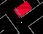
Play game
Porphyria's itch.io pageResults
| Criteria | Rank | Score* | Raw Score |
| Game Design | #7 | 3.467 | 3.467 |
| Theme | #9 | 3.400 | 3.400 |
| Overall | #9 | 3.222 | 3.222 |
| Fun | #11 | 2.800 | 2.800 |
Ranked from 15 ratings. Score is adjusted from raw score by the median number of ratings per game in the jam.
Leave a comment
Log in with itch.io to leave a comment.


Comments
Dude, this is fantastic. The menu looks professional, the graphics, while simple, work really well. The gameplay is really balanced (for the most part). The gameplay loop is simple but honestly I found it fun. The little breaks in the maze for the zoom in parts or whatever you call them are well spaced out. Overall man this is really great, you've got some great ideas and the ability to implement them. The small details go a long way.
In the spirit of criticism, I do wanna point out some small things that I think could be improved on. First and foremost, it's a bit disorienting. The look around sensitivity was super high on load in, I had to turn my mouse sensitivity to the lowest it could go to make it playable, and even then it was fairly dizzying.
Also at one point I died because one of the red guys spawned immediately in front of me and I had no time to react. Being sent back to the beginning is definitely a bit punishing, especially when there are 24 pages to find (I'll never know what's behind that button on the menu :c). Maybe having checkpoints at each page you pick up would be nice. I do like that it saves how many pages you've picked up even after quitting the game, but given you have to start from the beginning, it doesn't mean much.
But honestly, those are my only issues. The sfx and visual effects were awesome and make the whole experience feel polished.
Wow, thanks a lot for the review, I feel really flattered :D And thanks for the feedback - the mouse sensitivity didn't seem an issue on my PC, but I admit I mostly tested with a gamepad, so you may be on to something! The time didn't allow for the implementation of a settings screen, so that is something I might actually add when the rating phase is over.
The enemies are also something that could be improved with more time, absolutely, as is the punishment for dying. I'm glad it didn't frustrate you too much - adding chackpoints might be a great solution that I could add along with the settings. Thanks again!
Wow. That was pretty amazing. I personally found it very disturbing and spooky. The subtle touch of the maze walls getting more and more disorganized after each--I dont' know, "cutscene"??? The parts when you would go out to the middle and get a page of the poem and a geometric picture--that was one of those things in horror games that I love that makes me go "wait, was that always like that?" Really incredible work. I can't believe all the subtle stuff you got in here. The music and the poem and the maze all creeped me the heck out. Good job!
Thanks so much! The walls actually move a tiny random bit (I think 0-1.5°) whenever you find a diary page... I'm glad that had the intended effect and did create some unease and tension :D
Good poem, fairly fun to play, I might have gotten really dizzy though.
I really wish the player character was more than just a triangle, and the maze being the main gameplay is not very fun. The sfx and music were themed appropriately but it didnt seem to fit with the maze.
If there’s not a flashing lights warning on this game - I don’t remember if there was one at the start - THERE NEEDS TO BE. The concept is cool - I like the bare geometry, it’s pretty, though it feels like it’s missing something - and the plot is… barely there? I want to know the full poem, but not enough to keep pursuing it.
That is a very valid point. I've pushed version 1.01, which now includes a photosensitivity warning right before the main menu. Thanks for pointing it out :) As for the plot - this is pretty avantgarde, so there's no real plot except for the exploration. Just google, you'll find the poem easily if you want to know the rest ;)
Theme: Not really a horror game, but a good maze crawler
Fun: Wasn't a fan of the cryptic story, but the maze was alright. Liked how it became more and more crooked over time. The fighting mechanic felt more gimmicky, as the enemies weren't much of a threat for the entire game. Maybe make more use of the flashlight/lightbeam detection you had - like, you can see only the parts of the maze you lit, and have it like a flashlight.
Game Design: Good work, liked the maze crawl. Can't say about the poem, as it's not to my taste.
Absolutely, the enemies are only a quick draft, mostly because getting the pathfinding to work in a chunk-based infinite maze took a good portion of the development time. Linking visibility to a flashlight was actually in the first version, but turned out extremely confusing and would have taken a lot of playtesting and tweaking. Thanks for the feedback :)
didnt play it too much becouse it got boring incredibly quickly, but from what i have gathered its definetly a horror game, but its not that scary, its kinda fun at the start but gets old really fast and the light has a really long cooldown. if you like this kind of game im sure you will have a grat time, but it just isnt for me. but i will still say well done!