Play game
Decrypt the Dungeon's itch.io pageResults
| Criteria | Rank | Score* | Raw Score |
| Graphics - Is the game aesthetically pleasing? | #30 | 4.125 | 4.125 |
| Overall | #56 | 3.408 | 3.408 |
| Theme - How well does it incorporate the theme? | #57 | 3.208 | 3.208 |
| Audio - Does the game have nice sfx and music? | #76 | 3.333 | 3.333 |
| Completeness - Is it an unfinished tech-demo, prototype or a complete game? | #88 | 3.250 | 3.250 |
| Gameplay - How fun is it to play? | #89 | 3.125 | 3.125 |
Ranked from 24 ratings. Score is adjusted from raw score by the median number of ratings per game in the jam.
Leave a comment
Log in with itch.io to leave a comment.


Comments
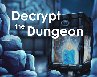
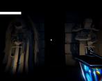
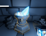
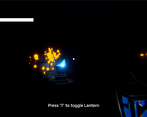
Really cool game and concept! I like that it isn't combat-based but instead you have to solve puzzles. The puzzles themselves were interesting and engaging, and felt satisfying to complete - though I admit I needed a hint or two on them...Graphically, it looks really good - the lighting in particular is really satisfying with the blue torch illuminating the dark rooms.
Lovely game! Well done!
The second puzzle might be a little misleading. I thought I was meant to interpret what the message was, not sort the weight. The third puzzle had me stumped when I thought I couldn't reset the puzzle. Was wondering why a big nail on the stairs had light.
I played all We Were Here series and this is a really good puzzle game, although most of them fall on the easy side.
Thanks for playing! Balancing the difficulty of the puzzles was really hard. Most of the time we thought they were too hard... Glad you made it! :)
I escaped!
The presentation is nice and the 3 puzzles are all good, I really enjoyed those (the 3rd one took me much more time that I'd like to admit, I think I first tried this game like 5 days ago).
When you're walking upstairs you can easily leave the grid but that's no big deal since it takes barely 1 minute to come back there.
Both fun an atmospheric game, thanks for sharing.Thank you so much for the kind words. Glad you liked it! :) Yep, the clipping wasn't meant to happen that much :D welp, atleast one can't really fall through the map.
Good combat is so difficult to get right in a week I'm always thrilled to see a puzzle entry. There's a nice atmosphere as it is, but I think a cavity shader and some baked lighting for the orange goo in the dark realm would really bring it together. Audio mix was a little off too but no real complaints- this was a fun entry.
Hey there! Thanks for the kind words. Combat would have been pretty basic in one week. Atleast we thought so. Feel free to check back after the jam!
Cool short game with an original idea but had a lot of bugs on my playthrough, wrote them in your feedback form :) Nice graphics tho and mechanics with light and dark were great!
Also, doesn't it say in the rules that games must have combat? //If it doesn't, well, damn it, i could have had it so much easier with my development if i knew :(
Thanks for using the form! We make sure to implement the feedback after the jam has ended, so feel free to try again! :) hopefully we both got the rules right
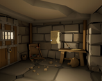
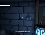
That was a very polished experience, from the start screen to the notes to the light/dark effects. The fonts were nice and the sound effects and music were good. The low-poly graphics with great lighting worked really well. The hidden clues that were revealed when the light was off was a great idea, reminiscent of escape rooms. You did well on the theme with the light/dark mechanics.
We struggled with the free look being locked and being a bit sensitive, so we had trouble putting the mouse on the combination lock to turn the dials. Centring the view when you moved would have been good. The view restriction (45 degrees left/right) was slightly uncomfortable to play with. The steps were very small and the lack of keyboard repeat made it slow, unresponsive and a bit frustrating to walk around.
We're not sure how big the game was because we never got past the door, despite play attempts. We always ran out of lantern charge before we could progress.
Well done on producing such a great looking and stylistic game. We'd play it again if it was a bit easier to progress in.
Thank you for the kind words! I guess we got used to the freelook and not centering the view on movement (courtesy of not really playtesting it with others lol). Feel free to come back to it after the jam. We will be implementing most of the feedback found here!
I really like the lighting effects and other visual elements of this entry, as well as the audio.
Just a couple minor tweaks that would make it more enjoyable for me: I would like to be able to hold down W (and maybe make the "steps" longer) and move forward constantly rather than having to tap, and I think in this game free look might be better as toggle-able (personal preference for me). The other thing was the lantern timeout was a little short for me, especially since I'm a smooth brain and was stuck trying to understand the weight riddle for ages when I died. I also wasn't able to click restart after Seymour called me pathetic lmao.
I do really like the theme implementation in the fear mechanic and having to stave off the darkness with the lantern, I think this game looks really good and there is a lot here to like.
Nice entry, good job!
Thank you! Holding down W to move faster is an interesting thought. The lantern mechanic, especially the charging really needs some more tweaking to create a less stressful gameplay experience.
Great visuals and atmosphere. Good interpretation of the theme. I like most of the mechanics here except the recharging got tedious quickly.
My biggest problem is that the grid is half the size it needs to be to make the game feel "right". As it is it feels like the grid was slapped on after the fact and not something the game was designed around. Also the mouse look must snap back to 90 degree angles and also be an optional thing, like if you press and hold a button to activate it.
Thank you for your feedback! Yes, the recharging mechanic definitely needs an overhaul/better balancing!
I would also agree with your assessment of the grid-based aspect of the game. Funnily enough, the first thing we had implemented was the grid movement, but I guess along the process of designing the levels etc. it turned into what it is now and we just got used to it.
So biggest take away here: Don't test/balance your own game by yourself. Lol
Really nice aesthetic and atmosphere! I really loved the idea of light / dark puzzles. However, I found the recharging mechanic a little annoying as my light seemed to run out very quickly and I wouldn’t have enough time to read the clues.
This is definitely the type of game I would play a full version of! Great work :)
Thank you very much! May I ask how far you were able to progress?
Unfortunately I had pretty bad z-fighting in the textures on my machine (M1 Macbook Air) ... to the point where I couldn't read the messages and know what to do. But I can tell it's a great start!
Thank you for the feedback! Sadly we can't test it on any macbook here at the moment... Sorry!
Same problem.
Well done! I really liked the play with the light mechanic. When I died, the Restart button did nothing for me, and I LOL’d when I pressed Exit. The only thing I wish for would be to snap the user’s facing to the center when moving, otherwise, great job!
Thank you very much! :)
I like the lighting. Really makes a difference between a boring looking level and an interesting one. I liked the idea to toggle the lantern to see the secrets. However I think the time until you need to recharge is a bit short. Recharging the lantern becomes an mandatory and repetitive task really quickly and those are not fun. Also the level does not seem to be designed around a grid. It feels more like that is was build with an FPS in mind and then constrained into a grid with very small tiles to make it work. There is a lot of clipping of the lantern into other objects going on for example. Please do not enable free mouse look as a default, it makes it a lot more difficult to navigate on the grid because at the most freedom extent it could be that you are either facing north (with free look to the max right extend) or east (with the max left extend). Free mouse look is fine when you can enable it if you choose too not the other way around.
Thank you so much for the in-depth and constructive feedback! You mentioned some very crucial parts, and we're already working on improving the balancing of our game.
Nochmals Dankeschön!
You are more then welcome. I hope it did not came across to harsh, it was not meant to. I really liked how you implemented the door lock.