Indie game storeFree gamesFun gamesHorror games
Game developmentAssetsComics
SalesBundles
Jobs
TagsGame Engines

BLOODBATH

43
Posts
2
Followers
10
Following
A member registered Jan 04, 2016 · View creator page →

Creator of

Recent community posts

(1 edit)

The compass is actually an objective marker but I didn't think to mention that in the tutorial until after submission. The cube is procedurally generated each time you spawn, so that could result in a tragedy for cartographers too.

Another fun bit of trivia about the objective marker is that it wastes around 30% of your framerate. Thanks for making it to the end.

Feels like an authentic crawler. Good consistency throughout. Text is slow and all I can do in combat is pray Agnes dies last.

Movement, perspective, and style are all good. Enemy combat moves are very slow and I was hoping the stink-lines would be more helpful in finding a way out.

Rune combos are fun- would prefer concentration were faster or instant. Also prefer QE rotation and tweening but I don't know what the consensus is on that.  Had trouble figuring out what to do with yin and yang and got immobilized by pressure plates a few times but made it through. \[T]/

The music is really nice. Didn't get the color switching thing, needed more animation maybe. Got a bug near the end where 'good luck' stayed on screen then I engaged the boss and couldn't progress.

HUD is often obtrusive and the level layout could be less maze-like and more room-based but there's cool stuff here. Baked lighting would probably look good with the emission sources.

Good amount of level content here and good concept. Instant movement, or rotation at least, is a little confusing with two screens to watch and sometimes enemies hit harder than I figured.

There's a lot going on here for the time spent which is really nice. Cards are a little confusing at first but once I figured it out and found a high level shield I went back to the store; bought a high level attack card and destroyed everything else that I could, then beat the boss and walked out with $2k for the dojo.

(1 edit)

It's nice to see some angles and the unfinished render look is interesting. First minute or two is pretty confusing: Weapon pickups are too small and I expected to have them go straight to an empty weapon slot. Expected resource items to sit in the inventory. Quick keys for weapon slots and strafing would be a good addition. A bit undercooked, so it goes, but fun core concept.

Reminds me of Desktop Dungeons. I tried to make a game like that last year, but without a procedural dungeon and a little extra depth it came out as a math game without a clear formula to solve. Same problem here. I think a clear representation of the damage and experience exchange before committing to an action and an undo button would alleviate a lot of the frustration.

(1 edit)

Game looks great. I know it might damage the ambience but everything could be sped up more, especially combat.

A couple bugs I ran into aside from the boss door: First mannequin after the trapdoor, who you engage from behind, backed off into the abyss and didn't come back until I did my turn. Left arrow turns right.

Didn't use or even really understand the coin but it was fun attacking, blocking, and dodging. Character animations are cool too. Once you get when to dodge the game becomes really easy without more enemies, tighter levels, or smarter AI.

Good combat is so difficult to get right in a week I'm always thrilled to see a puzzle entry. There's a nice atmosphere as it is, but I think a cavity shader and some baked lighting for the orange goo in the dark realm would really bring it together. Audio mix was a little off too but no real complaints- this was a fun entry.

I managed to take a trick-shot piss from outside of the bathroom and get back to the door without speaking to Kokoro, but the janitor still beat me to it. My next speedrun idea was to drink 42,949,673 cups of water and literally overflow my bladder but I gave up after 26. Had fun anyway, it's a nice point and click.

Nice seeing something without traditional combat. Pretty neat entry. Would be a lot less confusing if the lantern increased your vision radius from 1 to 3 or 5 tiles away instead of from 0 to 1.

Music is nice and low cut walls are a great idea. Can walk past enemies and didn't need to go back to the ship to win but I imagine that's a result of blowing most of the week; I had the same problem.

The level looks great and I was excited to see a semicolon used in a sentence.

Ran into some bugs though: You can turn around upon entering the Red Rocket and walk off into the void. There's a chance for an enemy to get stuck in the Red Rocket staircase which blocks progression. When going to the Red Rocket as Drake there's a possibility to bypass the alley entrance trigger and get the title drop dialog from Daisy at the door.  There's a possibility that Acid won't speak to you, which may be related to the previous bug. And, long-hair-knife-guy has a pixel missing from the penis area.

It took three tries to make it past the bugs, but it held my attention anyway because it's by far one of the more engaging entries.

I really like seeing Another World style blue sci-fi palettes. Enemies are pretty cool and music is nice. Not much to do besides hold F but this is one of few entries I've seen an ending to.

A bit buggy and instant movement without a minimap is really disorienting but the light and limb based combat is a great idea.

A bit grindy; but everything looks, feels, and sounds smooth and consistent. Combat is so difficult to give depth and balance to in a week it's a big relief having mercs auto attack for me.

(1 edit)

Excellent presentation all around. There's a bit of a bug where mixing rotations and strafing while going on-to or off-of staircases from the side prevents you from going forward, but only until you back up and give it another go.

Combat system is really good after figuring it out; I think a submit action button may have made it more intuitive. Music is cool and graphics are almost there but the black circles and inconsistent resolution of the HUD were distracting. Ran into a bug where shooting the shield guy ends combat mode but he's still alive and the doors are still locked.

Lighting is pretty busted for me but the character variety is really nice

The character dialog goes a long way. Had a clear reason reason for being there and a clear goal which is a sentiment often overlooked in a jam. Only complaints are that it's a bit quiet and at some point the rogue started started walking on air.

I don't fully understand the orbs, they seem to behave inconsistently at times. The way the screen snaps when you try to push them is really disorienting. I love the projection method though, and the responsive movement.

(1 edit)

Graphics, music, and movement are all great. Combats too slow and I never discovered any goals or purpose for being in the dungeon though.

The drawn characters are cool and the bright colors are well suited for the simple level design. HUD is quite a mess though. Early stages of combat are just spam clicking and hoping you don't run into two gobbos at once, which makes it real tough to get going especially since saving doesn't seem to work on Windows at least.

It runs at 5-10fps for me and I never figured out how to dodge consistently, also you can still attack when dead. Aside from blown highlights in some areas it's a pretty cool aesthetic though.

Love the water shader. I think avoiding spot lights from lighthouses and patrol boats while dodging naval mines could make for a fun gameplay mechanic that still fits the tone.

bar theme is great, but too short. character art is great, but dungeons are all over the place. so it goes in a jam, but i really like the card battles. i think taking some inspiration from crpg and tactics games when it comes to entering battle mode and utilizing the environment in combat could make the combat system here something pretty special.

(1 edit)

i thought about adding a second ending for getting those last few kills but figured an alternate ending would be too weak compared to the current one without having some more time to work on it. that room before the end just serves as a distraction for the boss to disappear and set up the end sequence.

i planned on having a couple more enemy types and tile palettes for an upper and lower deck area, but between my inexperience with pixel art and having the balancing crisis that i think a lot of us had i cut scope quite a bit. not sure i'll get around to adding it all back but i'd at least like to add a linux build and speed up movement maybe 10% after the jam.

appreciate the thorough playthrough.

hoping for a c64 port

(1 edit)

i immediately did a 180, walked out of the dungeon alive and won. not sure if that's a bug or a reward for lateral thinking but i enjoyed it.

cool pixel art and music. audio is mixed too low, and it feels like the game needs strafing. there's also a bug where restarting with 'r' lets you keep your keys from before, and duplicate the tutorial key for example.

i didnt get around to finding a way to much bring attention to it, but the stats on your hud are very important as you have to look for the best damage value per level up. each level up refills your health but monsters dont regen. you can also go through any door with a handle on it.

only entry ive seen so far that actually seems like a complete game. always happy to see source code too. id like to be able to move with the map open though- im constantly referencing it when navigating explored areas and just spamming WASD to move around without rotating, based on what i remember from flashing the map open.

the frequency mechanic is a great idea. QE/AD feels a bit backwards. i think a 'rest' option to quickly recharge while out of combat would improve the feel as well. balance is a little off, as damage seems to basically be the better version of stamina; but we all struggled with balancing it seems and this system errs on the side of fun over frustration.

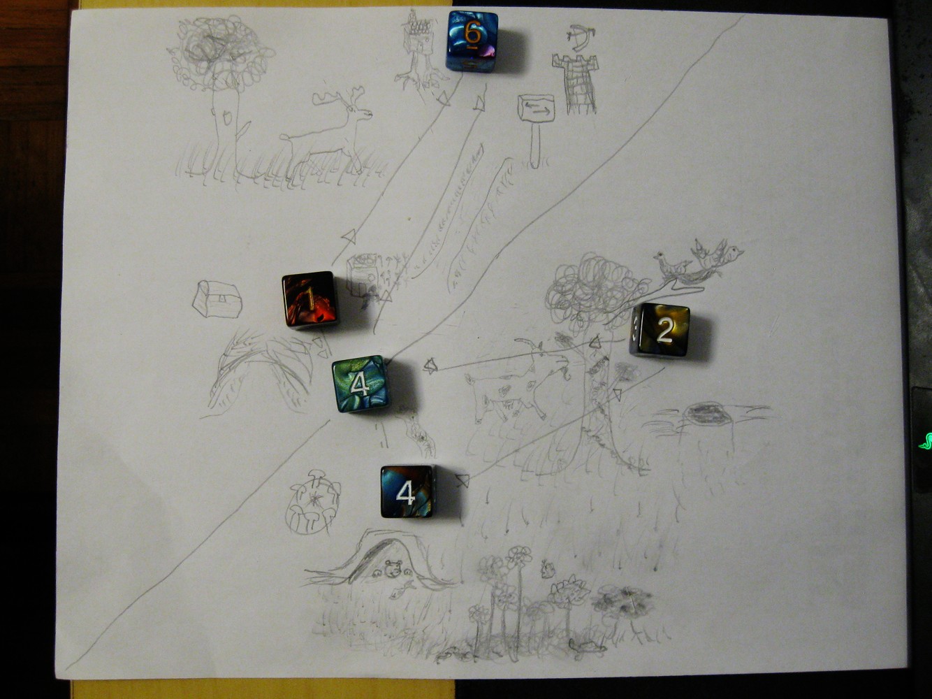
the three references on page 6 are two pages behind what they mean to be. i also failed to understand 'going off trail' and the passage of time system. fun way to get a map going though, even with insufficient dice.

super cool game. there's a repeatable bug where you can beat level 4 by standing upside-down at the toggle eye, shooting it pointblank, and immediately sidestepping into the door as it's closing, then rotate twice which puts you on the other side and from there you can then back-step to clear the door and just walk to the exit without doing the other half of the level. sometimes my character gets rotated off-axis from the grid too, don't know the cause. would love to have a FOV slider and more of this game in general.