Play game
Blinding Lights's itch.io pageResults
| Criteria | Rank | Score* | Raw Score |
| Presentation | #18 | 4.650 | 4.650 |
| Overall | #134 | 4.033 | 4.033 |
| Fun | #378 | 3.700 | 3.700 |
| Originality | #634 | 3.750 | 3.750 |
Ranked from 20 ratings. Score is adjusted from raw score by the median number of ratings per game in the jam.
How does your game fit the theme?
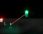
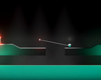
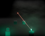
The player is connected to and can throw around a heavy cube - that is the only way to move around.
Did your team create the vast majority of the art during the 48 hours?
Yes
We created the vast majority of the art during the game jam
Did your team create the vast majority of the music during the 48 hours?
Yes
We created the vast majority of the music during the game jam
Leave a comment
Log in with itch.io to leave a comment.


Comments
I know you have been very critical about your own project but I absolutely love the "look and feel" of this game. The ball has a lot of weight and hits hard but perfectly. I very much enjoyed playing this version of golf.
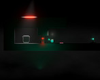
Visually speaking the game is very minimal and a bit bland, but the lighting gives it the flair it really needs. I love how stuff that our out of light range are just invisible by being kept in the dark. The slight static noise seems to be done incredibly well. However this should be tested well for people that get very quickly nauseous by this.
If this wasn't a game jam and you had your full time to develop this. More mechanics would do amazing. And this game could be the next golf with friends.
Speaking of which. I think this game could work wondrously well in multiplayer, especially well in troll multiplayer like "golf with friends". Maybe experiment with 3d to see how the current mechanics would hold up.
I absolutely loved playing this game and I think this game with a bit polish and more mechanics would be great on steam. I really do think this game could turn successfully and make a profit.
Thank you for taking time to play and write about my game, I don't really plan on making this into anything more, I just like game jams and having a deadline, testing new ideas and learning :)
I think this is my favorite "look and feel" of the jam. Maybe game favorite that I've played in the jam
The weight of the ball, the chill music, the sound fx that go well with it and the gameplay, the screenshake, color scheme, lighting, fog...
So many nice touches done well. And you developed them all during 48 hours?! Well done!
Also I'm proud to say i solved "They are looking" in one shot :)
The only constructive feedback I can give is on the overcharge UI and it sounds like thats already on your radar.
Great work!
Like others have mentioned the aesthetics and overall design and quite good, and the feel of weight is captured really well, but, with no real way to judge arc or force it's more of a challenge of repeating shots and levels over and over until either you get lucky or you memorize angles and shot strengths, the shot strength meter also seems maybe inconsistent? Definitely, the overshot strength is a bit odd where the meter is filled up but still charging, the sound effects work properly so maybe just a UI issue?
This game really does capture a golf feel, with the whole planning your shots and sort of "par" system that limits how many you have, be an arc indicator, freeing up how many shots people can take but scoring them based on how many it took, I'm not quite sure, but, I feel there needs to be something to help with the feeling of randomness you have when you launch a shot (though really just fixing the UI of the charge and perhaps making the charge a bit more linear would go a long way).
Overall I still had a ton of fun playing it and again the aesthetics are great, it'd be cool to see this taken further, whether more in the "golf" direction or even diverting to a different kind of puzzle system, perhaps at some point manage multiple of these launched weights? Anyway, it's a solid entry, nice work!
The shot strength is an UI issue, the game will frop the shot force by 50% if the player "overshoots" the charge by more than 500ms - this was supposed to be indicated, but I failed to do so because of the time left. Very good catch!
Thanks for a thourough review, I agree with all of it, those 48h are brutal :D
Top notch aesthetic and design but I found it really hard as well. So most of my comments will be on difficulty design.
1. I think the "# of shots" mechanic is a bit too punishing when you can't see the full level from the start. I'm was often forced to retry as I couldn't gauge how many shots I need to preserve.
2. I had a sort of "neon-golf" vibe from the game and maybe that's a solution to 1.: Instead of limiting the number of shots, give a "par" for each level and punish through deduction of score? Or, if you want to preserve the limited shots, add a finite number of "bonus shots" that are used up whenever you go above the limit. However, these bonus shots are shared between level and going back to an older level and improving your play there will recover them.
3. I was confused too by the overcharging power but that seems to be more of an UI issue after reading the comments?
4. Maybe add an (optional) indicator for the arc of the throw? I think a few options to making the "throw" easier to estimate would go a long way in accessibility.
Again, it's clear a lot of work went into aesthetics and that def. paid off but I also think that the underlying mechanics are neat and full of potential. With a bit of tweaking of the difficulty you'll have a really interesting (and less frustrating :) ) game.
Edit: Two things I forgot and appreciate: Ingame tutorial and story were both very welcome and are so often omitted in game jams (takes one to know one, eh?) so that was very welcome sight!
I love the effect you've made where it looks like you're seeing it through a monitor. Plays very well into the game's atmosphere. Nice and chill sound track too, challenging mechanics and a nice easy start to it all. Very well done!
Check out the credits for Kino postprocessing effects from Keijiro Takahashi if you're using Unity and HDRP - those are pretty nice and in public domain :)
Ohh hell yea! I just took a look at it and those looks great. Thanks! :D
interesting mechanics. I liked the art and post proccesing quite a lot. nicely done!
i think the game would be a lot more fun without the shot limit and with some kind of arc that shows where you'll land, but on it's own it's a very cool game with a nice aesthetic :)
It started out without the limit, but then there's no way to lose the game at all. I thought about having a time limit instead, but it was even worse :P
Thanks for playing!
I absolutely love the shader and aesthetic of the game, but I can’t for the life of me get past the first real level :)
I mismanaged my time on music and didn't finish the overcharge mechanic - if you fill the bad too much, it will half your shot power, that's probably it. The game doesn't show it at all and I saw some people get stuck on it.
Thanks for playing though!
The game looks great and I enjoyed the mechanics a lot.
That said… I got frustrated quite quickly. The launching power of the teleporter feels unpredictable, it seems that you need to launch the ball at the exact moment the bar is full for full distance and if you hold it longer your range decreases, if that is intentional it’s not indicated (that I could see). If there was no shot limit this would be much less of a problem, or replacing the maximum shots with maximum teleports could work too.
Well the bar can get overcharged and it drops the power, so it feels unpredictable, that's a big noob move on my part, but I had no time to flesh it out. In hindsight I should've just removed it, would take 5 seconds ;/
Thanks for playing, though!
You have the ingredients for a banger here, I hope you take it further.
Absolutely beautiful game. The mechanics were simple and well executed. I loved the approach to design, starting with a very straight-forward tutorial and slowly building up.
Thanks, I learned over the past few jams that this is very important, but I still messed it up and made the game too hard - a learning experience for sure ^^
Good game , with mature technique and visual language. This is what game I'd like to pay for on Steam.The graphics and interaction design are excellent. I like this minimalist style with fluorescent light and the screen texture that imitates the old-fashioned monitor. According to the levels, it already shows a high degree of completion and completeness. The gameplay is enlightening, which gives people a lot of imagination for the further deepening of the game. It is the best GMTK game I played today.As a 48-hour game, I hope it gets the attention it deserves.
I will keep to follow it. I playered it in a borrowed PC for a while, so I haven't experented the whole levels. If there will be a Mac version, it would be great.
Thank you very much for a very thorough look at my game, I'm glad you like it!
I won't promise any updates, because I tend not to update my jam games, but I might get the MAC version going (though I can't test it, so I didn't want to just make builds without testing them).
it is good
Nice eye-candy, good job! Also, the game plays pretty well!
Niiiiice lighteffects!
Thanks! It's a very simple technique, I think I should make a tutorial on it some day ^^
Looking forward to the tutorial. I also like the effect of the imitation monitor screen.
That is just a simple overlay postprocessing effect + a texture ^^
It has nothing to do with technical difficulty. What I like is the aesthetics embodied in the game as a work, and the ability to organize stylized elements.