Play game
Slime Siege's itch.io pageResults
| Criteria | Rank | Score* | Raw Score |
| Style | #1574 | 3.619 | 3.619 |
| Overall | #3582 | 2.857 | 2.857 |
| Creativity | #4497 | 2.667 | 2.667 |
| Enjoyment | #4852 | 2.286 | 2.286 |
Ranked from 21 ratings. Score is adjusted from raw score by the median number of ratings per game in the jam.
How does your game fit the theme?
The player can scale the kingdom and enemy size
Development Time
96 hours
(Optional) Please credit all assets you've used
Slime 3D Models
https://assetstore.unity.com/packages/3d/characters/creatures/kawaii-slimes-221172
Tower Models
https://www.kenney.nl/assets/castle-kit
Environment Tiles
https://www.kenney.nl/assets/hexagon-kit
Game Icons
https://game-icons.net/
Leave a comment
Log in with itch.io to leave a comment.


Comments
THEME💡
🔲 What theme?
🟨 Sure, I guess
🔲 I see what you did there
🔲 Nailed it
🔲 10/10 Philosophers crying
GAMEPLAY⚙️
🔲 “Game” is a stretch
🟨 Confusing but works
🔲 Basic and well done
🔲 Very creative
🔲 Never seen before
SCOPE🌎
🟥 Blink and you’ll miss it
🔲 Bite-sized
🔲 Balanced and just right
🔲 Aimed high, respect
🔲 Elden Ring?
DIFFICULTY🏔️
🟥 Playing asleep
🔲 Some brain usage
🔲 Easy to learn / Hard to master
🔲 Difficult
🔲 Prepare to die… again
GRAPHICS🎨
🔲 MS Paint
🔲 Not bad
🟩 Clean
🔲 Impressive
🔲 Reality 2.0
AUDIO🎵
🔲 None
🔲 Earrape
🟩 Basic
🔲 Groovin’
🔲 Eargasm
BUGS🪲
🔲 Bugpocalypse
🔲 Disruptive
🟩 Infrequent
🔲 A little glitchy
🔲 Perfectly smooth
VERDICT📝
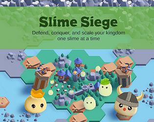
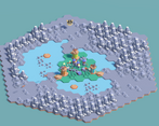
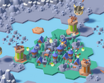
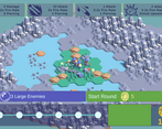
I have to start by saying that I really enjoyed the art style of this game. The cute isometric display was a nice touch, and visually, it was a pleasure to look at. However, beyond the visuals, I found the rest of the experience lacking. UI was confusing, tower selection was unintuitive and buggy with the one tower in the back being almost unselectable, and the gameplay was incredibly simple. It also doesn’t help that I’m pretty sure the game is actually impossible. I think the thing that was really missing was upgrade features. Maybe the towers get bigger and do more damage. It also would have been someplace to spend all of the excess money.
As for the theme, I really don’t see the connection to the theme here beyond building more towers. Nothing really unique here to fit the “Built to Scale” idea. Overall, there is a lot of room for improvement here. That all being said, nothing but respect for submitting a completed playable game for this game jam in such a short amount of time.
Was quite confusing to play would have liked to see some upgrade options.
Good use of assets!
It was a little frustrating when a slime went past a tower and you just had to watch it attack your keep. maybe the player getting to rotate the towers would be fun?
Nice entry
Really cute art style, would have liked to see more placement options and have the towers be able to target enemies in other lanes / rotate.
would have really benefited a tutorial I think ! Presentation is nice, I think the scaling idea can be further developed :)
A little bit confusing, but also a lot of fun.
a little confusing but very impressive
Nice visuals and camera transitions, but was initially lost a bit in how to interact with the map and place towers. But once I got it was fun.
I found it a bit confusing and took some time to understand the controls, but I like the concept.
took me some time to understand how it works, but it’s fun afterwards!
It took me a while to get what was going on, but when I did it was enjoyable. Well done!