Play game
What Hangs in the Balance's itch.io pageResults
| Criteria | Rank | Score* | Raw Score |
| Style | #315 | 4.286 | 4.286 |
| Overall | #356 | 3.968 | 3.968 |
| Creativity | #427 | 4.048 | 4.048 |
| Enjoyment | #920 | 3.571 | 3.571 |
Ranked from 21 ratings. Score is adjusted from raw score by the median number of ratings per game in the jam.
How does your game fit the theme?
The scale is the primary setpiece of the game, being the recorder of the score. The imbalances are built up over the course of the rounds.
Development Time
96 hours
(Optional) Please credit all assets you've used
see description for full credits
Leave a comment
Log in with itch.io to leave a comment.


Comments
The games mechanics took me a tiny bit to understand, but once I did the game was a lot of fun! The filter is very cool but it makes it a tad bit hard on the eyes, but it looks cool so Ill gladly sacrifice my eyes for it. For me, the second stage was by far the easiest and I spent the longest at the 3rd one
It clicks once you learn how to trick the AI
Yea unfortunately we ran out of time towards the end and so we ended up having to cut most of the tutorial lol. Definitely need allocate more time for that next game.
That was really cool! The aesthetic is simple and chilling, and the asymmetrical gameplay leaves a lot of room for forcing the opponent into unfortunate choices. Even the hardest difficulty was doable after a few tries.
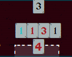
My only note is that there could be another way to distinguish between each direction of cards, rather than only being by color.[EDIT: 8-23]: Retracted, extra details already exist.Fantastic! Great work!
hi! thanks for commenting! there is an arrow on the top left and bottom right of each card that show the direction of the card. i'm impressed that you did so well, most people find the ai too difficult to beat.
Oh! I apologize; I'm not sure how I missed those arrows.
it's ok! we should definitely have had a better tutorial haha
Great art style and atmosphere! Really fun to play, well done!
ahh thank you!
Absolutely love the art, fantastic job. Feel free to check out my submission too if you have the time!
Thanks for checking out our game, I really like the way you took the theme and design of your game!
I like the style and atmosphere in this, really hits a nice spot between eerie and fun :)
The mechanics are also unexpectedly deep, I think with a little bit of polish this could become a really great game if you decide to expand upon this. Well done!
<3
Great concept! I did get confused with the directions more times than I would like to admit. with just a bit more thoughtful UI this can be a great full game!
thank you for playing!!
This is a really simple numbers-based card game on the surface, but there’s a lot of depth here! I found myself constantly strategizing and changing my plans. I think the drawing phase is where the round is truly decided. I think this could even make for a pretty cool physical game.
The aesthetic was really neat too - I loved the slightly ominous feel and the banter between the characters. If I had one critique, the chromatic aberration started to hurt my head a bit by the end, so maybe tone that down a notch.
Overall really excellent work! There’s a lot of depth here for a game jam.
thank you for playing and giving your feedback!! If we ever update the game there’d be quite a few settings changes but I’m glad you enjoyed the game!!
Really loved the style and the game was fun. Great job!
Really glad to hear it, we put a lot of effort in as a team and were polishing down to the last few minutes!
I couldn't find the arrow to tilt the scale up.. Than I realized that the text probably shouldn't be there.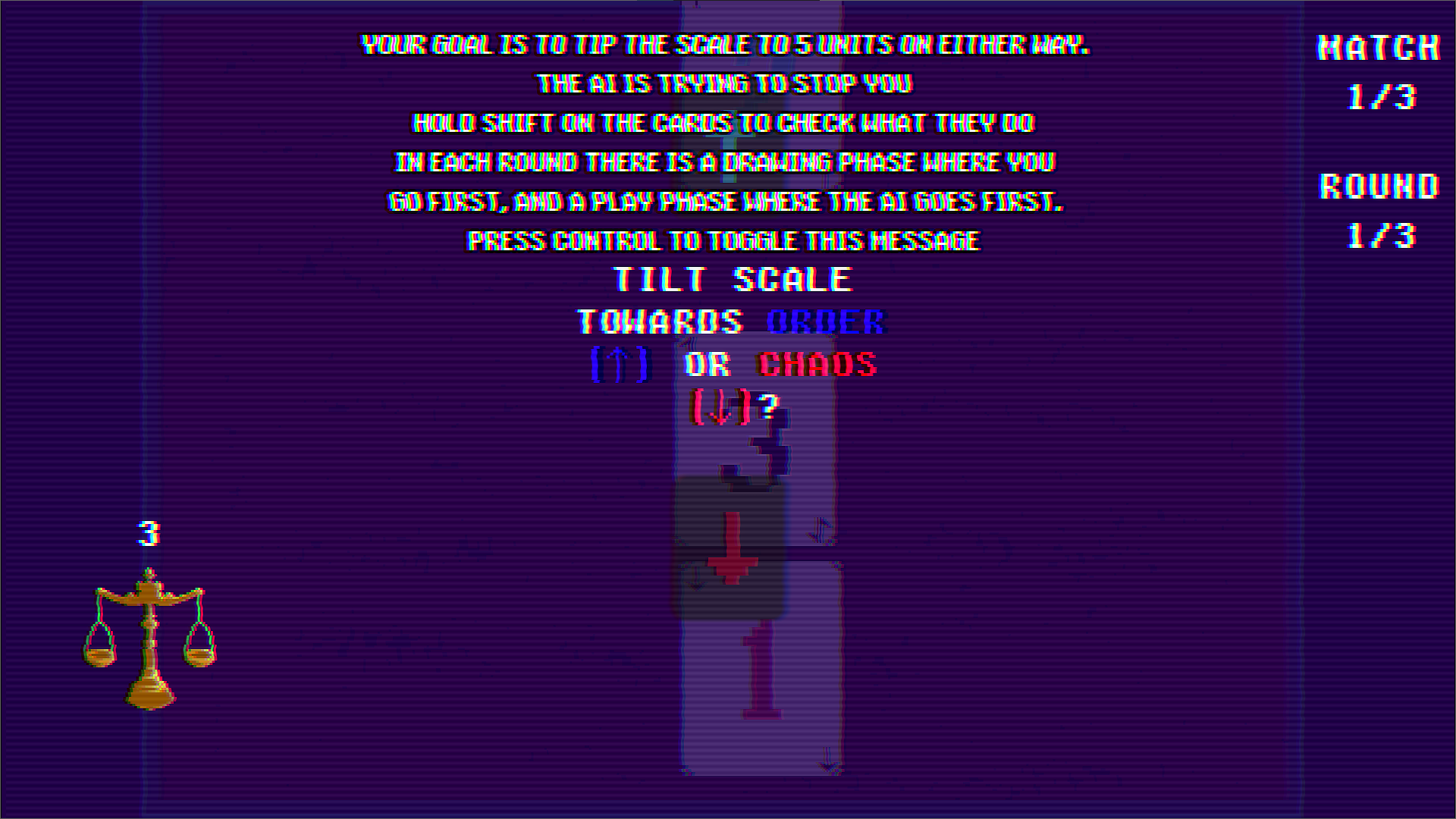
it does say “press control to toggle this message” aha…
Amazing style. made me nervous.
<3
Really creative take on the concept, I haven't seen any other games like this in the jam. I really liked the creepy vibe this game delivers. Reminds me of Buckshot Roulette a bit. Would love to see more creepy gambling type games like this. Great work.
creepy gambling ftw
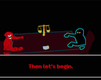
The art style, CRT monitor effect, and the sound design really make for a foreboding atmosphere. I love the framing of it as a battle between two abstract entities, and I like the banter between them when you win/lose rounds. I do really like the gameplay, but I’m just bad at it haha – I’m directionally challenged and struggled a bit with understanding which direction the scales would tip when I had to consider both players.
thank you for commenting!!!
Tbf the ai is kind of cracked so don’t be too hard on yourself haha
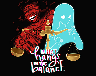
the VFX on the title screen and for the characters are really cool! also, whoever did the cover page did an astounding job with it; the hands were done really well!
i thoroughly enjoyed it when I got to use the flip cards, the mechanics of the game made sense when they were introduced and gave me a new way to play which was very cool.
good job to y'all's team!
AHH THANK UU 😭We worked really hard on the game and are glad that people are enjoying it!
Cool character designs! nice cutscene, neat concept but I couldn't figure out the winning strat
everyone has their own strategy! mine personally is to pick wild cards (the ones that go both directions). thanks for playing :)
the art and atmosphere was really great in this one!!
HI! thank you so much, that's all thanks to our wonderful SporiumCorium! thanks for playing the game :))
Bro the style on this game <3
<3
I absolutely loved this game. The music and art were outstanding. The gameplay itself was well-designed and well-implemented. I had some issues getting it to run but I'm glad I put that effort in. This game awesome.
Ahh HI!! I saw your game earlier, it was awesome:) thank you for the compliments :))
Just returning the favour! Thanks for playing Wyrmtech!
The art looks so cool and the vibes game me chills!
Wait that's such a coincidence I found your game on the game jam page, I didn't even know you checked our game out
Thats really something. I found yours after seeing you comment in another entry i was rating
I really like the ambientation!! good job!
Thank you so much!!!