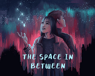
Thank you for checking the game out even when kinetic novels aren’t your thing!
ray 蕭
Creator of
Recent community posts
I liked the satire on corporations and the art direction! I also like the progression – feels super satisfying to be able to drill faster and faster, and also that you eventually stop seeing coal blocks so your run has a limit. It did take me a moment to see the “press space to start” on the top right corner before my first run.
I like the presentation a lot – the little dialogue with the alien and the music and SFX are very charming. It took me a bit to understand that the card effects activate upon placement, and I do wish I could review what the effects are for when I get a slot machine so I can decide where best to put it.
Interesting incremental game! I like the opening and how you were inspired by plants. I was not clear on the pricing or effect each upgrade had on the plant and eventually reached a point where I bought all possible cells, chloroplasts, and mitochondria and had nothing to do but wait to eventually accumulate enough energy to buy a new leaf pair. Wasn’t clear if there was a more specific goal.
I like the mood and atmosphere of the game, being alone in the vast emptiness of space. The controls took some getting used to, but I was eventually able to at least navigate to and find a blue planet. Wasn’t able to successfully detonate any of them though :( Also, the instructions for the inputs on the itch page have “throw a bomb” and “detonate a bomb” flipped – E detonates a bomb, and Q throws it, which I found out when I detonated myself trying to throw a bomb.
Thanks for playing, and I’m glad you like our little slime. jabenero was the incredible mind behind the mechanic!! I was the level designer, except I didn’t have as good of a grasp on the mechanics as jabenero did, so I had a bit of trouble trying to design levels with appropriately increasing difficulty.
Thanks for giving the game a shot despite the confusion!
The slime will push any fruit until it is in contact with a wall. Then, the interaction changes depending on the colors. If a slime is the same color as a fruit, it can move through it. The other mechanic is that the slime can exchange a color with the object it interacts with, but the slime also must always have at least one color while objects are able to lose all their colors, and you can only “hold” one of each color. So a blue slime interacting with a green (yellow + blue) watermelon would only able to RECEIVE yellow from watermelon and will turn green and explode. If you’re an orange (red + yellow) slime interacting with a green watermelon, you can either RECEIVE blue or GIVE red to the watermelon.
I think our intro level not being correctly updated to be… an actual tutorial level probably made it a lot more confusing too – we didn’t mean to introduce pushing in the first level, and the sprites should have been updated to fruits with strong color associations.
Awesome game! I love the visual direction and atmosphere on this, particularly the particle effects, lighting, and glow effect on the pushable blocks! Also, as you can tell by my profile picture and username, I do like root vegetables. I also like the design of the entities you’re able to interact with and wonder more about the world. I like the puzzle design and the way the platforms are shaped make it clear to the player how to progress, but I do wish that it were more clear where a block is obstructed from being pushed further – I would either find out inadvertently when I couldn’t push further or notice a little top of a box peeking from the floor. The parallax effect is really nice, but in the last sequence, it visually blocks where the platforms are! I think the spikes don’t immediately read as dangerous because they share a color with the pushable blocks, and I only take damage upon landing, so I am able to walk on the same section of spikes without taking damage afterwards. I do also wish the movement / jump was more responsive, but I understand you don’t have much time for tuning in the game jam duration.
Cute game and concept! I didn’t have anyone to play with though, so I was controlling two frogs on my own. Does the tongue do anything or is it just purely visuals? I spent some time trying to hit the other frog with the tongue without jumping so close that I despawned them, but it didn’t look like the tongue did anything. Also, as others have reported, I ran into the teleport bug and the charge not appearing over the blue frog’s head.
The concept and mechanics design is thanks to jabenero! In the hustle and bustle of everything, the first level wasn’t updated to be a proper tutorial level (should not have allowed pushing in that level and only introduce color change) and is missing the fruit sprites, so I wonder if that made the game a lot more confusing.
Really charming, and I like how you expressed each celestial body’s personality through their designs, dialogue, and unique minigame! The dialogue boxes and music are really fun too.
I didn’t immediately understand the goal of each minigames, so combined with the time pressure, I would mess up on the first try. Mars moves so fast 😭 I didn’t realize that the ingredients should be put in a specific order for Venus, so I failed the first try of that too. I did understand the Neptune one before the first try, though that one was really stressful because she wobbles so fast.
After talking with Pluto, I cut back to the dialogue with the Sun about how Earth wants to go home and wasn’t able to progress any more.
I’m glad you had fun and that you liked the decision to not add a score! That last point especially means a lot – it was a deliberate decision because it felt like it worked best with how the physics and mechanics were implemented, but (understandably) people tend to expect some kind of scoring system.
I love this interpretation of the theme and the humorous critique of beauty standards! I also love the art direction and how you even applied it to the itch page! I did have trouble understanding that I was being asked for ratios at first (there’s quite a bit of space between the digits and colon), and I didn’t realize the powder(?) was the stamp of approval at first + that just clicking it and releasing it stamps. After my first run where I got shut down for malpractice, I chose to end on a high note and closed up shop once people were coming in with already-scaled features.
I like that the aim is to avoid knocking stuff down as you move – I feel like that’s not something I really see in platformers. I think the isometric view made it a little difficult to determine where my jumps would land. I like how the music and the art fit well together, but the relaxing atmosphere does feel a bit at odds with the destruction I wreak when I accidentally knock down a building.
Really loved the art direction, SFX, and puzzle mechanic! I liked it allowed for multiple approaches in beating levels. I also like that my progress is saved when I exit and reopen the game (which I needed to do deal with the screen resizing bug). One quality of life improvement might be to allow restarting the platforming with the robot without also having to rebuild the platforms.
I love the art direction – the 2D and 3D feel really cohesive – got to 108 flowers in the end! I appreciate that you included accessibility options, though I didn’t try them and am not sure how the gameplay changes based on them. A few things I had issues with were that the camera made me a bit motion sick, the shape of the beanstalk made hopping on it a bit difficult (maybe being able to climb on the beanstalk would help?), and sometimes I would walk right off the platform after respawning to the checkpoint because that’s the direction the character would be facing.
I’m glad you had fun! So, a bit about how this was implemented:
- If a block is thrown and lands on the hardwood, the block explodes into cats
- Otherwise, the block position/rotation freezes after it collides with something once velocity & angular velocity are close to zero
I think the case you ran into usually happens if you throw a block that hits another block that’s sliding down, and because the sliding block is being pushed in the opposite direction, its velocity becomes zero. Since it freezes upon becoming zero, it doesn’t actually get pushed up and just gets stuck there 😅 honestly thought there were issues with the conditions I set for position lock, but I didn’t think of a better way to deal with it. Maybe should have checked whether a block was in the space over the hardwood after its position locked and explode it then.
You are actually able to throw your block from any position, not just the bottom, and you’re also able to drag the block through other blocks because physics is ignored until after you throw. I think because I was aware of that as a dev, the possibility of a block getting stuck in the throwing area didn’t feel like a big deal to me, but I realize players aren’t going to be aware of that.
I’m glad that it came across as really clean – my goal was to make the game feel as polished as we could because the mechanic is simple. Maybe dev bias came into play because I stopped considering a scoring system since I enjoyed just throwing blocks randomly while testing without actually trying to make a tower 😅 some players chose to make themed towers (like no wood blocks) probably because of the lack of scoring system, so it’s interesting to think how changing the framing by adding scoring would change how people approach the game.


