Play game
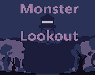
Monster Lookout's itch.io pageResults
| Criteria | Rank | Score* | Raw Score |
| Style | #344 | 4.263 | 4.263 |
| Overall | #853 | 3.719 | 3.719 |
| Enjoyment | #1163 | 3.474 | 3.474 |
| Creativity | #2048 | 3.421 | 3.421 |
Ranked from 19 ratings. Score is adjusted from raw score by the median number of ratings per game in the jam.
How does your game fit the theme?
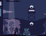
This game takes the theme of "Built to Scale" and focuses on the aspect of a small player growing in size. Exploring how that would affect the gameplay for the player, as last-minute dodges become harder with size.
Development Time
96 hours
Leave a comment
Log in with itch.io to leave a comment.


Comments
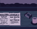
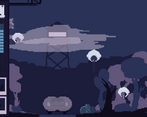
I first clicked on the cup of coffee and the game froze and then i understand i might have been the quit button ahaha. About the gameplay, it's quite weird to me if i had to avoid or not the cameras falling but i liked the vibe of the game and tower, reminds me of firewatch !
Yeah, that was my bad. It was a way to exit the game for the windows exe version. I thought I turned it off, but I clearly didn't. While I plan to fix it after the voting, I still want to thank you for checking out the game.
The visuals and ambiance are great. I got to the end because i wanted to see what would the monster look like at maximum size.
The atmosphere of the game is awesome. You should be proud of your work. Nice game :).
The art and atmosphere is great. The main menu is super creative, and the entire presentation from the UI to the photos you get is really well done. The car seems slightly unfair as it pops up without much warning, but I suppose it's a deterrent from staying on the road.
Entranced by the atmosphere. It took a couple playthroughs to realize what was going on with the falling cameras. Once I figured it out I couldn't stop playing until I was as big as possible!
The game is very simple, but the presentation, menu's, art, and pictures are awesome!
The game is very simple, but the presentation, menu's, art, and pictures are awesome!
I liked the art and style, and the sound fits very well
At atmosphere was really good. The whole game played really well and looked great, My only critique was that if you got hit with one camera, you would basically get chain hit (wombo combo'd with the other camera's because of the slight pause after being caught).
Thanks for playing. I agree that the camera fall combo, may not have been the best idea. It was an unintended effect that was kept in the game as a way to increase to the difficulty, but it seems to cause some unfair losses.
My favorite game of the jam so far! The theme, art style, and SFX make for a really unique experience. The character is cute and I adore all the art in the game. Super clear and visually cohesive thanks to your limited color palette (great choice btw!) I was impressed with how many types of ways you could be photographed and it was a fun game trying to avoid them. My only complaint is that often when I got photographed once I couldn't move and therefore would be photographed again by something else.
Phenomenal job! This is a really nice game!
One of my favs I've seen so far, well done! One little thing I found was as I had gotten big - if I got caught by a dropping camera, the next one would also see me before I could move. Otherwise, I definitely enjoyed it.
Really like the art direction! Fun little game loop as well and I like how you incorporated the ui as in world elements. Also love the photo snapshots. Super satisfying even though you're supposed to avoid them! Great work especially for a solo undertaking :D
Thanks, I downloaded your game. I love the idea, it feels like a rogue-like tower defense game.
Thanks for taking the time to play :)