Play game
Smart Heart's itch.io pageResults
| Criteria | Rank | Score* | Raw Score |
| Theme | #2 | 4.650 | 4.650 |
| Originality | #2 | 4.600 | 4.600 |
| Controls | #2 | 4.300 | 4.300 |
| Overall | #2 | 4.458 | 4.458 |
| Graphics | #3 | 4.650 | 4.650 |
| Fun | #3 | 4.350 | 4.350 |
| Audio | #7 | 4.200 | 4.200 |
Ranked from 20 ratings. Score is adjusted from raw score by the median number of ratings per game in the jam.
Godot Version
3.2.3
Wildcards Used
Flattery
Game Description
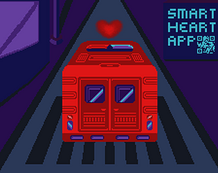
Your first days as an intern in a tech company.
Source
Yes. https://github.com/TRy-Dev/Smart-Heart/
Discord Username
TRy Dev
Leave a comment
Log in with itch.io to leave a comment.


Comments
I enjoyed managing the ambulances and making them take certain routes. The story was a nice touch, made it feel alive. Sound effects and art all suited the game.
Well done!
This is one of my favorite type of games: organized chaos and multi-managment.Trying to get as many people as you can can be frustrating, but more of the "How do I do this? instead of the "Why can't I do this?. My only complaint is that you can't tell the ambulance to go somewhere when it is heading back to get refueled. Plenty of times there is someone that spawns right in front of the other, but I don't click fast enough and it takes a LONG trip all the way back.
Thanks, I'm glad you enjoyed it. When I was playtesting the game I often asked myself "Why did I do this?!" after making this one small mistake :)
I have added the ability to add path on the way back at the beginning, but I was having some issues with it and decided to remove the feature for both code simplicity and as a design decision.
This feature would add extra element of strategy, which would be great for players like you who enjoy and have skill for this type of games, but with this I would also have to increase the difficulty, as it makes the game easier if you use it well.
And for players that would not be able to use this feature to full extent adding it and increasing difficulty would mean a lot of annoying noises, red screenshakes and frustration in a game which could already easily snowball into chaos after even one mistake.
If I spent a few more hours on it I'm sure I could make it work and keep the difficulty curve similar, which would probably result in a better game, but unfortunately I did not have this extra time. With feature creep creeping behind my back I always force myself to think "What can I remove?" twice before thinking "What can I add?".
very immersive experience, good combination of sounds with environment... I like it
Top marks all around. Clever premise that evolves over time, and it's really well presented. The lore works nicely, too.
Thank you!
Hi there, this game feels really cool and the story feels really well incorporated. I felt so responsible for those people I couldnt get to in time! Good work, manic and fun!
Glad I could make you feel that way! ;)
This was so cool. Simple, but very engaging gameplay and story. The visuals are obviously really good and very polished. The ambient background music is spot on. Nice touch with the vignetting of the screen and the interlacing in the intro. It reminded me of "Blueprint" for the C64, for some reason. Great job
Thanks, Cheers!
That was incredibly well executed! The way story and gameplay work together was really captivating. Kinda like a little "Papers, please" located in Silicon Valley. Definitely one of my favorites in this jam.
Thanks!
That was a lot of fun! I hope you add content later.
There are no plans to add more content. Game feels finished and the code is a mess I wouldn't want to touch :)
Very slick visuals. I really appreciate the CRT screen effect of a rounded TV screen. I also loved the colour pallet. Great contrast and lighting!
Good stuff
Thanks! It took me 2 or 3 days to pick the pallette, but I learned a lot making art for this game. Aseprite is awesome :)
Really polished for a jam game and nice use of the theme. Nice art and atmospheric music. The difficulty curve was spot on. Great work! The only constructive criticism I have is maybe having the ambulances be different colors or have something else other than the name above them to differentiate between them, I'd lose track of which one was tied to 1 and 2 when they were out driving.
Thanks. I spent a lot of time playtesting and also bothered my fiancee from time to time :) It's great to ask for feedback early if you have that opportunity.
I was sometimes getting lost myself, especially after adding 3rd ambulance, but I had so much on my mind that I didn't register it as a real problem. In the hindsight I can see trivial solution that would probably solve the problem... Just add corresponding number in front of name above ambulance.... It would take 1 minute, but oh well :)
What a polished, engaging game, and it's opensource! Thanks so much for sharing.
I had a lot of fun and this reminded me of the Emergency 911 game on Steam. Very atmospheric and I can see this become a full game in the future.
Cheers.
I don't plan on making additional content to this game. I tried to make it complete in set amount of time and I'm happy with how it turned out. Also, code is terrible, it would be easier to rewrite it from scratch than expand what's there :)
This feels really polished already, i like how it's a very simple gameplay mechanic but the situations get crazy chaotic really fast, also like the tiny isometric style you went for, and the whole meta thing where you're an employee of the software co of the app and the whole game's interface is you going through your e mails and such is a neat detail.
Really enjoyed this one even though i did a terrible job at managing all this :p
One small mistake is enough to ruin whole day :) I was feeling the stress when I was playtesting it on the last day :D
Haha ! Can't imagine the stress level when combined with the incoming deadline's stress on top Oo
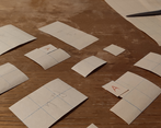
So cool! Love seeing the addition of the paper prototype too! Nice touch.
Really well put together, incredibly polished. One of my standouts of the jam! Well done :D
I start to realize the power of paper prototyping. It helped me a lot with coming up with level design.
Thanks for the comment!
Cool game, I really like the noir chiq aesthetic. The sound fx and slowing the car down was a great way to incorporate traffic without making it super cluttered.
Noir chiq? I'll have to check it out. I had problems coming up with a genre name for music I wanted for this game.
Traffic was added at the very end, so it had to be simple, or none at all :)
Well done indeed! The story goes beautifully with the game, and love the game opening / title with the news and messages. Lots of great little touches made this enjoyable -- the shortcuts for choosing which ambulance, the route lines and even showing when the fuel will run out by changing the color of line, the hearts getting larger over time, the effect of a dying heart -- really all come together in a cohesive way.
At one point, one of my drivers was stuck refueling for half the level -- I think that must've been a bug -- but no other major issues with playability. I did wish there was maybe a bit more forgivability on heartbeats when you have an ambulance realllly close to a heart about to go. xD
I think I got most into it and most overwhelmed once I had three ambulances at my disposal. :D
Thanks!
This refueling bug seems strange, I have not encountered anything like that, but the code is wild there :D
I agree that 3rd ambulance can be overwhelming, but also sometimes RNG is just not in your favour and hearts spawn very far :)