Play game
Shoot Him Up!'s itch.io pageResults
| Criteria | Rank | Score* | Raw Score |
| Audio | #46 | 3.862 | 3.862 |
| Visuals | #58 | 4.172 | 4.172 |
| Overall | #73 | 3.914 | 3.914 |
| Authenticity (use of resolution restriction) | #133 | 4.379 | 4.379 |
| Gameplay | #134 | 3.241 | 3.241 |
Ranked from 29 ratings. Score is adjusted from raw score by the median number of ratings per game in the jam.
Did you work in a team?
Yes! We had three members — Sinforoso did all the dev wizardry, NathGuti handled all things colorful and sparkly and PiJaMar created the songs and bleep-bloops. We all contributed to the design choices, but the idea of a "reverse shmup" came from Sinforoso and everyone loved it.
Was the resolution a challenge?
DEFINITELY! The resolution not only guided (or hindered) most design decisions, but it also made the UI design absurdly challenging.
What did you learn?
Overall, we learned how to work as a team, distributing tasks, communicating and creating as a collective.
NathGuti — I learned it's actually possible to make visual design decisions using a tiny 8x8 canvas!
Sinforoso — I learned how to design a Shoot Em Up!, how to develop an UI using a new add-on / plug-in and I had my first game jam experience! Oh, I also learned that a 64x64 resolution makes me very angry.
PiJaMar — I learned how to compromise (and have fun!) while working with other people and how sound design can be tough as nails!
Leave a comment
Log in with itch.io to leave a comment.




Comments
I thought this game was pretty fun and had great presentation. I felt that it was difficult to gauge what the best tactical decisions were, so I mostly ended up spamming the ships on cooldown. Great game, I think it just needs a bit more explanation.
It took me a minute to get the feel for it, but I like what you got going on. I think that the drones might need a slight increase in either spawn time, fire rate, or the enemy's fire rate might need to be decreased slightly. But I really liked the idea and the game play, I'll defiantly check it out again after the jam if up make updates to it ;)
Interesting concept! I like idea of a reverse shmup, and it's something I haven't seen before. The UI design, artwork, and color palette are very clean, and the music fits perfectly.
It would be nice to see additional updates in the future that expand the complexity of the gameplay a little bit.
I had fun playing!
Thank you for playing and for the nice words, we appreciate it! We definitely have plans for a future version. STAY TUNED!
Wow, this is polished to a sheen. Sound design is on point, sfx are perfect and the loop's a bopper. The visuals are great too - good choice of palette, awesome sprite work in general, and the UI's tidy and clear. I played around with strategy a bit but in general it seems hard to lose, especially if you just launch each drone as soon as it's available. Still, the amount of time you've got to defeat the invader feels just right. Short enough to give a real sense of urgency, but enough to safely stave off the threat.
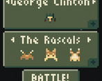
Only thing that breaks my heart is that George Clinton would be out here trying to conquer galaxies.
LOL I wasn’t familiar with George Clinton, the musician, until now! We simply combined the first and the last names of different US presidents for the pilots. It might be a good idea to change it hehehe. Thank you so much for taking the time to play and for saying such nice things about the game. Your game is super cool!
Love the visuals and the audio. Perhaps I don't fully understand the gameplay, but I tried to control the individual ships on my side and wasn't able to do so.
Is the gameplay just clicking to deploy ships once they become available? Is there some extra element I'm missing here?
For now, the gameplay during the battle is simply deploying the drones in the most optimal order — they move / fire by themselves. Picking the best drone squad to fight each enemy ship also requires some thought (although we had to sacrifice balancing due to time constraints, so it’s far from perfect). For now, the strategic / tactical decisions are definitely narrow. We wanted to focus on presenting the core gameplay concept with a polished experience, and improve on it in case the idea had legs. Thank you heaps for playing and leaving feedback!
An interesting idea. The presentation is great. The menus, music, and sounds all work together very well.
It's very hard to grasp any strategy on it though, as you can't place the drones yourself and you it doesn't feel like you can wait until all the drones recharge because every second counts.
Thank you for playing and for the feedback, we appreciate it :)
I really liked the idea of flipping around the classic Space Invaders game! A very unique idea I can’t recall seeing anywhere before, and it was very well executed! The graphics were excellently done. The ships all felt unique, and I was also impressed by not just how much information you were able to convey in such a small resolution, but how cleanly it was all presented!
One of the biggest issues I had was, when the game starts, there’s a period of time when I’m waiting for my Protectors to become available and, in that time, the enemy ship is making progress on the tracker at the bottom of the screen. I think, it would be a little more fair if at least one of my Protectors was available as soon as the game starts. This can be random, or it could be that the player gets to choose which protector is immediately available, but, I just feel like I’m loosing a small chuck of the game through no fault of my own.
Another issue I noticed was, there were a couple times when I would have, for instance, Protector A on the field attacking the human ship and, the button for Protector A fills up and goes white, indicating it’s ready to deploy, but, because Protector A hasn’t been shot down yet, I click on Protector A’s button, and nothing happens… now, nothing happening isn’t the issue itself, but rather, the button turning white. If the button turns white, I want to click it. I may not notice that my Protector A is still on the field, so I keep spamming the Protector A button because it suggests it’s available. Instead, I think the button should fill up, but only turn white if the corresponding Protector isn’t actively on the field… Hope that makes sense.
Finally, small issue, and, during stream you already mentioned it was a web-build issues, but still mentioning it… the larger text, like “VICTORY” or “DEFEATED” get cut in half. Nothing major. I know what the text was supposed to be even without having seen the screenshots, but still.
Overall, wonderfully made game!!
First of all, we’d like to thank you for streaming not only our game but a bunch of other games from this jam. It was great for the community and for us as game devs / designers / artists. Your live feedback was invaluable as a learning tool and you added a lot of charisma to the experience. Keep at it, your content is great :) Also, we deeply appreciate your suggestions on how to improve the gameplay and the UI — they will help us solve some design issues in a smart and straightforward way. Thank you so much for playing our game, streaming and leaving such in-depth feedback. You rock!
This turned out well! It looks really good and, and the resolution doesn't hinder anything at all to me.
I agree that it felt lacking in the strategy department, and the side-shooting bots were so bad at aiming it became a little frustrating. I decided on the rogues as the best team for John Nixon, due to their high fire rate, but then it became a game of chance of whether or not the drones could even hit the ship. I never ended up beating the last guy, but I did give it a good 10 tries!
Overall a really good concept (especially as someone whos bad at sh'mups! This is a fun subversion of the usually hectic gameplay) that would be excellent with a little more fine tuning :)
Thank you very much for playing! We definitely had to sacrifice some balancing and cut some strategy features to make sure we could make a complete, polished experience in time. But I totally agree, the gameplay needs a bit more “fleshing out” before it can be considered a full game, not just a “jam game”.
Interesting concept, I wish there was more strategy behind the gameplay though, I feel this has great potential.
We decided to keep the scope as under control as possible so we ended up with a more bare-bones gameplay experience for this version. But I agree, some more strategic / tactical resources would be very welcome. We appreciate you taking the time to play and leave feedback, thank you :)
This is such a neat idea. The sound design is top-notch, and the pixelwork is great. The UI overall is incredibly clean. (The drone counter on the battle screen I think got mis-sized, it looks smaller than it should for 64x64 pixels. Also there's a strange visual glitch on the web build in Firefox at least where some of the text is cut off halfway. Victory, Defeat, and the title are the only things I think were affected by that.) I do wish there was another aspect to the fight, though I'm not sure what--something interactive, like maybe clicking on a drone to activate a special move or something? Regardless, an A+ game that I had fun playing.
(Also, extra kudos to whomever named the human pilots. That got a chuckle out of me.)
Sadly we did not foresee the text rendering issues — we plan on correcting this for a post-jam version. Nice idea on drones having special moves / skills! We wanted to add a couple of drone-independent weapons / items with a high cooldown and powerful effects, but we ran out of time. Thank you so much for playing and leaving thoughtful and kind feedback, we appreciate it!
I like the idea, haven’t thought about it or seen it before. AI seems solid, good job!
Thanks for playing and reviewing, so happy that you liked the idea.
Wonderful looking game, despite limitations, and I'm amazed that you managed to get an AI sorted in time! I would like to have seen some more complexity, but it's still a great game!
We would love to increase the complexity. Sadly we had no time enough, even though it's already pretty hard to beat sometimes.
Thanks for playing and reviewing. We Appreciate.
This is a really unique idea-- it did take me a few minutes to understand what was going on but then it clicked. The presentation of the whole thing is really nice, I love the menus, the color palette, the music. Very nice to look at and I can feel the love put into this game.
Ahh appreciate the kind words <3 Looking back, we think the game could’ve benefited from a more in-depth tutorial. The experience is different enough that it requires further explanation. Thank you for playing and sharing our thoughts with us :)
Took a lil learning to know the mechanic, but when I figured it out I loved it!
I'm happy that you liked it, thanks for your review!!