Play game
Shitty Mech Game's itch.io pageResults
| Criteria | Rank | Score* | Raw Score |
| Visuals | #52 | 3.280 | 3.280 |
| Audio (Does not apply for Physical Games) | #58 | 2.480 | 2.480 |
| Overall | #59 | 2.840 | 2.840 |
| Fun Factor | #59 | 2.680 | 2.680 |
| Originality | #80 | 2.480 | 2.480 |
Ranked from 25 ratings. Score is adjusted from raw score by the median number of ratings per game in the jam.
Is your game a video game or a physical game?
video game
Was your game made solo or in a team?
solo
Did you use any third party assets, if yes what assets did you use?
Tiny Worls: Free Pixel Font - Thaleah ... Chris Nolet: Quick Outline
Did you use choose from one of the optional secondary themes?
retro
Does your game contain 18+ content (Nudity, Gore, Language)?
yes
Leave a comment
Log in with itch.io to leave a comment.


Comments
Hi Nezuo, took this for a spin. It has groovy aesthetic. Some indication of whether my shots were hitting the enemies would be cool. A good jam submission.
Nice classic game. But the name of the game is weird.
really like the visual flare you got going on there
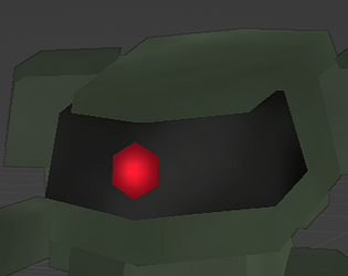
I like the style, it's really plausible as an original classic and the low-fi particles remind me of games like lhx. Mech design has a playstation era vibe, and dithering background was a great touch.
Not shitty as the title suggest at all :D
The controls are great. I find it funny how you've put those images of control layouts right ingame.
Not so shitty mech game.
I had fun with it! Really liked the aesthetic and the mech design. I think some better hit registration and lower mouse sensitivity would be really nice, though.
I loved the mech models, they look so cool!
Pretty dither and very nice mech models. Simple, fast-paced, and enjoyable combat. I would however recommend that you add a bit of 'juice' to the combat, or else it ends up feeling a bit repetitive. Nice submission.
The movement was pretty smooth, it was a bit difficult to see if you are hitting enemies from far away, but I saw it up close. Really liked the style reminded me of retro games I used to play. Good job!
I probably could've made it a bit more clear but the players gun has a pretty limited range, both of the enemies can shoot at you before you can them.
I had some trouble with the web version with the camera wanting to drag back to the bottom right constantly, but I had a good time running around and pkewing at enemies. I loved the enemy mech design too!
Interesting, I'll have to look into that, thanks for the heads up.
It’s absolutely not shitty hahaha. Small scopes are fun too! I had some mouse drift for some reason, but other than that really cool.
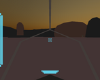
Agree on the crosshair feedback below, something like a hexagonal outline would look appropriately sci-fi while not obscuring vision. Nice fullscreen dither and feeling of being in the cockpit, I'm a sucker for that stuff :)
I found that it was sometimes hard to tell if the Dash was doing much - maybe it needs to be more intense? Maybe an anime-ish screen effect?
Other than that I enjoyed circle-strafe-cheesing the enemies a la Doom. Makes me think that with more time, this could be the pace & feel of classic Doom mixed with the customisation, heat/energy management etc... of PS1/2-era Armored Core. Homing enemy projectiles that require Dashing at the last second might be cool too. I like it :)
Retro shooters like doom were an inspiration for the gameplay for sure, heat/energy management is something I'd love to add in the future, as well as customization. Thanks for taking the time to play, and I'm glad you enjoyed it!
I'd say you've mistitled it cause from what i tried it's anything but shit XD
Feels pretty fun to play and i like how this is essentially a more action focused MW2 with the more sim aspects cut out, visually it feels pretty authentic too, i like the dithering effect on the mountains, and the flat shaded look really feels like your inspiration source ^^
I'd say the main issue so far is that combat is a bit hard cause you can't really judge when an enemy's about to shoot so it's hard to dodge any incoming missile, and the crosshair could be a bit more translucent cause here it tends to obscure the target a bit.
But otherwise it's pretty solid, so you did great here as far as i'm concerned :)
I hadn't considered making the reticle translucent, I tried making it smaller but it distorted. That woulda been a good idea. And I do agree that right now it is a bit too reliant on trial and error to get the timing down. I didn't have quite enough time to get a working tell for those missiles. Its a bit rough around the edges but certainly playable. Thanks for playing, commenting, all that jazz, and glad you enjoyed it!
No worries like i said despite some rough stuff this is solid :)