Play game
We Have Evangelion at Home's itch.io pageResults
| Criteria | Rank | Score* | Raw Score |
| Fun Factor | #30 | 3.138 | 3.138 |
| Overall | #36 | 3.241 | 3.241 |
| Visuals | #36 | 3.621 | 3.621 |
| Audio (Does not apply for Physical Games) | #48 | 2.690 | 2.690 |
| Originality | #59 | 2.828 | 2.828 |
Ranked from 29 ratings. Score is adjusted from raw score by the median number of ratings per game in the jam.
Is your game a video game or a physical game?
Video Game
Was your game made solo or in a team?
Solo
Did you use any third party assets, if yes what assets did you use?
"Neon Laser Horizon" Kevin MacLeod (incompetech.com) Licensed under Creative Commons: By Attribution 4.0 License http://creativecommons.org/licenses/by/4.0/ Some assets made with AssetForge by Kenney https://assetforge.io/ Nectar Font License Free for personal use. For commercial use, please order a license here: https://www.creativefabrica.com/product/nectar-3/ref/144265/
Did you use choose from one of the optional secondary themes?
None
Does your game contain 18+ content (Nudity, Gore, Language)?
No
Leave a comment
Log in with itch.io to leave a comment.


Comments
The title is apt for what we have here. Jokes aside, It's a nice little isometric shooter. Though, I feel like the first weapon paled in comparison to the other two options. I also found myself quickly outnumbered by aircraft and the AA rockets weren't enough to deal with them all.
Mhm You are right. Some of that was by design, I wanted the game to end and didn’t want the player to be stuck in game for half an hour just shooting enemies. It certainly needs balance. Thanks for the feedback :)
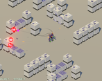
Solid start, found it very hard to actually see the default weapons shots against the floor texture!
Yeah the projectiles is something I want to iterate on
Nice work! The visuals look great, I like the mech models and enemy models, and their movement is executed well. I also appreciate the variety of weapons. Does the shield also block enemy attack, or is it used to alert the enemy aircraft?
It’s supposed to be a radar pulse to lock your missile swarm on airships. Buuuuut the vfx is not clear at all, I agree
Really nice mech models with some fun music! Fell off the map a couple of times, but hey, it happens!
Space exploration is where it’s at! Thanks for the compliments, first model I’ve ever rigged hahaha
Very nice game! Love the variety of weapons, always appreciate having shotgun like option. The models looked great as well and it looked very well put together overall. Nice work!
Thanks!
I like the isometric perspective, just a shame there are no sound effects. I think that would make it better.
Overall I think it's a good start for what could be a bigger game!
Great to change between the different weapons, especially the cluster bomb and the anti air homing missiles.
My Evangelion will never succumb to the enemy as they are chilling in the void after a long mission 😀
Nice tutorial as well!
Haha, thanks! I had fixing the out of bounds thing in my list and I completely forgot about it xD
love the title/theme haha
The graphics were nice, and it's a solid gameplay loop. If I could offer some criticism, I think adding some shadows under the mech/enemies would do a lot for spatial awareness, and I would personally swap the UI for the weapon selection to match the side of the mouse that the player has to click to fire them; currently, the AA is RMB but is on the left of the weapon UI (and conversely for your primary weapon) which makes selecting your weapon a little less intuitive than it would be otherwise.
EDIT
actually on a second look, there are shadows in the screenshots but they weren't rendering for me...weird. I wonder if this is a bug?
There are shadows, but the light is not perfectly perpendicular to the ground plane. I iterated a bit on the angle and haven’t settled a bit on a better angle yet. Might be a bug who knows! Thanks for the feedback too!
Really nice game, I especially liked the look of the models!
Fun horde mode + gotta love that title joke XD
The 3D models are cool, and i like both the mech and the enemy planes/tanks designs.
Gameplay wise the WASD + mouse aim combo works really well, and there's a good amount of weapon variety on offer.
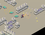
If i had to nitpick i'd say the only small issues i had were the anti air missile aren't all that intuitive at first, cause the scan zone kinda looked like a shield to me, but it's not a big deal cause once you get what it actually is its easy to use and pretty fun at that, the other is a small readability issue, the laser color (the turquoise - ish looking one) is kinda hard to see against the ground's color so it makes it a bit difficult to see if you're hitting anything with this weapon.
But like i said more small nitpicks than anything ^^
The rest is pretty good and i can easily imagine a fuller version with small missions more enemy types etc...
Fun fact, you can fall out of the map O_o happened to me the first time i thought there'd be invisible walls at the edge of the arena but nope XD
Anyway, well done :)
Thanks for the thorough feedback!
Nice music and a fun visual style! I'm always a sucker for missile swam weapons, too. I thought the weapon management was a little clunky, maybe one of those could be just the mouse wheel?
Yeah, you are totally right. I just wanted to show variety and UX kinda got brushed to the side for the jam version.
Nice entry! I think that some sound effects would help in giving the whole situation a little more weight/general context. While we are shown that the mech is large compared to the buildings it is hard to feel that without clunking footsteps and the like.
Yeah, I tried adding sounds but at that point I was already too burnt out to keep fiddling with a good balance so it wouldn’t just become noise. I will certainly try and add sounds after the jam ends :)
I know the feeling well XD. Good work making it as far as you did
Love the tutorial screen haha. Overall nice work! :)
Hope it was helpful enough hahaha. I realized color coding stuff was maybe bad without testing if it was clear for color blind people
I think red-blue color blindness is fairly rare, so that should be fine for most people. Only thing I would change to make it more intuitive: swap the two weapon selection columns in the user interface, so the left click weapon selector is on the left, and the one for right click on the right.
The game overall is pretty fun! I loved the aerial assault and the way you can target them was crisp! I even felt it would have been cool if you could target the land units as well. It was pretty fun for the ride!
Yeah. If I continue this project I will probably make other ground specific weapons and stuff. Lot’s of things to iterate upon which I just did not have enough time for.
switching between missiles and bombs is fun, the music is jammin', falling off the map is hilarious everytime as the mech just kinda vibes to music in the void
Oh shi–. Forgot to fix that, I had it in my list!