Play game
Mech Jam IV: Tountra - Cold Steel Vengeance's itch.io pageResults
| Criteria | Rank | Score* | Raw Score |
| Fun Factor | #18 | 3.421 | 3.421 |
| Overall | #29 | 3.474 | 3.474 |
| Audio | #35 | 3.211 | 3.211 |
| Visuals | #40 | 3.526 | 3.526 |
| Originality | #55 | 3.211 | 3.211 |
Ranked from 19 ratings. Score is adjusted from raw score by the median number of ratings per game in the jam.
Is your game a video game or a physical game?
Video Game
Was your game made solo or in a team?
Knight Ideas - Unity Lead, Fixel - 2D Assets, Denos - Music and SFX, GuyW - 3D Models, MemoryCanyon - Unity Coder, Moth - Code Tester
Did you use any third party assets, if yes what assets did you use?
AI Generate Skybox: Some unity textures used for terrain - free to use: All other assets created by the team.
Did you choose from one (or more) of the optional secondary themes?
Dragons, Frost, Starting small, Low battery, Resourceful
Does your game contain 18+ content (Nudity, Gore, Language)?
NA
Leave a comment
Log in with itch.io to leave a comment.


Comments
I enjoyed playing but got a little dizzy at times. I wasn't sure if my health was the green bar at the top or red power bar. I didn't die when the red bar ran out. Loved the artwork and UI, the character it all looked great! I especially liked the game case cover design. Great work to you and your team!
Its a fun little game. Great job. I liked how I could drift with the mech if I boosted into corners haha.
My only issue were that the projectiles seem to stop where I clicked rather than keep going forwads till a hit was made. Other than that, great work.
Thank you for playing and leaving feadback.
It was a toss up between an aim to ground based system or enemies with very tall colliders, otherwise the shots would possibly pass over them.
I noticed that many people expected the shots to carry on so I'll probably change back to the other system, its not a difficult change to make and I think it will be a big improvement.
I had fun :) Good job team!
Thank you!
Nice game, really good visual designs for the mech and vehicles. I was seemingly invincible though and I started to float above everything?
You and a few others it seems.
Lots to fix over the coming months, we'll post a dev log once its done, but obviously can't upload anything until the jam is over!
Played on stream, VOD here: https://youtu.be/wlr1r0gS4Uk?t=3508
Thank you for taking the time to play.
I agree with the camera, once the jam is over we are going to work on the things that didn't come out as we would have liked.
Hope you enjoyed the game though.
Hi there. I don't know is it only problem of mine, but the game becomes laggy after the first 10-15 minutes of gameplay. And the laggishness is accumulating, at some point it is unforgivably laggy. So you have no any ability to proceed playing :(
Pretty sure its the pickups, nothing I can do until after the jam though I'm afriad.
Its a shame as I have a switch on everybase that tracks the player, the game used to fly along really smooth for the size and what was happening, but there is no time to live for the pickups so they just persist.
Once the jam is over I will fix that issue immediately
Nice one, I really like the art and the narrative works well to add immersion, good job!
I do feel a bit dizzy whenever the camera rotates though, but maybe that's just me being weak, ahaha
We wil be going with a different camera perspective once the jam is over.
I'm glad that you enjoyed playing.
Súper chuli el juego me ha gustado mucho la estica y la idea tengo ganas de ver cómo desenvuelve ^^
I am going to as many games as I can on this jam and leaving constructive and positive feedback.
Constructive: I had fun playing this though there were a few things that stood out to me. I felt the rotation of the camera sometimes made me a little motion sick so maybe finding a better way to control it would help. I also often would get stuck when surrounded due to enemy projectiles.
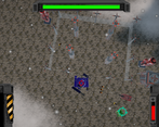
Positive Feedback: Visually the game looks really good, and i loved the collapse animations when destroying a target. I also loved the UI and the diverse weapon options. The mini map helped a lot with navigations and has a cool style to it.
Overall very nice job, seems well polished and was enjoyable to play!!!
I had fun with this shooter! I like the variation in enemies and base-layout, it makes it very fun to explore. I got a kick out of unlocking the grenade launcher, it was a blast to use!
I think that I would find it even more fun if there were a way to 'strafe' with the mech, it would work nicely with the bullet-hell-like feeling of the game. Also would be really staisfying if the regular gun had some impact feedback, I think that's why the greanade launcher was so nice to use.
There were some things I never got the hang of, like the green bar at the top, but all in all it's a fun contribution to the jam :)
El juego tiene potencial pero podríais ajustar la cámara, poner un árbol de habilidades o diferentes robots. La mecánica de driftear molaria que destacara mas con chispas o un movimiento mas exagerado. Si se pule y se implementan mecánicas chulas tendría potencial.
Aprecio tu pensamiento creativo y fuera de lo común para las mejoras. Son sugerencias perspicaces que definitivamente consideraremos. ¡Gracias!
I dont know if i fully understand how to play, but i was enjoying boosting and wandering around to kill all those Enemies i found.
It feels like a Command and Conquer Shooter with those Tanks, the Mech could need some improvements.
Is there more then 1 Level?
Good Job for the Game i enjoyed it.
Thank you for playing, glad you enjoyed it.
There were some mechanics that didn't get fully fleshed out.
What about the mech could be better?
There are 3 areas of the map to explore with the final being a mech vs mech boss battle.
Each zone has a barricade set up as an upgrade check on the player.
Honestly though I struggled to find my way around the map even though I designed the damn things so it needed some more ways of finding your way around apart from just the radar.
i felt even with the radar kinda lost but without it would be a bad experience i think so good you implemented that. It was a nice experience. Mhh maybe i killed those Boss im not sure, i remember a Huge tank or something :p
I Mean from the Visual appearance and Controls. It feel like a floating Wall-E with Weapons in Ugly Blue xD
Fair enough, perhaps I didnt present the mech in the best possible light but I've got to defend our 3D modeller because he worked tirelessly and made all the enemy models during the jam.
He even put together last minute snow textures for all the models that didn't make it in to the build, my fault.
Either way thank you for the feedback.
The Enemies are awesome, but the Player Mech doesn't look good compared to the Enemies.
Not only the Enemies, also the Environment Models looks pretty nice!
I didn't mean that offensive, sorry if it sounded like.
Its fine, these things are subjective anyway.
The strong colours were in case the snow effects limited vision, perhaps we could of had a more muted the colour pallete a little if we knew it would be brighter etc and easier to see.
Really neat!
Not sure if it was fully intentional but the time it took for the momentum to slow down from movement really felt like it added some weight to the mech.
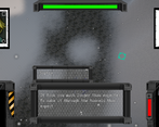
I wasn't expecting the dialogue at the start to give a little bit of story and explanation to the weapons, like the tip to take out the enemies to get mortar shells for your own mortar, a cool direction to take with the resourceful theme.
I came across an upgrade for the weapon in slot 1 which I wasn't expecting to find either, certainly felt like the more I played the more there was hidden around to discover which was honestly kinda rad.
The looks crisp and thematic, both in the art aspect and the gameplay aspect, like the map felt like it fit as a kind of radar / sonar look.
Overall I thought it was great, good job!
I'm glad you enjoyed it and managed to find some of the hidden stuff.
There was actually more dialogue that refused to trigger, we just had very little time for play testing in the end.
The design for the mech worked around velocity and drag so it was intentional but we were lucky with some of the initial control designs working from the outset, I just didn't know how it would behave on the big mechs.
There were weapon unlocks for the Mortar and Railgun and a level 1 upgrade for all but the railgun scattered around.
Very cool, reminds me of some old arcade games I played as a kid. Plenty of things to blow up, lots of ammo pickups and very smooth considering the short work window we had. I encountered a bug which gave me infinite health, but that was a nice chance to explore the map and check things out. I especially liked the dialogue section in the beginning and the old-school cover art! Some more character interaction, story development, and specific mission parameters could make this a really cool game in the future!
Thank you for having a play.
It definately needed more time for dialogue and fleshing out the barricade/ fortress playstyle.
2 weeks goes by quick. Making a solid demo like yours is about the best anyone can hope for. Besides, you can always flesh it out after the contest if you want :)
The game was really fun, and I loved the fact that everything is destructible so you can just wipe a base from existence. The sound design is very cool and satisfying, and I loved the cover art too. Once I got the hang of the movement, my strategy was to circle strafe with the shotgun. The art direction and designs were also top tier
Unfortunately, there was a bit of a performance issue; the longer I played the more jittery it became, to the point where I just quit the game because the lag was unbearable. My session was pretty long so it shouldn't be too big of an issue.
The graphics could use a bit more polish; a realtime directional light would've be nice (although I have tried to use unity's terrain with baked lighting, so I do understand why there is no said light), as well as some post processing (some anti aliasing, ambient occlusion, bloom and color grading would be beneficial here). Either that or you could've make it look more retro to fit the 80s/90s cover art style. Although, the game looked good anyway.
Thank you for playing.
Glad you had some fun with it, the destructible buildings were tedious in blender but the final effect is worth it.
I have some ideas on the performance spikes so I can hopefully polish the game after the jam is finished.
Nice to get some graphics feedback, I'd planned to do more with the visuals but it was a race at the end to get as much of my team's work in as possible and since final visuals was on me it slipped a bit.
Snow effect was made in the wee hours of the morning crunch time.
Your spot on about lighting, would love more time to test things.
Light bake was also the last thing I finished!
Neat and streamlined gameplay experience.
Shooting the mortar felt very satisfying, variety of enemies and difficulty progression also keeps the game engaging and fun
The shotgun felt underpowered compared to to the rifle (maybe less spread would make it more effective), I think some variety in the colour/shapes of the projectiles would add also some visual fidelity and make it easier to differentiate between different bullets.
Great work
Than you for taking the time to play.
I'm glad you found the mortar and got to test it out.
I agree with everything that you said, especially the shotgun.
For some reason I put off tweaking it.
Awesome game and lives up to the expectations set by the cover artwork :D
First of all the story and setting are really cool, with the main mech being a sort of surprise superweapon develop to flip the balance on a dire situation.
I also really like how this plays, even for a tracked vehicle you managed tomake it feel nimble enough to outmanoeuvre the Red Claw’s regular tanks especially with the boost.
The models both the main mech and the enemy vehicles and buildings have awesome designs to them as well, and i’m quite impressed by the enemy and building variety showcased here for a jam game :o also digged the way you made the shield on some turrets look, it made me think of how sheilds looked in the old Dune movie so i don’t know if this was an intentionnal nod or not but quite cool regardless :p
The Ui design is also really nice with the screens feeling like analogue screens inside the Mech itself, although one small issue i’ve had is that it tends to get in the way and obscure the view when battling enemies. One other small issue i had as well was that the minimap didn’t show the terrain on the background which made it a bit hard to know where i was going outside of the marked “areas” of enemy bases.
Other than that it’s really an impressive entry, and i like how the leveldesign makes it feel like you’re wrecking havok on someone’s neetly planned RTS bases XD
Good job to all you guys :)
Really appreciate the indepth review and taking the time to play our game.
I'm glad to hear that you enjoyed it overall.
I too became very lost and I designed the levels, many clever thoughts on how to improve it but a little late in the jam to do anything.
It will be the first big thing fixed in any updates!
Our UIs are on the chunky side... they need to lose some weight.
No worries, i always try to be detailed when giving feedback in hope this helps ^^
But yeah it’s a cool game, and i’m sure the updates will iron things out.
The UI thing can be tricky though cause to be honest i really like chunky diegetic UI elements like this but here i feel that it kinda gets in the way since you see everything in a topdown view and that the whole view rotates when you turn the lower part of the mech, so i’m not sure how you could find a good compromise here, cause it’ll be a shame to just ditch these sick looking monitors :)