Play game
Misery Blissness's itch.io pageResults
| Criteria | Rank | Score* | Raw Score |
| Concept | #4 | 3.889 | 3.889 |
| Overall | #12 | 3.181 | 3.181 |
| Presentation | #15 | 3.500 | 3.500 |
| Use of the Limitation | #27 | 2.722 | 2.722 |
| Enjoyment | #44 | 2.611 | 2.611 |
Ranked from 18 ratings. Score is adjusted from raw score by the median number of ratings per game in the jam.
Team members
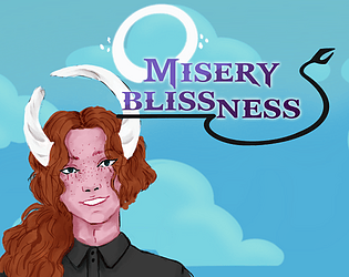
Four of us worked on it, One Programmer who also Designed the game, Two Artists and one Sound Designer. There are links to each of our itch pages on the game page credits! Heres the list though:Ryria - Game Design, Programming; Ayperosia - UI Art, Devi & Peter Characters; Caesarinohs- 'Soul' Character Assets; Finn Talisker Music - BG Soundtrack
Software used
Unity, Clip Studio Paint
Use of the limitation
Each soul, room and even your playable character Peter can become lost forever to the lower realms of hell if you miss-manage the bliss and cause too much Misery!
Cookies eaten
About 4 personally over the jam, I think our programmer had a few more than that though 😊
Leave a comment
Log in with itch.io to leave a comment.


Comments
I felt as if the rate of new souls was a bit high! I still had fun though. I eventually lost when I had about 6 archangels and was trying to just free up the queues by sending people to random angels.
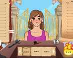
The character designs are great and full of personality. It made me keep going just to see who the next person through the gates would be.
The game concept was interesting but it took me a while to wrap my head around it at first. Even after I basically understood how it worked I didn't get a good feel for how well I was doing or the consequences of putting a person on a specific angel.
Though I think part of the problem might be trying to wrap my head around all the mechanics when I'm just quickly jumping between different games. It gave me a similar feeling to trying to play a tabletop board game with a group who's never played it before.
I can tell a lot of effort went into the project. And overall it's a neat game.
Im glad I finally got around to your teams game, was excited for it since I saw it in the discord, I really really enjoy anything with a hint of simulation and my mouth salivates at potential hehe.
I really enjoyed this entry, Your basically just trying to fit characters into "good enough" rooms so they can get along well. Its cute, and I would love to see some sort of expansion on the interactions between the people. Considering how short the Jam is and how much is here I wouldnt say that would have been good for the jam haha.
Things I loved: The art (I am especially a sucker to things that remind me of Chainsaw man right now, and one of the mouths just screamed Power to me haha) I myself love adding character generators to things ehehe, I know its takes quite a bit of time sometimes.
The concept, heaven management, where you biggest concern is keeping people with those that make them happy. Simulation is so expandable in so many directions which is why its so exciting to see in Jams. For example, Having a relative system, people want to live with family, but that might create alot more diverse thought in a space, which can cause more conflict. Plus I love the idea that Archangels are just dead people baby sitters.
Some notes from me tho, It was hard to exactly tell how well I was doing and I think the reason is, too many stats. They were all fun to look at, but it made it hard to tell what was actually good or not. Maybe less would have been more tight feeling. For the jam version this was fine, reading over the stats was the main thing to do. I do think numbers beside the sliders could have helped too.
I did find a someone goofy almost evil strat however haha. Get 2 angels. Then just start LOADING up the first one with who ever, this will average out the interests and lead to high misery. At first I thought it was clever "if its average everyone will be neutral, not miserable! aha!" I was wrong, so really great work balancing that. THE true strat came in realizing that the angel doesnt close up, until you click off, so even if its so miserable it collapses I can keep sending souls to it. Forever! I get paid, they get sent to earth 2. Use this to stockpile up a TON of money, then you can basically just have free rein of sending who ever to hell if you wanted. Made it so if you want to get into heaven you have to love pepsi, dogs, winter, and the night time hehe.
This was alot sorry!
tldr: Art was fantastic. Concept is awesome and fun to play with! Would love more Clarity on how well your doing. Should probably kick the player out of the Archangels room once it collapses otherwise it just becomes hell that pays you hehe.
The art of the game is very good, and the gameplay reminds me of the indie game: "Papers, Please"; but the gameplay seems very confusing to me. I would suggest simplifying more the game mechanics.
Tysm, our initial concept had influence from ‘Papers, Please’. We’d love to make it easier to understand if we have a chance to further develop the project, thanks for the feedback!
This is an incredibly cute game. I love the idea of it and you really managed to convey a heavenly vibe :) It is a shame the hair thing happened right at the end of development, but you barely notice with most characters. Overall you guys did an amazing job!
Thank you so much! Even with the wee bugs, I think we’re all proud of what we managed to create in this wee jam as a proof-of-concept!
If this game had a slow and step by step introduction to all of it's concept and features it would be great. Right now I feel like not understanding enough of it, to really play it.
Ah yeah, sorry about that, we didn’t quite have time to go back to make an introduction during the jam itself. It’s something we wanted to add but had to settle for popping some key info and a wee infographic on the itch page to meet the deadline
Thank you so much for trying out our wee game and taking the time to write us some feedback!
Lots of interesting mechanics and concepts here. The gameplay loop seems really solid (and is very stressful for me, ha, like all games of this genre). I liked how the different realms change to an average of all the inhabitants.
The Cloud 9 Social seemed cool, but I also never looked at it. It felt like too much raw data without really telling me much. I'd have liked to have seen some kind of summary sort of thing? The burning pages gave me some of that, but maybe some more indications would have been cool? Like an overall bliss per realm shorthand on each of the pages?
Also, having the misery/bliss be at the top of the comparison charts, but not separated in some way, was a bit visually confusing, in that a quick scan to check compatibility often caught the misery/bliss as one of the things I needed to compare.
Anyway, very polished and impressive!
Thank you so much for playing, and thank you so much for the in-depth feedback!
I agree with you, having an indication on the realm pages at the bottom for player clarity would be a great addition! If we decide to take the project forward, we’ll for sure add something of the sort to make information easier to glean at a glance for players. Having a little more separation for the average realm total is for sure another thing we’ll look into fixing if we take the game further as well.
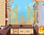
The art and the presentation and lovely, the Cities: Skylines—style Cloud 9 interface is a really cool interaction idea for player feedback. And double-hair bug is, in my opinion, not a bug at all, it’s magical.
It wasn’t clear to me if there was a “win” point or “lose” point, or what the downside is of putting people who disagree in the same realm, just seems like you still get bliss just less of it. I guess it would help if you made clearer what the end goal is — or, if there isn’t supposed to be an end goal, just making that clearer would be good too.
I think a casual, personal game like this would benefit a lotfrom little dialogue lines from the people at the pearly gates.
I like this game, thank you for sharing it with us!
Thank you so much for the feedback!
There is not a set win point, but the game gets faster and harder as time passes, with more souls queueing up faster and the cost to request new realms increases each time you get a new room as well! And losing is based on your own bliss, which is affected by overall ream/room happiness, how many souls are queued up, giving a soul over to Devi using the flame icon, or losing realms/rooms! It’s something that I should’ve popped on the page for player clarity, so I’ll amend it tysm!
Adding dialogue for Devi and Peter was one of our stretch goals, we might go back to add it after the rating for the jam ends when we have some time to. Thank you so much for the suggestion of adding some dialogue with the lost souls, that sounds like it’d be a really fun element to play with!
It seems like it would be interesting, but it was hard for me to tell what to actually do in the game. It would be nice if there was more information on the controls and what each of the elements you click on do, and why you should click on them.
Hi! Thank you for the feedback! We didn’t quite have the time to implement any hint features during the jam… But, if you pop over to the games page and spy, theres a wee infographic that walks you through the buttons and icons in the gallery, as well as some key info listed on the page ✨️