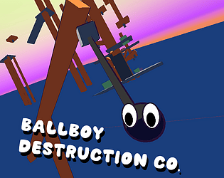
Play game
BallBoy Destruction Co.'s itch.io pageResults
| Criteria | Rank | Score* | Raw Score |
| Presentation | #19 | 3.615 | 3.615 |
| Use of the Limitation | #19 | 3.385 | 3.385 |
| Overall | #25 | 3.308 | 3.308 |
| Concept | #25 | 3.538 | 3.538 |
| Enjoyment | #44 | 2.692 | 2.692 |
Ranked from 13 ratings. Score is adjusted from raw score by the median number of ratings per game in the jam.
Team members
Just me DuckTree
Software used
Unity
Use of the limitation
The level slowly lowers into the ocean, forcing you to quickly rise to the top.
Cookies eaten
1 this time :3 I'm quite happy about it.
Leave a comment
Log in with itch.io to leave a comment.


Comments
I loved the intro, the menu, and the graphics. The blob was so cute. The music was interesting xD. I can tell how much effort was put into the camera and player movement.
Like the others I had trouble with controls. Although the camera didn't bother me as much. I just couldn't get the hang of the controls enough to be precise with it.
I wasn't sure why I was restarting(unless I rolled off an edge D:) until I read the comments and the subbmission page.
Nice work on this! I really liked the intro UI, loading sequence, and everything—all felt very polished. The dynamic camera felt really good for the first part of the game, but unfortunately led to a lot of difficulty with the controls when I got to the grappling section. I almost wonder if locking the camera to a sort of 2.5D perspective would help during those parts, as I found it really hard to intuit which direction I needed to hold to swing in the direction I wanted. For the parts of the grappling sequence that I could do, though, I really enjoyed the swinging mechanic!
I was also unable to tell exactly where the water level was at any given moment, which caused some frustration when dying to the time limit. Part of me feels like I would've enjoyed the game more without the rising water altogether, though I understand that was necessary for the limitation.
The music was a lot of fun!
Great job overall, I think with some work on the camera and controls this has a lot of potential!
Nice idea to make the camera locked in areas where control is needed. I've decided to just make the camera's orientation and hence the movement direction fixed, only changed at certain triggers where the level would change direction.
Didn't also realise that the water would be difficult to see how far up it is, which now makes sense due to the poor depth perception. I might add a UI element to show the water but honestly I didn't want the time limit in the game at all its just for the limitation.
Honestly during testing my I ended up finding that the easiest and fastest way to clear the grapple section was to get a good launch off the first one to skip it... which should have clued me in but eh now I know.
Not bad, I really love visuals!
Pretty cool game. I like the movement and I think it could be further improved and feel more responsive had you made the dash and acceleration faster.
Really fun game, the sonic vibes in the level start and end screen are super fun!
I think you said in the Discord at one point "depth perception hard" or something to that nature and gotta say, yeah I feel that haha, was alot of fun and the shadow was very helpful at times. Momentum gameplay was great too, but took me a hot minute to learn there was a dash (I didnt read the description and went right in), would be nice if there was some indication on what buttons I need to use hehe, but other then a bit of learning it was alot of fun.
Visuals were very enjoyable and the music was pretty interesting. Is it weird that the game made me think of De Blob? just the vibes, colors, oil, playing as a ball.
Had lots of fun I think my winning run was a C rank.
Great work on this game
Glad you liked the game, and managed to finish it. The controls I would have loved to display somewhere in that first section of the level like I usually do but my time was running out so had to settle for description controls method.
Also funnily enough the level start and end screen were just very rushed recreations of ones I made for a sonic fangame.
Pretty Good Concept, I like the Cartoon Design.
Loved the juicy UI!
The idea of the project is interesting (I have a similar one, but in the first person), but the realization is so-so. I will highlight a few points:
Upd: a quick restart feature would be very helpful
Thanks for playing the game :3
The Pseudo-loading screen was mainly just so it doesn't look jarring when the level restarts entirely but I seem to have messed up the timing in the animation so it goes for longer than it honestly should. This was a last minute addition, which also explains the control during it which I did notice but didn't have time to fix before posting. Apologies for that.
I was expecting complaints about the camera since even I at times was confused by it but I hadn't thought it would be so bad (turns out I'm wrong) I should have honestly noticed sooner and tried out a different style of camera but for the level I wanted to make I felt like it was necessary. Honestly if you have any ideas on how the camera could be better for this sort of winding level I would love to hear.
So far, I have only two ideas of what can be done with the camera:
Thanks for the suggestions. I saw someone else say to make sections like the grappling areas with a fixed camera so I might for the post jam release make a new system that just has the camera switch orientation at certain triggers in areas where its safer to lose control for a split second, having the camera still follow the player in a similar way but now the movement direction is mostly fixed.
Thanks again for feedback, been really helpful :3
visuals were very cool