Play game
Boulder Rush's itch.io pageResults
| Criteria | Rank | Score* | Raw Score |
| Creative use of art assets | #52 | 3.938 | 3.938 |
| Overall | #172 | 3.417 | 3.417 |
| Overall polish | #260 | 3.125 | 3.125 |
| Engagement | #266 | 3.188 | 3.188 |
Ranked from 16 ratings. Score is adjusted from raw score by the median number of ratings per game in the jam.
Leave a comment
Log in with itch.io to leave a comment.


Comments
Nice merging of the graphics and a different (in a good way) game control. Well done.
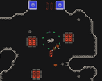
This is a very clever game! The backstory/concept is great, I wish it was told in more of an interactive or cutscene format. Same for controls, the control scheme is unique enough that learning how to do things while I'm performing them would have solidified it to me. I'm glad you gated off the intro and allowed players to learn how to do everything before facing any enemies. It wasn't clear to me that the flashing red boxes were things that would insta-kill you -- maybe a basic system for "You're getting close to crashing" "Incoming" would warn players to avoid it.
The control scheme is definitely not designed for traditional combat and I love that, fits the theme well.
Thanks for playing!
Glad to hear you liked the premise, though I agree it would be better if it was somehow delivered more steadily through gameplay. You're also not the first to suggest that some pre-warning for the flashing boxes would be a help!
Yeah, I decided right away that if I was going to do a game featuring a spaceship I didn't want it to have guns, just felt too predictable, so the more steady controls and tractor beam were born!
Thanks again for playing/commenting!
This is a great concept. I really like the capture and throw mechanic.
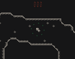
The texture tiles on the floor were very confusing. It took me several times playing before I realized that they weren't obstacles. It would be nice to have them be a different color, something to distinguish them from the walls.
I think, but I'm not completely sure, that I would have preferred a more arcade style movement for the ship rather than the more realistic style. At very least I'd like the ship to be a bit more agile. It felt very cumbersome and I don't think that added to the game.
It seemed odd to me that the rocks impacted the walls if they were floating around but could pass through the walls when I had them in the tractor beam. It would be nice to remove that inconsistency though it might require making the levels a bit less cramped. Similarly, I was expecting that the rocks in the tractor beam would block bullets and was surprised when they didn't.
Thanks for the feedback!
You're not the first to find the floor tiles confusing, something I'll be learning from going ahead for sure. With the in world 'physics' also there is that lack of consistency. I'd planned on there being a story/lore based reason, that the tractor beam took the things it held 'out of phase' with the universe for safer travel - but in the end things landed where they fell and there is little explanation in the finished game.
I think next time I'll bring my mechanics back a bit to allow more time for these kinds of checks to be made - get that layer of polish on.
Thanks again for playing!
Alot of unique concept into this!
Love what you did with the ship and content of the art kit man.
Was fun to wander around and throw fruits on the walls.
Though it's a bit slow for my taste (more acceleration/deceleration could be cool)
But hey, the grab n' throw mechanic is something i haven't seen before^^.
With polishing and maybe music this can gain alot of fun.
Good work!
Thanks for the feedback! I fee that one of the main things I've seen via the feedback I've got is that games like this are not for everyone. I think the slow pace could have been changed - bigger levels and longer passages for example - but that'll be notes for another time I suppose. Thanks for giving it a try!
I was expecting a high speed game because of the title, but wow I had to be surgical about my movements. Very good game.
Yeah, the name was one of the last things to be finalised but by that point my brain was pretty fried! Glad you liked in in spite of the misleading title :P
I'm a sucker for cheesy names, so my vote would actually be Boulder Dash (after Balderdash :P)
This game was very well made it had the perfect blend of satisfaction and frustration.I loved yeeting all the boulders to destroy stuff :)
Haha, thanks for the nice feedback - perhaps I should have called it Boulder Yeeter XD
The way you combined the assets was super creative. The mechanics made for a very exciting game. The map was engaging the explore. I went for the secret crystal and lost it all :(
The aiming turrets were very difficult with how slow the ship goes, I ended up just spamming rocks into the rooms which wasn't too satisfying because I couldn't see the enemies. Maybe the rocks surrounding could be a shield?
All around very complete experience, awesome work!
Oh wow, you're the first person I've heard say they got up to those last points in the game, well done!
The rocks forming a shield was definitely something I was considering - as well as them being able to intercept bullets after you throw them. In the end I wasn't able to get it implemented in time, mainly because I hadn't planned it from the beginning & getting it to work would mean changing a lot of other parts of the code. Just goes to show how useful it is to plan these things out ahead of time!
Thanks for playing & giving feedback!
Very original idea for control game. The retro style combined pretty well with the game concept.
Nice idea for a game. It was a little bit hard to get into but after a time i got used to it. Very good use of the assets. I had fun playing it! :)
Thanks for checking it out :D
I love this concept! I wish I had more lives in game. Difficult to have this much patience during this jam's rating period.
Thanks for giving it a try - yeah the difficulty does rather work against it in that regard. May I ask how far you managed to get/what you got to see?
I got close to what looked like another ship.
Gotcha, thanks for the response. It's funny, when I was building it I didn't intend general movement to be quite so tough as it turned out. Ah well.
We play it so much during development that we get really good at it--and perhaps in a way craft it after our own abilities. A lot of people saying my game is too difficult too.
This one is hard, I tell you. The movement is slow, but that makes sense, since you are on this spaceship, but a checkpoint system would be really nice in here. Really enjoyed the way you used the assets as well. Congrats!
Super fun, very creative use of the assets. From what I've seen so far, this one has quite a unique feel to it. Maybe have the controls be introduced slowly by play. It's a mistake I made as well. When testing games in a jam, nobody really remembers all the keys :D
The ship movement was very well done. Felt super solid!
Thanks very much! I'm glad to hear you approve of the use of assetts, from the outset I was kindof aiming more for that catagory of rating than the other two. I agree with the controls, would be nice to have have a tutourial but hey-hum. Thanks for playing :)
I really like the concept, though I sort of wish there were checkpoints at the gems. Also, it wasn't clear to me what the first three red squares were, past the second barrier. Well done!
Fun game! :-)