Play game
Silicon Sword's itch.io pageResults
| Criteria | Rank | Score* | Raw Score |
| Aesthetic | #5 | 4.361 | 4.361 |
| Audio | #7 | 3.972 | 3.972 |
| Fun | #11 | 3.889 | 3.889 |
| Overall | #11 | 3.883 | 3.883 |
| Innovation/Design | #15 | 3.583 | 3.583 |
| Theme/Lore Reference | #22 | 3.611 | 3.611 |
Ranked from 36 ratings. Score is adjusted from raw score by the median number of ratings per game in the jam.
How did you incorporate the theme and lore?
For the theme the system being broken is the computer being attacked by the viruses you have to fight off. The silicon sword is the thing placed into your hand in the first half of the lore and the thudding is the final bosses attacks at the end.
Leave a comment
Log in with itch.io to leave a comment.


Comments
Art style and character control feel very polished. Nice job!
That was quite fun =] Super graphic design and sound effect!
Wow this is amazing! I love the art and great level design.
This is a very good game and I had fun playing it. It has a nice skribblnaut artstyle. The only (a bit) annoying thing was the turning in air. Also you can skip a very smal section by attacking into a wall in the right timing and grabbing the ladder (The location is in the 2nd level I think). Also it would be cool if there was a restart button (Maybe I missed it tho) Also in one part of the game my points just increased forever. (I don't think that was intended) (Actually it stopped at 765 after moving right a bit)
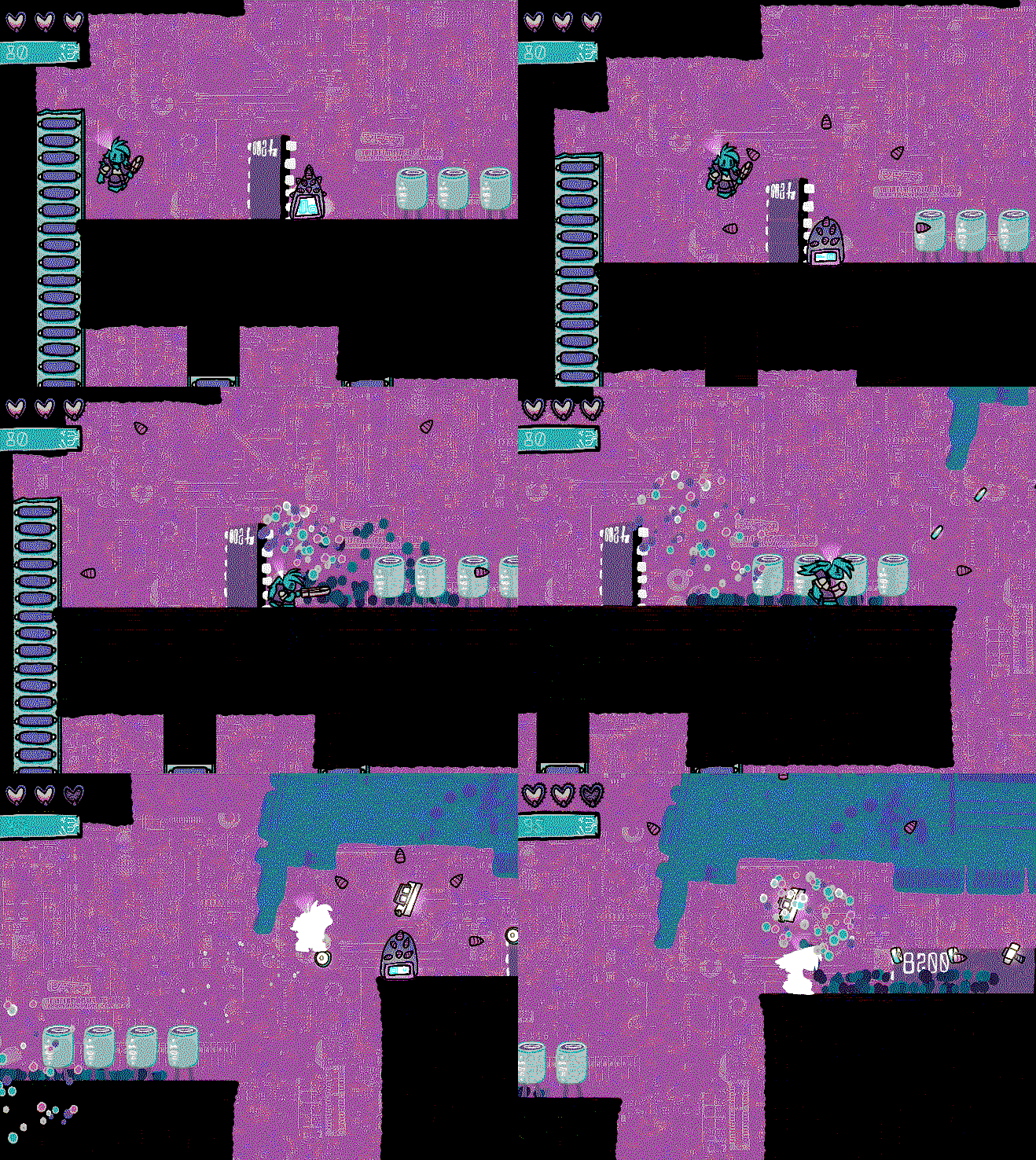
(Also if those images spam the comment section too much I can edit them out)
I L O V E D the art style. (Those transitions were 10/10)
The game was really fun, and even if it was short, it felt it had a lot of content.
The only thing I didn’t like were the controls: moving and jumping didn’t feel right. This in turn makes some parts of the game a bit harder than they should be (in my opinion).
This is a game! Really good one too! It's put together well, and one of the first games that feels complete. Bravo.. Great Art and Music, the difficulty was a little tough. It seriously reminded me of Vectorman or other great 16-bit platformers. The ONLY things I would fix/change are:
An action button for grappling ladder/ledges.. more of my noobiness.
I'd like to see more of a retro filter add on. The visuals were clean but looked a little like a flash game.
Thanks for the feedback! I appreciate the vectorman comparison because genesis platformers were one of my inspirations for this one.
I agree on the ladder grab button. Thats something i thought about adding but needed to focus on other things. If i do a post jam update I'll definitely add that.
And i think something that would add to the look a bit is more post processing and particle effects for the foreground. That's something else I'd add in a post jam update
I would imagine you needed an entire team just to make the animations. I liked the overall feel, but it seemed stale, in that it's mostly just an obstacle course.
Thanks! I definitely spent a lot of time on the animations. Trying to maximize how much i could do I couldn't add a ton of mechanics since i had a lot to do, so i was hoping it'd be kind of a short but sweet experience. But i definitely agree the current mechanics wouldn't be enough to stretch for a full game and i woud definitely add more mechanics if i fleshed this game out
It looks professional. and i really loved playing it.
oh my god this game is so good the platforming is fun the music is good and the art is amazing
I bet this game will be in top 3,no joke
Haha, thanks! I hope so
Really cute and wholesome game. I like the art A LOT ! Having a Boss at the end was very cool addition. My only problem would be the air control, it seems like the character build momentum while running, so running and jumping feels nice, but jumping from ladders to ladders, which you get to do a lot in the earlier levels, is a lot harder as it feels like you cant move enough to reach the other ladder and since you need to press up to stick to the ladder, it can be tricking to jump from 0 horizontal speed, press the direction to reach the ladder, making the timing very tight.
Loved the look and ambience of the game. Great game.
Thanks for the feedback! I think the point about air momentum is a good one. The problem is I'm using the same acceleration formula for on the ground as well in the air, when if you actually jump irl you go from zero to top speed immediately. If i do a post jam update I'll definitely give the character more air control
(Also, you actually don't have to press up to grab onto the ladders. The player auto-grabs when you touch them)
I am AMAZED by this! This game looks so professional, and it's safe to say it's the best-looking plattformer I've played in a jam setting. I loved the character design and the flow of the animations (sometimes you turn around just to see the nice swoosh). This deserves a lot of stars, thank you! <3
Wow, thanks for the high praise! I spent a ton of time on the animations so I'm glad you appreciated them
I could Immediately Tell from the Cover Image The Art On This Is Sick!
Nice Job!
I like this game a lot. The art style is very cool, and the backgrounds look stunning. The sound design is also really nice, i like the kinda musical sound effects (on ladder etc), very enjoyable and pleasant to the ear! I’m also love the fact, that you can use your attack in mid air, to gain further distance, that’s very fun to use. Also that you can jump down ladders, use your attack mid air and then catch yourself on the ladder again, this makes for really cool combo possibilities. I also found the level design really good. Where in a lot of cases when you fall, you don’t fall all the way and just have to repeat a shorter section. And also so secrets are well communicated if you pay attention, nicely done.
My Only issues with this game is that the controls don’t feel tight enough for a platformer. It feel quite laggy, especially the jump. One reason might be that the jump sounds tirggers way to late, so you don’t get the instant feedback for the jump. Another issue is that you can not turn which way the character is facing in mid air (you just can control his direction) which is relevant if you wanna combo with the attack in mid air.
Thanks for the great feedback! For the level design I made them by playing a little bit, adding more to the level, and playing again until i felt like the level was enough, so I'm glad that translated to well-designed levels! (Which i usually struggle with)
I think your critique on the jump controls is pretty spot on. If i do a post jam update i definitely plan to tighten up the movements and give you more air control
I loved the overall style and aesthetic! My only complaint is the controls and handling felt a bit off. I liked the attack animation and it felt very satisfying to kill enemies.
Thanks! I played around with the controls and couldn't decide if I liked them a little more slippery or not, but I guess making them tighter would have been the better choice
Love the visuals!
Controls are a little stiff but the aesthetic is lovely.
The electronics art is awesome!! Really nice.
So good. I got 1405. It's amazing for being completed in only a week too.
absolutely fantastic