Indie game storeFree gamesFun gamesHorror games
Game developmentAssetsComics
SalesBundles
Jobs
TagsGame Engines
A jam submission

PROJECT AEGISView game page

FPS survivors-like arena shooter with 90's inspired graphics and vibes.
Submitted by dotplus — 2 days, 23 hours before the deadline
Add to collection

Play game

PROJECT AEGIS's itch.io page

Results

CriteriaRankScore*Raw Score
Fun#43.7783.778
Audio#73.6673.667
Overall#83.4443.444
Graphics#123.2223.222
Gameplay/Design#163.1113.111

Ranked from 9 ratings. Score is adjusted from raw score by the median number of ratings per game in the jam.

What would you like feedback on?
- Did I capture the survivors-like genre correctly?
- How does the art look? Does it look complete in the battle stage? (Sorry if the question sounds silly I am not an artist so I have a hard time answering that question myself.)
- Does anything feel missing from a potential survivors-like horde shooter?
- Does the music feel distracting or is it okay to have?
- Any other feedback!

What did you update?
- Added 40+ powerups
- Added new enemy waves
- Add visuals for weapon
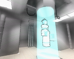
- Added HUB world for player before entering main game
- Added some basic SFX
- Tweaked player controller movement knobs
- Adjust spawn rates

Name of updated upload (if downloadable)
ProjectAegisv0.5.exe

Leave a comment

Log in with itch.io to leave a comment.

Comments

Submitted(+1)

I haven't heard of a whole Survivors-like genre before, I assume this is referring to Vampire Survivors? But, that game is 2D, which means if enemies spawn behind you, you can still see them.

For my first few runs of this, I saw a gem in front of me, so I shot it, then I immediately got brought to an upgrade screen, then I died immediately after picking my upgrade. It took me multiple runs to realize that enemies had already spawned behind me & killed me. In fact, the enemies seem to exclusively spawn behind the player?

The visuals really aren't clear either, I had a hard time telling if my shots were hitting the enemies. Some extra visuals & sfx would go a long way!

Developer (1 edit)

Thank you so much for your feedback :)

I have gotten the enemies attacking the player for behind feedback quite a bit, and honestly it was defiantly a problem to solve. My next update will have a mini-map to help fix this issue! I also pair that with some way better audio queues for enemies approaching behind player. I had some in it, but they were not that good lol. I hope that will fix that issue! 

The enemies actually spawn from spawners which randomly spawn around the arena! But those can potentially spawn behind you. I am adding a better distinct audio queue for those now, and maybe a special marker on the minimap.

Nice feedback there! I will add more effects to make easier the enemies are struck.  I added a hitflash and hit sound effect, but I think I need some more. I will adjust the effect, change the audio a bit and add some particles to make it easier to read and some for enemy death!

Submitted(+1)

The Art

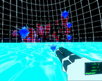
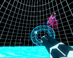
The bright blue floor is a bit straining to look at while moving and although I like the colors for the enemies, their transparent look makes them hard to see. I love the visual style a lot and I think the biggest improvement would be to change the floor color. It makes the enemies and half the magic circle on the gun difficult to see.

The Music

I enjoy the music

Other Feedback

The gameplay is a little confusing. It feels like the enemies are either spawning right on top of me or they are moving too fast for me to get distance away from them. I'm not sure if I've killed them or not. A more readable confirmation sound effect or visual effect could be added. 
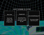
The power-up options show pop up as I'm still shooting so I end up clicking one without having a chance to read it.

The movement feels good while the aiming and shooting are very satisfying. I don't have a lot of experience with survivors-like games but I'm confident that this would get me hooked.

Developer (1 edit) (+1)

Thanks for your feedback! :D

I am definitely changing the floor color next update. Its color messes generally with everything else as my gems are blue and enemies are transparent red. I am taking notes from other games I am inspired to create a better color palette to work with!

I noticed the startup time for learning the game is bit rough. I am now planning on writing a tutorial to resolve this! I also recently redesigned the spawner enemy to be easier to see / read,  and to do a visual +audio cue for when the spawn occurs. I hope that fixes the spawn the head problem!

As for the fast enemies that might be the tank chaser types and that is hindsight 20/20 from me. I initially designed them to only be dodged 100% of the time by bunny hopping, but I did not even explain that was possible. I will add this to the tutorial and also adjust the stats of them to ensure they do not get the player instantly.

I got the upgrade screen feedback, and I think I got the fix for this actually. Next update will have the player initiate the upgrade sequence via the tab button. I played with a slow mode, but I think would be easier and not interrupt the flow as much or feel too weird. I will also make sure though a level up is obvious by making the level up sound is audible

Submitted(+1)

You're welcome! Thanks for sharing it😊

Submitted(+1)

The literal first thing I do upon booting up the game is get stuck in a wall. Off to a good start!

Mean jabs aside, I do really like the futuristic/low-res aesthetic, and I'd be interested to see real levels in this framework. The battle arena itself is a little hard to judge since it seems to just be there for testing purposes; maybe you could put in some background details like buildings or stars/planets in the distance, but that's about all I can suggest. The shooting controls are smooth and the gameplay loop seems neat, though again it could've used real levels. I think the music is good to have here, but the loop felt rather short and should probably have been extended more.

Really, my biggest issue is probably some UI/UX stuff. The HP counter should probably be more obvious, there were times where the upgrade menu lingered on-screen even after selecting an upgrade (it was still visible even when the game unpaused), and there seems to be no way to pause/exit the game yourself. Aside from that, I'm actually pretty interested to see where this goes.

Developer (1 edit) (+1)

Thanks for the feedback and playing my game! :D

Lol, yeah that is still a bug. I am planning on increasing the size of the HUB to add in space for some new playable characters and game progress data so the wall glitch will be gone by then. My guess is the normals are flipped on it, but I am sure I can fix that.

Yeah real levels would be cool! I am planning maybe in the future as I was interested in attempting a roguelike more like Nuclear Throne as an FPS, but at the moment I want to keep it a pretty simple arena shooter in the spirit of Devil Daggers or maybe an FPS Brotato. I am planning more enemies and bosses though to keep it interesting! I am also playing with the idea of an infinite arena like the old Swarmlake had, but that would come later as a potential map if anything though.

Nice catch on the song loop! Its only about like 20 seconds before it looped. I ran out of time, but really wanted to put something so that is what ended up happening. I am working on the full song at the moment :)

Thanks for the feedback on the UI/UX! I do agree it should be more obvious. I am thinking of maybe making the health be lights on the gun or hearts rather than number. I will play around with this as I personally cannot design UI or want to animate it like at all so I am for like the most diagetic as reasonable possible lol. Though if I have to I will fold lmao

Also I will defiantly fix up the menu glitches and add in a way to exit the game! I will place those into my bugs column and feature column!

Submitted(+1)

Interesting concept, I like it. I'm not into fps in general, but here are my thoughts.

I felt a bit lost at first. The art style is cool, but some elements are blending together. I found confusing the fact that for basic enemies you have to shoot at their body, while for  any others you have to shoot at their gem. Also aiming is a bit difficult.

Anyway, after some death I began to enjoy the game. The gunplay feels good and the game itself is pretty fun. 

Because enemies are all around I would like to have some sort of radar in the UI, to give an idea of what's behind me.

In my opinion the upgrade screen shouldn't open and close by itself so fast. It's a bit annoiyng when I try to aim and suddently all stops without warning. Same goes when the game resume, I died once because the enemy was too close and I wasn't ready. You can either make the player open the upgrade screen by himself, or make a soft transition maybe with a countdown of some sort.

I'm not sure if the game can be called a "survivor-like". It's looks more similar to game like Returnal or other fps-rpg to me. But as I said, fps are not my genre, so I can't really say.

Overall you made a nice demo, was fun to play ^-^

Developer(+1)

Thanks for the feedback! I really appreciate the try and feedback even though it's not your preferred genre :) 

I have gotten all enemies  around the player awareness a few times and it's a problem at the moment. I was kind of aiming for a sound based approach (I was missing a bunch of sounds lol), but even I think it might not be enough. I am definitely considering adding a small radar / minimap somewhere! Thanks for the idea! 

I totally agree with you about the upgrade menu! It annoys me too, and I wanted a way to go about that. I will play with your suggestions for solutions and I am leaning on having the player start the powerup screen themselves. Also I am hoping with some animations it should make it less sudden! 

Once again I appreciate your advice, and best of luck to your game too! :D

Submitted(+1)

Right now, the game's start is still pretty jarring. I'm a strong believer that a game should explain itself when playing it, either through an in-game tutorial or by giving the player time to figure out the controls for themselves at their own pace; like an easy, short first level to get to know the controls. Because now I just got thrown into the game and died immediately not yet knowing what to do, lol.

The art & music feel fitting for the futuristic sci-fi vibe this has and complement each other fine. I didn't find the music distracting at all, if anything I think these kind of games need a good soundtrack to hype up the player. I really like the amount of upgrades this game provides and coupled with the randomization gives it good replay value.

I did encounter what looks like a bug: when I got the upgrade screen the first time, I picked the Star Buddy, and then got another upgrade screen (or it reset, probably, as it also listed the Star Buddy power-up again). But the mouse disappeared and I heard the game music start up again, and without being able to do anything, I suddenly died and the game over screen appeared. Basically looks like the game resumed but I remained stuck in the upgrade screen. This didn't happen again when I replayed the game, but it's worth mentioning.

Developer

Thank you for the feedback! 

I agree with the game start. I initially tried to go about Devil Daggers way, but after seeing their updated new kind of sequel Hyper Demon I noticed that they put a tutorial inside as well, probably for a similar reason now that I am thinking about it. I will definitely insert some kind of tutorial now for the first time playing!

That bug is not supposed to happen! Thank you for reporting that, and I will definitely ticket myself and fix that up for the next version. 

Appreciate all the feedback! Also I will def take a look at your game soon :)

Submitted(+1)

The shooting is fun. As Steventus said, more gameplay-changing powerups would be good. In a lot of survivor games, they increase the player's arsenal with a lot of weapons/ability powerups. That goes a long way towards making each build/run unique. 

I think the art assets are fine but the color theme lacks contrast. I haven't played devil daggers but it has red accents on black enemies which contrasts a lot. Here the floor is blue. The hittable parts of the enemy is blue. The transparent red body makes it even harder to see. I would suggest rethinking the color scheme here.

Trance music is a great choice for a survivors like game as they tend to be "zone-out" games. With some more SFX it would improve a lot.

Overall, it's a fun entry. As a programmer, I totally understand the pain that is art. Picking a  good color palette can help a lot in that regard. 

Developer

Thanks for the feedback! :D

Good insight on the color theme. I used a palette for this, but I definitely could have done a better job mapping it to gameplay better.  Looking at it through the lense I definitely can improve the contrast way better. When constructing the map V2 + enemy models I will consider this for the textures! I will look a bit more into Devil Daggers color selection a bit to try to get the select colors from the palette to match way better than now. 

Yes! I enjoy making art, but sometimes I wish it was as straightforward as programming sometimes lol.

Submitted(+1)

Swell game, very fun, interesting take to bring-in the player agency back into the autoshooter genre (the survivor-genre, in your words). Thoughts:

- As the game progresses, the sheer number of enemies certainly bring in that feeling somewhat, when you get escalating upgrades that lets you either run away faster or deal with the increasing hordes better.

- I love the aesthetic you're going for. The art and music really blends well to create this insanely, intense feel - similar to ULTRAKILL kind of vibes. Great choice to go for the breakcore kind of music. Only concern was the fact that's its really hard to tell where you're aiming (lack of a cursor) and where enemies are. Otherwise, love it.

- I think you're missing some potential here, as you're going for a survivors-like horde shooter. Since you're adding back player agency and adding a twist to the autoshooter genre, the kind of gameplay you're going for might differ abit. I think the skeleton is there,  consider streamlining the upgrades you get so that rather than just "stats increase" upgrades, you just get more "weapons" alongside your main gun - this lets people understand the upgrades they are going for much easier - similar to Vampire Survivors.

- Piggy backing on the above comment, I can't quite say for sure how you should consider augmenting the gameplay - you can either give the horde some form of range attack, or change up the arena at intervals. The fact that you can attack and destroy spawners is  great mechanic on its own and is an interesting path to take. Maybe different spawners spawn different enemies with different behaviours. It's hard to say. It depends on what kind of feeling you want to evoke.

- Controls feel alright, arena can feel confusing as I can find myself backing up then all of a sudden, didn't really realise I hit the border. Perhaps give the ground some texture, so it's easier to tell if the player is moving, or has stopped.

-The gunplay feels good, it has this erratic spray-and-pray feeling to it which is great for this kind of hit-and-run style of shooter.

- Game is honestly fun though. I find myself replaying a few times to really get a feel of the game and upgrades - good start to the variety of upgrades you have.

Very solid prototype and I enjoy the work you've put into this. I'll be keeping a close eye on the progress!

Developer

Appreciate the feedback! 

I am so glad you and everyone seemed to like the aesthetics! I love making retro PSX stuff, but I am not big on horror visuals which is the biggest use for the style so I am really happy it works with people :D 

Yeah I totally get enemies location issue and it has been a running issue for a bit. I was initially trying to go about using spatial audio for that like DD, but honestly even playing myself its exactly the best for this I feel even if all audio was added. After some feedback I am planning on placing a minimap somewhere. Also I can add a reticle if it helps. I can add that for features for the next version after the jam! :)

I can definitely add some more weapon types of upgrades! At the moment I have Cherub and Star Buddy which are roughly mapped to Friendly Ghost from 20MTD and the Bible from VS. I have a small list of potential others, and I can add those onto the next major update!

The funny thing about that is that there was supposed to be some more content. I have two bosses coded up that were supposed to appear around minute 4 and 8, along with two new elite enemy types that spawn similarly which are similar to DD’s spider and the Tree from 20MTD and exploding enemies. DD has these unique enemies appear on certain intervals so I wanted something similar to keep things fresh. I had to scrap them since I really want to check the very core some more before expanding and for art reasons as too many default cubes would have been confusing I felt. It was a bit rough to have their AIs there but not ready for the game. I should have those in the next update as well as I am currently working on the art for those (with the feedback gotten from here as well). 

I am doing a V2 of the area, and I will take your points into the new design. I feel way more comfortable with SFX so I can try to add some noise texture to signal that a wall is being approached!

Thanks once again for your feedback! I will def have a new version out soon, most likely sometime early next month. :D

Submitted(+1)

If you wished to capture the same feeling as Vampire Survivors I think you captured the rush correctly. Tho I am not sure if its intended but whenever a bullet hits an enemy the game lags. Also there is the fact that the visuals are really hard to follow. Making it difficult to see where I am shooting. The game also starts lagging like crazy after a point where the enemies increase too much.

Developer (2 edits)

Thanks so much for the feedback its really helpful, just some follow questions so I can improve on your points!

  • What you mean the rush by chance? I would to capture that, but unsure what you mean by that!    I read your comment wrong lol
  • Def a good amount of enemies can lag the game, by chance do you recall around how long it took or how many floating red things there were when that starts to happen?

Also did some experimenting and I think I think I know what is going on with the lag! I believe its the hit stop that occurs due to a time delay. When vsync is not enabled or supported it does the intense game lag you are referring to! I managed to get that on my machine, and that is totally not intended and I will patch that up.

Submitted(+1)

The same rush of many hoard shooters I suppose. The amount I cant say exactly because like I mentioned the visuals make it hard to count the enemies so I was just shooting at all the red hues I saw. 

Developer(+1)

Thanks for the follow up! :D

I will def improve the visuals on the enemies. I do agree that its hard to tell enemies as they all start blending with each other.  Been meaning to change em up, but always ended up pushing back, so its time to change those up! Also I will get to fixin up the lag issues as well once. I have a few ideas to go about that one.

Thanks once again for the feedback, I appreciate it Also I will get to looking over your game later today!

Developer (2 edits)

Hello! Just wanted to say that my game is more of a prototype than a full on demo  more of super early demo now. I am aiming for a 20MTD / Devil Dagger hybrid FPS kind of game. It is still a bit underbaked but hoping to improve graphics, sound, etc every update + fix bugs.

Regardless I would love to get some feedback and suggestions on what I have so far! :)

KNOWN BUGS:

  • Collecting an explosive upgrade will cause game to crash.
  • Shotgun fire is loud. Lower volume on machine for now. (Going to make a dedicated shotgun sound vs using a sound per blade)
  • Walking around the HUD close to walls may trap you! I will fix this as the HUD is getting a redesign to fit more characters I am added!
  • Cherub shotgun crashs the game.
Developer (1 edit)

UPDATE v0.5 (HOTPATCH)

  • Fixed enemy hit lag
  • Temporary remove auto VSync