Play game
Block Drop's itch.io pageResults
| Criteria | Rank | Score* | Raw Score |
| Aesthetics | #35 | 3.231 | 3.231 |
| Theme | #37 | 3.269 | 3.269 |
| Overall | #42 | 2.865 | 2.865 |
| Sound | #52 | 2.385 | 2.385 |
| Gameplay | #55 | 2.577 | 2.577 |
Ranked from 26 ratings. Score is adjusted from raw score by the median number of ratings per game in the jam.
Leave a comment
Log in with itch.io to leave a comment.


Comments
Nice gameplay and the theme spot-on! Though the game window was too small, and the sounds were a bit harsh to the ears, but great job!!
Thanks, the window I am not to sure about, but the sounds I can definitely improve on for next time!
I'm so impressed at the amount of work put into this game. You really went all out with this.
Nothing else to say but this game was great! :)
Thank you so much!! Really glad you enjoyed it!
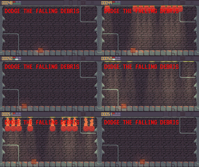
Nice one. Interesting that you have to predict next attack using spotlights, and it's kinda risky thing.
P.S. The small screen is Web related, I think.
Ahhh right, I will try and fix it with the hotfix after the jam!
Nice game.
1, The game is on a small screen, so It is hard to see the game.
2, You can only use A and D to move, but I would like It if you could use the Arrow keys as well.
Besides these, nice game.
Thank you for the feedback. Not entirely sure how to change the small screen issue.
Nice Game ! Rated !
check mine too :)
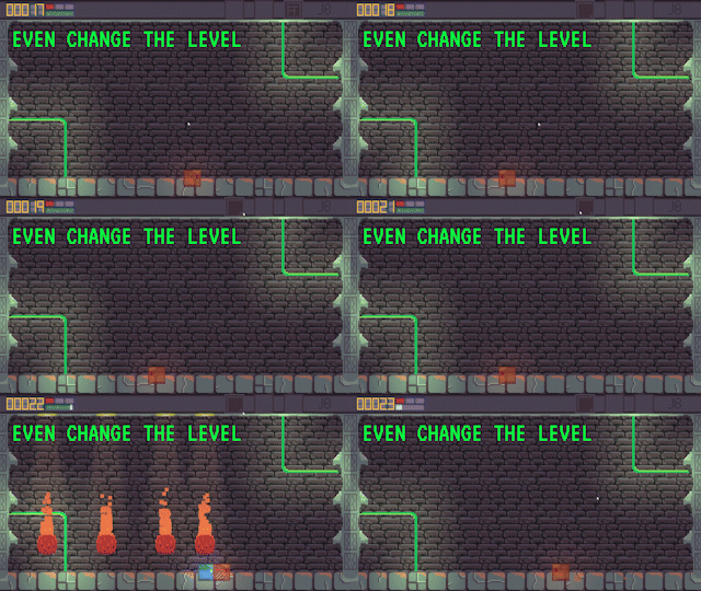
Nice Game! Those Lighting effects are amazing! As it gets to level 3, the game gets harder but apart from that, you made a good game! :D
Thank you so much! Yeah I wanted to really push the player on level 3, maybe a little to hard...
I didn't see the leaderboard implementation. Gameplay wise, it was good. Simple design. Art for the player could have been a little bit better, the half-transparent block, floating like halfway through the ground doesn't make sense. A+D & Left+Right would have been sweet, rather than just A+D movement. But neat artwork & gameplay, had fun.
thanks for the feedback! the character is meant to be halfway up on the floor block, and I didn't think it needed a leader board as such, just a scoreboard?
Oh I undestood what the half-on & half-off block meant. It's like how in many 2d games, the player's legs and a small part of the body are on the ground's layer. I mean that keeping the player semi-transparent just removes that illusion/feel that the character is standing on top of the ground, rather it looks like the player is stuck in the ground.
About the leaderboard, many games have implemented the scoreboard feature, that's not the what I meant. Since the jam was about leaderboards implementation, I didn't get to see the "highest" score at the end 😉, rather only the score for this run.
Cool game! simple concept to pick up and play and I like the settle ques from the dropping fire.
Thanks! Alot of time went into the lighting of this game, something I've never really focused on before, glad it was received positively.
When I first saw this played on the livestream I thought: "Brutal", but now that I've had the chance to play it myself, I notice that you actually broadcast where the fireballs are coming from with the spotlights. Very clever. Looks great, and quite challenging.
Good work, and good luck!
Thanks, yeah, I wasn't to sure how hard to make the game and obviously cranked it abit to hard, but we live and learn, thank you for the kind feedback!
concept is very neat, but maybe the character gains speed rather than having a fix moving speed just to make up for those times that the safe place in the map is in the opposite side. good job!
I really like this idea, if I have time before my next game jam I will incorporate this in the hotfix after the jam
Simple concept but well executed. It was hard to adjust to the player speed, maybe that could be something modifiable in addition to general difficulty?
Yes! In my hotfix after the jam I will allow the player to gather speed as the button is held down
The reaction time is very short then character speed, maybe you could increase it. Nice game!
Thank you! I've had a lot of comments over character so its definitely a place to improve on!
Nice! May you rate my game too?
Yeah buddy! I'm gonna go through all the games tonight, or at least however many I can get through.
Fun game, with really nice pixel art. Hard to see on browser. Zoomed all the way in and it wasn't even near the standard size. Maybe add a fullscreen option? Game's challenging and for level 3 it doesn't feel like the player moves fast enough, even with the warp. Thank you for telegraphing where the debris is dropping, however. Really fun and could be way better with some minor improvements!
Sweet! Glad you enjoyed it, the minor improvements you think should be in player speed?
Yeah, and adding fullscreen through itch for the WebGL player.
Okay I'll look into how to do that, wasnt to sure.
level 3 is veryyy hard. Also the default size in browser is tiny, and I couldn't make it any bigger. But overall good job. I like the indicators of where the fireballs will come from next
Thank you! So sorry about the browser size, not entirely sure on how to fix that, an alternative is to download the application but I will try figure out a way to deal with that. :)
Nice, no idea where the audio goes? just kinda, disappears, also gets boring after a little and is hard to dodge when there's a 1 wide grap
Thank you for the comment, what did you mean by the audio?
no idea, sometimes the audio stops looping? not sure why this occurs but it comes back when i restart.
Okay thank you I'll check