Play game
Bloody Hell's itch.io pageResults
| Criteria | Rank | Score* | Raw Score |
| Aesthetics | #31 | 3.417 | 3.417 |
| Sound | #31 | 3.042 | 3.042 |
| Overall | #47 | 3.021 | 3.021 |
| Theme | #62 | 3.125 | 3.125 |
| Gameplay | #71 | 2.500 | 2.500 |
Ranked from 24 ratings. Score is adjusted from raw score by the median number of ratings per game in the jam.
Leave a comment
Log in with itch.io to leave a comment.



Comments
very cool design and sound !
i don't know what happened in game but the design introduce to me how play x)
the main menu don't work with me :/
This game is very addictive , I recommended !
Hey thanks for the feedback and glad you liked it 😊 I've fixed the bugs and uploaded it as bloody hell 2 if you're interested.
I got to about 17,000 before I couldn't move to the next portal and died
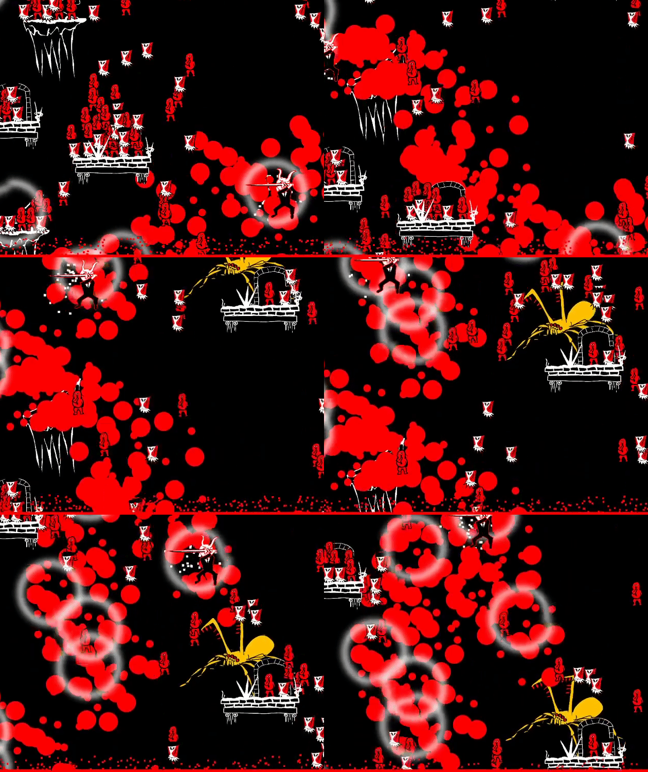
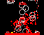
Cool visual effects but there was too much going on the screen at the same time
Hi thanks for the feedback. Sorry you got screwed by the clicking bug. I've fixed it already in my new version.
My best score was 666666. 😈
Naw, it was 15050. Absolutely impressive when it comes to the art style though, and it reminds me of our game when it comes to just how hectic things end up getting! Between worrying about the rising lava pit and wondering exactly how many minions of Hell I'm hacking, this game's always keeping me on my toes!
I'm agreeing with other comments that more could be done to the general gameplay. I couldn't tell if you had put in things like score multipliers in there, but I think it'd be amazing if you killed a bunch of demons in one swing, and then you end it off on one of those spiders... and it gives you like x5 score boost to that one slice! Clicking from ring to ring also felt finicky at times, and I think there's interesting things you could do with them. Maybe some of them move really fast, or go invisible/can't be clicked for a moment before becoming available again. But if you use those rings, they give you even more points or something.
Overall, this game is aesthetic AF, to both the eyes and the ears! But if I were to give a suggestion on how to make it better, just go nuts with the score! Really indulge the player, make it feel good to do that slicing and dicing... This is Hell we're talking about! 😁
Thanks for the awesome feedback! I've fixed all the bugs if you are interested and uploaded it as bloody hell 2. Main difference is clicking the circles always works so the game is a lot smoother. Your game was great and when I'm back from the wage cage I'll leave a comment :)
Splatter in its best form! Simple in a good way. It can be a little bit more challenging.
Thanks for the feedback :)
Visuals = great, but it felt a little clustered.. which is not a bad thing in this case
Yeah hopefully it's a cluster in a good way. Cheers for the comment :)
I really liked it, felt pretty solid and the graphics were just about perfect. Very unique game, great job!
Thanks for the nice feedback :)
So fun how the blood is splattering everywhere :D This is the closest combination of a clicker game and a platformer I've seen so far. This idea definitely has potential and should be explored more. Some kind of progression would be great. Maybe really lean a bit more in to the clicker genre. Really unique game. Great job!
Thanks for the great feedback and glad you liked it :) I really enjoyed designing the combination. A balance between fast clicking and risk/reward of different portals. I would have headed more towards !Osu if I had time. A game I've never played but looks interesting. I'd have had some swiping between portals for a start. Cheers!
"Climb out of hell and murder some or your old colleagues on the way.
Left click the portals to fly around slicing and dicing as you go.
Everything made by me during the ScoreSpace9 Game Jam."
Hope everyone had a great time. I've caught up on sleep now so going to spend a day checking out games and replying! Thanks for all your feedback already.
I actually like the cluttered/messy screen, the artstile is great and i really like your logo too. Maybe you could change the circles color to yellow to help the player spotting them quickly! Well done!
Hey thanks for the feedback :) Glad you liked the logo. I probably spent too much time on that as there was so much I didn't get to lol. The gold colour I wanted to save for the rare spawn objects (spiders are worth a lot of points btw!) so wouldn't want to use it for the circles but I get your point :)
It took me 5 tries before I figured out the controls, the help button didn't work so that was a bit frustrating. Once I figured out the controls it became pretty fun, but as has been said already below the screen is pretty cluttered/messy. The art style is great, I think this game could be greatly improved by reducing the clutter and have the speed that the screen moves upwards speed up over time.
Hey thanks for the feedback. I'll definitely prioritise the help button next time. It's in the long description here but it's not enough.
The screen does speed up and the music too. It's subtle but after a couple of minutes it's pretty tough!
Going to have a full day checking out games now that I've had some sleep 😊 cheers
The game is a bit messy and hard to understand at first but it's pretty fun to slash through a bunch of enemies. Maybe it's just me but I found that sometimes portals didn't register my clicks unless they were closer to the centre which made for some frustrating moments. Decent entry, good job!
Hi thanks for the feedback and glad you enjoyed it :) It wasn't just you and I didn't quite squash that bug. Probably the first thing I'll fix when I patch it!
Hi if you're interested I fixed the clicking bug and a few other things and uploaded it as bloody hell 2 :) Going to develop that further after the jam.
Oh, nice to hear! It's good to see people taking feedback to heart and improving their games. :)
Quite good idea. Love the balance between points and killed enemies, also the take on the theme was good. As improvement I would suggest that you add some kind of tutorial. It took me quite a while to realize how it works :d
Thanks for the feedback glad you enjoyed it :) Definitely going to include a tutorial next time. Kicking myself because it would have taken 5 seconds to rename the help button to at least say "left click the circles" lol.
Very nice game!
I love this concept of trying to get to platforms with the more things to kill to gain more points. You certainly already thought about it, but I would love to see some enemies that can kill you if you click on them by mistake! Would make the whole game a bit harder though.
A very good job, keep creating games!
Thanks for the feedback glad you enjoyed it! I intended the way you interact to be more like the game called "Osu!" which wouldn't be suited for punishing clicks. Didn't quite get there and had to cut a lot of ideas for time of course :D cheers
Oh yes of course, you're its maybe a bad idea. Oh ok! It's true that it made me think a lot to Osu, but... Osu killer mode :p Well done again. :)
Art style is cool and unique. A bit messy visually (that might be part of the art style?) and I wish the slashing part had more gameplay involved
Hey thanks for the feedback :) It was supposed to be messy in a good way lol with the amount of objects on the screen. I'd have liked to put a lot more gameplay in too! Really liked yours saw it yesterday and I'll comment in a bit.