Play game
Don't Look At Them's itch.io pageResults
| Criteria | Rank | Score* | Raw Score |
| Sound Design | #9 | 3.846 | 3.846 |
| Aesthetics | #39 | 3.923 | 3.923 |
| Enjoyment (Best Game) | #43 | 3.385 | 3.385 |
| Horror | #78 | 2.692 | 2.692 |
| Story | #98 | 2.000 | 2.000 |
Ranked from 13 ratings. Score is adjusted from raw score by the median number of ratings per game in the jam.
Leave a comment
Log in with itch.io to leave a comment.


Comments
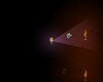
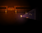
Good game! I liked the way the light activated the enemys
Simple and entertaining!
While I believe there could be more time spent on the graphics, the simple concept and gameplay did make for an enjoyable experience! It was not anything horrifying but still took a good twist of strategy and horror!
Not much to say bad about this title. Good job!
I really liked this game, it was simple in concept, but challenging to get through the rooms without getting caught. Well done!
Fun game! Really liked the mechanic of the enemies being activated by light, it made it super tense trying to creep past them, particularly in the tighter spaces. Great level design to maximise the effectiveness of this mechanic too- very satisfyingly stressful :D
Thanks a lot for the comment :)
The first level is a easy one to introduce the player to the main mechanics. The second level has thin corridors which works great with the game mechanics and challenge the player.
The only thing I have to complain about myself is that there is nothing else to explore. It's just collecting avoiding enemies, collecting keys, finding the exit (which is always in the middle top). With more time (and motivation) I would have added a few more features like torch-fuel, a use for the coins, step-platform which trigger doors etc (it would be able to lead the enemy over the platform to trigger it).
Yeah, many ideas but lack of time, motivation and skill! But a jam is for fun and to gather experience ^^
The idea of adding buttons is a really good one, as it forces more interaction with the enemies, which will increase the tension a lot as well as open up a lot of new puzzle mechanics. There's never enough time during a jam to get everything we want done, but the good thing is once the jam is over there's all the time in the world to just work on it whenever inspiration/motivation strikes :D
(Edited: spelling)
Great concept, level design and pixel art! The game feels really smooth and polished and makes great use of sound cues. It's cuter than it's creepy, but if that's what you're going for good! If you wanna crank the spooky factor up however here's some suggestions: use colder colors, add footstep sounds, slow movement down and most importantly go for disturbing music and sounds. Maybe a heart rate sound that accelerates when chased would be cool too. And graphical effects that underline the tension of being chased and get more and more intense as the monsters get close. Anyway good job!
We actually thought the warmer colours worked really well for the aesthetic of the game. The richer, more vibrant tones made it feel more alive and set it apart a bit since most games in this genre use the colder palette. Agree that footsteps would be a good addition though :)
They do work in fact, if you're happy with that style go for it! I was merely offering suggestions to make things spooky :)
Yeah of course! We aren't the devs of this game, just other players offering a different perspective :)
Haha sorry I didn't notice XD
Thanks for the feedback.
The tileset is created by pixel poem - no credits for me ;)
I also had a few ideas to make it creepier adding camera shake or blur if you see an enemy. Actually I added footstep sounds to the game but in the end I forgot to use them. There are a few features I ain't managed to implement due to lack of time (and dwindling motivation). As example, all coins have no use :|
It was a nice little jam and creating horror games is a lot of fun. I want to go for a 3D game next time :)
Yes it's so fun! And yeah I totally get you about the lack of time :P
About the coins, haven't you used them as score? There definitely was a room full of them that was optional and required backtracking. That's actually a good enough use of coins if you ask me!
And good luck on your next 3D game! ;)
An interesting game! I like the use of tourch. It adds more fun in this game!
Very clever idea! I adore the little bounce animation that plays when the character walks. Only minor nitpick I have is that the character moves faster when walking diagonally, but that's not a big deal.
I watch your devlogs, by the way! Really cool to see a developer's insights on their own game. Great job on the game!
Thanks a lot for the feedback :)
I was too lazy to fix the diagonally move speed^^ (I have seen a video about it, something with normalize the vector idk - but it wasn't on my priority list)
Thanks, it was my first try no create a devlog (even harder if english isn't your native language).
Fun To play, smooth and engaging.
Really wonted to click something as I was playing.
Nice gameplay idea and good work! that's well polished
Thanks a lot for the feedback :)
This was a nice-looking and sounding game. The concept (thanks for dropping it right in the title, or I probably would have died a lot sooner than I did) is novel and fun.
Thanks for the feedback^^
I often struggle finding a title. This one just came up with the main game idea! (not very creative, but it fits)
I love the idea and also the looks of the game :)
Thanks a lot for the comment :)