Neat concepts with the AI, it felt like a challenge balancing both of the enemies. Felt like the player goal could have been explained a little better. I ran around with the gold for awhile before realizing I could just leave. Nice visual style and it ran great, but it felt a little empty audio and story-wise.
Play game
Clyde Manor's itch.io pageResults
| Criteria | Rank | Score* | Raw Score |
| Horror | #41 | 3.462 | 3.462 |
| Enjoyment (Best Game) | #105 | 3.231 | 3.231 |
| Aesthetics | #190 | 3.231 | 3.231 |
| Sound Design | #214 | 2.769 | 2.769 |
| Story | #260 | 2.154 | 2.154 |
Ranked from 13 ratings. Score is adjusted from raw score by the median number of ratings per game in the jam.
Comments
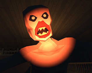
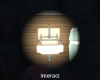
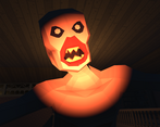
It's a well put together game! The house is fun to explore, and I like how the monsters slowly move towards you. It took me a little while to know I could interact with objects, but once I did, I had a good time trying to get to the end. I had fun playing it, and excellent cover art!
The house was nice and the game was scary, Mouse sensitivity needs tweak. Also off topic, really pretty cover art.
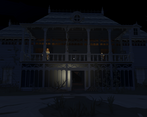
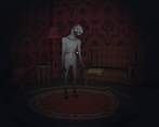
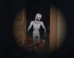
Hooray, I won, I wooonn! Loved this little game, though not too scary (the Synty assets didn't help because I recognised the style, but for budget assets they're great - I used some in a game of mine a little while back, totally get why you used them, making all of a house that detailed from scratch would just of been impossible in the timeframe!). The ghoul management mechanic was fun, at times it felt more like I was playing some weird kind of horror management sim, which could be a genre all in itself. The only issue I had is that sometimes when going up and down steps or the doorways from the upstairs, occasionally the charecter collider would get stuck - felt like maybe it could of used a little invisible ramp there to make it simpler to navigate. Otherwise though, really good :)
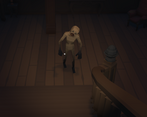
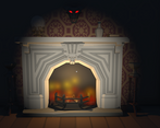
This is a very nice entry to the jam, congratulations! I really enjoyed the short experience, and was left wanting for more, so definitely a good thing! The ambient sound is very good and so are the ghouls footsteps, but I would've loved for additional SFX (for example, hearing the fire or the water pump coming to life). Also, and maybe this is a case of people game-ifying things to much, but I ended up leading peek outside to the side of the house and leaving him there for the full playthrough to simplify the ghoul management -- maybe having him move around even when out of sight but never coming more than X-steps away from the player would make it scarier as you'd never entirely know where he went. Definitely one of the best entries of this game jam, hoping you don't stop here!
Agreed on the mouse sensitivity from the other comments. Cool that you made the two entities polar opposites, made it fun to balance.
Good atmosphere, especially liked the non-guided gameplay. Mouse sensitivity setting would be handy.
Aaaaaah, the footstep sounds... stressful. Peek and Boo is a good combo, well done.


Leave a comment
Log in with itch.io to leave a comment.