Play game
The Tragic Curse of GRIMHILL FORT's itch.io pageResults
| Criteria | Rank | Score* | Raw Score |
| Game Master Usability | #2 | 4.095 | 4.095 |
Ranked from 42 ratings. Score is adjusted from raw score by the median number of ratings per game in the jam.
Leave a comment
Log in with itch.io to leave a comment.


Comments
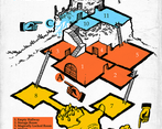
I love the way the map is drawn.
I think this could be a fun one-shot or bandit lair in a hexcrawl if random encounters (perhaps a haunting?) and some rumours/hooks are added. With the text alone, I'm struggling to think of a compelling reason for exploring the site instead of just taking shelter to wait out the storm.
For better usability, I would like to see the doors and ladders mentioned in both room descriptions, especially if they are locked. Otherwise, if the players are in room 1, the GM won't know that one of the doors in that room (the one leading to room 3) is locked until they read all the adjacent room descriptions too. I think the author understands this concept at least partially because this is done for things like sounds that can be heard from adjacent rooms.
I would also like to see some more interesting magic items to find. The locket and speak with dead scroll are interesting/evocative. However, the +1 sword and +1 dagger aren't as fun.
I liked the statuette easter egg. I wonder if the pose of each statuette can be highlighted as a subtle clue that they fit together.
Thank you for the detailed feedback. Much appreciated.
Oh yeah, I see that. I missed that haha :) Just an error on my end. There are mentions like these later in the PDF, but not here. I will edit that specific thing later, after the judging.
As for the other things you mentioned, I wanted to leave some freedom for the GM to play with. Personally, I prefer open-ended adventures that leave some wiggle room for tweaking, improv, and interpretation. Perhaps the ghost calls one of the characters by name? Maybe the bandits will go on a routine check-up? Maybe 2-3 bandits will return from patrolling outside and catch the PCs inside? etc.
I really love the overall look and feel, and the isometric map being color coded is a plus as well. A+ overall.
Thank you very much! :)
I've been loving the color coding I've seen in these modules. Changing some of my own ideas about design.
This one's a five star from me.
Thanks. Whenever I prep for my group, instead of writing stuff down with one color, I use various markers for better organization and clarity. It really helps.
The artwork is amazing. Excellent job. Being that there are no random encounters or danger level- I'd love to put this before my players and see how they do!
Thank you! I used some public-domain art for the monsters and whatnot. The cover and the map are original art. I wanted to put some random encounters, but I had to work with the limitations and the format.
I'm disappointed there were stirges rather than stingbats. The color coding is a nice touch.
Thanks a lot :)
Looks and reads fantastically!
Thank you very much!
This is great. I love little dungeons like this!
Thanks :)
Truly a tour de force of Jaquaying a dungeon. Classic vibes and a believable dungeon ecology. Personally, I would omit, combine, or repurpose many of the fluffy, transitory areas like the Atrium or the Old Wine Cellar, but they do contribute to the atmosphere.
Yeah, there's a few things I might tweak or make explicit here if I were running, some of it probably just different taste really (like I wouldn't have the storm dispelled by reuniting the lovers), but that map is so fun to look at, and a nice mix of fighting, skill challenges, and potential mystery.
Thanks a lot! This is why I didn't explicitly say that the storm is dispelled, it just stops. Maybe it is because of the spirits being reunited or a coincidence. I left this part open for interpretation.
Thanks a lot for the feedback. The intention of these areas is to give atmosphere, and also give players some tactical options (Wine Cellar primarily).
Very easy to understand. I could read in 20 minutes to grok the whole adventure.
Thanks :) That was the intention. Something easy to read and run.
Really, really well put together, outstanding isometric map too. Hats off to you!
Thank you very much for the nice words :)
Wow this looks amazing!!!
I love the layout style you chose!
Thank you! I tried to make it easy to read as much as possible. :)
It really goes a long way.
another great release, I love the writing and the artstyle!
Much appreciated! Glad you enjoyed the adventure.
Oh, we got a good one here! That map by itself would be a solid entry!
Thank you very much!