Play game
Last Night's itch.io pageResults
| Criteria | Rank | Score* | Raw Score |
| Graphics/Animation | #24 | 4.275 | 4.275 |
| Theme/Limitation | #40 | 3.688 | 3.688 |
| Overall | #60 | 3.507 | 3.507 |
| Music/Sound | #85 | 3.362 | 3.362 |
| Technical Implementation | #108 | 3.163 | 3.163 |
| Fun/Design | #155 | 3.050 | 3.050 |
Ranked from 80 ratings. Score is adjusted from raw score by the median number of ratings per game in the jam.
How does your game apply the limitation (and optionally, the theme)?
the limitation Boss: our whole game is based around the boss battle between the player and the monster(shadow) and for the theme we were going for an on the edge as in paranoid vibe for the player
Team Size
Quartet (4)
What main engine/tool/language did you use to construct the game?
Unity
Leave a comment
Log in with itch.io to leave a comment.


Comments
I really liked your graphics and how you manage the theme. Control were a bit clunky, weird choice of not allowing the player to shoot if moving (jumping allow shoot), even a little move ruin your attack window. Great job !
Amazing art and game, animations and background were superb. The boss had a bit too much health In my opinion and maybe the powerup could have been more frequent. Besides that, amazing game.
Cool game!
Very nice side scroller, the boss design is really cool! The game is tough, definitely draws you to play one more time after each game over
so cool!!
Wow, the graphics gave me gameboy flashbacks, really stunning art direction, the music is stressfull as it should be given the concept. Agree with Shovel on the checkpoint remark, would take the game further. As it is, it's pretty solid and impressive.
Great game. Blown away by the Artwork! Fitting music and sounds. Loved the little portal and items.
A really, really fun game with a great art style!
My only real feedback would be to add some checkpoints or maybe full health refills in the safe rooms - something to make it more approachable for someone of my middling skill level LOL!
Gorgeous looking game with a haunting soundtrack. You also hit the target with the implementation of the theme. My feedback is I felt the players movement was a little slippery and the jump a bit floaty. I would also map all the actions to the keyboard unless you needed the mouse specifically in the game. There was also the display aspect issues where the sides got cut off in the main menu as others said.
Overall I had a really fun time with this, well done!
Took me a while to know what to click but managed to do it. Loved the palette color and art! Very relaxing
I enjoyed the art and the concept of having the boss push you to the edge. Remind me of Limbo.
I feel that the controls needs to be a bit quicker for the reaction that the rays thrown by the boss demands. Still, quite fun!
Really nice game ! liked the visuals and the whole ambiance !
Got a little display problem, could see the sides of the game (but that might be just me my screen is not exactly 16:9)
A bit hard felt like i was barely scratching the boss with my gun and the difficulty ramp up quite fast with a lot of spawns after the first shelters.
appart from that, solid game !
Great job !
Really enjoyed the art and audio to this, it was calm enough to match the environment which is hard to do on these short Jams!
I really like the ambiance and the aesthetic of the game The is some issue with aspect ratio, it's clearly done for 16/9 but I got a 16/10 so the edge are a little bit crop (can't see the control keys for instance). I like that you have to look back in order to shoot your enemy, but then your late so must platform a bit, and repeat that. That's a solid core loop. Great game.
Aesthetic and style was consistent so the nightmare-ish theme you were going for sold me. The shooting mechanics can be better implemented.
- I think utilizing the mouse to aim would definitely be a quality of life improvement rather than a handicap - especially once more elements like other enemies appear during the run. Having to physically stop moving and turn around to shoot the boss while trying to dodge enemies hurt the flow for me - my issue with the bosses in games like metal slug that have this format, although, there is typically less elements to deal with on screen (think of metal slug 3's first boss).
- having quicker accessibility to shooting towards any part of the screen would definitely be a good thing, imo
- With how far I got, I saw no point on shooting downwards - maybe there are specific ground enemies that appear later that you have to shoot.
- jump animation is a little wonky , but I'm not going to rate quality of animation with how little time we had to complete our entry - it works - that is all that matters right now. Animations are overall serviceable for what you were trying to accomplish.
-I like the implementation of an upgrade system. It's cool to see game jam games incorporate them with how little time there is to complete anything.
overall, a cool little run and gun keep it up!
The overall aesthetic, from sound to art, was really well implemented. It did feel like I was in a nightmare. The upgrade system and format was interesting and made me want to keep running through to make it to the next upgrade room.
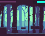
Geez that difficulty spike kind of comes out of nowhere though! Being able to shoot on the move would be a great addition. This is a small thing that probably won't affect a lot of people and it's tough to check every scenario for a jam game, but I have a widescreen monitor, so this is what running the game in fullscreen looks like:
I played it in the browser window instead. The nightmare is much more frightening when his back end isn't cut off!
Great work to the entire team. A great approach to a unique boss battle.
yea i forgot to put the scale size of the game to 16x9 and kept it on 1920x1080 once the jam is over i will update the files
Really really love the art, well done in that regard. I also like that there's an upgrade system, it hit right when the mechanic was feeling stale for me, so getting the sunglasses was nice :)
For constructive criticism, honestly the art is so good that it kind of overshadows the UI. I also think some of the things, e.g. the monster, are so well animated that it kind of makes things that aren't animated stick out: I think the shooting and projectiles could use more juice. Gameplay wise, there are some gaps that you can't jump out of forwards which I get is a design choice, but being that you have to turn around a lot it can feel bad getting trapped with no way out
Atmospheric and intense! Graphics style and music go well. I like this game.
It's really well done, quite long (not that that's a bad thing), for such length I would recommend some power ups (could be just a way to recover health), or check points (then again this is just what I would like xD) the game looks great and it's well programmed, my only complaint is that I cannot find the theme, "On the edge" you could have made it more evident :) overall great game.
It does have a HP regen powerup, its a random chance in the safe room! Thanks for playing!
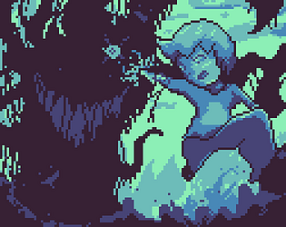
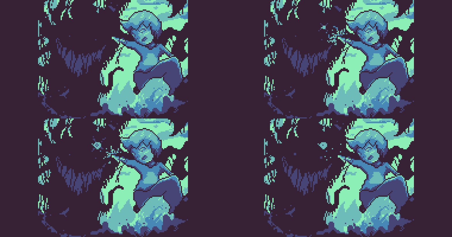
Love the art in this game! Really big fan of the limited color palette and choice of colors for that matter as well. The character art and parallax background were great, but what really stood out to me was the boss animations. Super creepy and well done. Really well done!
Artist here! Thanks so much, really glad you liked it!